Charts
Links in Big Number charts
Bullet chart
Sparklines in Big Number charts
Choropleth map
Chart annotations
Force-directed graph
Chart heights
Funnel chart
Geographic heat map
Google Maps with markers
Heat map
Hive plot
Horizontal bar chart
How to implement gallery examples using the HTML editor
Network matrix
Creating Chart Annotations using Matplotlib
Creating Histograms using Pandas
Creating Horizontal Bar Charts using Pandas
Creating Horizontal Bar Charts using R
How to Create R Histograms & Stylize Data
State choropleth map
Sunburst chart
Word cloud
Zipcode choropleth map
World choropleth map
How to Create R Histograms & Stylize Data
When exploring a dataset, you'll often want to get a quick understanding of the distribution of certain numerical variables within it. A common way of visualizing the distribution of a single numerical variable is by using a histogram.
What is a histogram in R?
A histogram is a graphical representation commonly used to visualize the distribution of numerical data. It divides the values within a numerical variable into “bins”, and counts the number of observations that fall into each bin. By visualizing these binned counts in a columnar fashion, we can obtain a very immediate and intuitive sense of the distribution of values within a variable.
How to Create a Histogram in R
This recipe will show you how to go about creating a histogram using R. Specifically, you’ll be using R's hist() function and ggplot2.
In our example, you're going to be visualizing the distribution of session duration for a website. The steps in this recipe are divided into the following sections:
You can find implementations of all of the steps outlined below in this example Mode report. Let’s get started.
Data Wrangling
You’ll use SQL to wrangle the data you’ll need for our analysis. For this example, you’ll be using the sessions dataset available in Mode's Public Data Warehouse. Using the schema browser within the editor, make sure your data source is set to the Mode Public Warehouse data source and run the following query to wrangle your data:
`select *
from modeanalytics.sessions`
Once the SQL query has completed running, rename your SQL query to Sessions so that you can easily identify it within the R notebook.
Data Exploration & Preparation
Now that you have your data wrangled, you’re ready to move over to the R notebook to prepare your data for visualization. Mode automatically pipes the results of your SQL queries into an R dataframe assigned to the variable datasets. You can use the following line of R to access the results of your SQL query as a dataframe and assign them to a new variable:
`sessions <- datasets[['Sessions']]`
Data Visualization
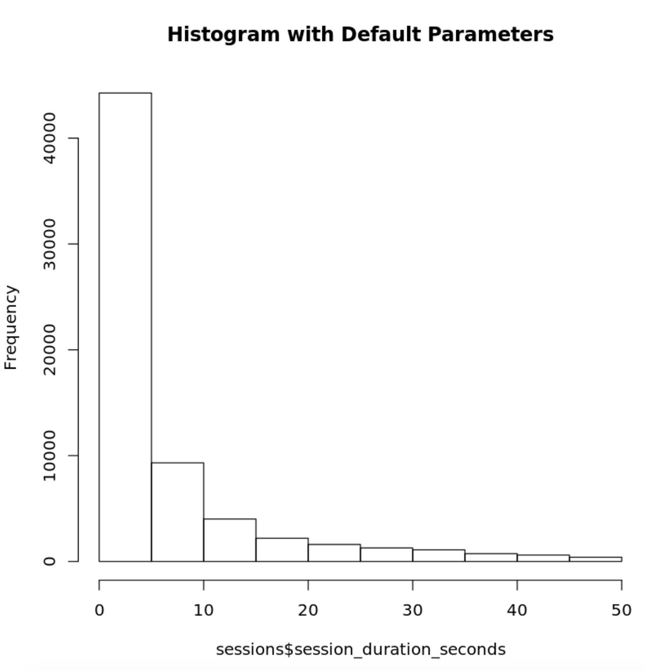
To create a histogram, we will use R's hist() function. Since you are only interested in visualizing the distribution of the session_duration_seconds variable, you will pass in the column name to the hist() function to limit the visualization output to the variable of interest:
`# Using hist() function in base graphics to make a histogram
histinfo=hist(sessions$session_duration_seconds, main="Histogram with Default Parameters")`
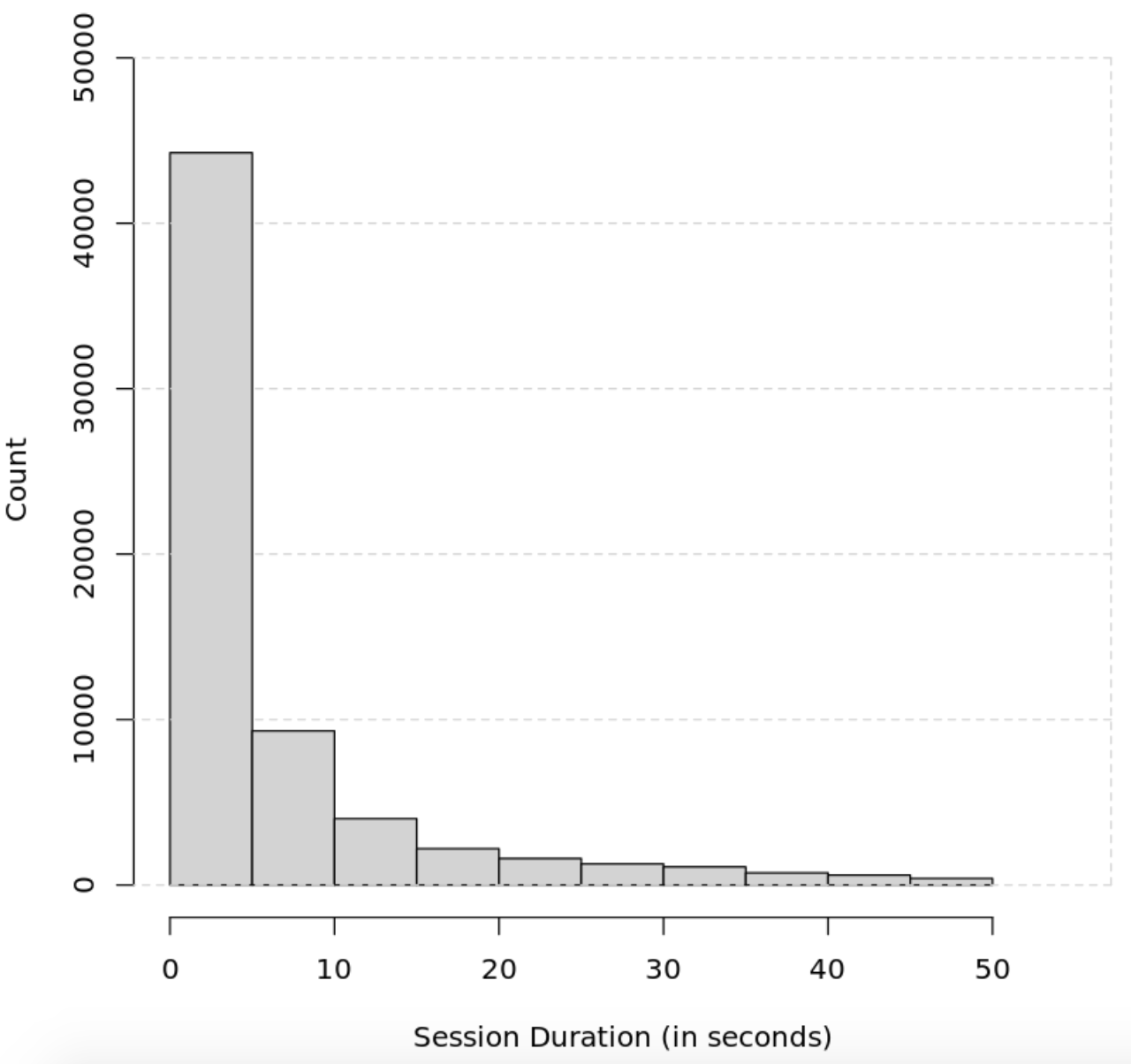
You can further customize the appearance of your histogram by supplying the hist() function additional parameters:
`hist(sessions$session_duration_seconds, main="Adding grid lines and ticks", xlab="Session Duration (in seconds)", ylab= "Count", xlim=c(0,55),  ylim=c(0, 49000), col="lightgrey")
axis(4, labels=FALSE, col = "lightgrey", lty=2, tck=1)`
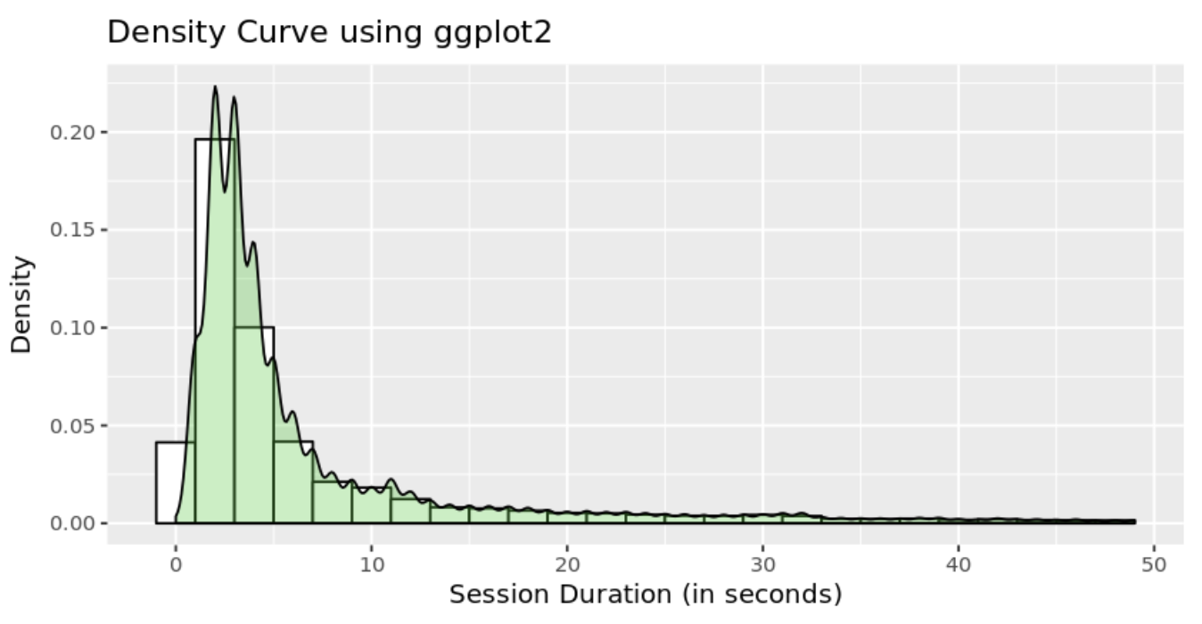
You can also use ggplot2's native histogram creation functionality to create and style histograms in R with additional features like kernel density estimations:
`p <- ggplot(sessions, aes(x=session_duration_seconds)) +
    geom_histogram(aes(y=..density..),      # Histogram with density instead of count on y-axis
                   binwidth=2,
                   colour="black", fill="white") +
    geom_density(alpha=.3, fill="#32CD32")

p + labs(x = "Session Duration (in seconds)", y = "Density", title = "Density Curve using ggplot2") + coord_fixed(ratio = 100)

ggsave("ggtest.png",
  p,
  width = 5,
  height = 8,
  dpi = 1200)`