
Example Gallery
Clone our sample reports on topics ranging from forecasting and A/B testing to building sales funnels and heat maps. Then take them for a spin with your own data. No coding experience necessary.

Charts
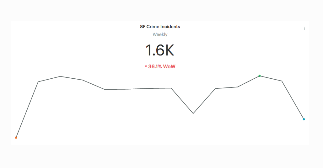
Links in Big Number charts
Turning Mode's Big Number charts into links makes it easy for your audience to explore the underlying factors impacting the result.
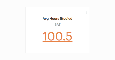
Sparklines in Big Number charts
Adding a sparkline to a Big Number chart shows your audience how the metric has performed over time.
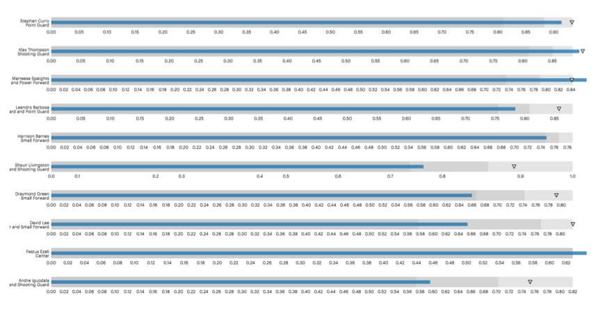
Bullet chart
Great for measuring progress toward a set of goals.
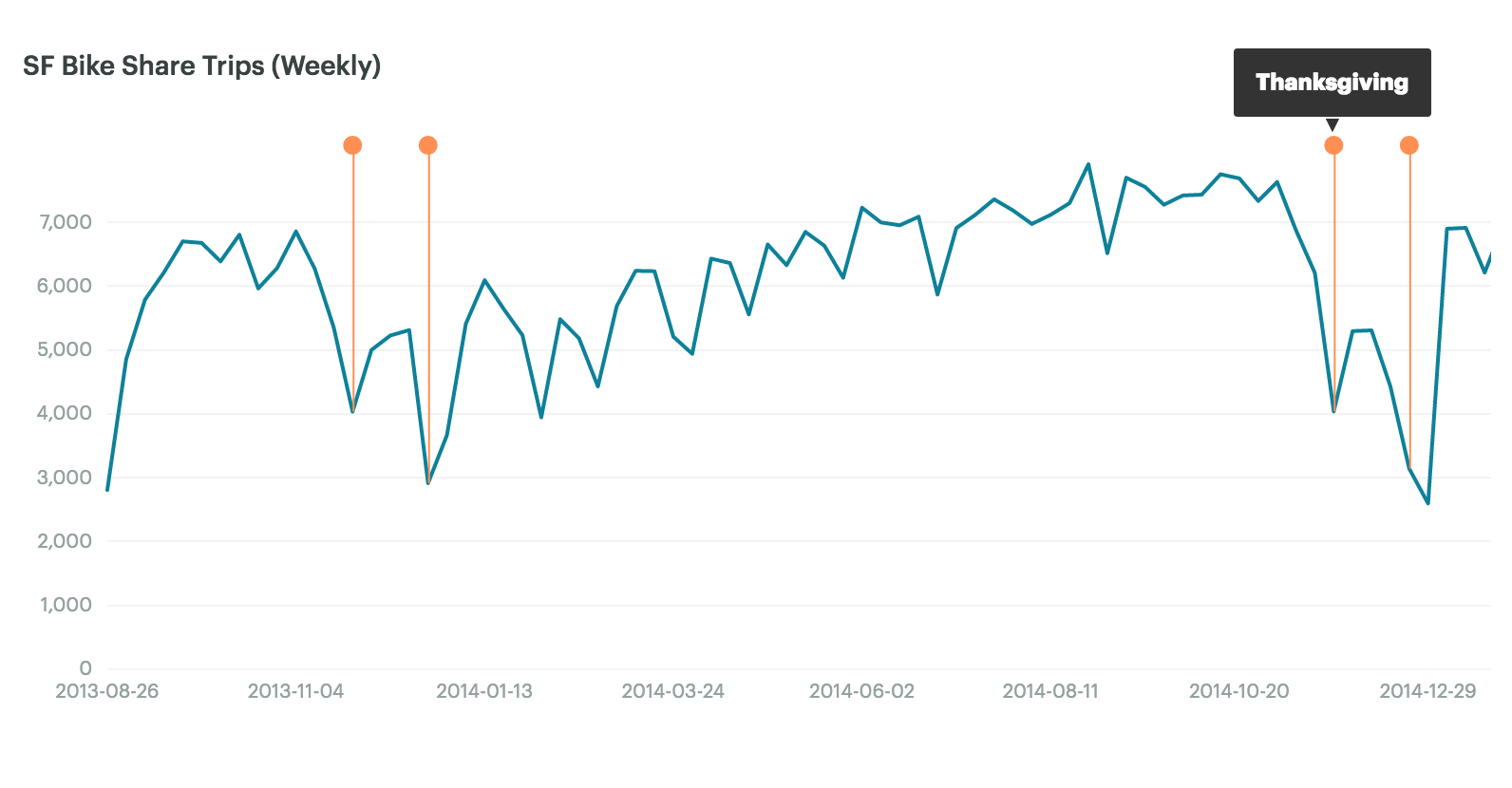
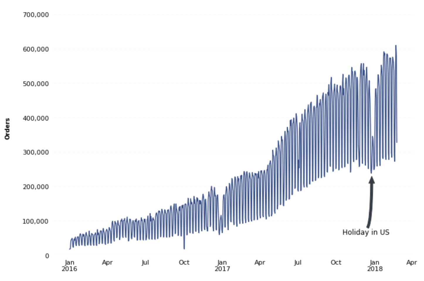
Chart annotations
Annotations are helpful for showing when key events occurred, especially when they have a noticeable impact on the data.
Chart heights
Sometimes it makes sense to change the heights of charts in your report.
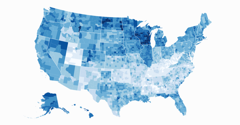
Choropleth map
Thematic maps in which areas are shaded based on the prevalence of a particular variable.
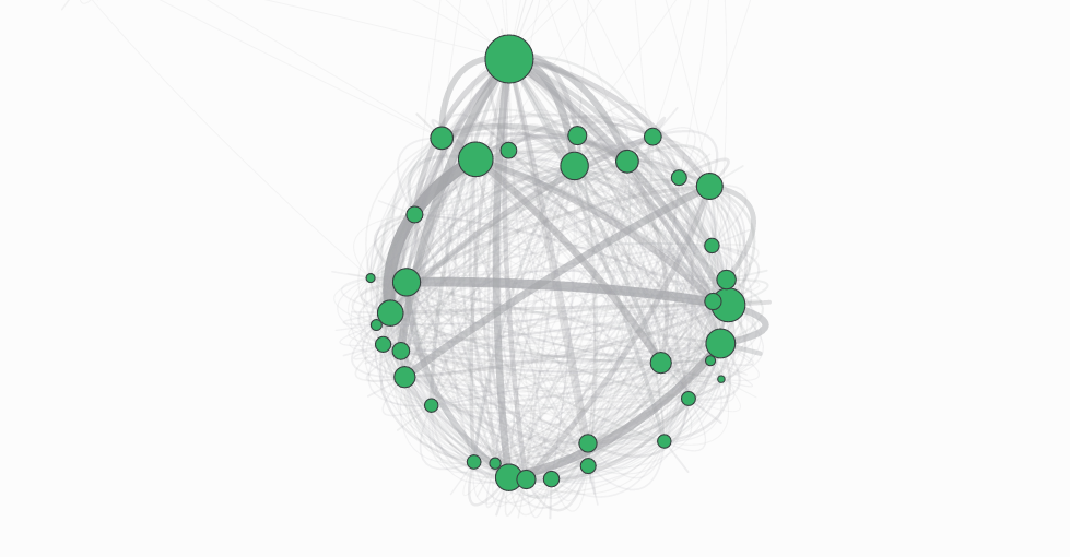
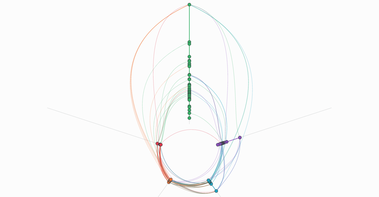
Force-directed graph
Visualize connections between objects in a network. Force-directed graphs can help uncover relationships between groups that may not be obvious otherwise.
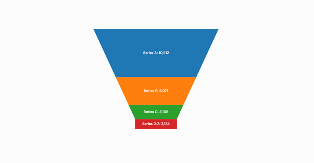
Funnel chart
Helpful for visualizing a flow of things (users, people, organizations, etc.) through a sequential process, such as the sales pipeline.
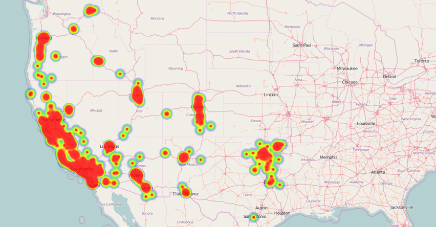
Geographic heat map
An interactive way to identify where something occurs, and demonstrate areas of high and low density.
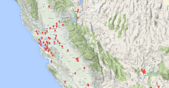
Google Maps with markers
Pin locations using Google Maps to visually tie your geo-data to specific addresses.
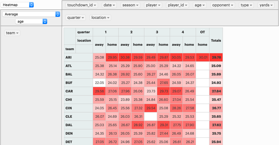
Heat map
Effective at communicating high and low periods for a metric. You might use heat maps to show how traffic to your site or usage of your product changes over time.
Hive plot
Similar to force-directed graphs, a hive plot shows how objects in a network are connected, with a more orderly, clean visualization.
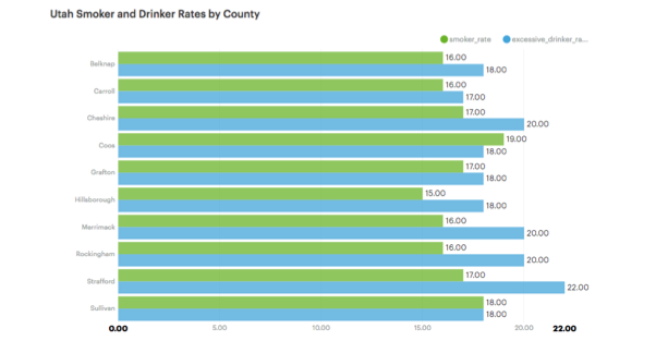
Horizontal bar chart
Great for presenting a long list of results that would become crowded if displayed vertically.
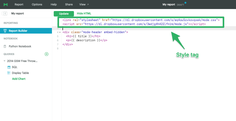
How to implement gallery examples using the HTML editor
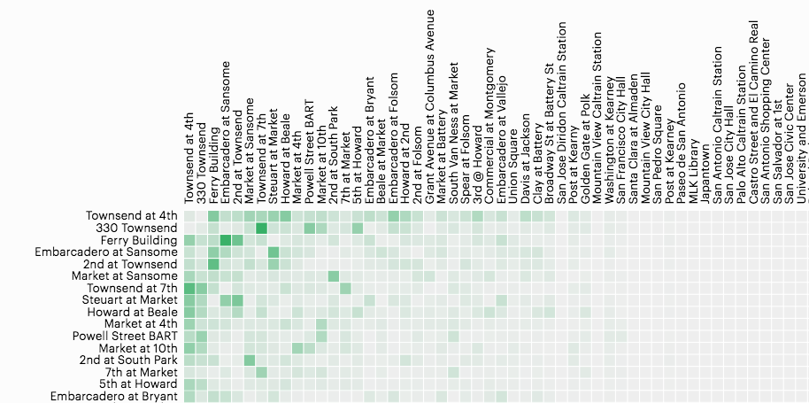
Network matrix
A structured, easy-to-read way to show how objects in a system are related to one another.
Creating Chart Annotations using Matplotlib
A guided walkthrough of how to create chart annotations using the matplotlib python library.
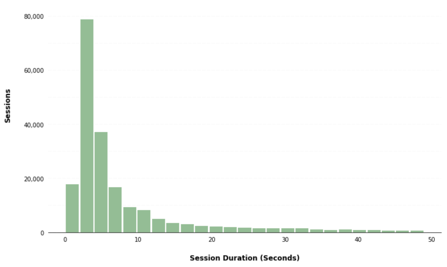
Creating Histograms using Pandas
A guided walkthrough of how to create a histogram using the pandas python library.
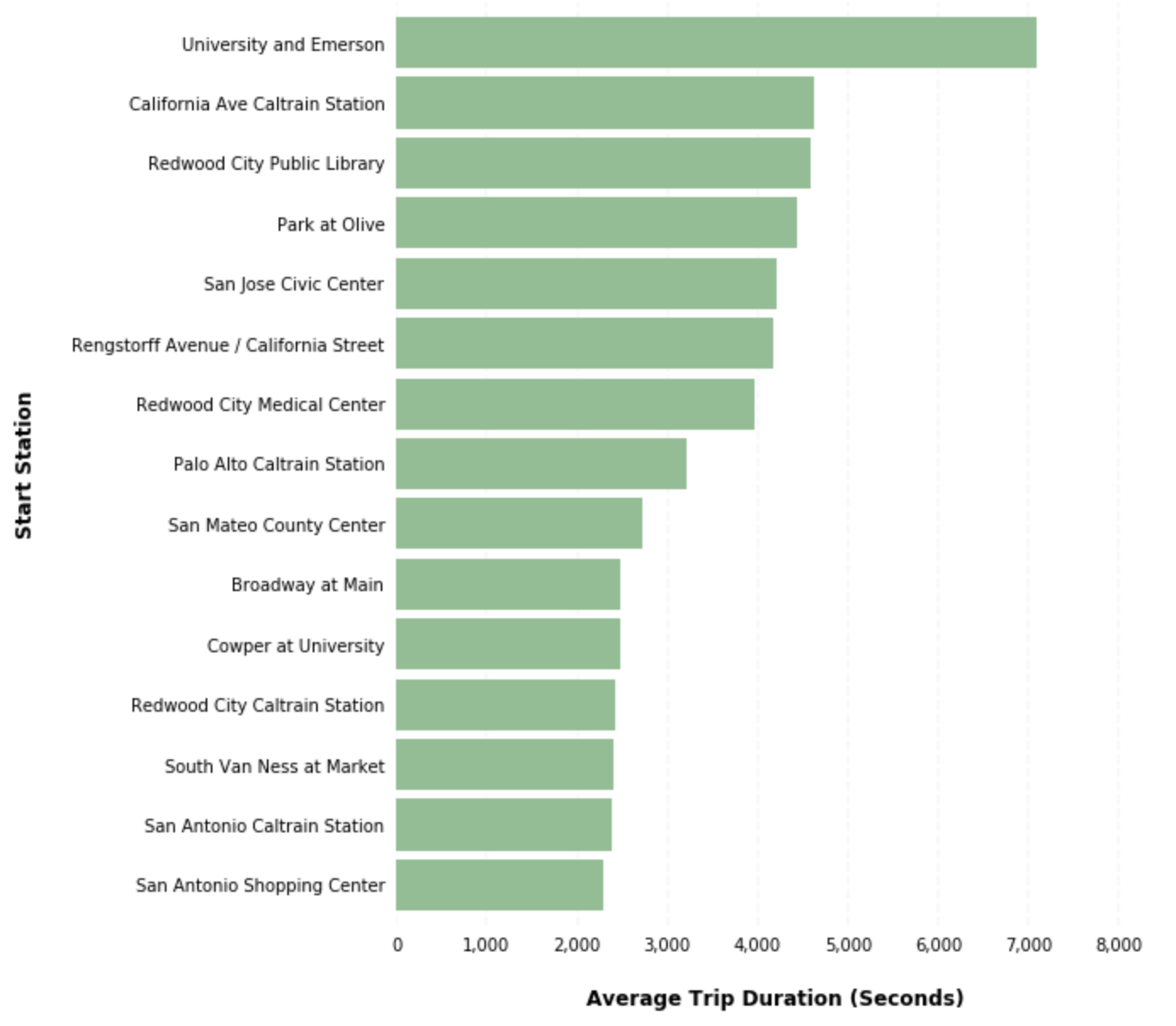
Creating Horizontal Bar Charts using Pandas
A guided walkthrough of how to create a horizontal bar chart using the pandas python library.
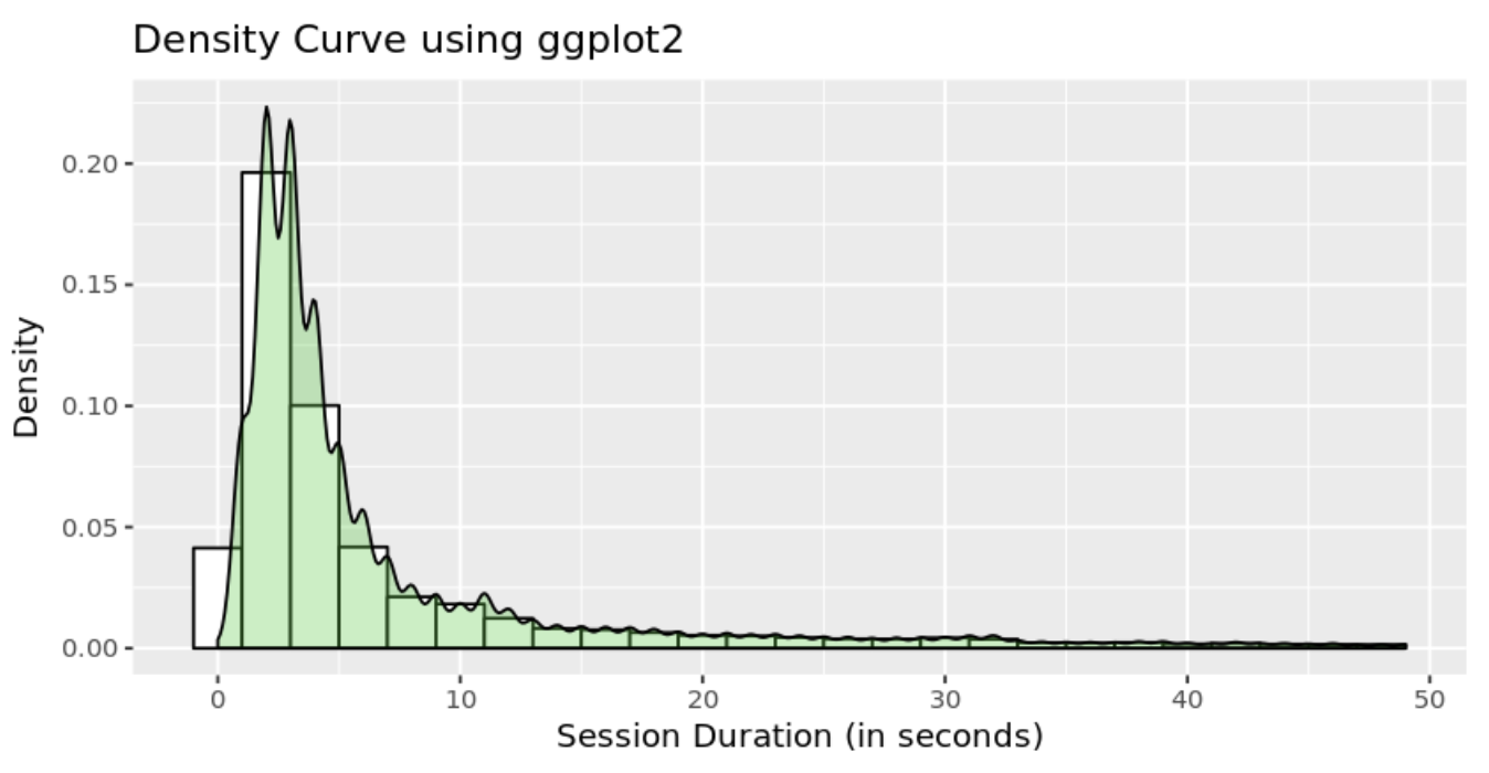
How to Create R Histograms & Stylize Data
Learn how to create a histogram using R programming language. Histograms are a common way of visualizing the distribution of a single numerical variable.
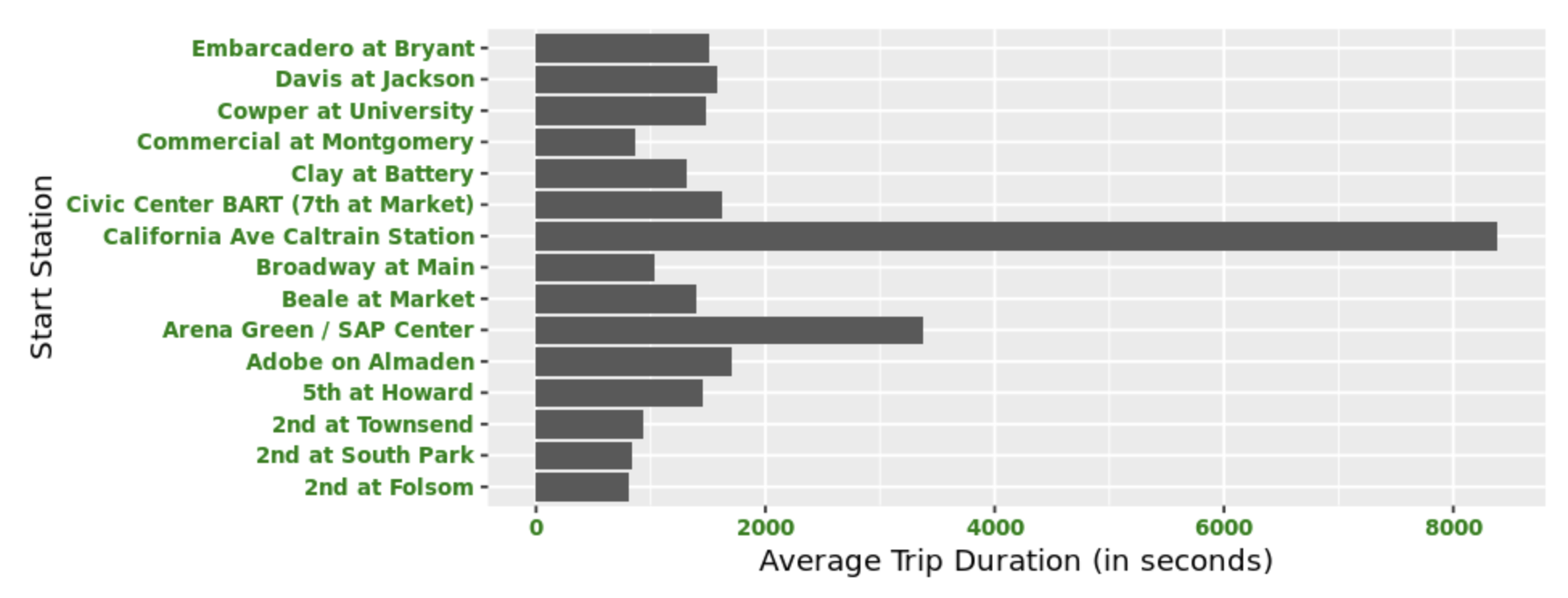
Creating Horizontal Bar Charts using R
A guided walkthrough of how to create a horizontal bar chart using R.
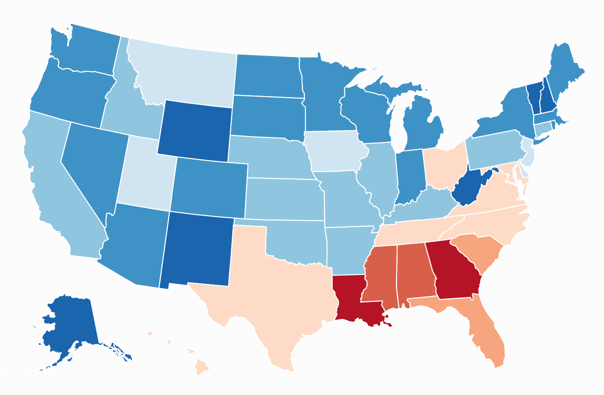
State choropleth map
Great way of showing how a measurement varies across a geographic area, in which areas are shaded based on the prevalence of a particular variable.
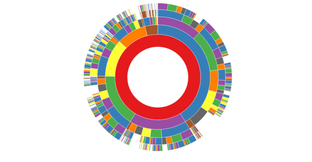
Sunburst chart
A way of illustrating the flow of users through a complex system.

Word cloud
Quickly identify the most common terms from a dataset of free-form text.
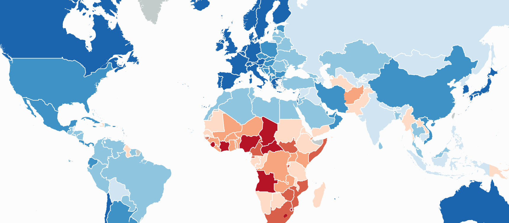
World choropleth map
A thematic map in which areas are shaded based on the prevalence of a particular variable.
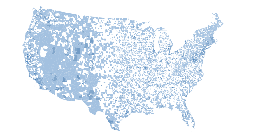
Zipcode choropleth map
Thematic maps in which areas are shaded based on the prevalence of a particular variable.
Tables
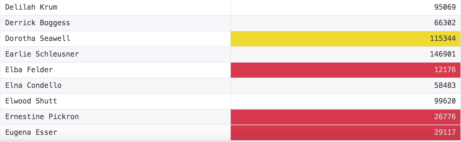
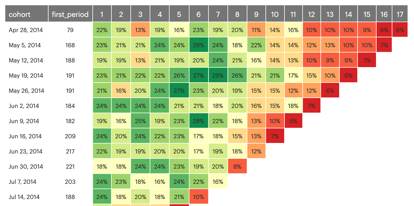
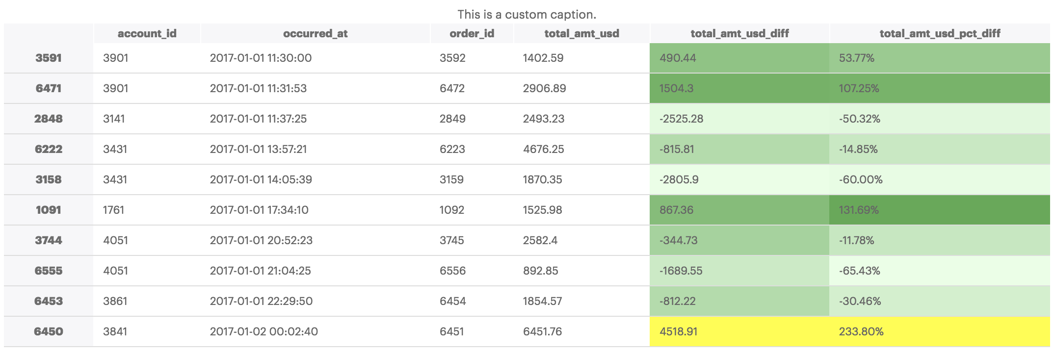
Conditional formatting
Shade table cells with values that fall above, below, or equate a given threshold to quickly spot outliers or trends.
Pivot table
Filter and group results without making any updates to the underlying SQL.
Dataframe Styling using Pandas
A guided walkthrough of how to use the pandas python library to style dataframes.
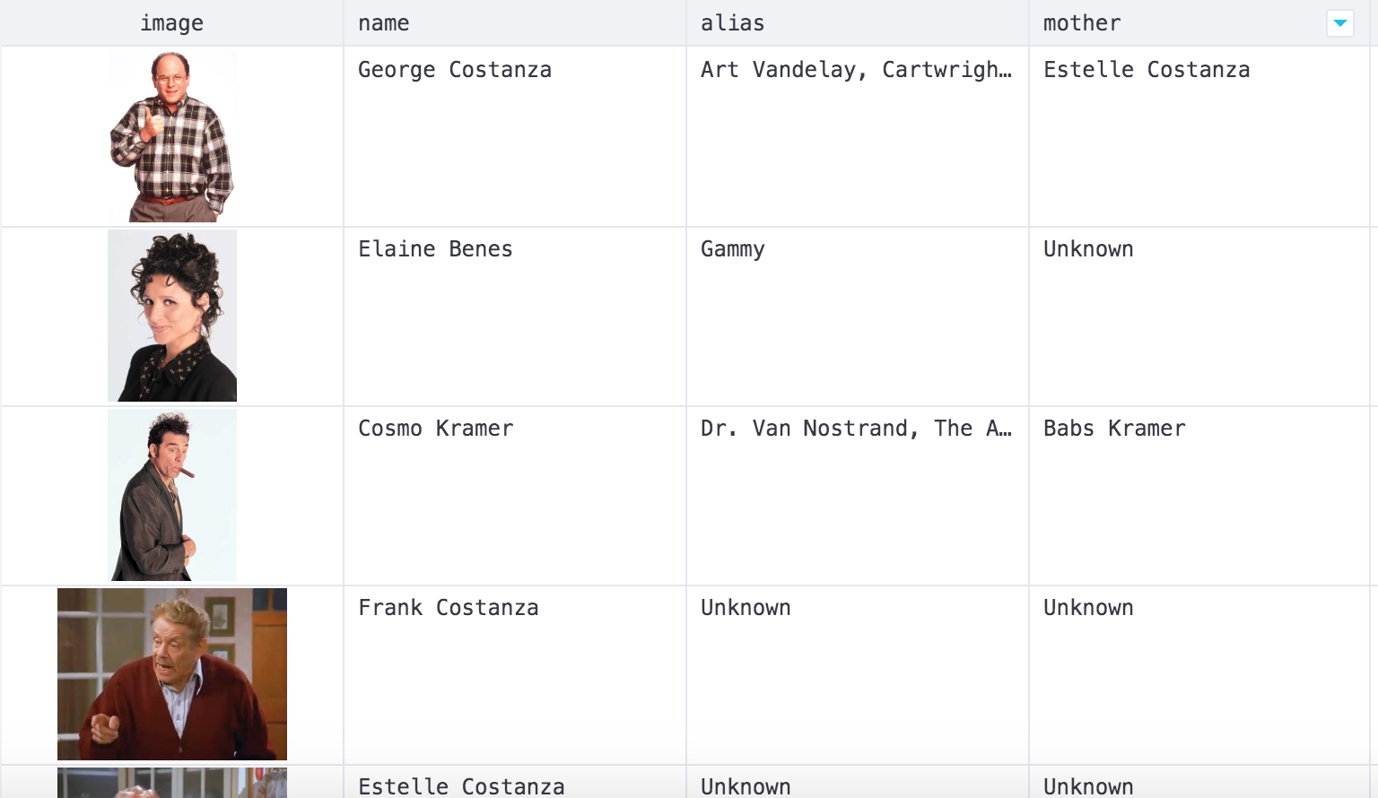
Images in tables
Adding images to your tables
Reports
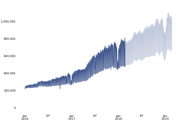
Forecasting in Python with Prophet
A guided walkthrough of how to use the Prophet python library to solve a common forecasting problem.
Forecasting in R with Prophet
A guided walkthrough of how to use the Prophet R library to solve a common forecasting problem.
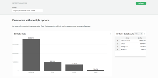
Parameters with multiple options
Allow your audience to easily interact with the data with parameters that allow your users to enter in multiple options in the form of comma-separated values.
Dashboards
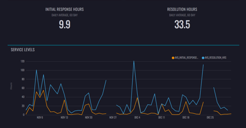
Intercom dashboard
Create a dashboard of your Intercom customer support data in Mode, surfacing insights into daily conversation volumes, service levels, and reassignment rates.
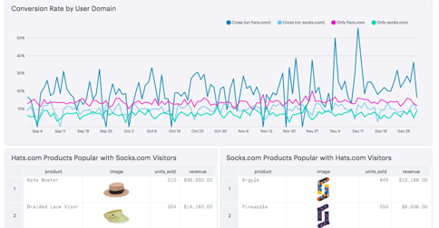
Segment Cross-Domain Dashboard: E-Commerce
E-commerce retailers can track how visitors move across domains to find out which products have the most pull for these audience segments.
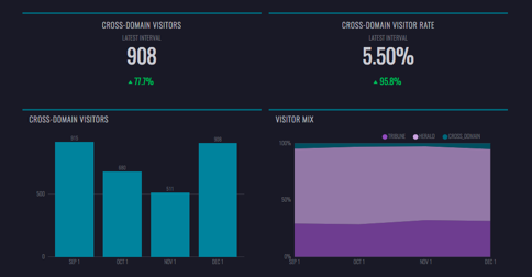
Segment Cross-Domain Dashboard: Publisher
Publishers can track how visitors move across domains and what content is most popular with those audience segments.
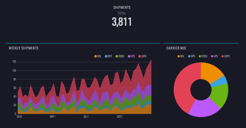
Shippo dashboard
Create a dashboard of your Shippo data in Mode, surfacing insights into shipment volumes, costs, and success rates.