
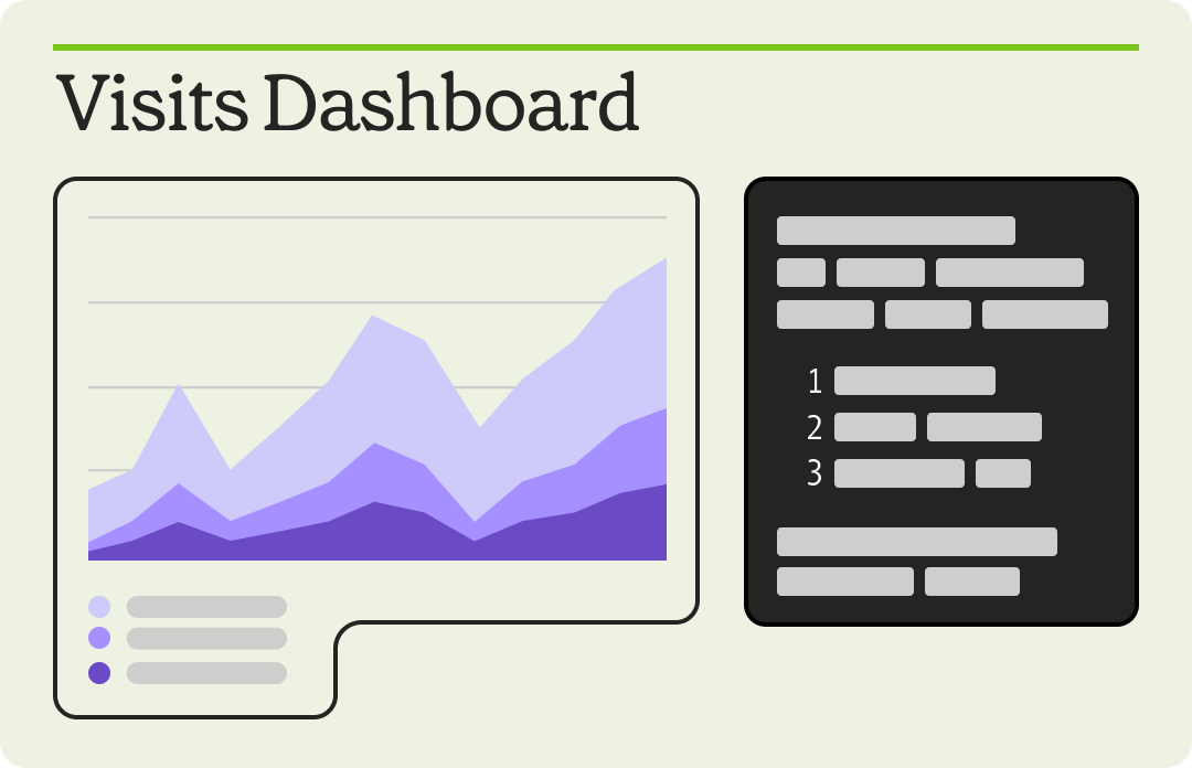
Interactive dashboards
Get the data to the people
Love them or hate them, dashboards are how you get data out of the warehouse and into the business. With Mode, data teams can build powerful reporting in record time – and business teams can use them as jumping off points for self-service.
From big picture to nitty gritty
Code-free, interactive dashboards that anyone can build. That’s what we’re talking about here. With Mode, these curated Datasets let anyone in your organization build the dashboards they need to get to the heart of their questions – and insights.
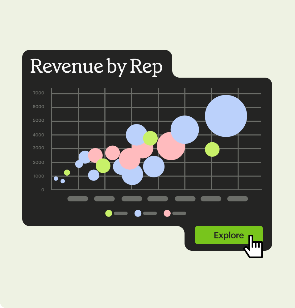
Explore
A chart often answers one question, but then inspires five more. With explore, report viewers can use standard reporting as a starting point to delve into more of the data.
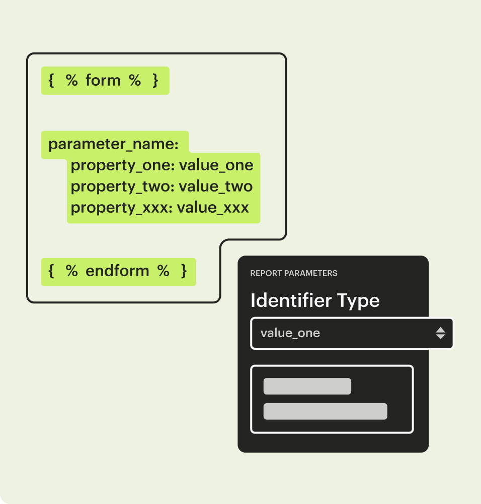
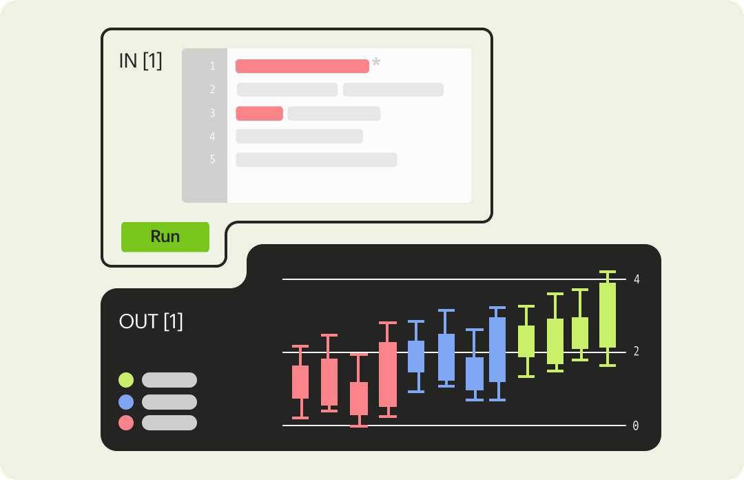
Parameters
We make it simple to create report variants powered by a set of underlying queries. It’s a great way to reduce report sprawl while giving business teams the flexibility they need to safely look up customer info, pull A/B test results, or anything else.
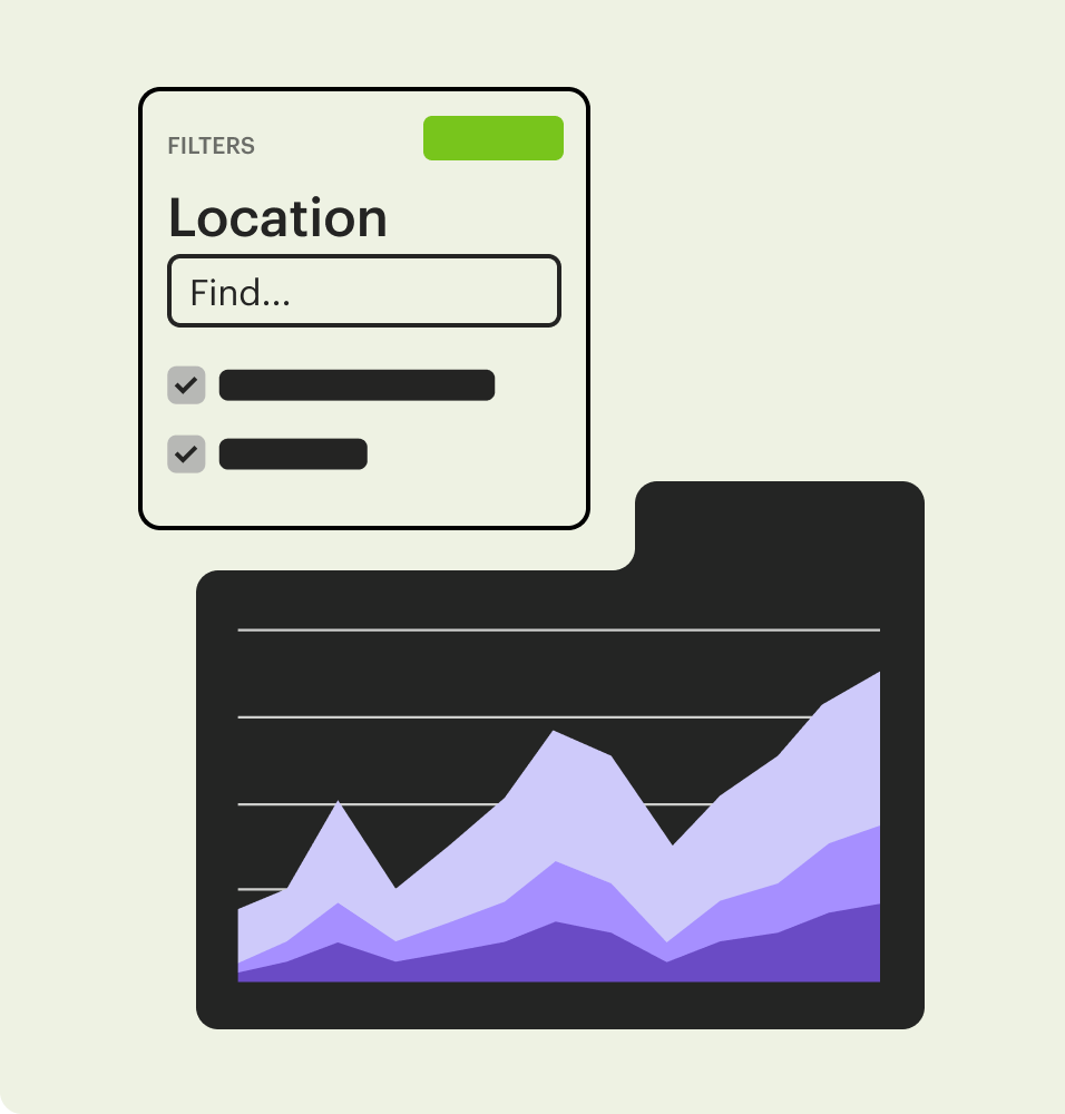
Filters
Filters are your go-to for specifying time periods, marketing channels, event types, and more because they let your report viewers home in on data at the same time your data team is sifting through it – without rerunning underlying queries. That’s a major, and welcome, reduction in data warehouse load.
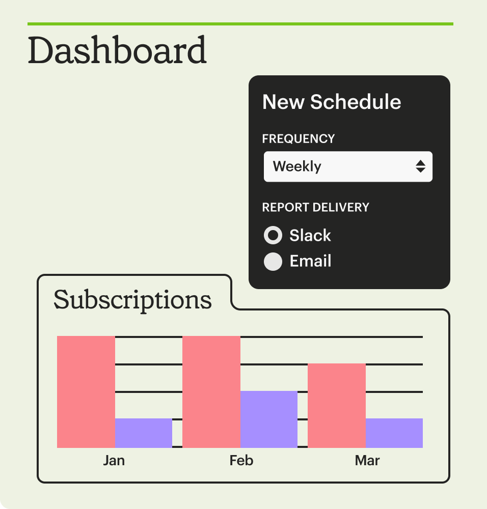
Schedules
We love the smell of fresh data in the morning. To keep your data at its peak too, set up automatic report refreshes with Mode, and the latest data will be ready when your teammates typically view reports, which also means fewer concurrent dashboard runs.
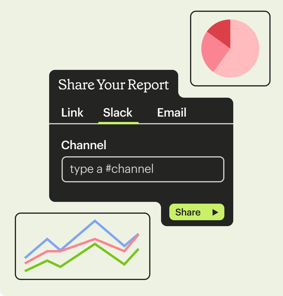
Sharing
What could be better than teams bonding over data? Let Mode help you set automations to share your reports with stakeholders through email or Slack. You can also share a link to your report so that your data is front and center whenever decisions are being made.
Launch Visual Explorer from any dashboard
A chart answers one question and inspires three more. But that's not a problem in Mode. The ability to explore new dimensions is just a click away for any report viewer.
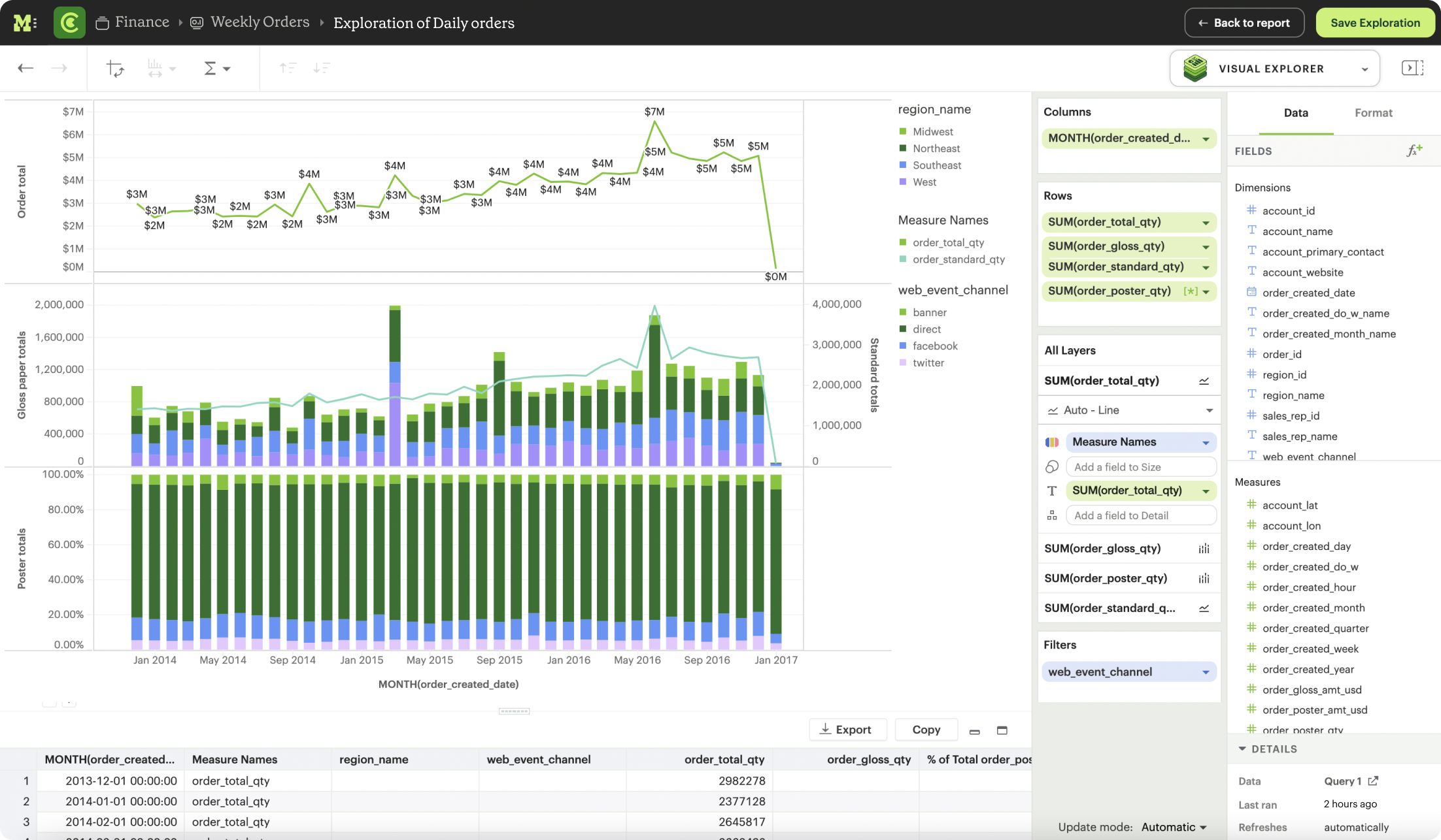
Not just a dashboard, a tool for understanding
Any chart in a Mode dashboard is a launch pad for deeper exploration. Simply click Explore to access all the power of Visual Explorer.


Bring in more dimension and measures
Viewers can investigate trends more deeply in just a few clicks.

Iterate quickly
Quickly cycle through different types of charts with the same dimensions and measures until you literally see what you need.

Multifaceted, multidimensional
Build complex charts reflecting multiple cuts of data on top of your largest datasets to reveal insights quickly.

Simple starting points
Table charts and bar graphs help you get the lay of the land quickly.

Sort it, filter it, display it
Nested and by-field sorting, Top N filters, and more display your data the way it works best for your business.

Choose to aggregate, or don’t
Your measures are aggregated by default, but maintain the flexibility to manually disaggregate for specific data types.
Our Mode dashboard is our North Star—it helps us determine how to focus our efforts.


Building blocks for next-level reporting
Mode's single platform enables data teams to design all kinds of data delivery, going far beyond dashboards. Mix and match text, notebook output cells, and more to build completely custom internal data tools – all in one place.
Write up blocks
More context is never a bad thing. Tell the entire narrative about your data findings by adding writeup blocks so your business partners don't miss any details and understand the whole story.
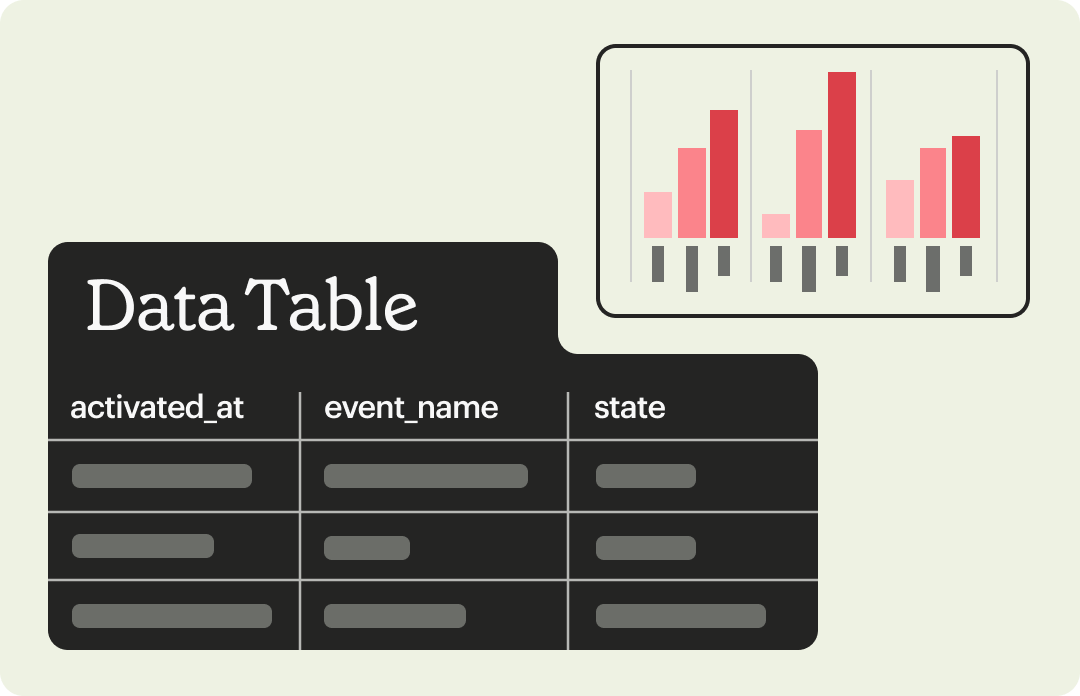
Data tables
Some partners may prefer to look at data in a tabular format. Add data tables to your dashboards and create a jumping off point for your teams to do their own self service exploration.
Notebook Output cells
When you need something drag-and-drop doesn’t offer, switch to the built-in notebook environment. There, you can create boxplots, histograms, streamplots, and more using popular libraries like Seaborn, Matplotlib, and Plotly. Then, embed your notebook charts directly in your reports.

Custom HTML
If you can’t find what you need with our built-in options, no problem. Create exactly what you need by using your own custom JavaScript or HTML.
Modern Business Intelligence
Beyond BI as you know it
Behind every great idea is really great data. Mode is the single platform to unite data teams and business teams around analytical work.
Platform overview


Get more from your data
Your team can be up and running in 30 minutes or less.