Charts
Links in Big Number charts
Sparklines in Big Number charts
Bullet chart
Chart annotations
Chart heights
Choropleth map
Force-directed graph
Funnel chart
Geographic heat map
Google Maps with markers
Heat map
Hive plot
How to implement gallery examples using the HTML editor
Horizontal bar chart
Network matrix
Creating Chart Annotations using Matplotlib
Creating Histograms using Pandas
Creating Horizontal Bar Charts using Pandas
How to Create R Histograms & Stylize Data
Creating Horizontal Bar Charts using R
State choropleth map
Sunburst chart
Word cloud
World choropleth map
Zipcode choropleth map
Creating Horizontal Bar Charts using Pandas
Often when visualizing data using a bar chart, you’ll have to make a decision about the orientation of your bars. While there are no concrete rules, there are quite a few factors that can go into making this decision. For example, when grouping your data by an ordinal variable, you may want to display those groupings along the x-axis. On the other hand, when grouping your data by a nominal variable, or a variable that has long labels, you may want to display those groupings horizontally to aid in readability.
This recipe will show you how to go about creating a horizontal bar chart using Python. Specifically, you’ll be using pandas plot() method, which is simply a wrapper for the matplotlib pyplot API.
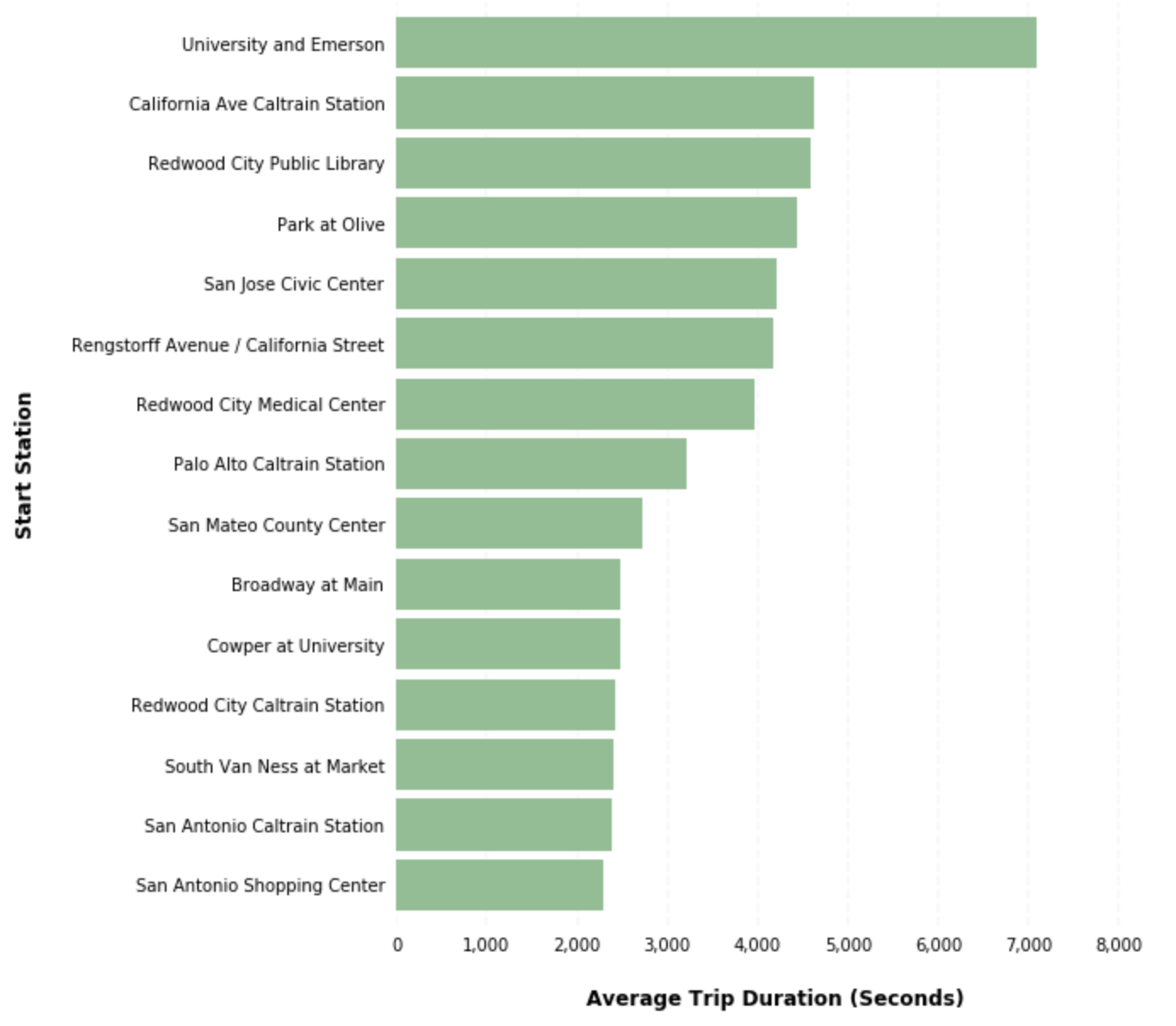
In our example, you'll be using the publicly available San Francisco bike share trip dataset to identify the top 15 bike stations with the highest average trip durations. You will then visualize these average trip durations using a horizontal bar chart. The steps in this recipe are divided into the following sections:
You can find implementations of all of the steps outlined below in this example Mode report. Let’s get started.
Data Wrangling
You’ll use SQL to wrangle the data you’ll need for our analysis. For this example, you’ll be using the sf_bike_share_trips dataset available in Mode's Public Data Warehouse. Using the schema browser within the editor, make sure your data source is set to the Mode Public Warehouse data source and run the following query to wrangle your data:
select *
from modeanalytics.sf_bike_share_trips
Once the SQL query has completed running, rename your SQL query to SF Bike Share Trip Rankings so that you can easily identify it within the Python notebook:
Data Analysis
Now that you have your data wrangled, you’re ready to move over to the Python notebook to prepare your data for visualization. Inside of the Python notebook, start by importing the Python modules that you'll be using throughout the remainder of this recipe:
import pandas as pd
import numpy as np
import matplotlib.pyplot as plt
from matplotlib.ticker import StrMethodFormatter
Mode automatically pipes the results of your SQL queries into a pandas dataframe assigned to the variable datasets. You can use the following line of Python to access the results of your SQL query as a dataframe and assign them to a new variable:
df = datasets['SF Bike Share Trip Data']
As previously mentioned, your goal is to visualize the 15 start stations with the highest average trip duration. You can analyze the dataframe to find these stations using the following method chain on our existing dataframe object:
x = df.groupby('start_station_name')['duration'].mean().sort_values().tail(15)
We now have a new dataframe assigned to the variable x that contains the top 15 start stations with the highest average trip durations. Now that we have our dataset aggregated, we are ready to visualize the data.
Data Visualization
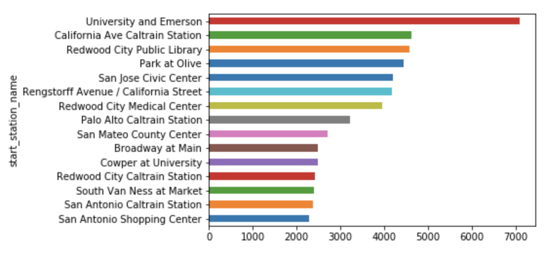
To create a horizontal bar chart, we will use pandas plot() method. We can specify that we would like a horizontal bar chart by passing barh to the kind argument:
x.plot(kind=‘barh’)
Pandas returns the following horizontal bar chart using the default settings:
You can use a bit of matplotlib styling functionality to further customize and clean up the appearance of your visualization:
ax = x.plot(kind='barh', figsize=(8, 10), color='#86bf91', zorder=2, width=0.85)

  # Despine
  ax.spines['right'].set_visible(False)
  ax.spines['top'].set_visible(False)
  ax.spines['left'].set_visible(False)
  ax.spines['bottom'].set_visible(False)

  # Switch off ticks
  ax.tick_params(axis="both", which="both", bottom="off", top="off", labelbottom="on", left="off", right="off", labelleft="on")

  # Draw vertical axis lines
  vals = ax.get_xticks()
  for tick in vals:
      ax.axvline(x=tick, linestyle='dashed', alpha=0.4, color='#eeeeee', zorder=1)

  # Set x-axis label
  ax.set_xlabel("Average Trip Duration (Seconds)", labelpad=20, weight='bold', size=12)

  # Set y-axis label
  ax.set_ylabel("Start Station", labelpad=20, weight='bold', size=12)

  # Format y-axis label
  ax.xaxis.set_major_formatter(StrMethodFormatter('{x:,g}'))
Running this block of code returns the following visualization: