Dataframe Styling using Pandas
One of the most common ways of visualizing a dataset is by using a table. Tables allow your data consumers to gather insight by reading the underlying data. However, there are often instances where leveraging the visual system is much more efficient in communicating insight from the data. Knowing this, you may often find yourself in scenarios where you want to provide your consumers access to the underlying data by means of a table, while still providing visual representations of the data so that they can quickly and effectively gather the insight they need.
In this recipe, you'll learn how to make presentation-ready tables by customizing a pandas dataframes using pandas native styling functionality. This styling functionality allows you to add conditional formatting, bar charts, supplementary information to your dataframes, and more.
In our example, you're going to be customizing the visualization of a pandas dataframe containing the transactional data for a fictitious ecommerce store. The steps in this recipe are divided into the following sections:
You can find implementations of all of the steps outlined below in this example Mode report. Let’s get started.
Data Wrangling
You’ll use SQL to wrangle the data you’ll need for our analysis. For this example, you’ll be using the orders dataset available in Mode's Public Data Warehouse. Using the schema browser within the editor, make sure your data source is set to the Mode Public Warehouse data source and run the following query to wrangle your data:
select
  id as order_id,
  account_id,
  occurred_at,
  total_amt_usd
from demo.orders
where total_amt_usd is not null
Once the SQL query has completed running, rename your SQL query to Orders so that you can easily identify it within the Python notebook.
Data Preparation
Now that you have your data wrangled, you’re ready to move over to the Python notebook to prepare your data for visualization. Inside of the Python notebook, start by importing the Python modules that you'll be using throughout the remainder of this recipe:
import numpy as np
import pandas as pd
import matplotlib.pyplot as plt
import seaborn as sns
from IPython.display import HTML
Mode automatically pipes the results of your SQL queries into a pandas dataframe assigned to the variable datasets. You can use the following line of Python to access the results of your SQL query as a dataframe and assign them to a new variable:
df = datasets['Orders']
For the purposes of this example, let's say you want to add two additional columns to your dataframe before visualizing:
- The raw difference in order total between an accounts order and previous order
- The percent difference in order total between an accounts order and previous order
You can add these columns to your existing dataframe using the following snippet:
# Sort the dataframe by occurred_at
df = df.sort_values(by="occurred_at")

# Calculate the raw difference between current order amount and previous order amount for account
df["total_amt_usd_diff"] = df.groupby("account_id").total_amt_usd.diff(1)

# Calculate the percent difference between current order amount and previous order amount for account
df["total_amt_usd_pct_diff"] = df.groupby("account_id").total_amt_usd.pct_change(1)
At this point, you will have two new columns (total_amt_usd_diff and total_amt_usd_pct_diff) in your dataframe. Your dataframe should look like this when visualized:

While this additional information is valuable, there is still much you can do to aid in readability for your data consumers. In the next section, you'll learn how to apply custom formatting to your dataframe to do just this.
Dataframe Styling
You want your end users to be able to quickly identify positive and negative values in the columns you added in the previous section. To help with this, you can apply conditional formatting to the dataframe using the dataframe's style property. As an example, you can build a function that colors values in a dataframe column green or red depending on their sign:
def color_negative_red(value):
  """
  Colors elements in a dateframe
  green if positive and red if
  negative. Does not color NaN
  values.
  """

  if value < 0:
    color = 'red'
  elif value > 0:
    color = 'green'
  else:
    color = 'black'

  return 'color: %s' % color
You can then apply this function to your dataframe using the Styler object's applymap() method:
df.style.applymap(color_negative_red, subset=['total_amt_usd_diff','total_amt_usd_pct_diff'])
Which returns the following stylized dataframe:

You also have the ability to apply value display formatting to the dataframe. For example, you may want to display percentage values in a more readable way. You can use the Styler object's format() method to achieve this and chain it to your existing formatting chain:
(df.style
    .applymap(color_negative_red, subset=['total_amt_usd_diff','total_amt_usd_pct_diff'])
    .format({'total_amt_usd_pct_diff': "{:.2%}"}))

You can also apply arbitrary CSS to the dataframe elements using the Styler object's set_table_styles() method:
# Set CSS properties for th elements in dataframe
th_props = [
  ('font-size', '11px'),
  ('text-align', 'center'),
  ('font-weight', 'bold'),
  ('color', '#6d6d6d'),
  ('background-color', '#f7f7f9')
  ]

# Set CSS properties for td elements in dataframe
td_props = [
  ('font-size', '11px')
  ]

# Set table styles
styles = [
  dict(selector="th", props=th_props),
  dict(selector="td", props=td_props)
  ]


(df.style
    .applymap(color_negative_red, subset=['total_amt_usd_diff','total_amt_usd_pct_diff'])
    .format({'total_amt_usd_pct_diff': "{:.2%}"})
    .set_table_styles(styles))

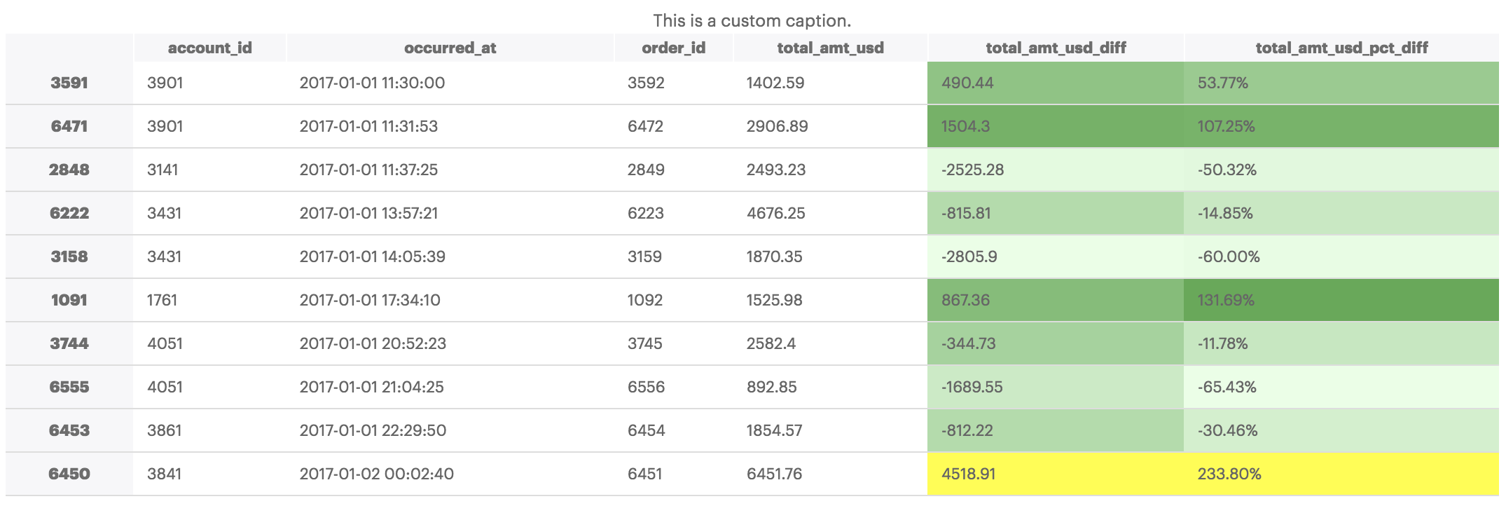
The examples above are only a small portion of what's possible using pandas dataframe styling functionality. Other possibilities include apply custom background color gradients and custom captions, amongst other things:
# Set colormap equal to seaborns light green color palette
cm = sns.light_palette("green", as_cmap=True)

(df.style
  .background_gradient(cmap=cm, subset=['total_amt_usd_diff','total_amt_usd_pct_diff'])
  .highlight_max(subset=['total_amt_usd_diff','total_amt_usd_pct_diff'])
  .set_caption('This is a custom caption.')
  .format({'total_amt_usd_pct_diff': "{:.2%}"})
  .set_table_styles(styles))

You can dicover more dataframe styling possibilities by reading the pandas Styling documentation here.