How Business Teams Can Take Advantage of Mode

Chioma Dunkley, Mode Team Writer
May 27, 2022
NaN minute read

Data analysis is never a one-person job. In reality, great analysis is a conversation between stakeholders and analysts. And often it’s an ongoing conversation; the stakeholder has a request from an analyst, the analyst provides a first round of analysis, the stakeholder has more questions, and so on. It’s an interactive process that requires active collaboration.
Here at Mode, we believe stakeholders are just as important and needed in the data process as the analyst. They have the domain expertise—the context—that analysts need to investigate a question. Most importantly, they are the ones making the decisions based on that data. Our goal is that those who are not on the data team can use Mode comfortably and get the answers they need daily without waiting for the data team. With the right context and ability to explore vetted data, stakeholders can leverage Mode just as much as the data team.
How non-analysts and stakeholders can get more out of Mode
Beginning with Visual Explorer, we’re going to walk you through ways everyone else outside of the data team can use Mode to explore reports that data analysts have created. Consider this a "mini" guide that’s stacked with links to useful resources for you to continue your education on how to get the most out of Mode.
Use Visual Explorer to see richer context with an array of visualizations
For stakeholders, Visual Explorer offers the opportunity to understand broader pictures of what's happening with an array of visualization options. It is an entire visualization system that opens up endless possibilities for flexibly exploring and visualizing data.
Visual Explorer makes it easy to create both familiar and much more complex visualizations, including pivot tables, faceting/small multiples, combo charts, grouped bars, dual axes with multiple measures, funnel charts, and more.

“This past quarter, I found Visual Explorer very helpful. It helped me really discover some insights into different customer segmentations and come up with an ideal customer profile (ICP) personas for our SMB segment.”
Chart guides for Visual Explorer
Want to create these charts yourself? Check out our Visual Explorer Field Guides.
.
Use Explorations to save data views that are important to you
In most software products you may see a dashboard of static health metrics, but have no way of adjusting those charts further. For example, you may be able to count monthly active users but cannot cohort these active users by the number of times they visited your help site. Data views in most software tools are limited by pre-set parameters. In Mode, you can explore data without being limited by parameters (or being limited by them by choice) and dig deeper in a chart to get more answers about what’s going on.
Explorations allows you to drill down into visualizations on existing reports without affecting them. We built this so that you can personalize and save slices of data that are most important or relevant to you.
Use case: Get a closer look at sales performance by region by clicking the "Explore" button at the top right-hand corner. Explorations will automatically update whenever the original report is updated.
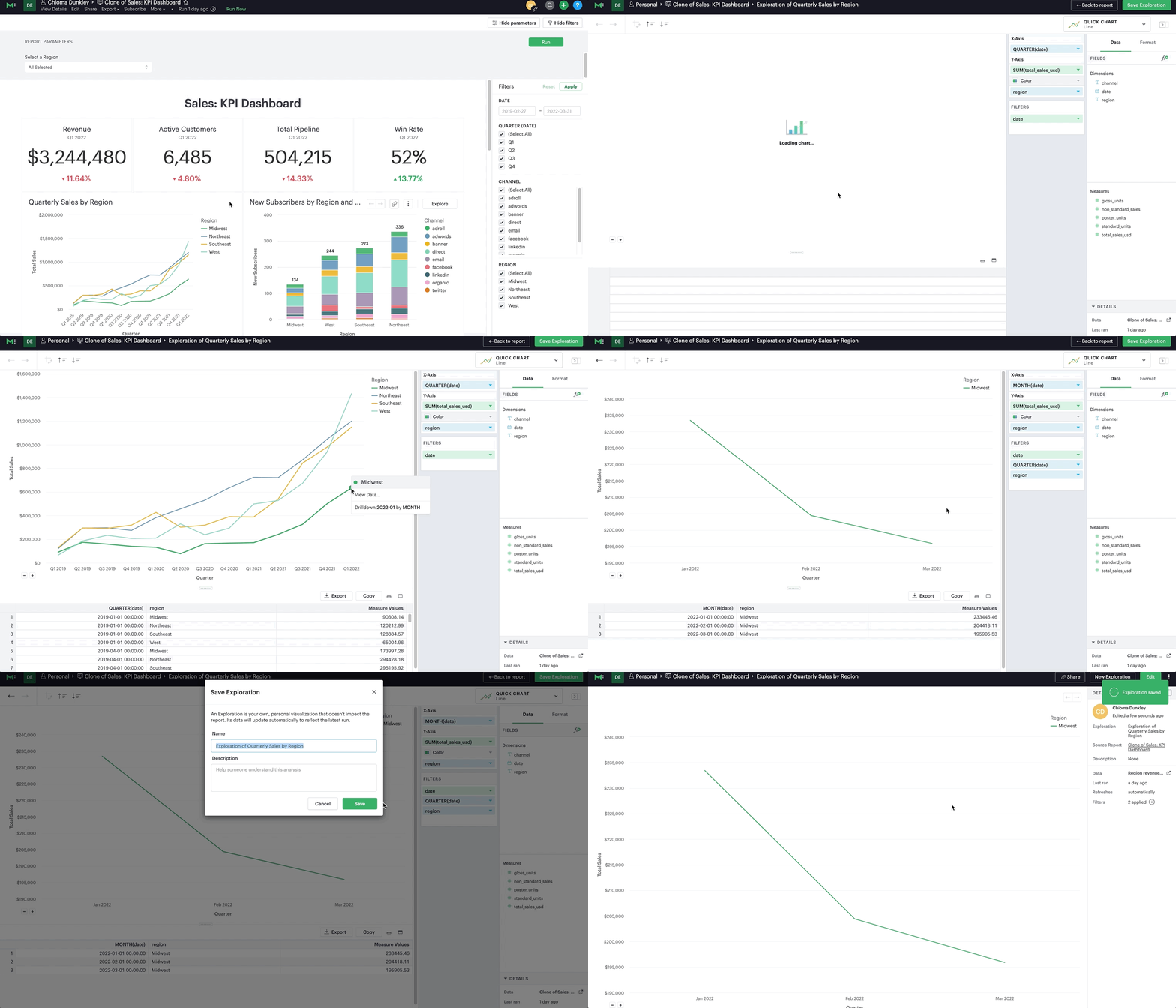
“I use Explorations to understand which channels (organic, paid social, paid display, paid search, direct) are funneling MQLs to our whitepapers.”
Use Filters to quickly see the values you care about in a Report
Filters are a great way to see a specific segment of your data without the hassle of re-running a query or contacting a data analyst. They are a powerful and easy way to see different cuts of your data.
There are two types of filters in Mode: report-level and visualization-level filters. We’ll focus on the first and most common one you’ll see and want to interact with as a stakeholder – report-level filters.
Use case: See just organic traffic in your chart.
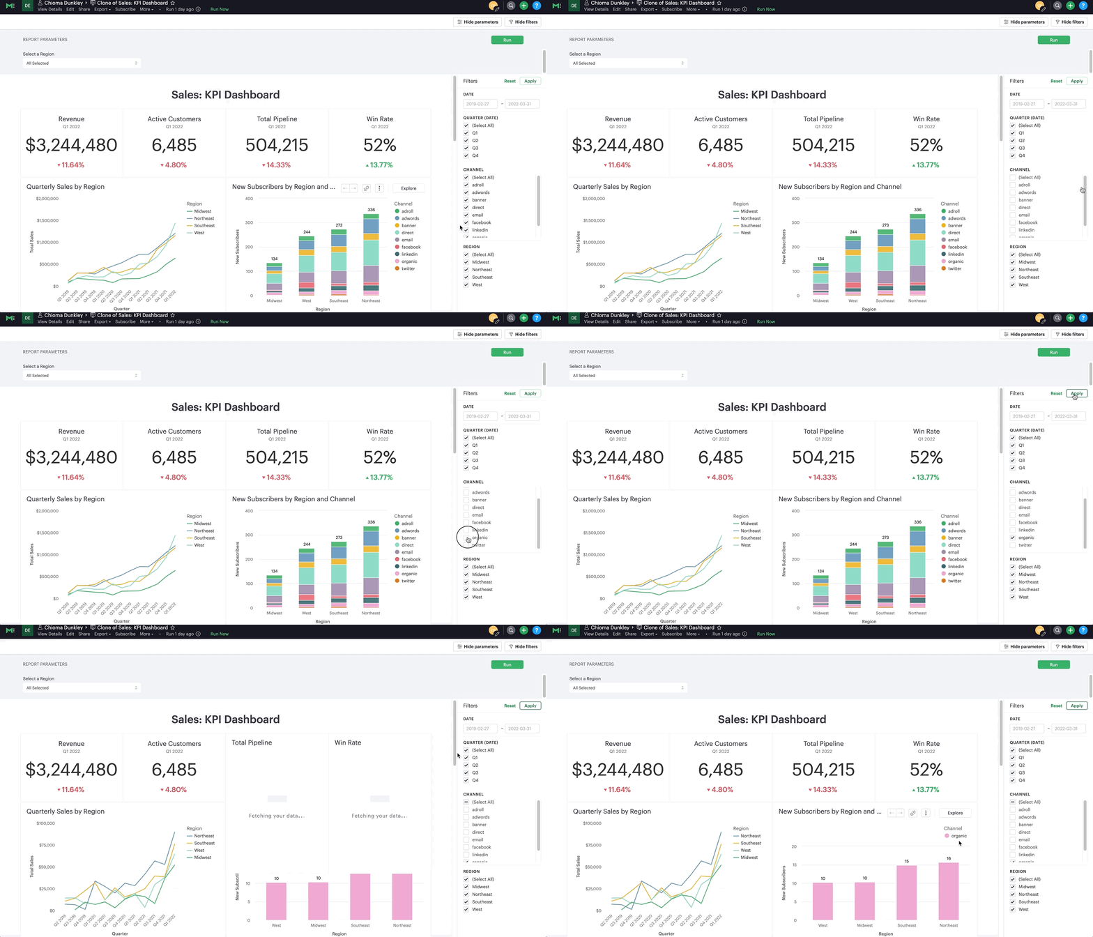
“I use filters when I’m investigating sales opportunities.”
Use Calculated Fields to zoom in
Calculated Fields are fields that allow you to create new data from an existing SQL query by applying additional logic. With Calculated Fields, you can easily generate new fields and drag and drop them right into your charts and reports. Simply put, Calculated Fields are basic equations that allow you to create a new metric for an existing report, similar to something you might do or see in Excel.
Use case: Look at a simpler view of Net Promoter Score (NPS) by creating a Calculated Field that shows the percentage of users that are Detractors (scored the product 0-6), passive (scored the product 7-8), and promoters (scored the product 9-10).
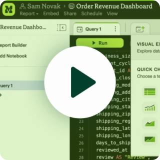
Watch the video below to see Calculated Fields being used in this use case.
“As a product manager, I found calculated fields helpful in creating calculations to help me understand user behavior. I was able to take two columns of data to create a ratio to understand the percentage of users who shared reports.”
We're here to help!
Explorations, Calculated Fields, Filters, and Visual Explorer are just some of the features that can help non-analysts explore data in Mode without the help of the data team. If you have more specific questions, contact us.
For async resources, see our Help page, or use Mode University if you’re already a Mode customer.
A Guide to Self-Serve Analytics
Self-service analytics is necessary—here's what makes the practice successful.
Get our weekly data newsletter
Work-related distractions for data enthusiasts.
