Visual Explorer Guides
Dual Axes
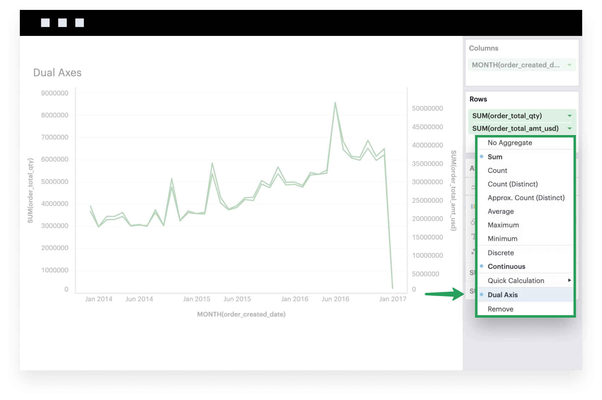
This example will walk you through how to create a chart with two measures that are set on a dual axis.
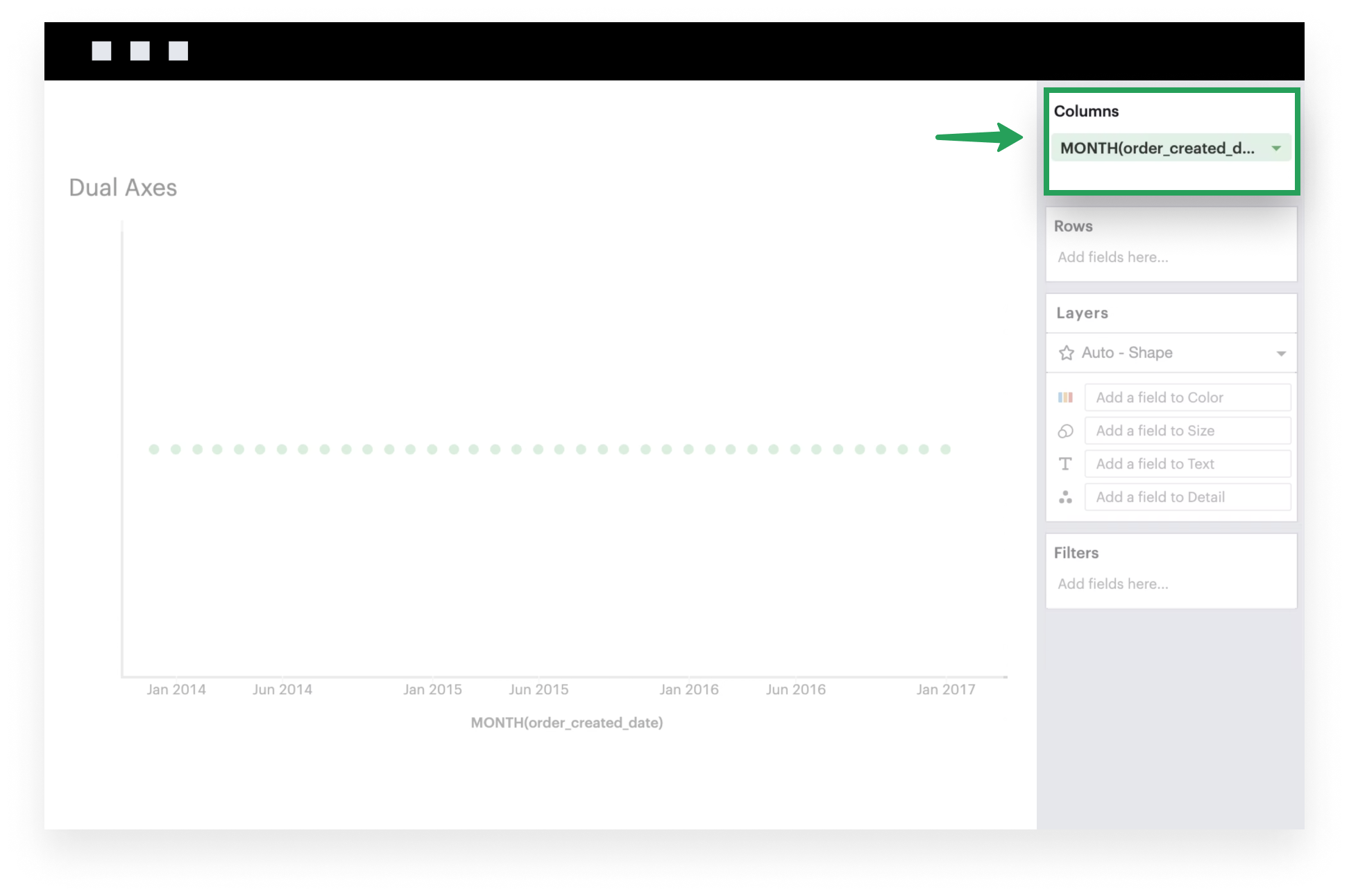
- Add a field to Columns. This is generally what you want to see on your x-axis. The example below uses a time series.
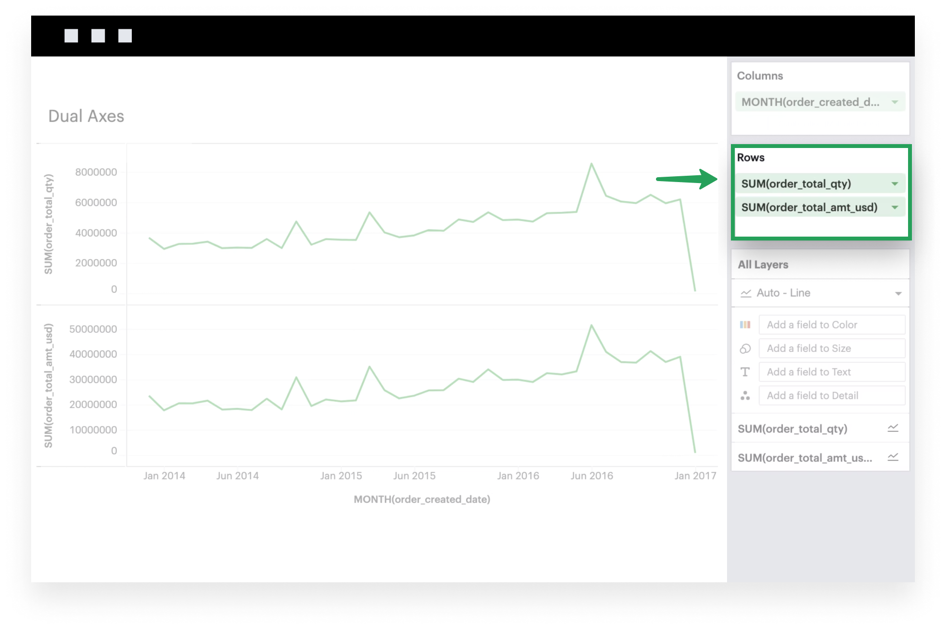
- Add two measures to Rows. These are the fields that you want to plot on your y-axis. Each measure corresponds to a Layer in your visualization. The example below examines the total quantity of orders received and the total dollar amount of those orders.
- Now, you can set these two measures on a dual axis. To do so, click on the caret to open the settings of the second measure you’d like to include in your dual axis. In the context menu, you should see an option to join this field and the field above on a dual axis. If it’s the outermost field and there’s no field above it, then you will not see the dual axis option.
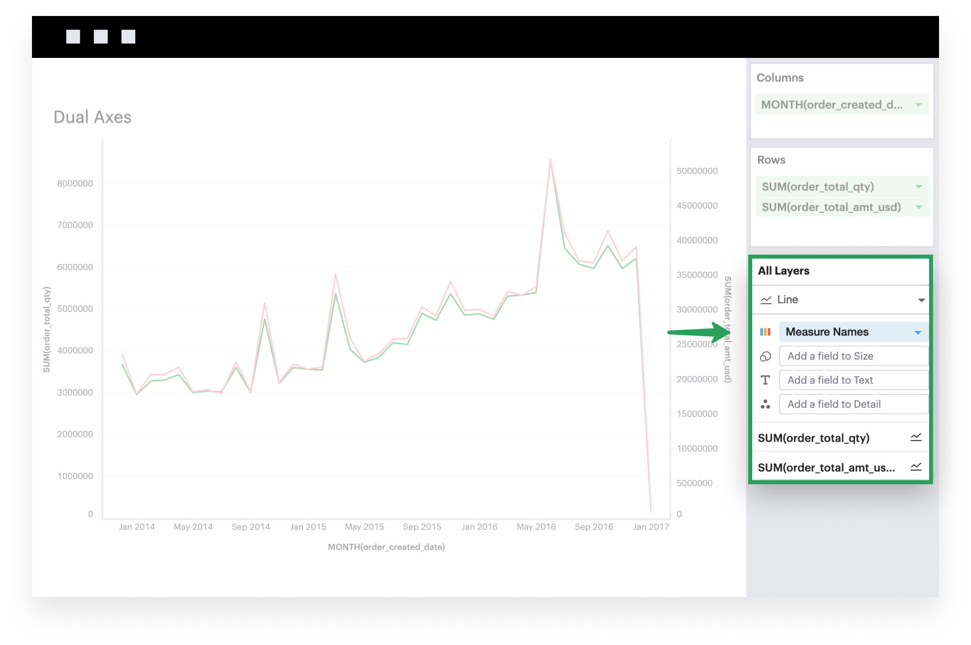
- Optionally, you can color each Layer distinctly by either adding Measure Names to All Layers’ Color channel or individually configuring the Color channel of each Layer.