Visual Explorer Guides
Grouped Bars
One Measure
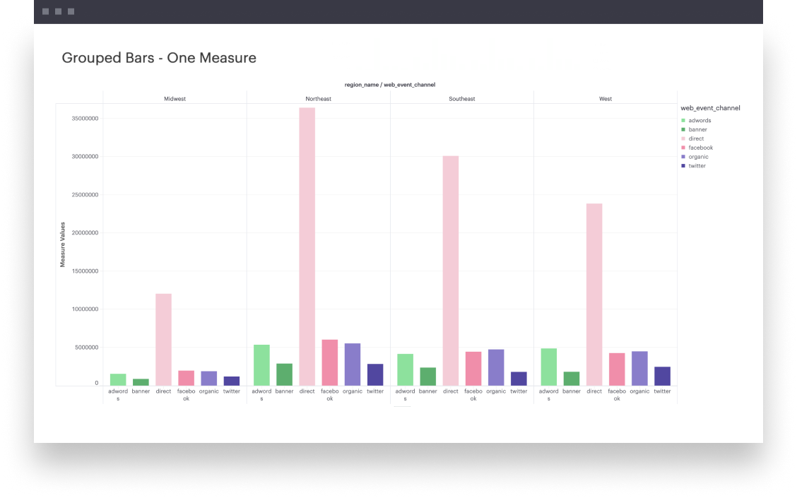
This example will walk you through how to create a simple grouped bar chart with one continuous field that’s broken into groups based on some dimension.
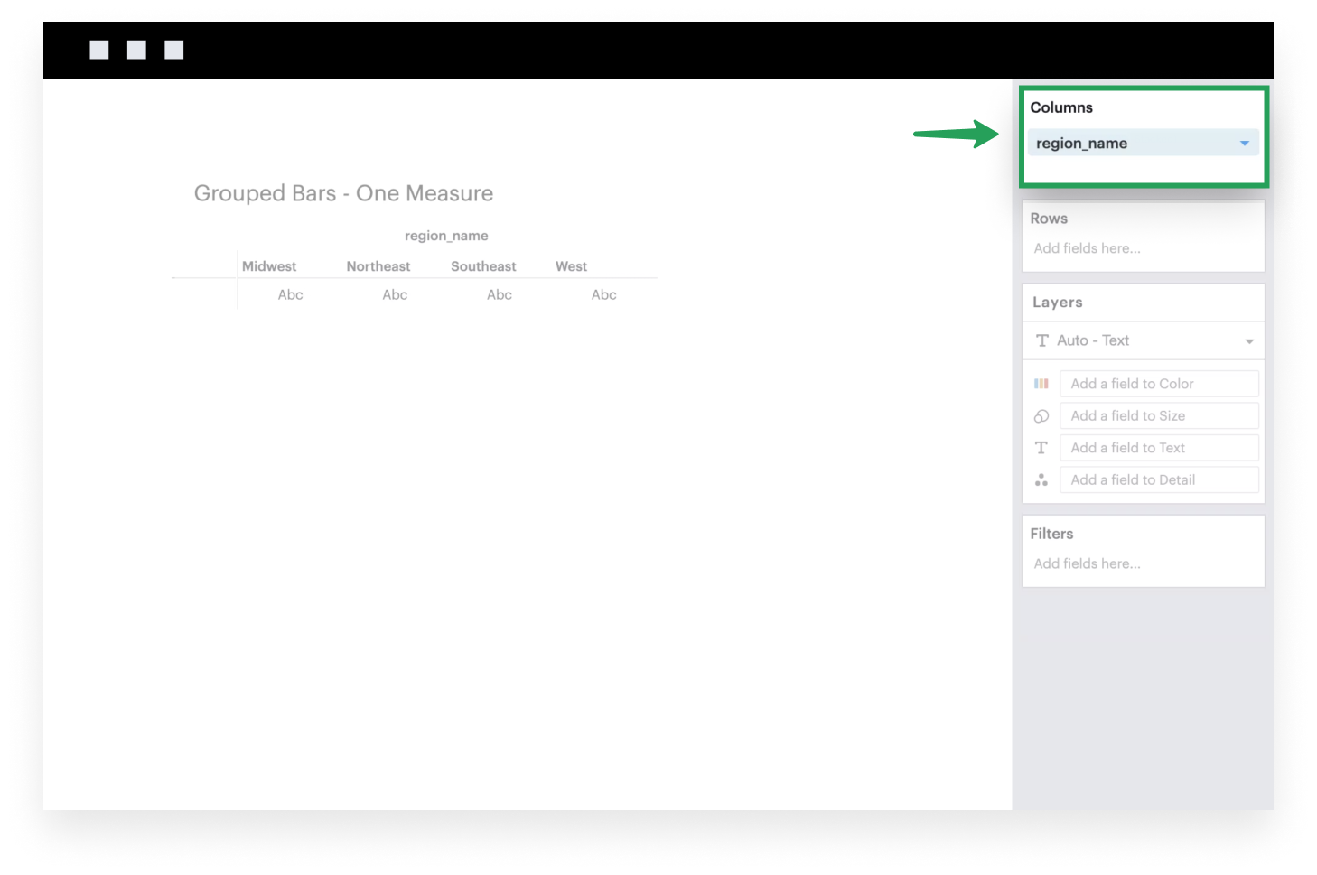
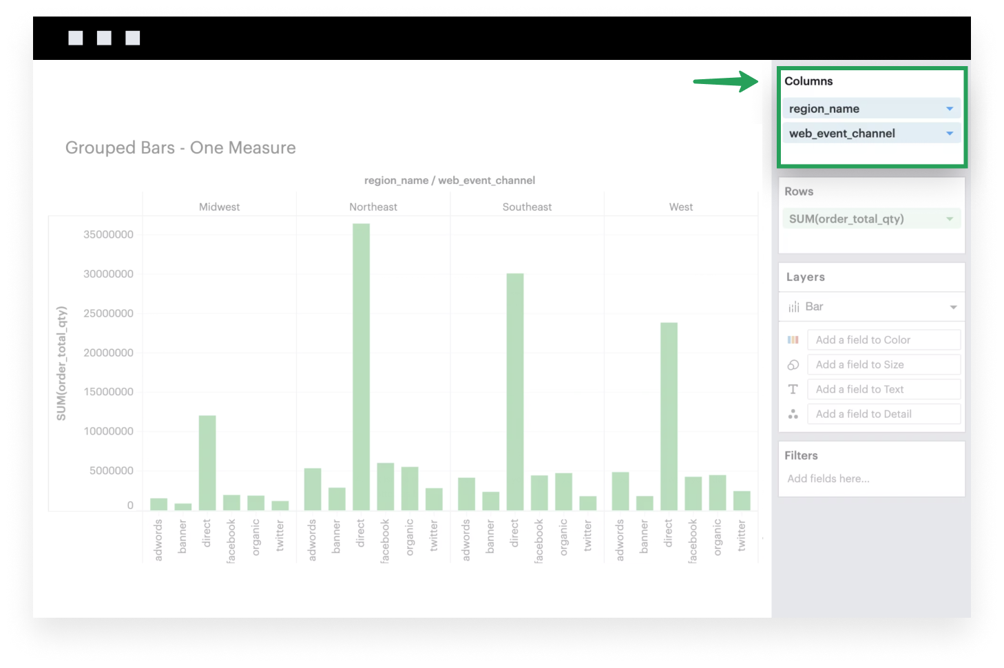
- Add a dimension to Columns. This discrete field will be plotted along the x-axis of your visualization, with groups formed based on the unique values within this dimension.
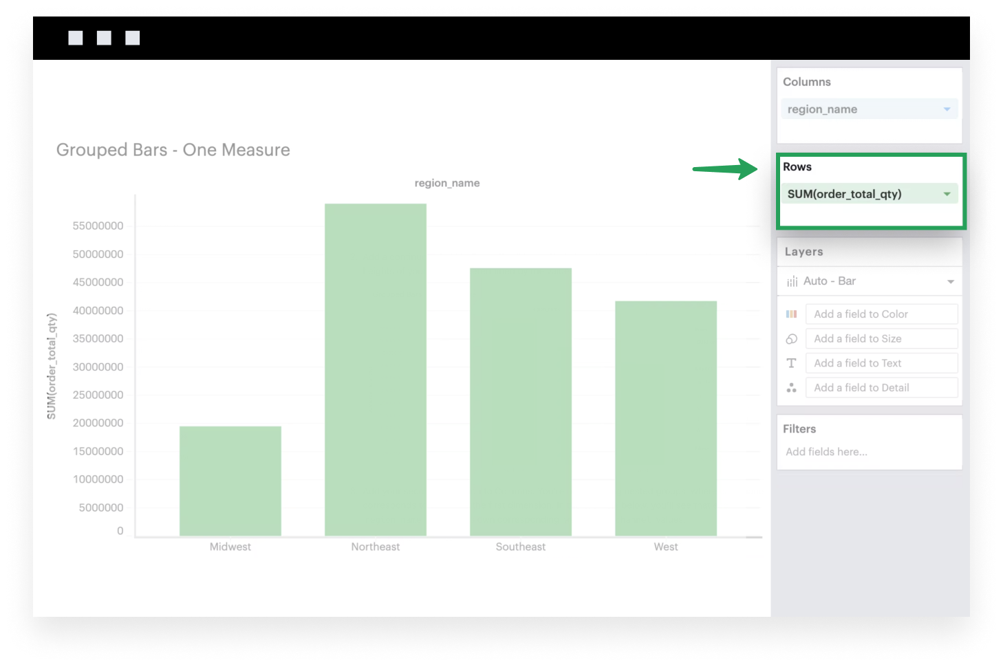
- Add a continuous field to Rows. It will be plotted along the y-axis of your visualization, where the heights of your bars are determined by the values of that field within each x-axis group.
- Add your second dimension to Columns. You’re now creating nested groups, where each pane corresponds to a value in the first dimension. In the example below, you’ll see that each
region_namecontains its own correspondingweb_event_channelvalues.
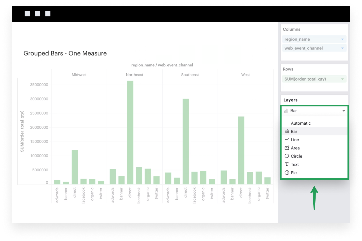
- If it isn’t already, make sure to set your Mark Type to
Barbecause you want your data to be plotted as bars.
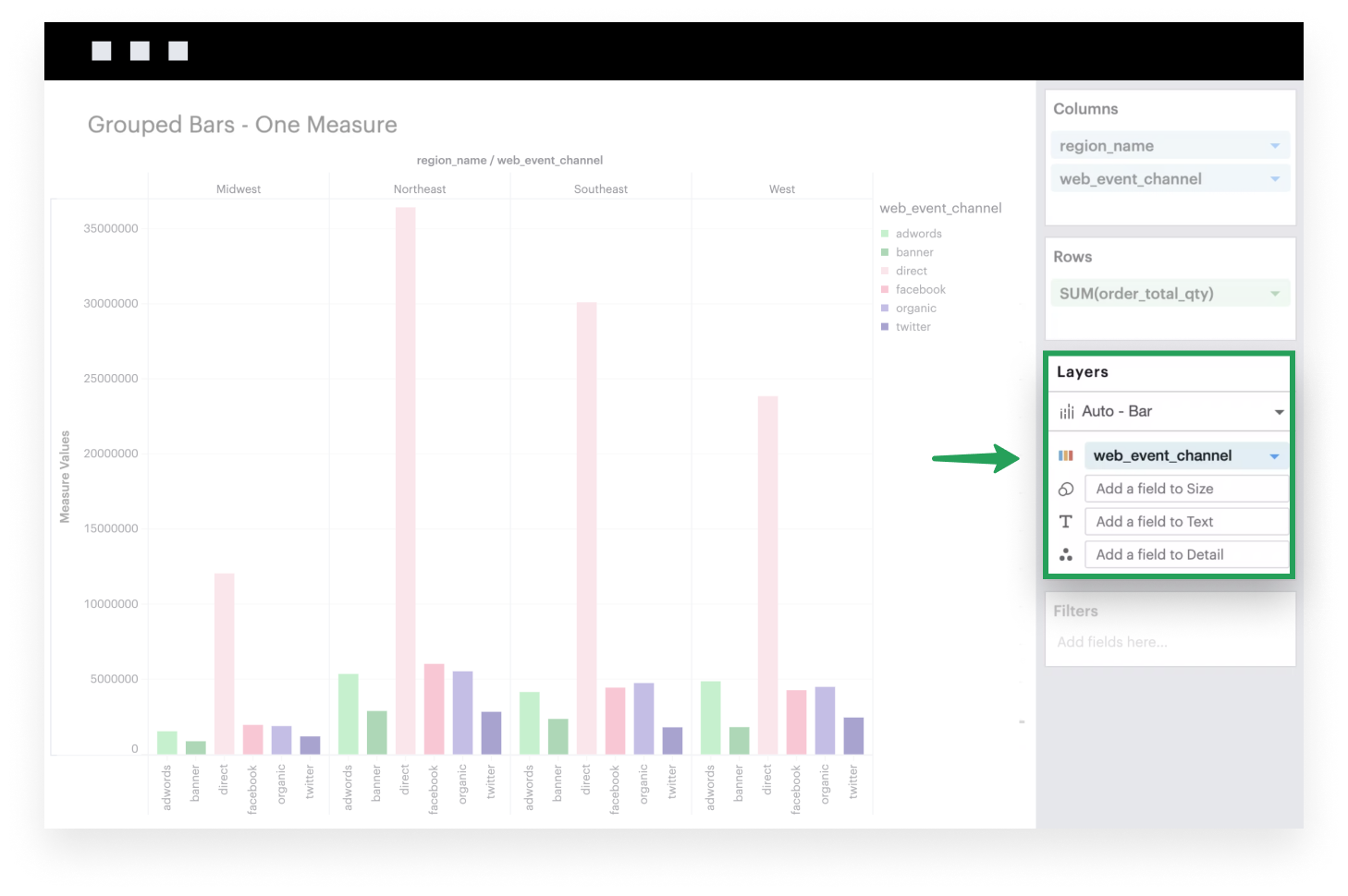
- Optionally, you can add the second dimension to your Color channel to help color code each bar value.
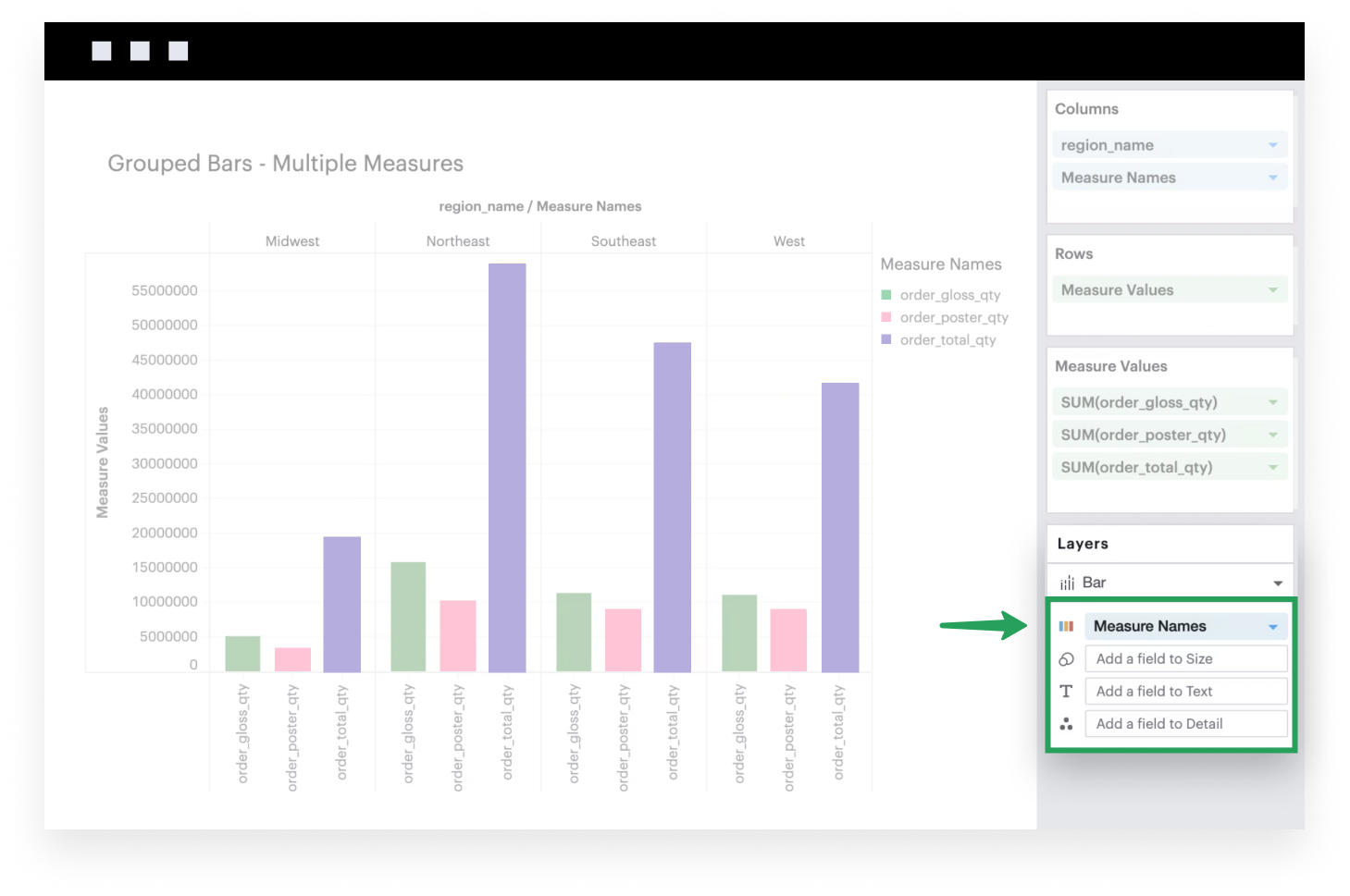
Multiple measure
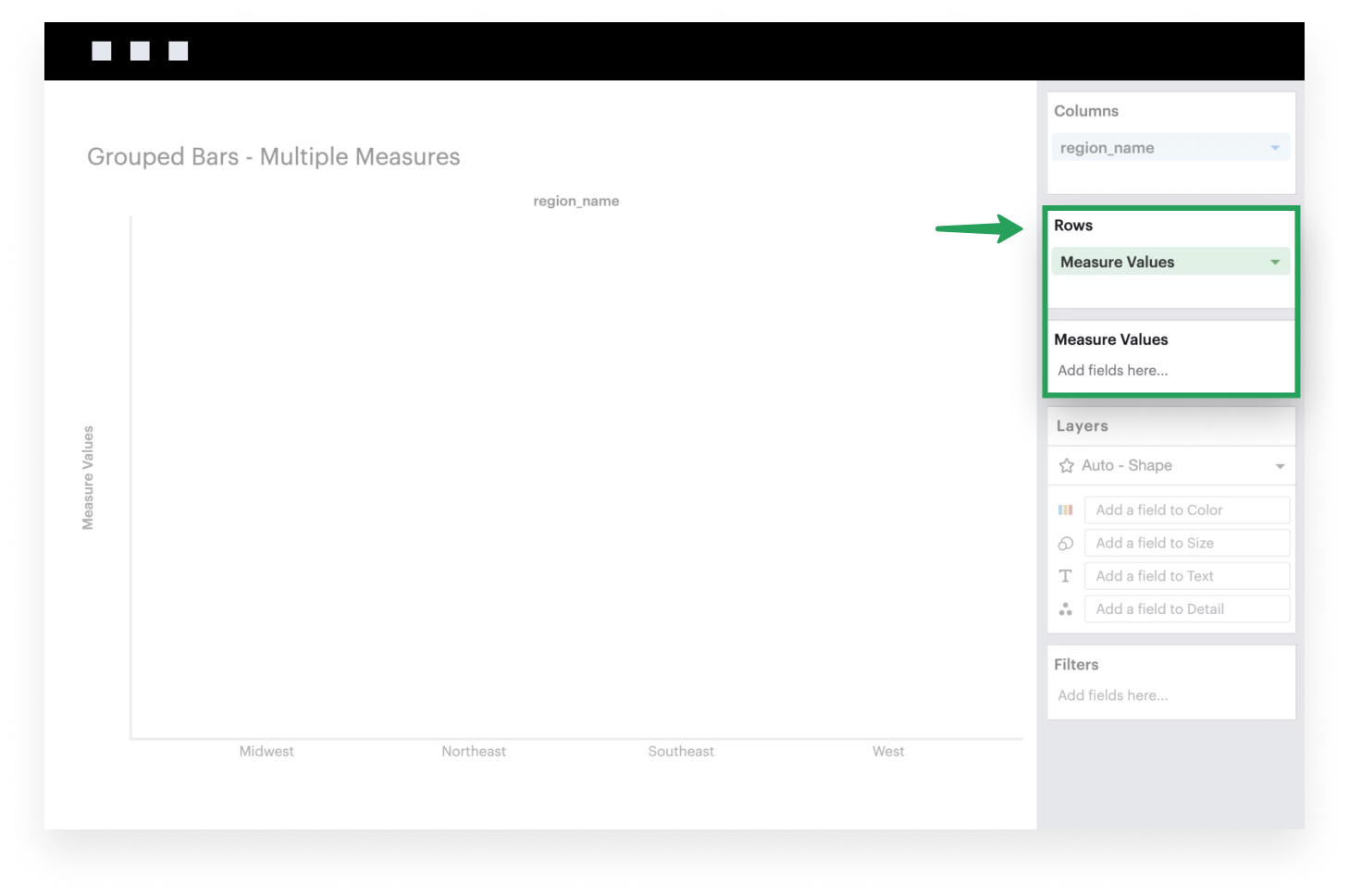
This example will walk you through how to create a simple grouped bar chart when you have multiple continuous fields.
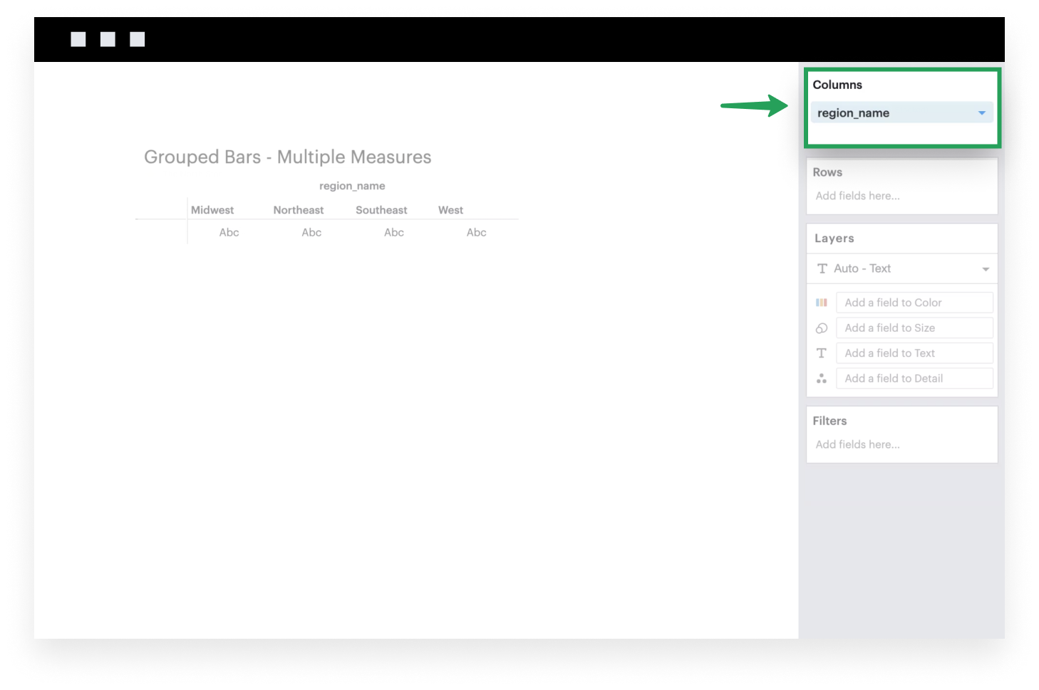
- Add a dimension to Columns. This discrete field will be plotted along the x-axis of your visualization, with groups based on the unique values within this dimension.
- Add the system-generated Measure Values to Rows. After you do this, you’ll see that the Measure Values shelf appears.
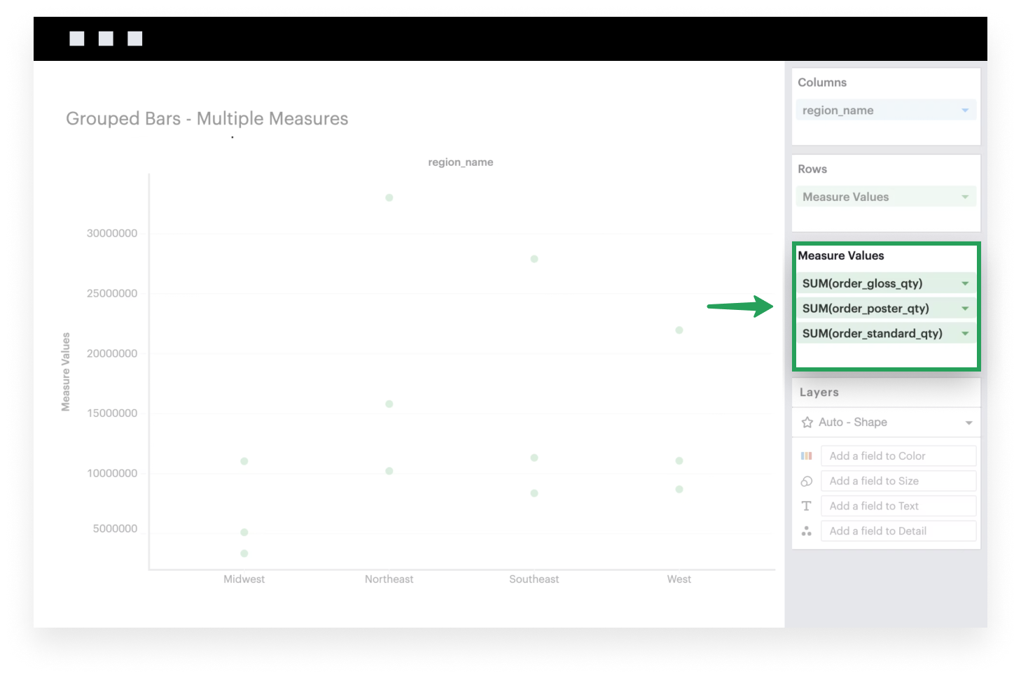
- Add continuous fields to the Measure Values shelf to plot them on your visualization. These fields will be plotted along the y-axis of your visualization, where the heights of your bars are determined by the values of your within each x-axis group. You can think of the Measure Values field as a placeholder or variable that references the list of measures you add to the Measure Values shelf.
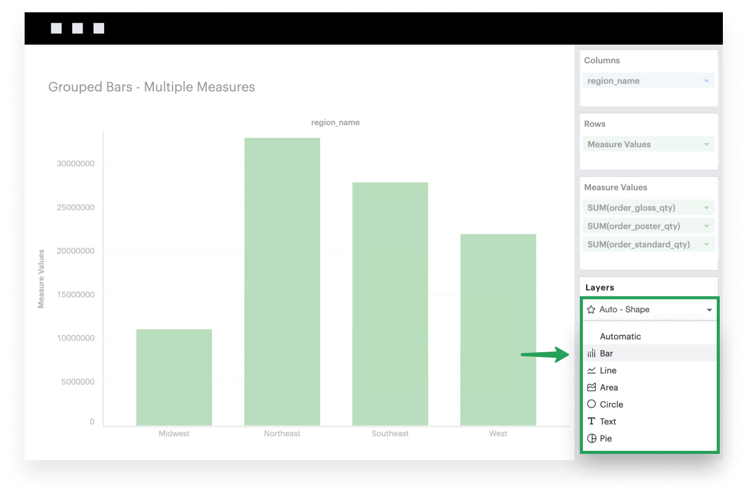
- If it isn’t already, make sure to set your Mark Type to
Barbecause you want your data to be plotted as bars.
- Add Measure Names to Columns. Doing so is extremely important as it will ensure that each field in your Measure Values shelf is represented as separate bar marks in each column; without this specification, Visual Explorer will plot each measure on top of the other.
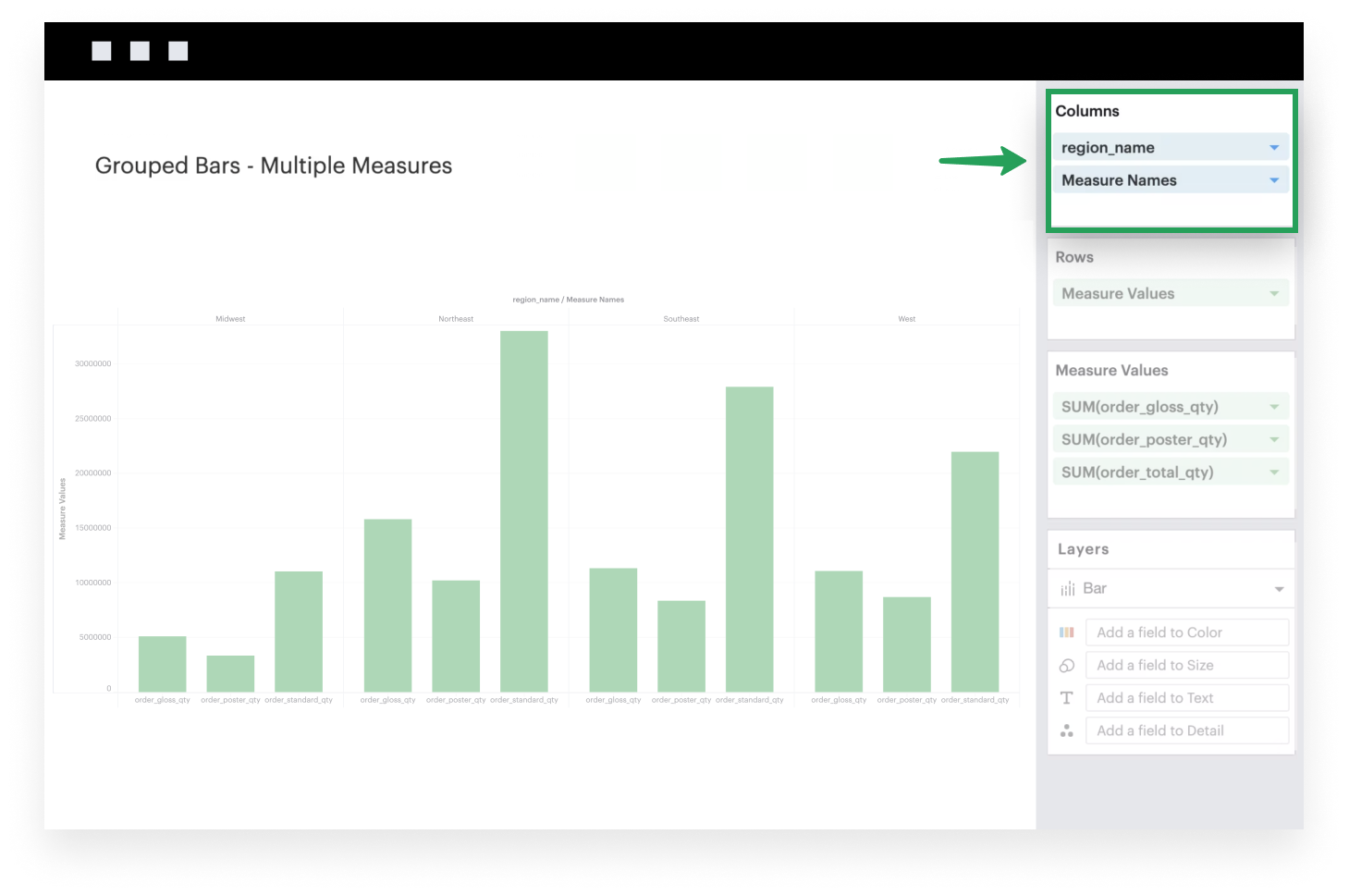
- Lastly, as an optional step, you can add Measure Names to the Color channel so each measure is color coded. You should also now have a legend that maps each color to the corresponding field names.