How KPI Dashboards Can Enable Alignment Across the Org
Jessica Schimm (Senior Content Marketing Manager) and Oona Pecson, (Marketing Intern)
September 19, 2022
NaN minute read
“We need to get data out across our org.”
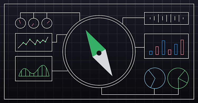
We hear versions of this all the time from prospects at Mode, and for good reason: one of the first steps in making data useful is getting it out to the people. Data analysts are usually focused on delivering analysis for specific priority projects or single departments (ideally through incremental shipments of analysis). This is important work, but another way to democratize data and increase data-driven decisions across an organization quickly is to build dashboards that show company North Star metrics around growth and goals—available to the entire company.
We did this at Mode, and these dashboards drove stronger alignment across teams, provided fast signals when there was a downturn, and created a much more data-driven culture. Designed to be useful and visible to everyone in the organization, our data team collaborated with stakeholders to identify metrics that would help everyone see where the business was at.
In this article, we’ll walk through the benefits of these company-wide dashboards, how to design yours, and how to socialize them within your organization.
This is a written adaptation of a webinar led by Mode’s data team.
What are “North Star” KPI dashboards? (that are accessible to the entire org)
These KPI dashboards are hubs of living data that display metrics like revenue, customer growth, and product usage—metrics that are most vital to core business success—that are viewable by everyone in an organization. The data in these dashboards should paint a clear picture of company goal progress and should be able to be used by others across the organization to help guide strategy as it affects bottom-line numbers.
Some of the metrics we chose to include in these dashboards were: Spot ARR, annual customers, new customer growth, monthly user activation rate, and more. The select metrics that are featured on these dashboards should make them more inclusive and a stronger company-wide asset.
What centralized North Star KPI dashboards are not
These dashboards are not meant for all departments to make all of their day-to-day decisions from. While viewers can drilldown into this data in Mode, the dashboards should give a high-level understanding of company progress at first glance.
What are the benefits of North Star KPI dashboards that are accessible to the entire company?
These accessible and analyst-vetted dashboards should be the single source of truth for the most important metrics that the company is using to guide its strategy. They then can help people create more successful strategies, become more aligned, and gut-check day-to-day decisions.
Altogether, these dashboards:
Fuel a more data-informed and data-driven culture. When leaders, middle managers, and junior employees all have access to company-performance data, they can make better-informed decisions.
Create stronger alignment between teams. This goes without saying, but when the entire crew is working off the same information, alignment and speed become easier.
Contribute to an accountability-based culture. When key metrics are transparent and visible to everyone at an organization, it creates more accountability.
People will use data to make decisions. Left to their own resources, they’ll use what’s available to them, which is likely siloed, department-specific metrics. And while department-specific metrics can be helpful for informing project decisions, they cannot provide enough information for big-picture strategy.
The North Star KPI dashboards that we built at Mode are considered central tools that drive value across the entire company.
Download

A Data Team Maturity Model Guide
Use this guide to identify where your data team is on a maturity scale.
Where to start: How to choose the right metrics for company KPI Dashboards
Before building the first drafts of your dashboards, here are some steps you should take to survey the current data landscape at your organization. These will help you make decisions about where to start.
1. Look at dashboards that are already being used
Getting started doesn’t have to be complicated. If there is already a reporting architecture in place, then that is the best place to start. As one example, at Mode, we had an existing marketing funnel that our data team used as a starting point to identify lead volume. This was one critical metric we knew we’d want to incorporate into our North Star dashboards, so we cleaned and simplified the existing lead charts and put them on the main dashboards.
Ask stakeholders who own or use those reports to identify strengths and weaknesses: what’s working, what’s not, and what can be improved on.
You can critically examine existing reports by asking these questions:
Are the data sources sound?
What are some of the pain points of the current dashboards?
Is there any information from one team (marketing) that can help another (like sales or customer success) in a more effective way?
2. Ask what's missing from current reporting
It’s important that these company-wide KPI dashboards contain information that’s useful on a daily basis to many different teams. To identify which metrics would be useful for the entire company, talk to teams to see what metrics they use daily.
One team may have data that could help another team operate more effectively. Find out where gaps are with current data. Team leaders will likely have a point of view on what’s most useful.
Our senior data analysts asked team leads:
What data do they use day to day?
What data can they use to improve their workflow?
How do they use data currently?
How would you like to be able to use data going forward?
3. Draft and iterate your first dashboard
Next, create a draft of what a core KPI dataset would be. A simple draft could be done in Mode Studio (if you’re not a customer yet). Drafting reports before you start a larger build will help you see what gaps you still need to fill to ensure it's immediately useful.
Before beginning this process, it’s best to ask:
How can I best serve the entire organization with data?
Will this data help us better understand trends within core business functions?
Can the information help teams make better decisions about the bottom-line business?
4. Walk through your drafts for rich feedback
Lastly, share your drafts with leaders of each team. Be sure to walk through why you chose the metrics you did and why you left out others (you gotta walk the people through both on the job and in interviews).
Make some changes, but don’t wait until it’s 100% right to get it out to the broader team. You’ll want to cross-check with c-suite execs that data that’s too sensitive has been scrubbed out, but after that’s done, set it live. You’ll learn what to change as the reports start to be used across the organization.
Make some changes, but don’t wait until it’s 100% right to get it out to the broader team.
What tools to use for your KPI reports
Before you start on this project, here are the tools you’ll want to have on deck:
Data warehouse (We use Snowflake) - to centralize data for optimized performance.
A data modeling tool (We use dbt) - for standard definitions and peer-reviewed version control.
A data engine (Mode has Helix) - that lets you speed up the processing of mass company-wide data—up to 10 GigaBytes with less database load (no more Excel sheet that crashes when too many rows of data and attributes are included).
Together, these systems allow for a dedicated space for information and queries to “live” in a single place.
Download
Get the full Guide to improving retention
In this guide, we’ll show you how to uncover insights about your users that drive better engagement and growth.
What next?: Socializing your KPI dashboards and measuring the results
Post initial rollout, how do you ensure your dashboards stay relevant?
After taking the steps needed to ensure buy-in from stakeholders, you’ll want to observe how KPI dashboards are continuously used over time. Like taking your car in for oil changes, these dashboards should be checked up on and maintained.
We found the following three actions helpful in making sure our KPI dashboards stayed relevant and up to date.
1. Socialize your dashboards with quarterly education
Quarterly education is one of the most important aspects for KPI dashboard maintenance. People need to know it exists, where it is, and what it is. Set up dedicated time to explain why you included the data you did, instead of just handing off the report.
2. Measure usage
Understand how your company is using KPI dashboards. Do people use it? If so, how often? What do they use it for? Where they are engaging will help you spot opportunities for optimization and more education. From there, you can ideate new ways to make these dashboards more useful. The most powerful dashboards have a cadence of views, and because of this you can constantly improve as you reach certain checkpoints (monthly, quarterly etc.). 3. Manage and adjust metrics
When you measure correctly, you can manage. With such widely-accessible information, dashboard maintenance needs to be managed effectively to ensure longevity and success. Therefore, providing a mechanism for ongoing feedback and updates and iterations is a must.
One last point to keep in mind: there is no right way to look at a business. After you go through this planning process and finalize KPI dashboards, there will always be new questions and new data to get out to teams. Rounds of editing and iterations are to be expected. Company-wide communication and education will make adapting to these changes much easier.
Conclusion
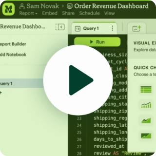
KPI dashboards that feature North Star company metrics are powerful tools that can help people navigate their field of business and make decisions more easily. They can also jump-start a process of data democratization at fast-growing companies. To watch a demonstration of how we built our dashboards, watch our webinar.
To get started building your own, sign up for a Mode free trial.
Get our weekly data newsletter
Work-related distractions for data enthusiasts.
