
Mode Help
Visualize and present data
Visualizations
Overview
After using SQL to gather, structure and analyze all of the necessary data for your analysis, you can build visualizations on top of that data. Mode offers a number of options for building visualizations, including the ability to take your analysis even further using Python / R or using any type of custom visualization using JavaScript (e.g., D3).
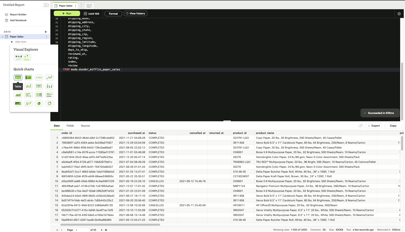
Quick Charts
Quick Charts are pre-defined templates to quickly create commonly used chart types in data analysis.
Quick charts can be added to a Report by clicking the "New Chart" icon located above the query editor to select the desired chart.
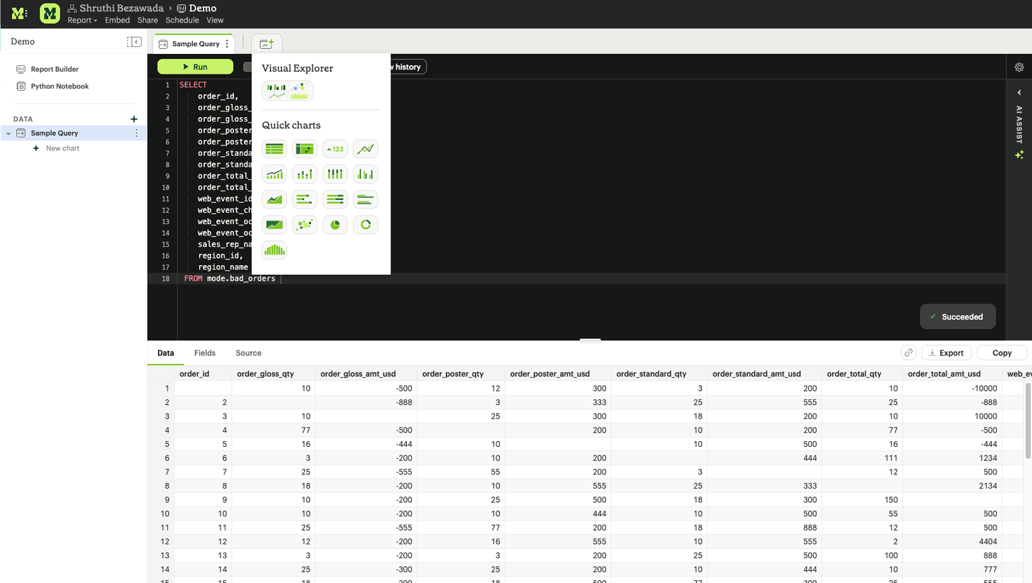
An alternative is to locate the dataset in the data panel to create a chart from and clicking the "+" button beneath it to select the desired chart.
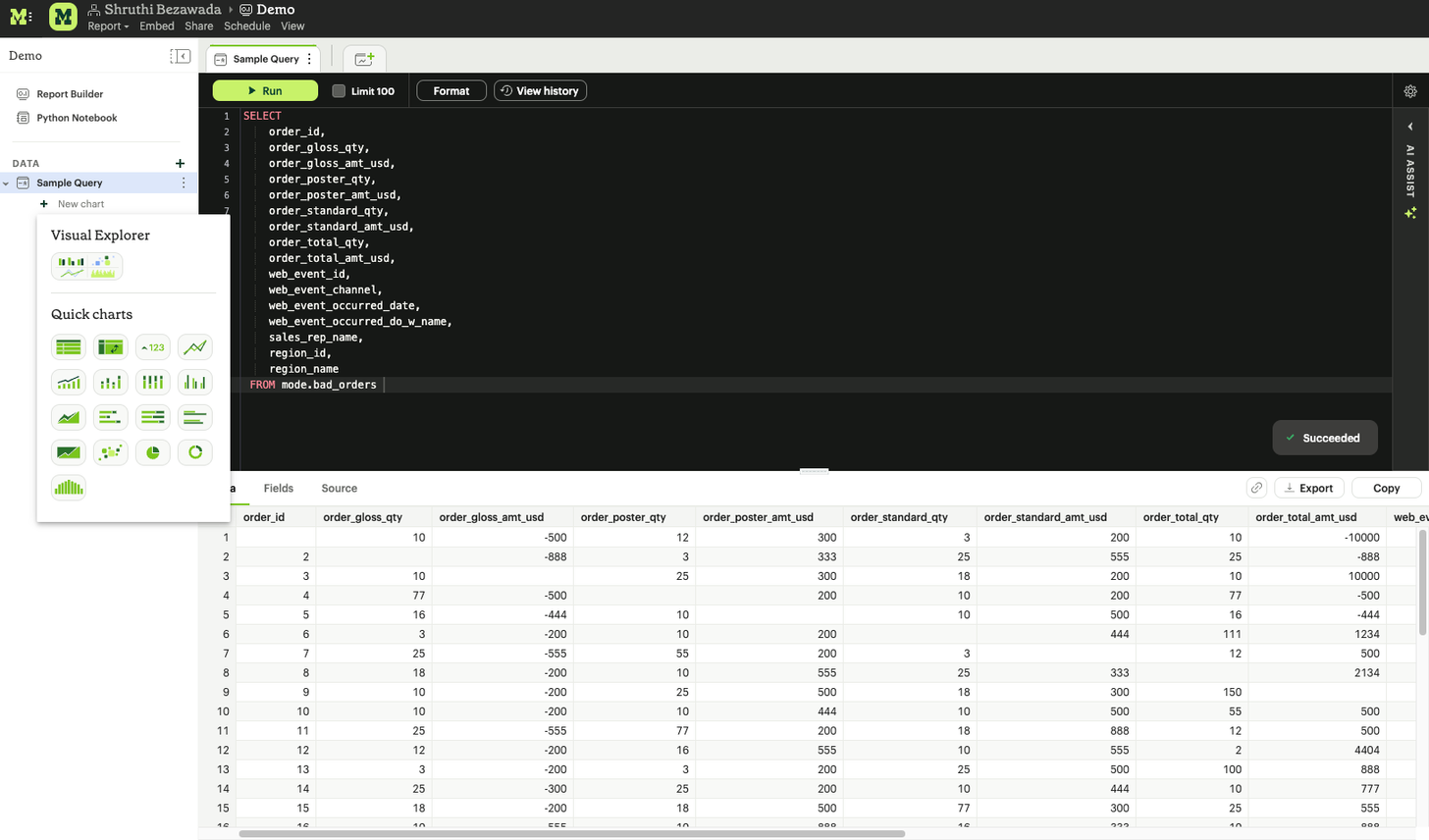
Mode supports the following Quick Chart types:
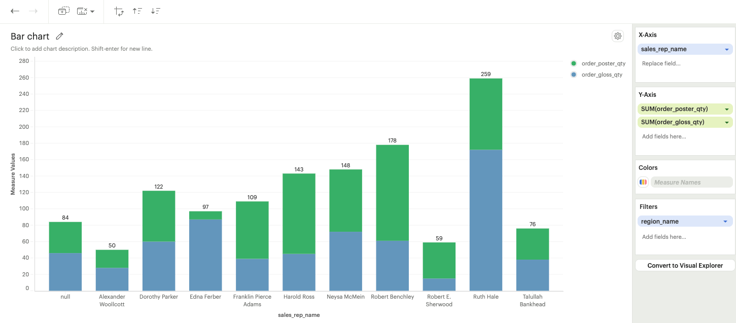
Bar and Column charts
Bar charts are useful for showing comparisons between categories of data, or for comparing changes for multiple groups over the same time period.
- Stacked bar: Bars are stacked on top of each other, showcasing cumulative data for multiple categories.
- 100% stacked bar: Bars are displayed as a percentage of the total, emphasizing the relative proportion of each category within the whole.
- Grouped bar: Bars representing different categories will be displayed side by side, allowing easy visual comparison between groups.
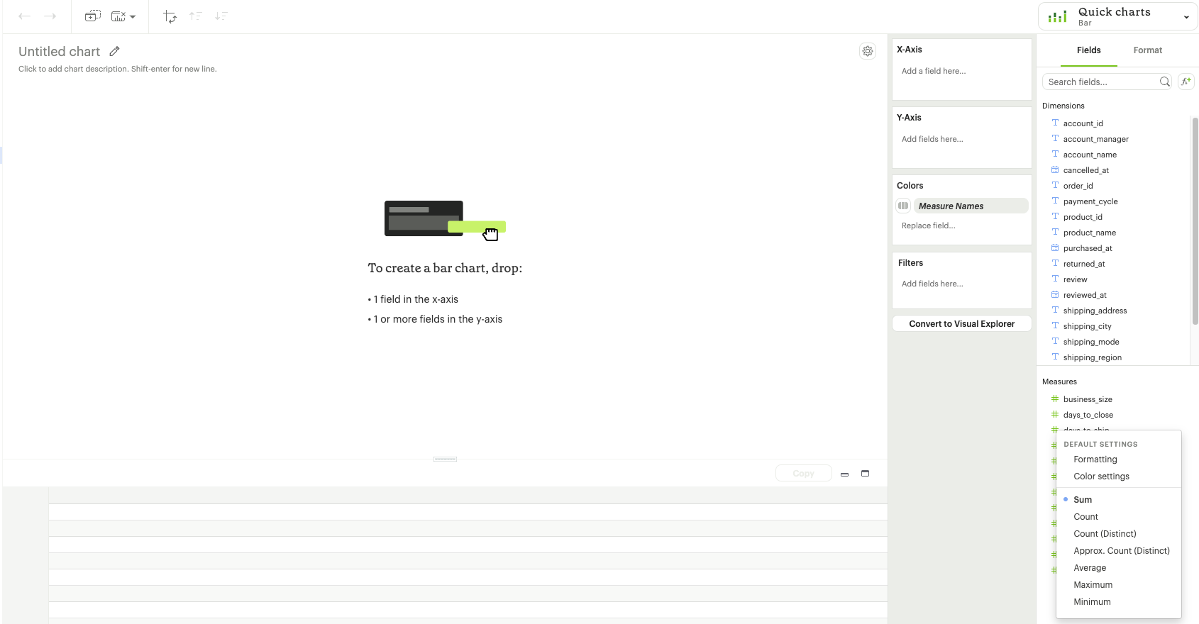
Bar charts require one of the following combinations of fields:
- Exactly one field and one field on the X and Y axis + optional field on color
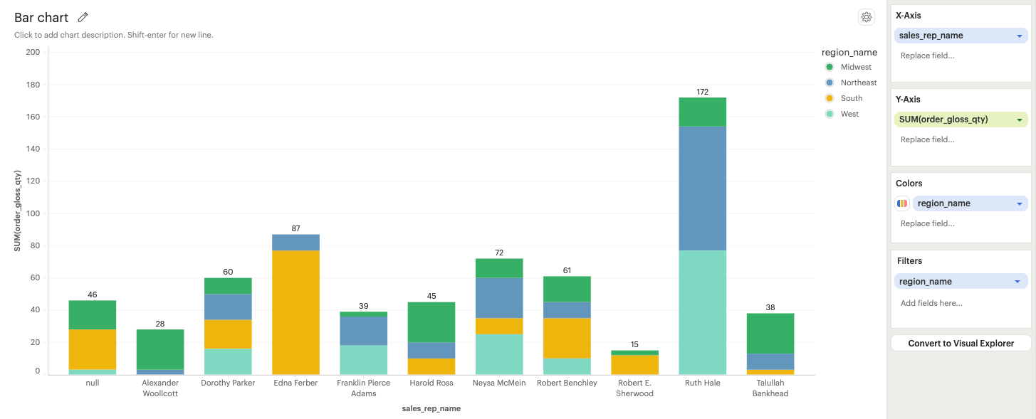
- Exactly one field on the X-axis and more than one field on the Y-axis
Format options:
-
Color formatting options: Refer to the colors section.
-
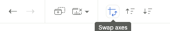
Swap axes: X and Y axes can be swapped to create horizontal bar charts using the swap axes option on the toolbar.
-
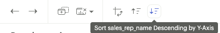
Quick sort options: Quick sort options on the toolbar can be used to sort the chart in descending or ascending order.
-
Advanced sort options: Refer to the advanced sort options section.
-
Table calculation options: Refer to the table calculation options section.
-
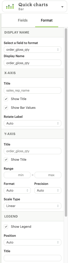
Display label: The format panel located in the top right corner of the chart editor (see screenshot below) can be used to modify the names of fields in the chart. The display label specifically updates the field name within the chart, affecting the axis title, legend title, and tooltip. However, the axis title and legend title can be individually customized using the axis and legend title renaming options. It's important to note that the display labels are not reflected in CSV data exports or in the summary data displayed in the panel below the chart in the chart editor.
-
Axes formatting options: The format panel available in the top right corner of the chart editor (refer screenshot) can be used to update the axis title, toggle on/off axis title, toggle on/off bar labels, update axis label rotation angle, set the axis range, change format of axis labels, precision of axis labels and axis scale type.
-
Legend formatting options: The format panel can be used to toggle on/off legend in the chart, toggle on/off legend title, adjust position of the legend and update legend title.
Histograms
Histograms categorize data into intervals, known as bins, and display the number of data points falling into each bin. Each bin represents a specific range of values. This distribution allows users to quickly observe the concentration or dispersion of data across the entire range.
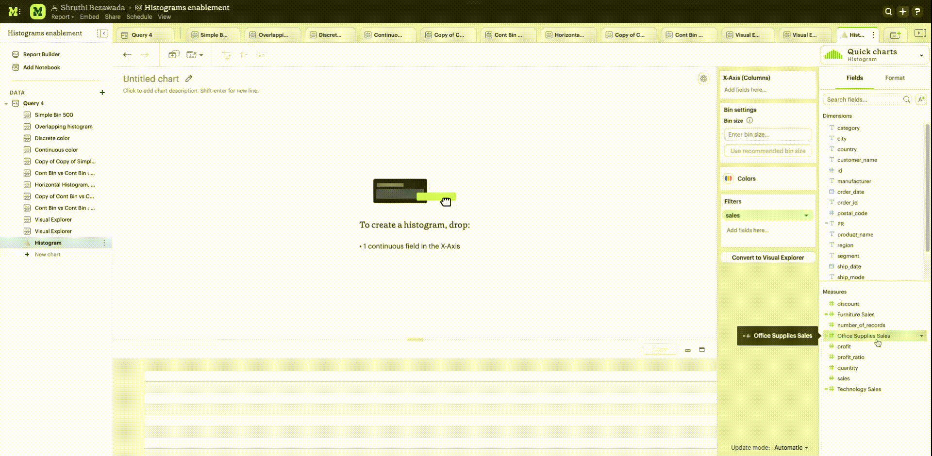
The histogram Quick Chart requires one field on the X-axis.
Format options:
- Color formatting options: Refer to the colors section.
- Axes formatting options: The format panel available in the top right corner of the chart editor can be used to update the axis title, toggle on/off axis title, toggle on/off bar labels, update axis label rotation angle, set axis label type, change format of axis labels, precision of axis labels and axis scale type.
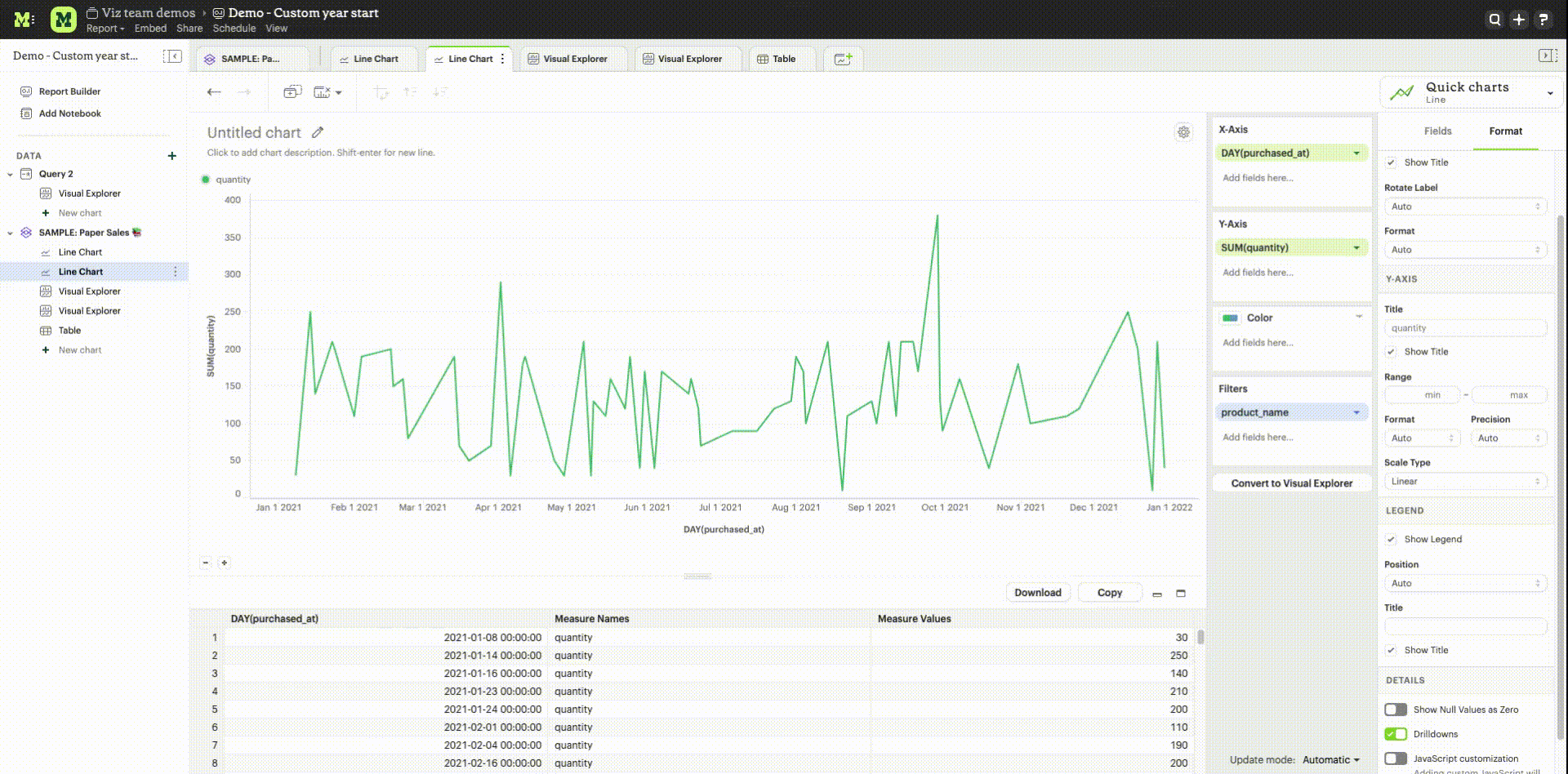
Line chart
Line charts are useful for visualizing trends, highlighting patterns and time series analysis. They require one of the following combinations of fields:
- Exactly one field on the X and one field on the Y axis + optional field on color
- Exactly one field on X-axis and more than one field on the Y-axis
Format options:
- Color formatting options: Refer to the colors section.
- Quick sort options: Quick sort options on the toolbar can be used to to sort the field by the field in either descending or ascending order.
- Advanced sort options: Refer to the advanced sort options section.
- Table calculation options: Refer to the table calculation options section.
- Display label: The format panel located in the top right corner of the chart editor can be used to modify the names of fields in the chart. The display label specifically updates the field name within the chart, affecting the axis title, legend title, and tooltip. However, the axis title and legend title can be individually customized using the axis and legend title renaming options. It's important to note that the display labels are not reflected in CSV data exports or in the summary data displayed in the panel below the chart in the chart editor.
- Axes formatting options: The format panel available in the top right corner of the chart editor (refer screenshot) can be used to update the axis title, toggle on/off axis title, toggle on/off bar labels, update axis label rotation angle, set the axis range, change format of axis labels, precision of axis labels and axis scale type.
- Legend formatting options: The format panel can be used to toggle on/off legend in the chart, toggle on/off legend title, adjust position of the legend and update legend title.
Line + Bar chart
The combination of lines and bars in a single chart facilitates easy visual comparisons between different categories or groups of data. Bar charts are effective for comparing quantities, while line charts are helpful to visualize trends.
Line + bar charts require exactly one field on the X-axis and two fields on the Y-axis. The first field on the Y-axis is represented by a bar (Y1 axis) and the second field on the Y-axis is represented by a line (Y2 axis). No additional field can be added to color
Format options:
- Quick sort options: Quick sort options on the toolbar can be used to to sort the field by the field in either descending or ascending order.
- Advanced sort options: Refer to the advanced sort options section.
- Table calculation options: Refer to the table calculation options section.
- Display label: The format panel located in the top right corner of the chart editor can be used to modify the names of fields in the chart. The display label specifically updates the field name within the chart, affecting the axis title, legend title, and tooltip. However, the axis title and legend title can be individually customized using the axis and legend title renaming options. It's important to note that the display labels are not reflected in CSV data exports or in the summary data displayed in the panel below the chart in the chart editor.
- Axes formatting options: The format panel available in the top right corner of the chart editor (refer screenshot) can be used to update the axis title, toggle on/off axis title, toggle on/off bar labels, update axis label rotation angle, set the axis range, change format of axis labels, precision of axis labels and axis scale type.
- Legend formatting options: The format panel can be used to toggle on/off legend in the chart, toggle on/off legend title, adjust position of the legend and update legend title.
Area charts
Area charts can effectively convey the distribution of data allowing easy comparison of trends between different categories. In the 100% area chart, the area marks are displayed as a percentage of the total, emphasizing the relative proportion of each category within the whole.
Area charts require one of the following combinations of fields:
- Exactly one field on the X-axis and one field on the Y-axis + optional field on color
- Exactly one field on the X-axis and more than one field on the Y-axis
Format options:
- Color formatting options: Refer to the colors section.
- Quick sort options: Quick sort options on the toolbar can be used to to sort the field by the field in either descending or ascending order.
- Advanced sort options: Refer to the advanced sort options section.
- Table calculation options: Refer to the table calculation options section.
- Display label: The format panel located in the top right corner of the chart editor can be used to modify the names of fields in the chart. The display label specifically updates the field name within the chart, affecting the axis title, legend title, and tooltip. However, the axis title and legend title can be individually customized using the axis and legend title renaming options. It's important to note that the display labels are not reflected in CSV data exports or in the summary data displayed in the panel below the chart in the chart editor.
- Axes formatting options: The format panel available in the top right corner of the chart editor (refer screenshot) can be used to update the axis title, toggle on/off axis title, toggle on/off bar labels, update axis label rotation angle, set the axis range, change format of axis labels, precision of axis labels and axis scale type.
- Legend formatting options: The format panel can be used to toggle on/off legend in the chart, toggle on/off legend title, adjust position of the legend and update legend title.
Pie and donut charts
Pie and donut charts are useful for visualizing and communicating proportional relationships within a whole. They require exactly one field for color and one field to calculate the angle
Format options:
- Color formatting options: Refer to the colors section.
- Quick sort options: Quick sort options on the toolbar can be used to to sort the field by the field in either descending or ascending order.
- Advanced sort options: Refer to the advanced sort options section.
- Table calculation options: Refer to the table calculation options section.
- Display label: The format panel located in the top right corner of the chart editor can be used to modify the names of fields in the chart. The display label specifically updates the field name within the chart, affecting the legend title, and tooltip. However, the legend title can be customized using the legend title renaming option. It's important to note that the display labels are not reflected in CSV data exports or in the summary data displayed in the panel below the chart in the chart editor.
- Legend formatting options: The format panel can be used to toggle on/off legend in the chart, toggle on/off legend title, adjust position of the legend and update legend title.
Scatter plot chart
Scatter plots are useful to visualize the relationships between variables, patterns and outlier detection. The require exactly one field on the X-axis and one field on the Y axis + optional fields for color and size
Format options:
- Color formatting options: Refer to the colors section.
- Quick sort options: Quick sort options on the toolbar can be used to to sort the field by the field in either descending or ascending order.
- Advanced sort options: Refer to the advanced sort options section.
- Table calculation options: Refer to the table calculation options section.
- Display label: The format panel located in the top right corner of the chart editor can be used to modify the names of fields in the chart. The display label specifically updates the field name within the chart, affecting the axis title, legend title, and tooltip. However, the axis title and legend title can be individually customized using the axis and legend title renaming options. It's important to note that the display labels are not reflected in CSV data exports or in the summary data displayed in the panel below the chart in the chart editor.
- Axes formatting options: The format panel available in the top right corner of the chart editor (refer screenshot) can be used to update the axis title, toggle on/off axis title, toggle on/off bar labels, update axis label rotation angle, set the axis range, change format of axis labels, precision of axis labels and axis scale type.
- Legend formatting options: The format panel can be used to toggle on/off legend in the chart, toggle on/off legend title, adjust position of the legend and update legend title.
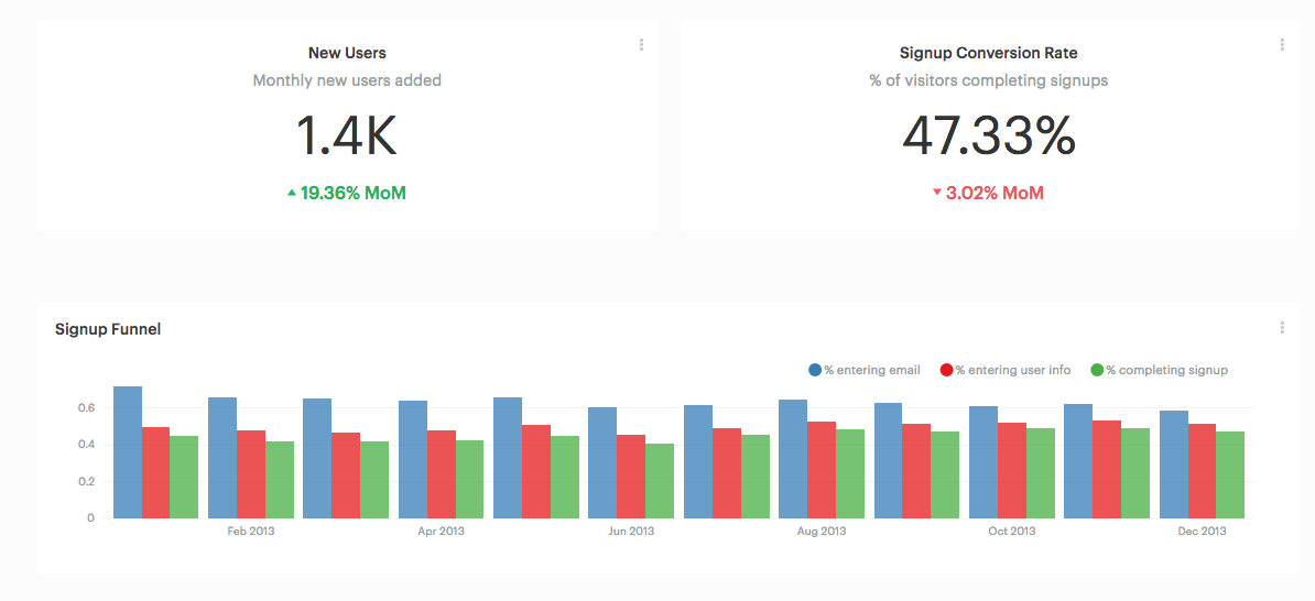
Big Values
Big value visualizations are useful for highlighting key metrics and how those metrics change over time.
You can use the following options to configure your Big Value. You can add any field from either Dimensions or Measures into each of these dropzones:
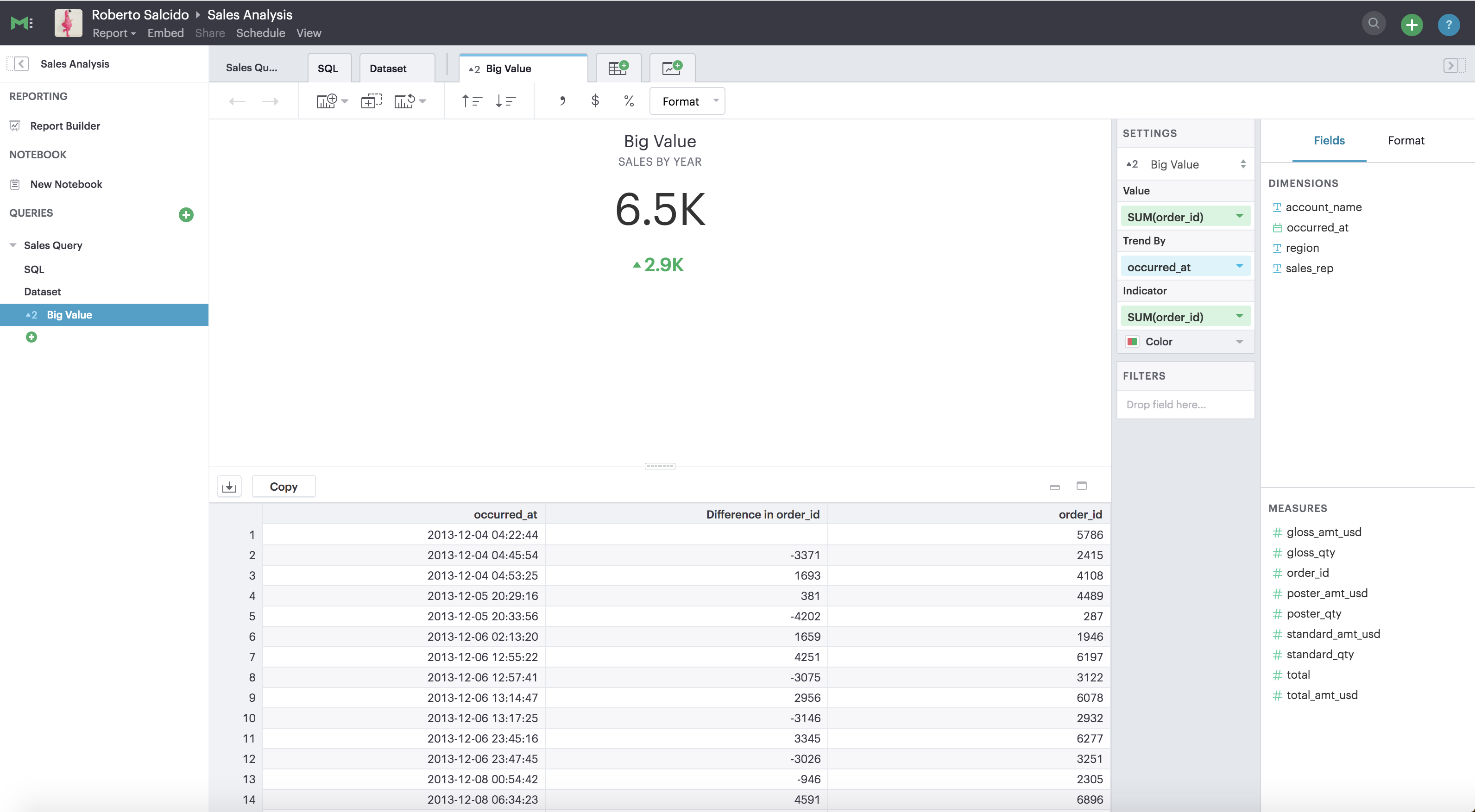
- Value: The field with the data you want to display. Click on the little arrow to the right of the column name to choose the aggregate type.
- Trend By: The field that you would like to group the dataset by to determine the aggregate values. After you’ve dropped a field in here, the Value we display is the last one in your grouped dataset. Note that the the default sort order is ascending by the field you have in the *Trend by. *If you would like to alter the sorting, you can do so by clicking on the sort ascending and sort descending buttons in the toolbar above.
- Indicator: Chooses how the inputted value compares to another value. Click on the little arrow to the right of the field name to choose the aggregate type, calculation format, and the value for comparing to the Big Value. Note: If you want to mirror the functionality of the Mode’s old Big Numbers, add the same field that you have in the Value dropzone to the Indicator dropzone.
- Format: use format shortcuts at located in the top toolbar to the right panel’s to customize the formats of Value and Indicator. These options include plain text, currency, number, and percentage.
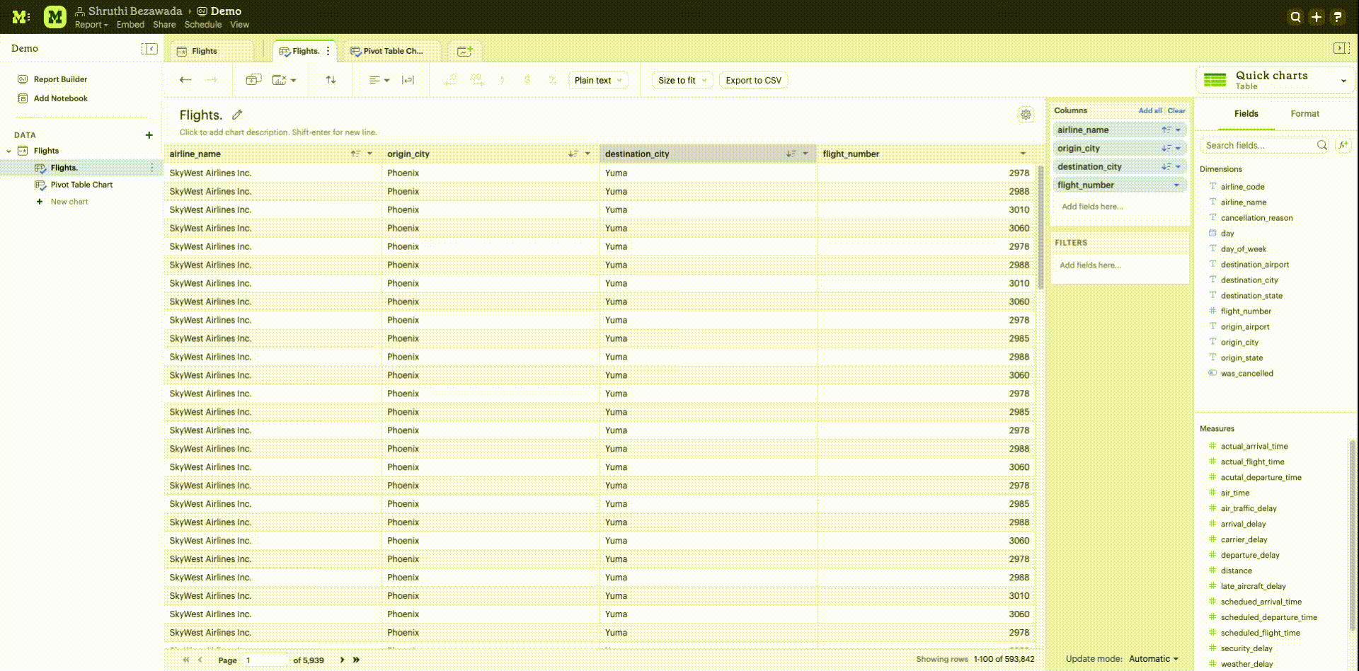
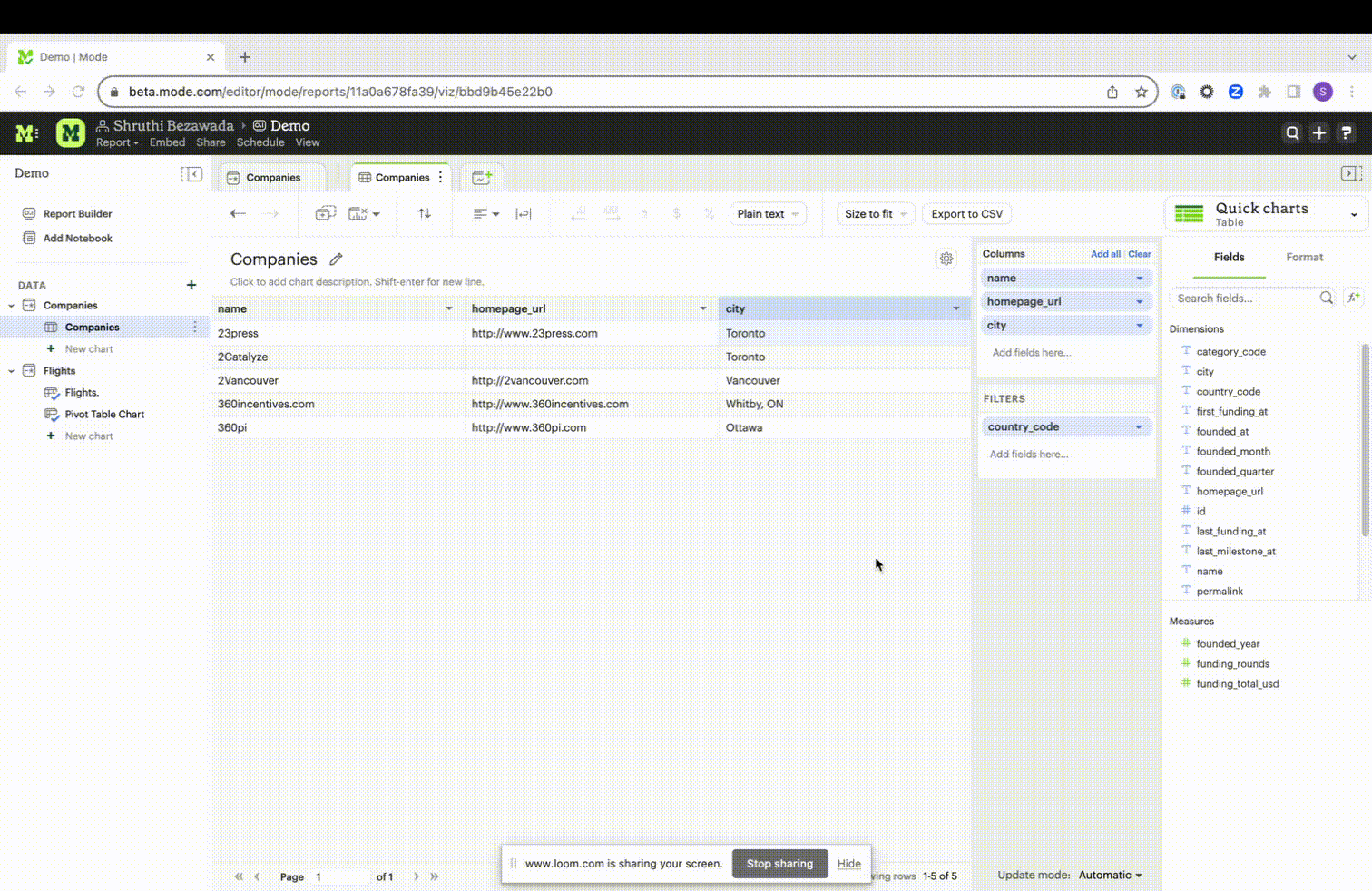
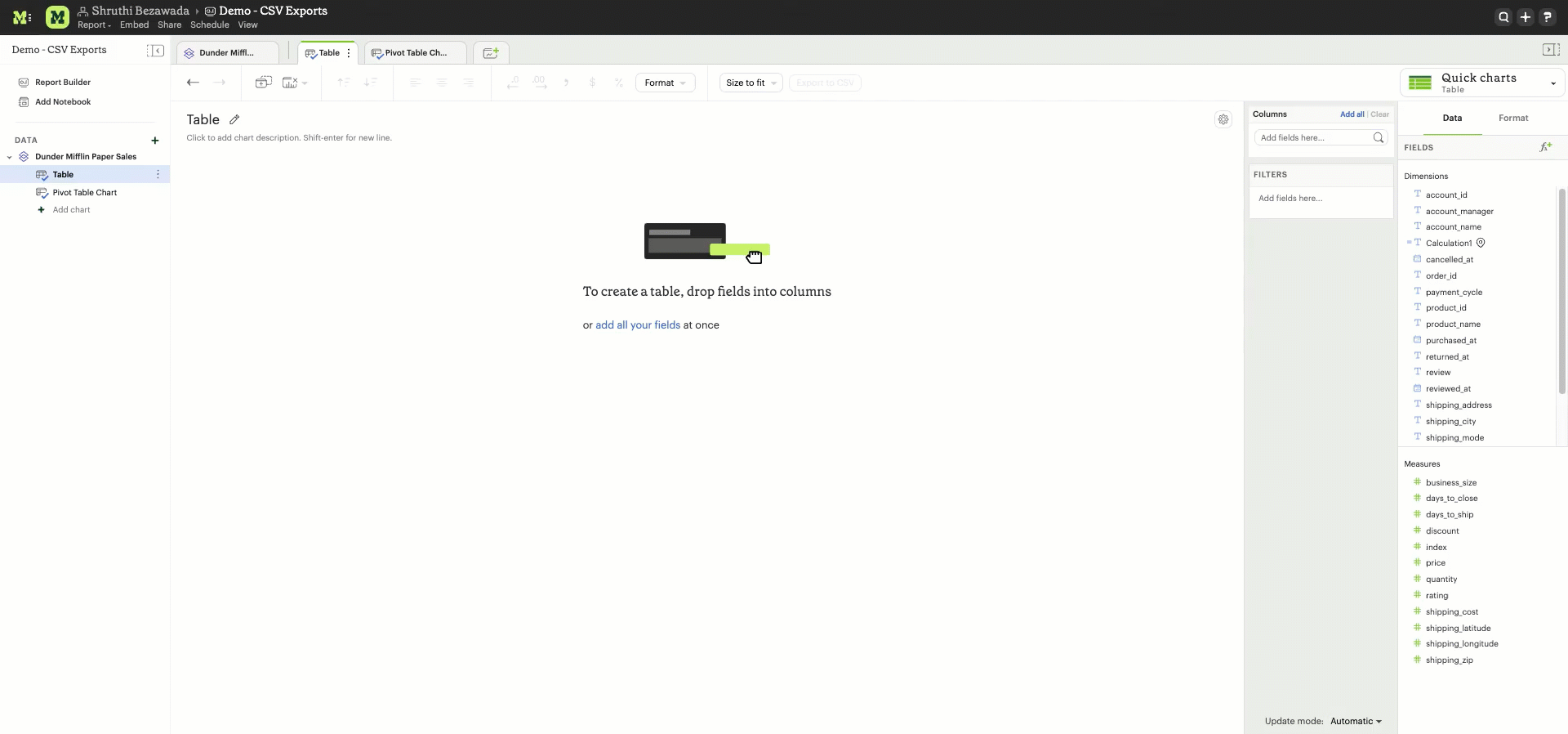
Tables
Tables present data in a format that is highly adaptable and easily understandable for end users. Users have two ways to create new tables. One approach involves selecting the Table chart from the green "Add Chart" dropdown located above the query editor by clicking on it.
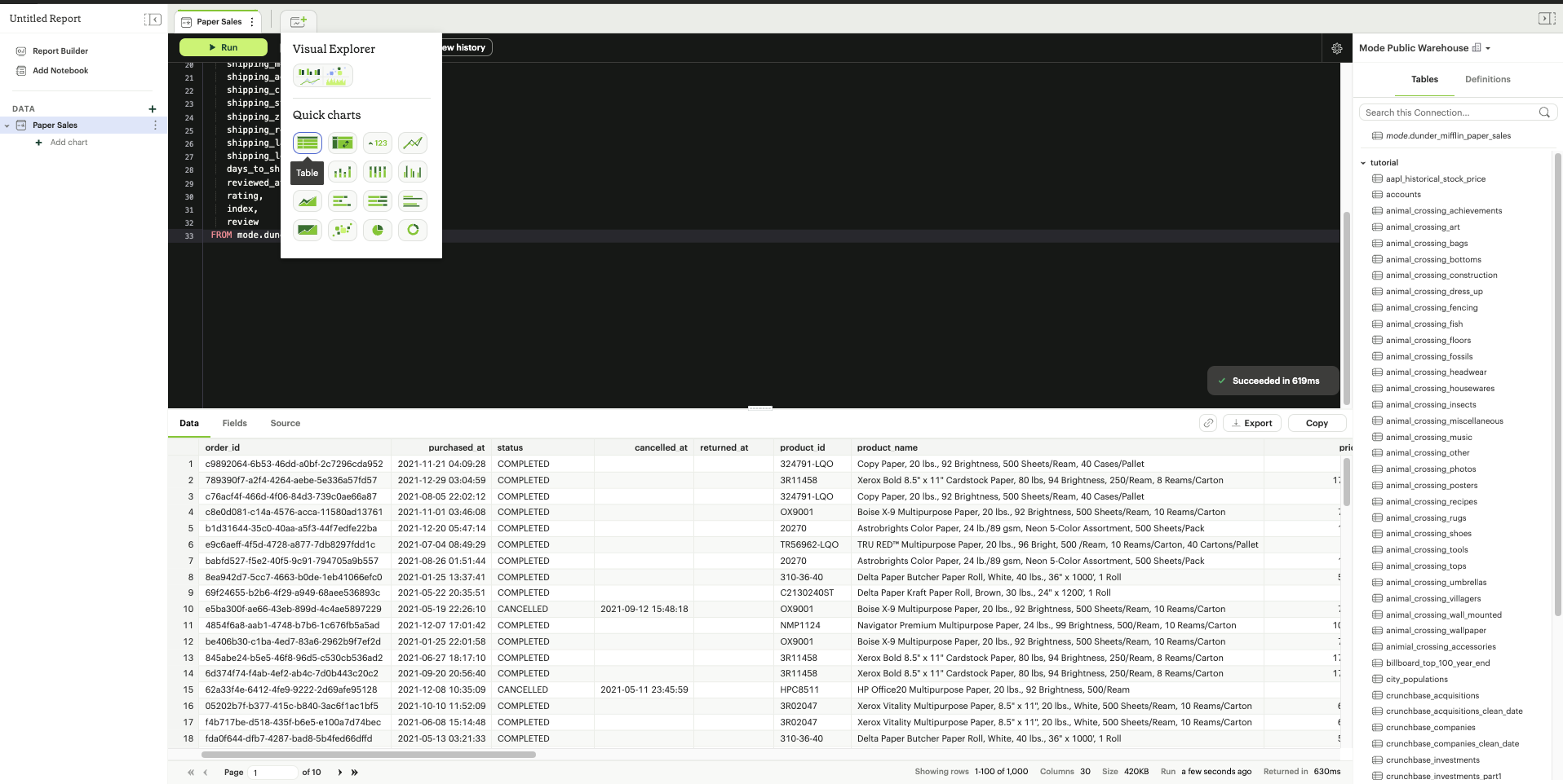
Another option is to find the query with the data you want to display and click the + button under it and select the Table chart.
The initial step for creating a table is to add desired columns from the "Dimensions" and "Measures" fields to the "Columns" section. This can be accomplished by using the drag-and-drop method or by using the type-ahead search option. Additionally, it is possible to include columns that are intended for use as filters within the "Filters" section. Column formatting options are available in the toolbar above the table.

-
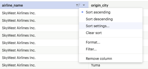
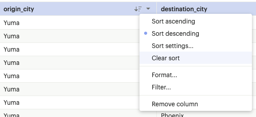
Sort settings
The user can sort any field in the Flat Table by ascending or descending order. The sorting hierarchy can be defined by specifying primary and secondary sort fields, or more levels if needed in the chart designer, Report View and Explorations.
Sort settings can be found in the field context menu or on the toolbar for chart designer and Explorations. In the Report View, it can be found in the field context menu.
The sorting hierarchy can be rearranged using the grab icon as shown in the demo video below
The sorts on fields can be cleared individually using the “Clear sort” option in the field context menu.
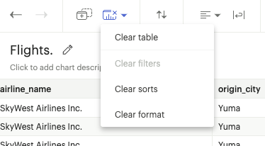
All sorts applied in the table can also be cleared using the “Clear sorts” option in the toolbar.
-
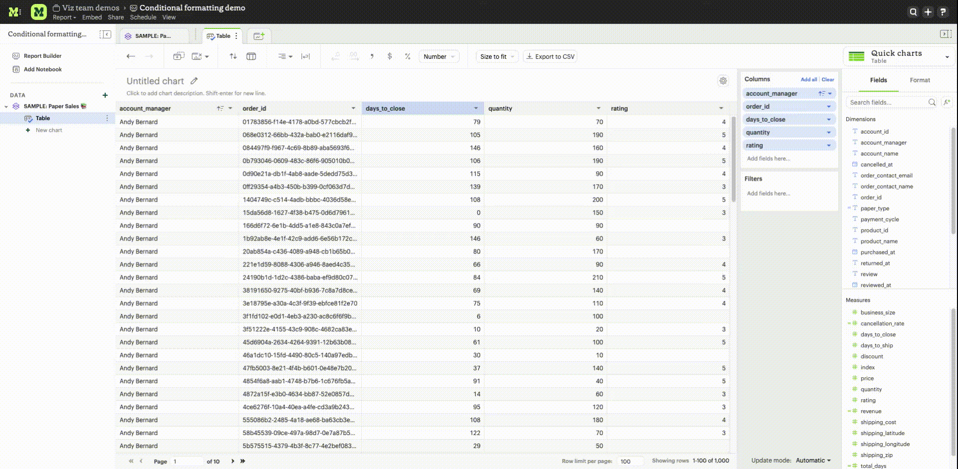
Conditional Formatting
Users have the ability to assign colors of different intensities to values, depending on their relative position within a specified range. The user can access the color conditional formatting option either through the field context menu or the toolbar in the chart designer and Explorations. This functionality is applicable to all measures in the table.
-
Column alignment options left, center, or right can be enabled or disabled.
-
Column text wrapping can be turned on or off. If the wrapped content exceeds three lines, the remaining part will be truncated. Similarly, the column header will wrap up to two lines before truncation.
-
Decrease the number of decimal places for columns formatted as number, percentage, or currency.
-
Increase the number of decimal places for columns formatted as number, percentage, or currency.
-
Format column as number with commas as thousand separators. This format can be customized by navigating to More formats...by clicking on the Number button
-
Format column as currency, with the US dollar currency symbol. This format can be customized by navigating to More formats... by clicking on the Currency button
-
Format column as percentage with two decimal places. This format can be customized by navigating to More formats... by clicking on the Percent button
Format
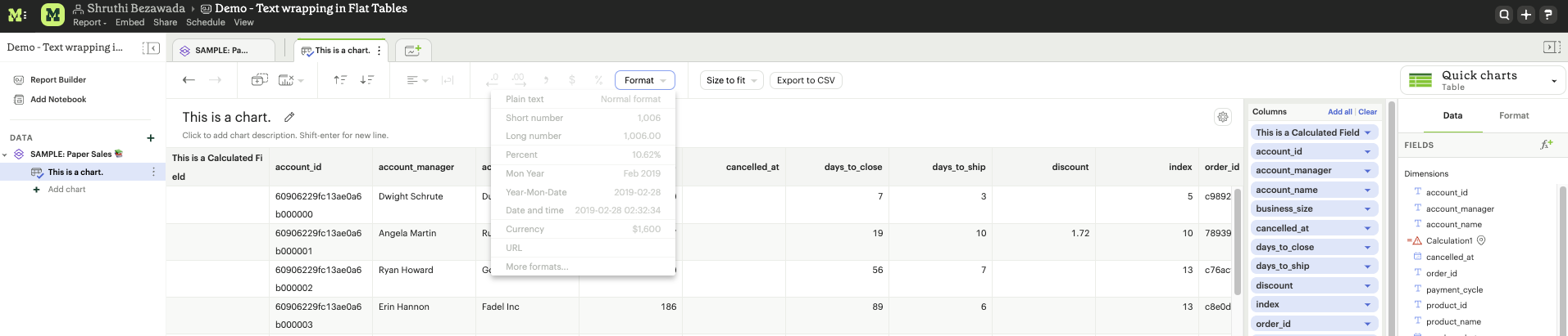
The Format button updates to reflect the data type of the column. Users can customize the format by navigating to “More formats”. The options available under “More formats” change based on the datatype of the column.
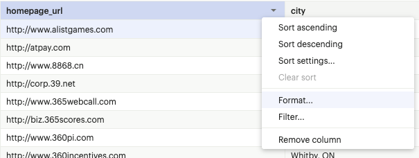
URL formatting
A field in the Flat Table can be formatted as a URL from the Format options in the the top toolbar or using the format option in the field context menu.
Basic hyperlink
A field in the Flat Table can be formatted as a URL and can be displayed as text, text with underline or as an icon. This formatting creates hyperlinks that serve as references to other web pages or resources.
Custom
The custom setting offers more advanced options to tailor the display and functionality of hyperlinks.
-
The text displayed for the hyperlink can be customized.
-
A reference field can be used as the URL address.
-
A URL can be constructed using a reference field with the field being formatted as the display text. For example, the domain and page name fields to generate the complete URL.
-
The reference field used as the URL address can be any field in the underlying data and has to be added to the Flat Table.
Size to fit
The columns of the table are optimally sized to fit the chart designer by default. This option can be changed to Manually size to update the column size based on user preferences.
Export Tables as CSV
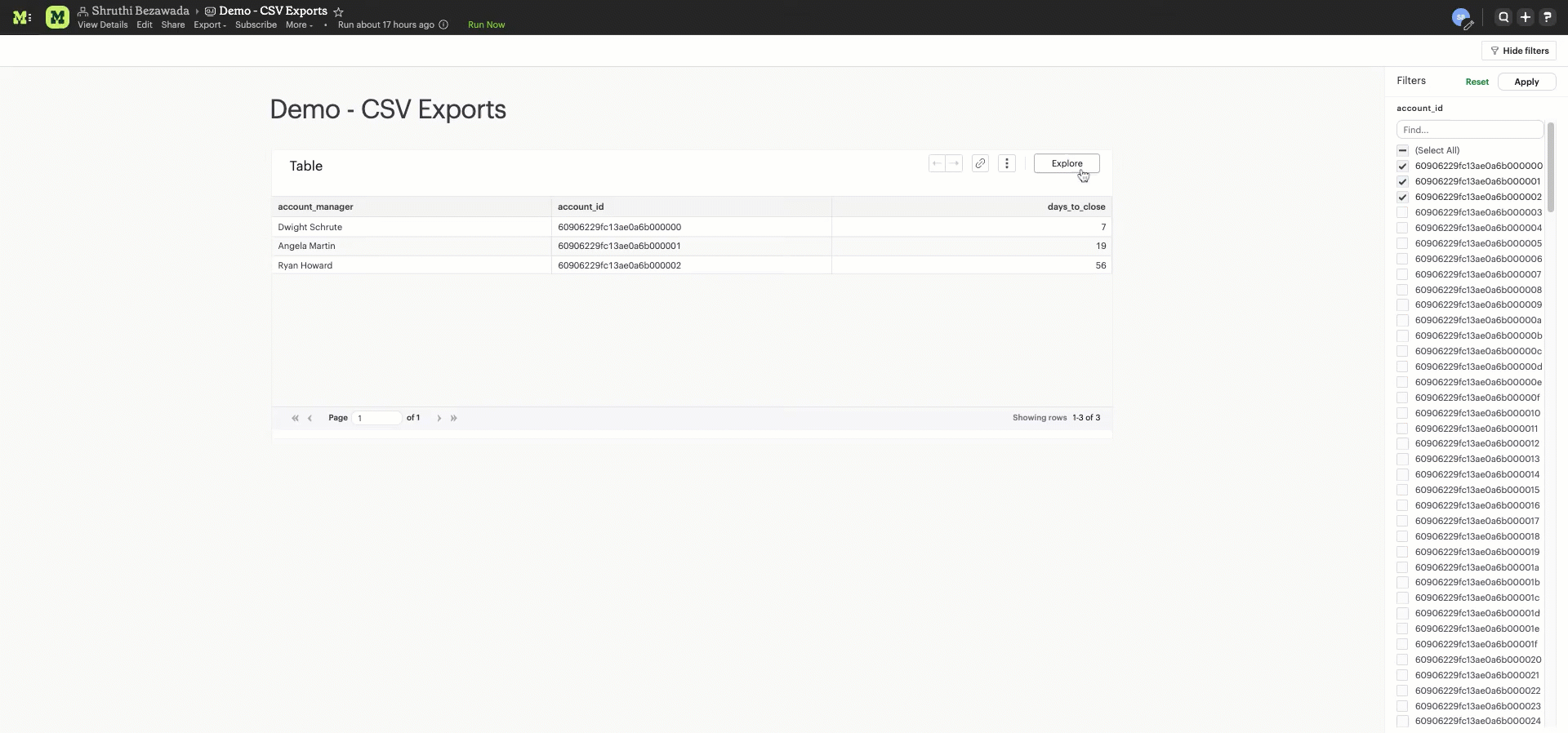
Tables with Report filters, chart filters or sorts applied can be exported as CSV files from the Quick Chart Table designer, Explorations, and the Report View. There is a 300,000 row limit on the tables that can be exported. Tables that are above this limit will be truncated.
In the Quick Chart Table designer, the "Export to CSV" option is enabled in the toolbar when fields are added to the Flat Table. In Quick Chart Table Explorations, the "Export to CSV" option can be found in the toolbar above the Flat Table. In the Report View, the "Export to CSV" option can be found in the context menu. Clicking on the “Export to CSV” option will start generating the CSV file and add it to the "Recent Downloads" drawer. A blue loading icon will appear while the file is being generated, a red X icon will indicate an error, and a green check icon will indicate that the file is ready for download. Clicking on the "Download" button next to the file will download the CSV file.
Multiple tables can be exported simultaneously, and the files are organized in order of recency, with the most recent files at the top in the drawer. The "Recent Downloads" drawer can be closed using the "x" icon, and can be re-opened by clicking the "Export to CSV" option again. The same CSV files will be available in the drawer once re-opened if there were CSV files in the drawer prior to closing it. For more detailed instructions, please refer to the gifs provided.
Export CSV files from the Quick Chart Table chart designer
Export CSV files from the Quick Chart Table Explorations
Export CSV files from Quick Chart Tables in Report View
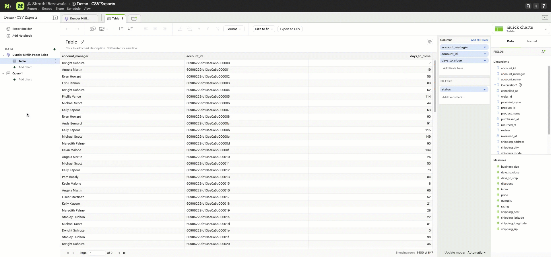
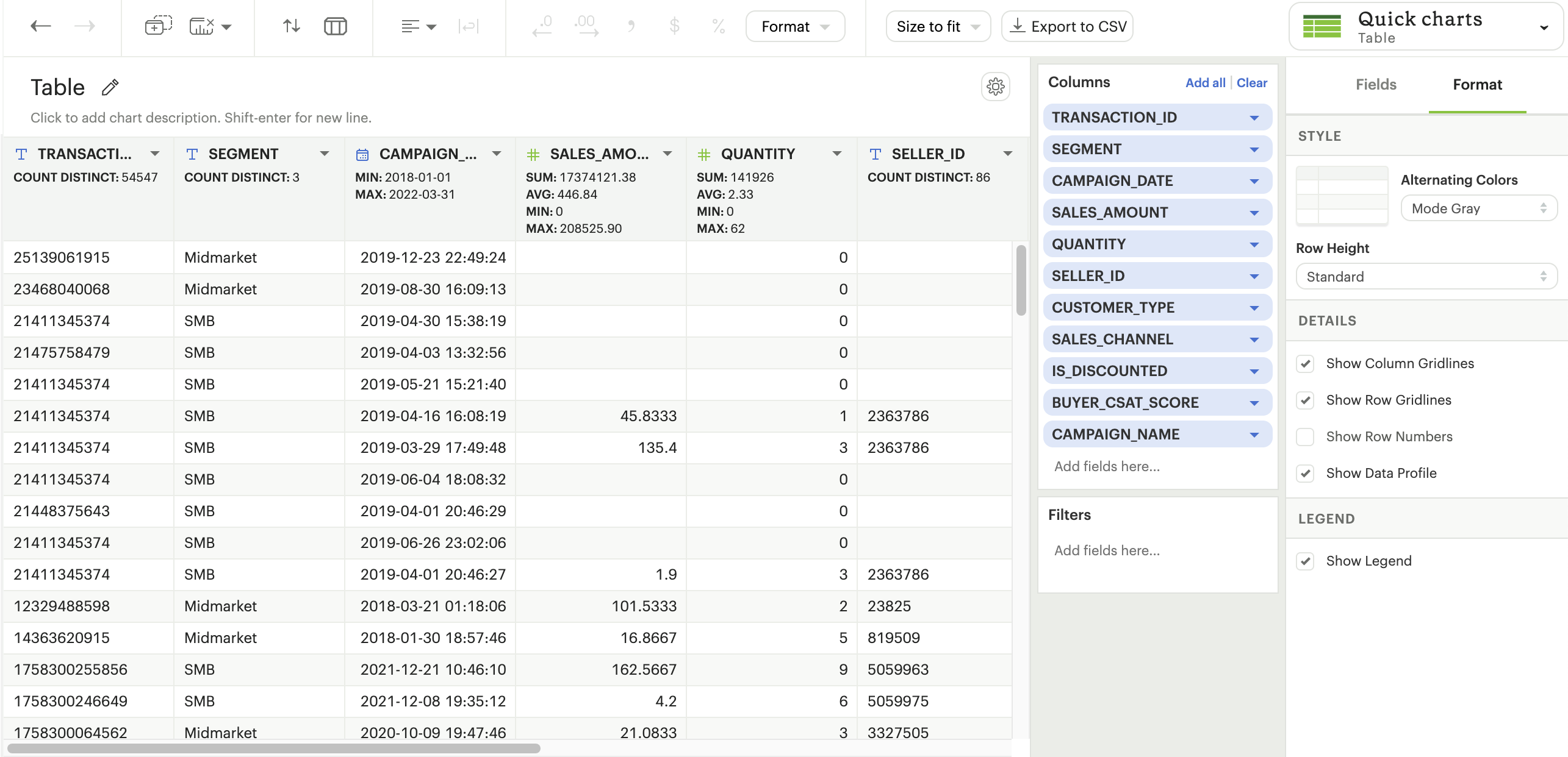
Table formatting options
Table formatting options can be accessed by clicking on the “Format” section to the right of the “Data” section. Formatting options selected will persist beyond the current session and will determine how the Table appears on the Report page. The table formatting options available are:
- Alternate row colors options to make tables easier to read for end users.
- Three row height options: standard, compact, and open are available. Altering row heights on larger tables can make more rows appear at once and reduce the amount of scrolling needed to navigate the table
- Hide column or row gridlines. Column and row gridlines are turned on by default.
- Show the row numbers. The row numbers are turned off by default.
- Hide legend. The color legend is turned on by default when conditional color formatting is applied.
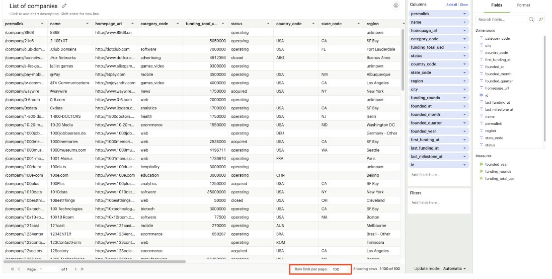
Page size customization
The table is paginated to enhance loading speed. The default number of rows per page is 100 rows. The number of rows shown per page can be customized by adding any number between 1 to 1000 in the input box located in the bottom right corner. The page size can be updated in the chart designer or Explorations.
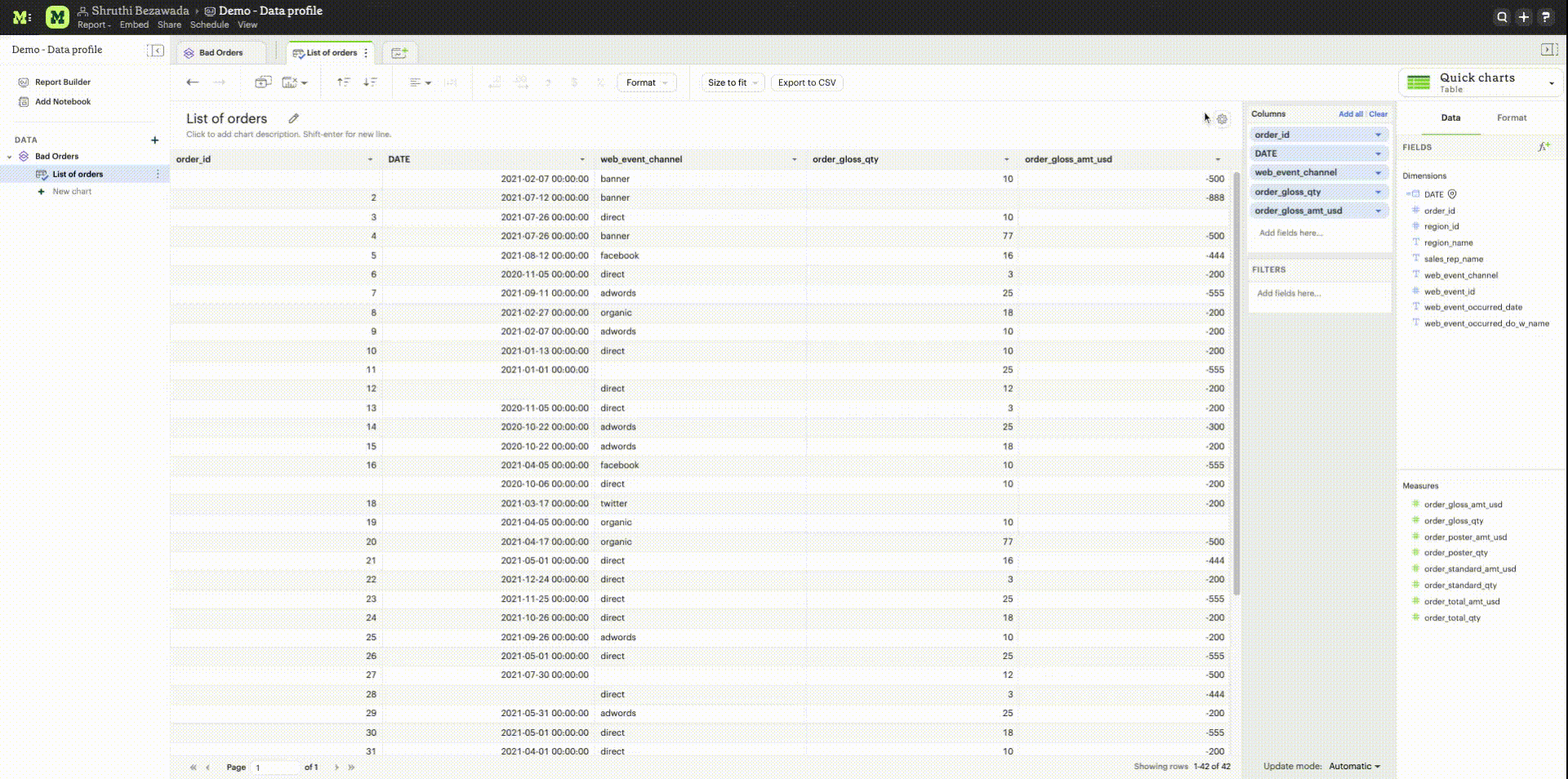
Data profiling
Data profiling provides a summarized overview for each column in a Flat Table, taking into account chart and Report filters. Data profiles reflect the total values of the entire table and not just the page in view. The summary varies based on the data type of the column:
- Categorical fields: Count of distinct values
- Numerical fields: Sum, average, minimum, and maximum values
- Boolean fields: Sum (count of true values)
- Date fields: Minimum and maximum dates
- Valid calculated fields will also have data profiles, and the displayed summaries depend on the data type.
By default, data profiling is turned on. It can be turned off by checking the “Show data profile” option in the settings gear in the chart designer or the settings menu in the Report Builder. In Explorations, the data profile setting is available in the Format panel.
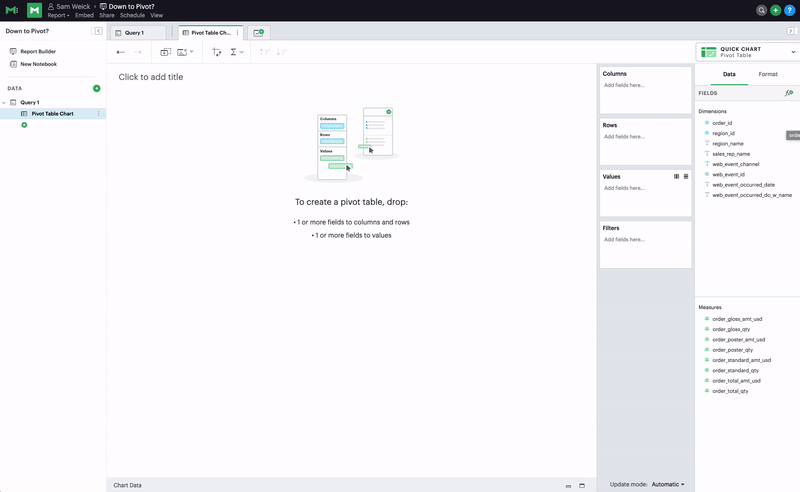
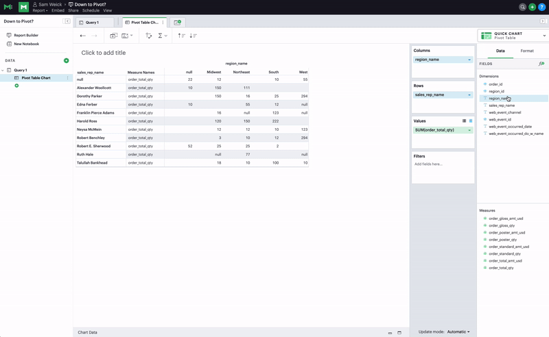
Pivot Table
A pivot table aggregates and summarizes (e.g., using sum, average, count, etc.) query results and presents them in a data table. To add a pivot table to a report:
- On the left side of the report editor, find the query with the data you want to display and click the New
 button under it.
 - Click Add Pivot Table to add a new pivot table to the report's layout.
- Add one or more fields to the quadrants on the bottom right to configure. This can be done by dragging and dropping fields or by using the type ahead search option. Fields should be added to the rows quadrant in the order of nesting.
Creating a Pivot Table
To create a pivot table, start by opening the New Chart menu. You can launch the New Chart menu in two places:
- In the left sidebar of the report editor, find the query with the data you want to work with and click the indented button under the query.
- While working on a query in the SQL editor, you can access the New Chart menu above the SQL editor.

Once you have opened the New Chart menu, select Pivot Table.
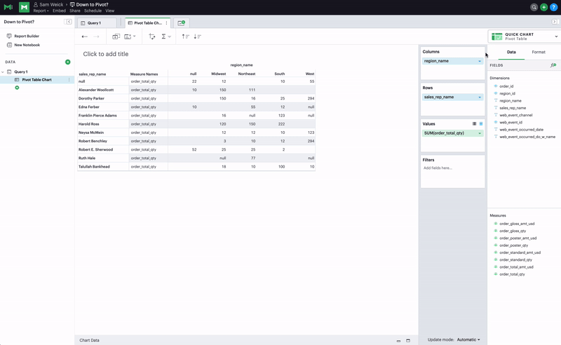
To create a pivot table, you will need to take the following actions:
- Drop 1 or more fields to columns
- Drop 1 or more fields to rows
- Drop 1 or more fields to values
Format Axes, Columns, Rows
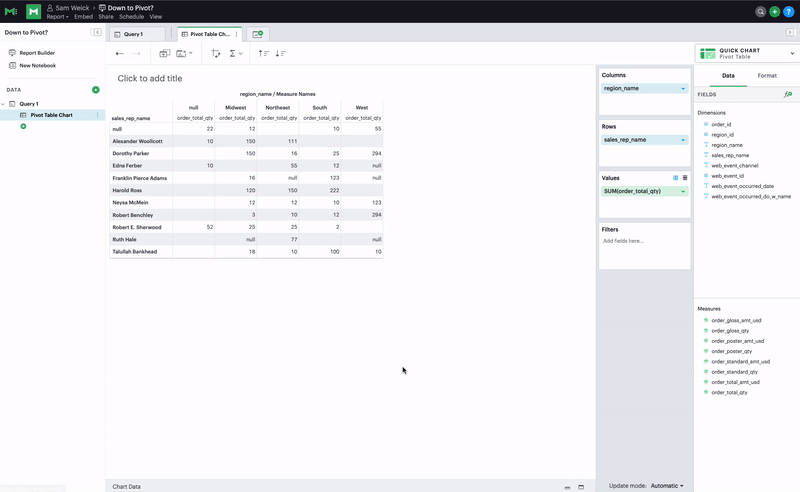
Swap axes swaps the fields in the columns and rows in addition to swapping the axis where the measure names are displayed.
Show as column / row changes which axis the measure names are displayed on without altering the fields placed in rows and columns.
Once you have the data you care about, you can use these options to quickly fine tune how it is visually represented.
Formatting Fields
You can individually format fields in pivot tables.
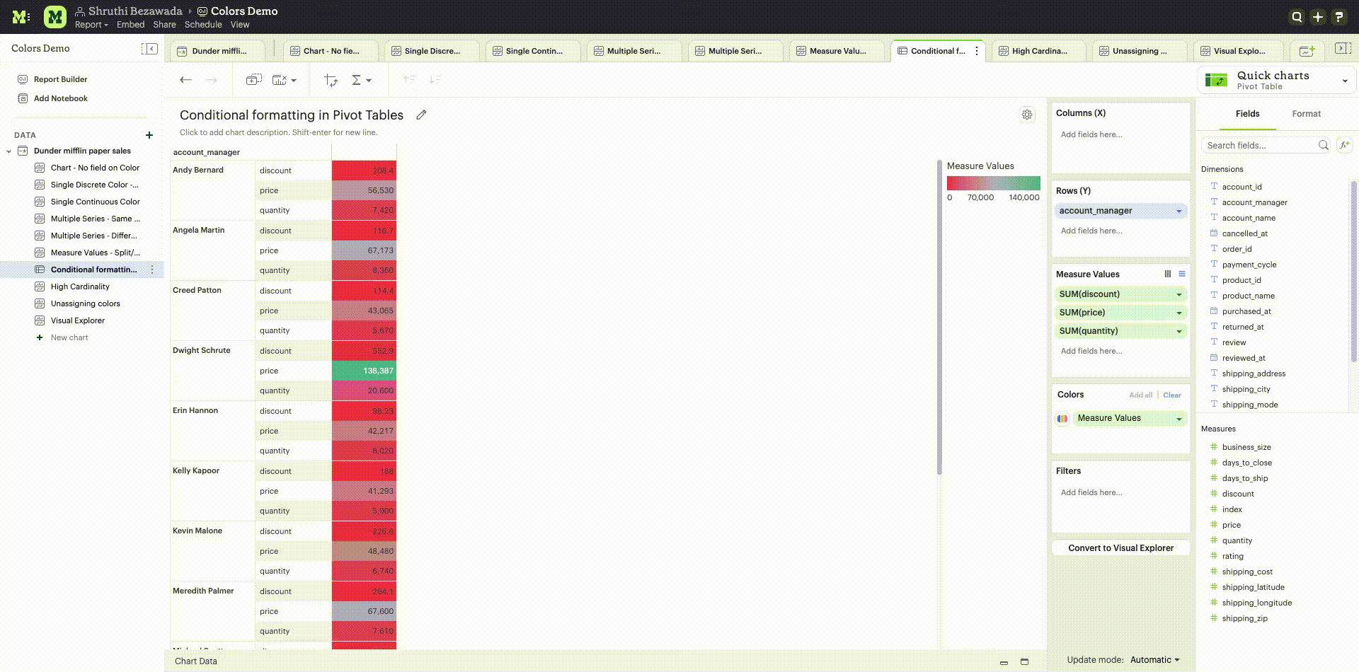
Conditional Color Formatting
Conditional color formatting is added to all Measure Values in the pivot table by default. There are multiple ways to conditionally color format the pivot table:
- Apply color to a single field by adding fields to the color marks channel
- Apply color to multiple Measure Values by adding Measures to the Measure Values shelf and select "Add all" in the color marks channel. The color can be removed by using the "Clear" option.
- Color can be changed by selecting the "Edit Colors" icon in the color marks channel. The color can be added to the text instead of background by using the same affordance.
Quick Calculations
Quick calculations are available in Pivot Tables.
Adding Filters
You can add filters to pivot tables by adding fields, including calculated fields, into the filters drop zone by dragging and dropping or by using the type ahead search. You can use calculated fields in all pivot table drop zones.
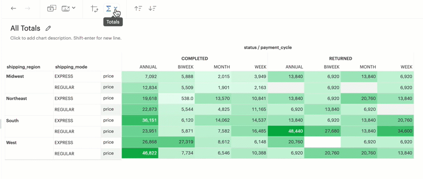
Grand Totals and Subtotals
You can toggle on and off either or both Column Grand Totals and Subtotals and Row Grand Totals and Subtotals using the Toolbar.
You will need more than one dimension and at least one measure under Columns or Rows in order to toggle on Subtotals. You can also utilize them for Visual Explorer charts.
Grand Totals and Subtotals will take on the same aggregation method as the measure, for example, it will sum all the values if your measure is SUM(field) or it will average across all the values if your measure is AVG(field).
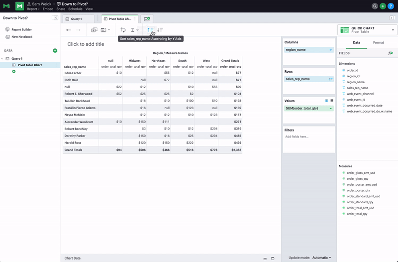
Quick Sort
In the Toolbar, you have the ability to leverage our Quick Sort feature to sort your innermost discrete, categorical data by the outermost measure in either descending or ascending order.
Advanced Sorting
However, you also have the option to define a more granular sorting behavior. When you can click on a field in your pivot table to open its context menu, you will see the ability to open the full visual explorer sort dialogue.
From there, you can specify exactly how you’d like to sort using your selected field. We currently support four sorting methods:
-
By data value
-
By field
-
By manual
-
By nested
For a full breakdown of each of these options, visit our visual explorer sorting documentation.
(Legacy) Display Table
** Note that we now no longer actively support Display Tables and we are in the process of sunsetting them at some point in the future **
The first time you successfully execute a query, a display table containing the query's results is automatically added to your report. By default, data tables display all columns returned in the underlying query and each column is formatted according to the data type of each column.
Click on Display Table under any query in your report to control how that query's display table is formatted and sorted, and to show or hide columns:
- Columns: Un-check any columns on the right side to remove them from the table.
- Sort: Click the header of the column you'd like to sort the table by and click the drop down
 button to choose how you want the table sorted.
 - Formatting: Click on the column header for any column to see formatting options for that column on the right side of the window. Depending on which format you choose, a number of additional customization options will appear.
To manage Quick Charts in the Report, click on the three vertical dots to access the following options:
- Duplicate: Creates a copy of the visualization
- Add to builder: Adds the visualization to the Report layout
- Remove from builder: Removes the visualization from the Report layout but does not delete it from the Report
- Copy to Mode clipboard: Copies the visualization that can be pasted in the same or different Report. Read more about copying and pasting visualizations.
- Delete: Removes the visualization from your report layout and deletes it from the editor.
All Quick Charts except Tables and Big Values can be be converted to Visual Explorer to access advanced chart options.
JavaScript customization
Quick Charts can be customized using the HighCharts JavaScript API or through Alamode by turning on the JS customization setting. This setting can be found in the Format panel of the chart editor. This is applicable to Quick Charts created on or after October 12, 2023. For Quick Charts created prior to this date, users will have the option to disable JS customization to access advanced chart settings available in Visual Explorer.
Enable/disable JavaScript customization
Enabling JavaScript customization will result in the inability to use certain features in Quick Charts. If a Quick Chart has any of the following features in use, the user will not be able to enable JavaScript customization for that particular visualization:
- Color by continuous fields
- Nested or manual sorts
- Custom table calculations
- Display labels to modify field names in charts
- Default field settings
Notebook Visualizations
Every report contains a built-in Notebook environment where you can take the results of one or more queries, further analyze them in Python or R, and visualize the results using one of the many built-in libraries.
The contents of any Notebook output cell can be added to your report. These visualizations will update whenever the Notebook is run and the output changes.
Custom Visualizations
Mode supports the ability to customize Mode's native visualizations or add custom D3 visualizations to a Mode report. When editing a Report, in the Report Builder's top toolbar, click the icon </> to customize the Report's HTML. The HTML editor lets you use valid HTML, JavaScript, or CSS in the layout of your report, allowing you to add interactivity, custom visualizations, and more. To help you get started, Mode's community maintains the Alamode JavaScript library that makes creating D3-powered visualizations a snap.
Check out Mode's Gallery for inspiration, sample reports, and more information about how to create advanced visualizations in Mode.
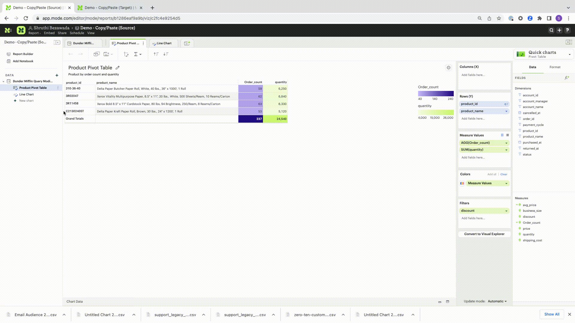
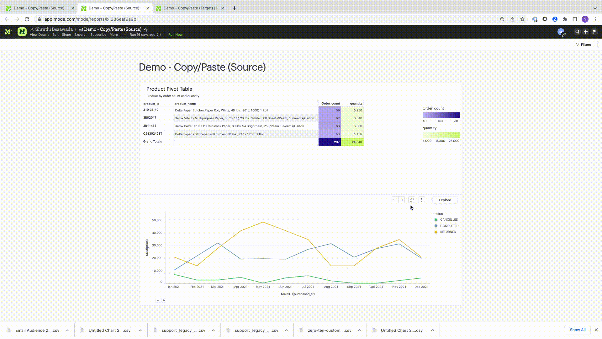
Copy visualizations across Reports
Users have the option to copy charts to the Mode clipboard and paste them under the target data source in the same or different Reports. This can be accomplished by following the steps outlined below:
1. Copy chart to Mode clipboard
The copy to Mode clipboard option is accessible via the kebob menu, located on the left-hand side navigation panel within the chart designer. Similarly, in Report View,the kebob menu provides the option to copy a visualization. In Explorations, a copy icon is available in the top toolbar. The following properties of the chart are copied to the Mode clipboard.
- Rows and Columns
- Reference to Calculated fields
- Chart title and description
- Chart filters
- All Layers (Color, Size, Text, Detail)
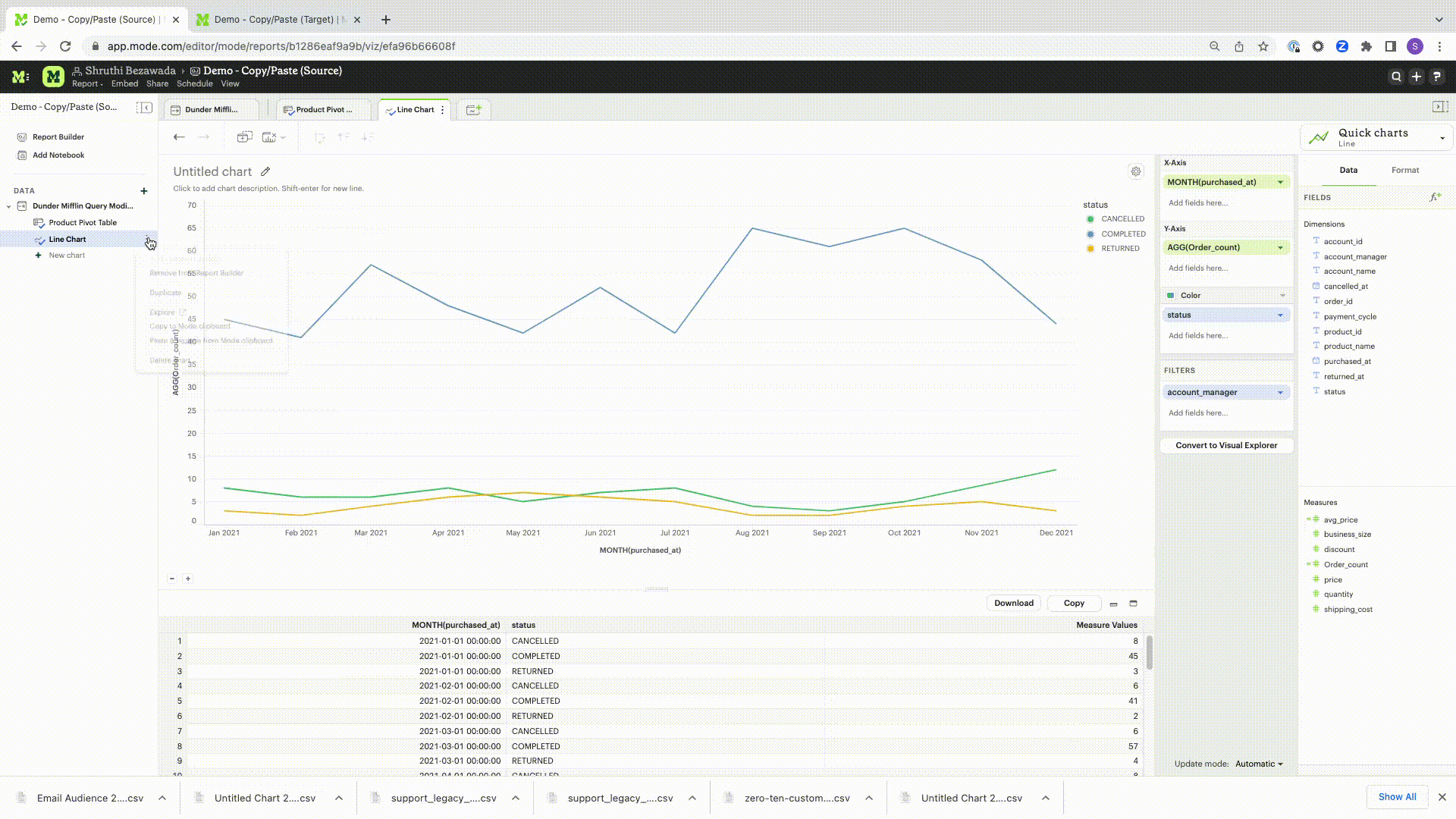
2. Paste chart from Mode clipboard
The paste from Mode clipboard action is available in the kebob menu for each data source in the chart designer. The paste and replace action is also available in the kebob menu for each viz in the chart designer. The replace action can be undone using the back button on the chart toolbar. The fields that are required for the copied charts but are missing from the target data source will be displayed as red pills. The user can switch out the red pills with relevant fields from the target data source.
3. Replace fields in the pasted chart
Users can drag fields directly on top of the field to be replaced in Visual Explorer and in Quick Chart dropzones that accept a single field. For Quick Chart dropzones that accept more than one field, the new field can be added to the shelf and the old field can be dragged out to be removed. The typeahead search in the dropzones can also be used to add the new fields. Refer to the gif for more details.
Copy a chart from the chart designer and paste in a Report
Copy a chart from the chart designer and replace another chart in a Report
Copy a chart from the Report View and paste in a Report
Copy a chart from the Report View and replace another chart in a Report
Copy a chart from Explorations and paste in a Report
Copy a chart from Explorations and replace another chart in a Report
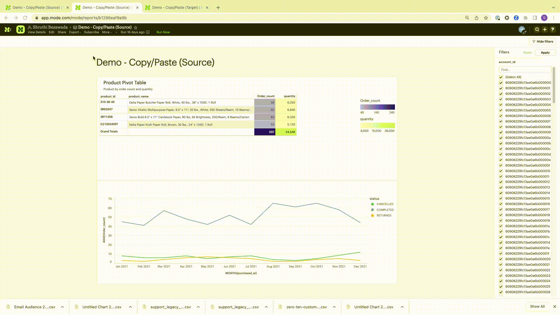
Copy-pasting visualizations is helpful in the following scenarios:
- Re-creating similar charts using different data sources without having to recreate manually each time
- Make updates to a chart in a Report in a Personal collection instead of editing directly in a Report that is used by others
- Move charts previously created off ad hoc queries to a reusable Dataset. Learn more about Datasets here.
Default Field Settings
Default field settings refer to the predefined configurations that are applied to the fields in a dataset (standalone query or reusable dataset).
- Default field settings will be applied to all applicable charts created off the dataset in place of the system default settings (including Quick Charts and Visual Explorer charts)
- Default field settings are available for queries in a Report and when a reusable Dataset is imported into a Report. They are not available when a reusable Dataset is created.
- Default field settings can be overridden at the visualization level. Visualization settings will take precedence over field settings.
- Default field settings are accessible in the context menu for each field within the fields list.
The following default field settings are available:
-
Formatting:
- Users can define default formatting for fields (short numbers, long numbers, percentages, dates, etc) for each dataset to avoid repeated manual configurations.
-
Color Settings:
- Users can assign specific colors to values within a field for consistent color-coding across charts using the same field.
- Clicking on color settings for Dimensions should open the categorical color assignment modal.
- Colors can be configured for fields other than the specific field for which the modal has been launched by using the field selector at the top of the modal.
- Selecting 'Apply' or 'Apply and close' in the modal will apply the chosen colors to all charts using the respective field.
- A continuous palette can be chosen for Measures. The selected palette will be respected only when the Measure is applied to the color channel.
-
Default aggregation:
- Users can define the aggregation desired when a field is added to a chart. This can be overriden at the chart-level.
- Aggregated calculated fields will not show default aggregate options
- If a default aggregate is set to a field and the underlying data type changes that renders aggregate invalid. We should unset previously set default and select the appropriate aggregate per the datatype.
FAQs
Q: Is there a limit to how many visualizations can be added to a report?
Our recommendation is to limit the number of visualizations in a single report to 20. This is due to the fact that excessive visualizations can increase the loading time of the report. As the number of visualizations increases, more aggregation needs to be performed on the server, which can lead to slower loading times. By limiting the number of visualizations, you can ensure that your report loads quickly and efficiently.
Q: Can you visualize a notebook generated visualization with Mode’s native chart editor?
At this time, it is not possible to use our visualization tools, such as Quick Charts and Visual Explorer, to manipulate Python/R dataframes. To visualize data from a notebook, you will need to use a visualization library to create a visualization. If you would like to see this functionality added in the future, please contact our Support team and they will be happy to add a request on your behalf for future consideration.
Was this article helpful?