
Mode Help
Visualize and present data
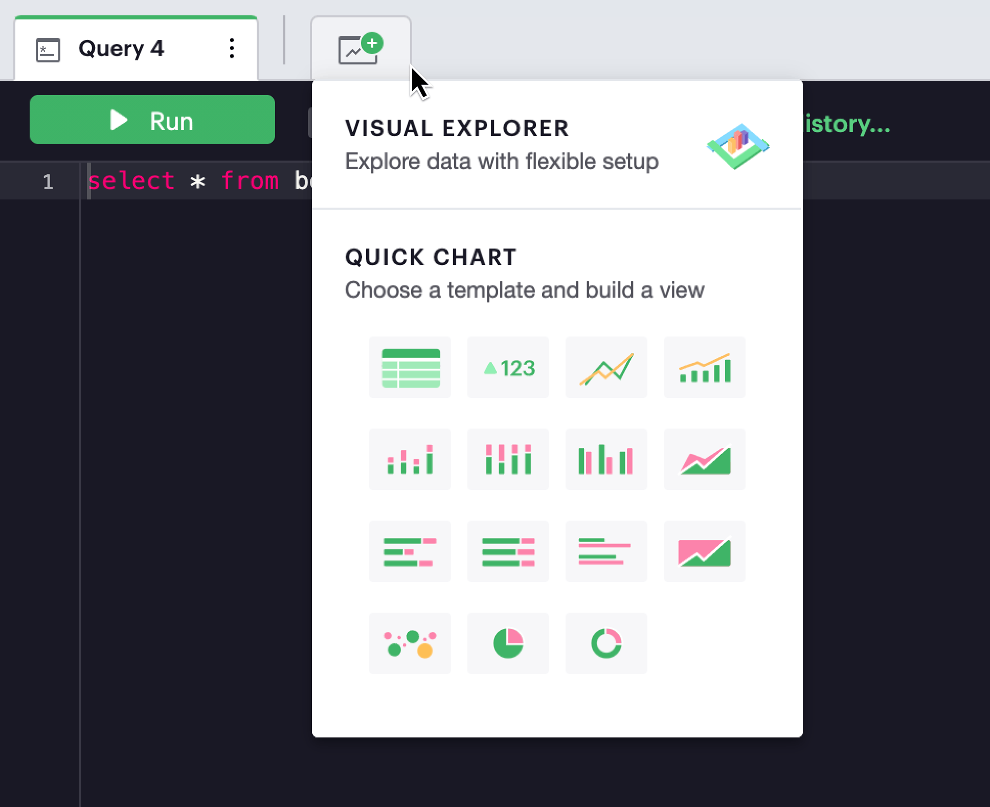
Visual Explorer
Getting Started
For those who want to explore their data visually, Visual Explorer is a more flexible and powerful alternative to our “fixed view” Quick Charts. Inspired by the layered Grammar of Graphics, Visual Explorer provides an environment where you can create and configure your visualizations based on a ruleset—a grammar, if you will. Just like how in English the word “grammar” has become synonymous with rules for the construction of readily interpretable sentences, Visual Explorer is built upon a framework that provides rules to construct readily interpretable graphics.
Consequently, there are a few key differences between the workflow within the Visual Explorer and Quick Charts environments:
-
The first question to be answered:
- Quick Charts: what chart type do you want?
- Visual Explorer: what features of your data do you want to examine?
-
The iteration process:
- Quick Charts: arrive with a starting graphic type in mind, then rebuild through until you arrive at something you like
- Visual Explorer: iterate toward your end visualization by using modular, independent components
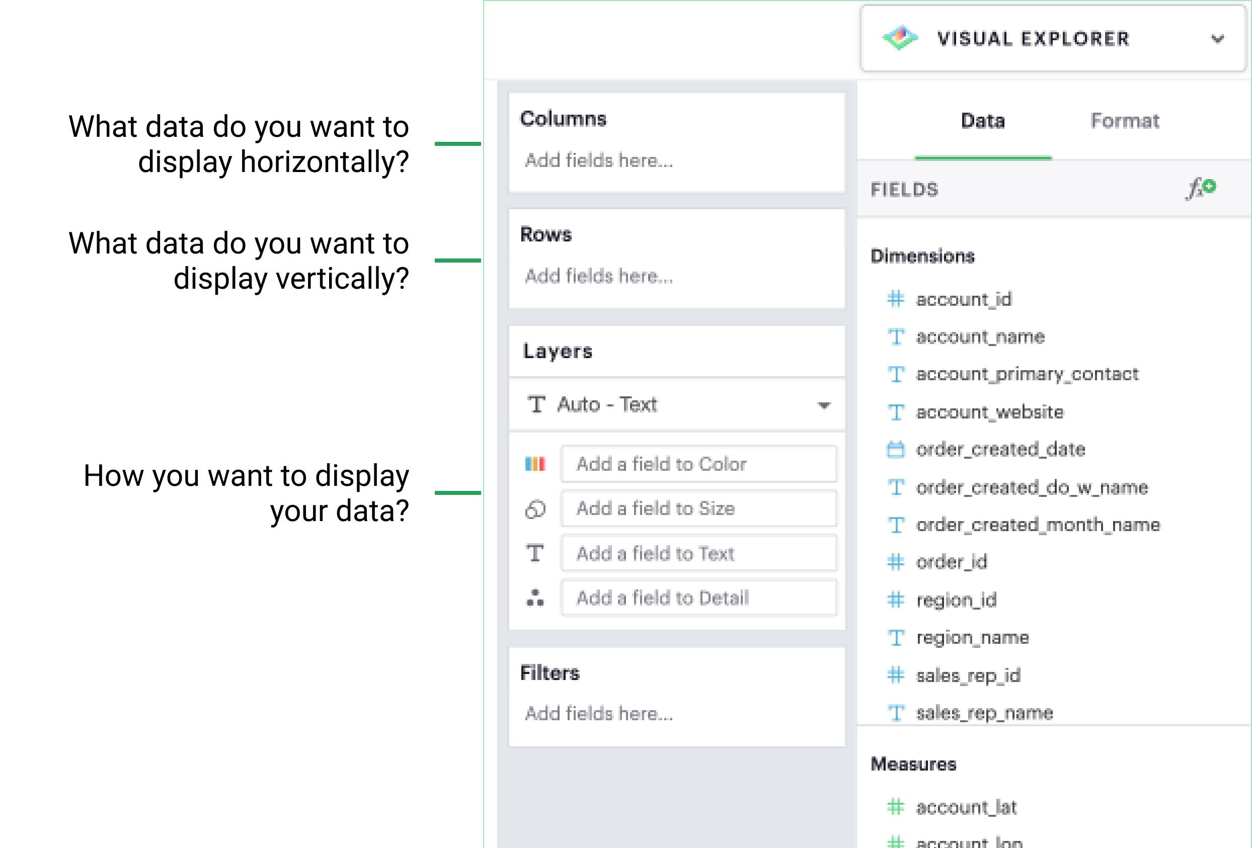
As a general principle, you can think of Columns as what data you want to display horizontally (similar to an x-axis), Rows as what data you want to display vertically (similar to a y-axis), and Layers as how you want to display your data.
Building a Simple Visualization
Adding Dimensions and Measures
If you have a multi-dimensional dataset, adding a Dimension to your Columns or Rows is a powerful starting point to begin slicing your data. Doing so, groups your visualization by categorical values, which helps you break down your data to better understand certain trends.
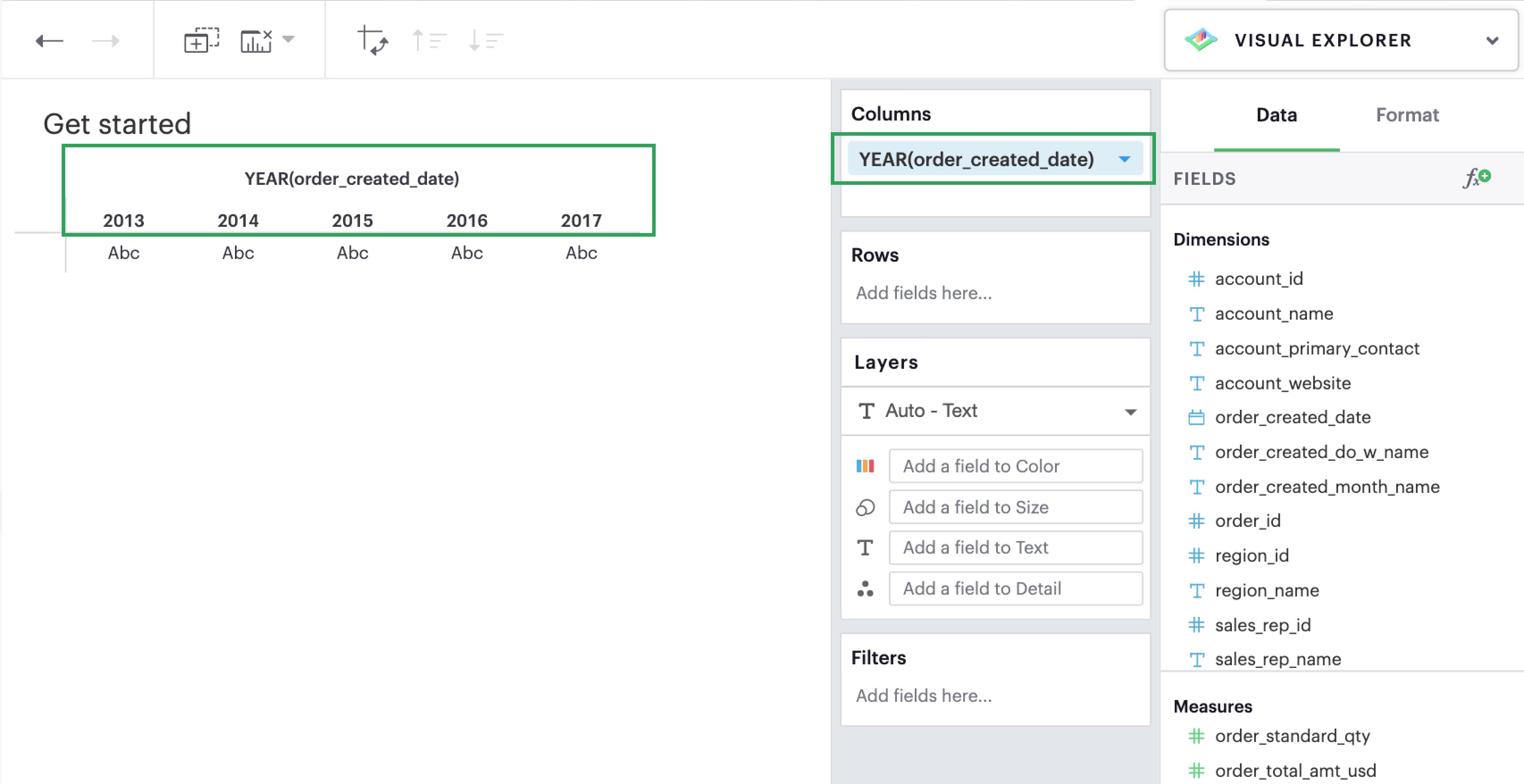
From there, you can drag and drop or use the type ahead search to add a Measure to your Rows or Columns. Measures are automatically aggregated by default when added to visualizations.
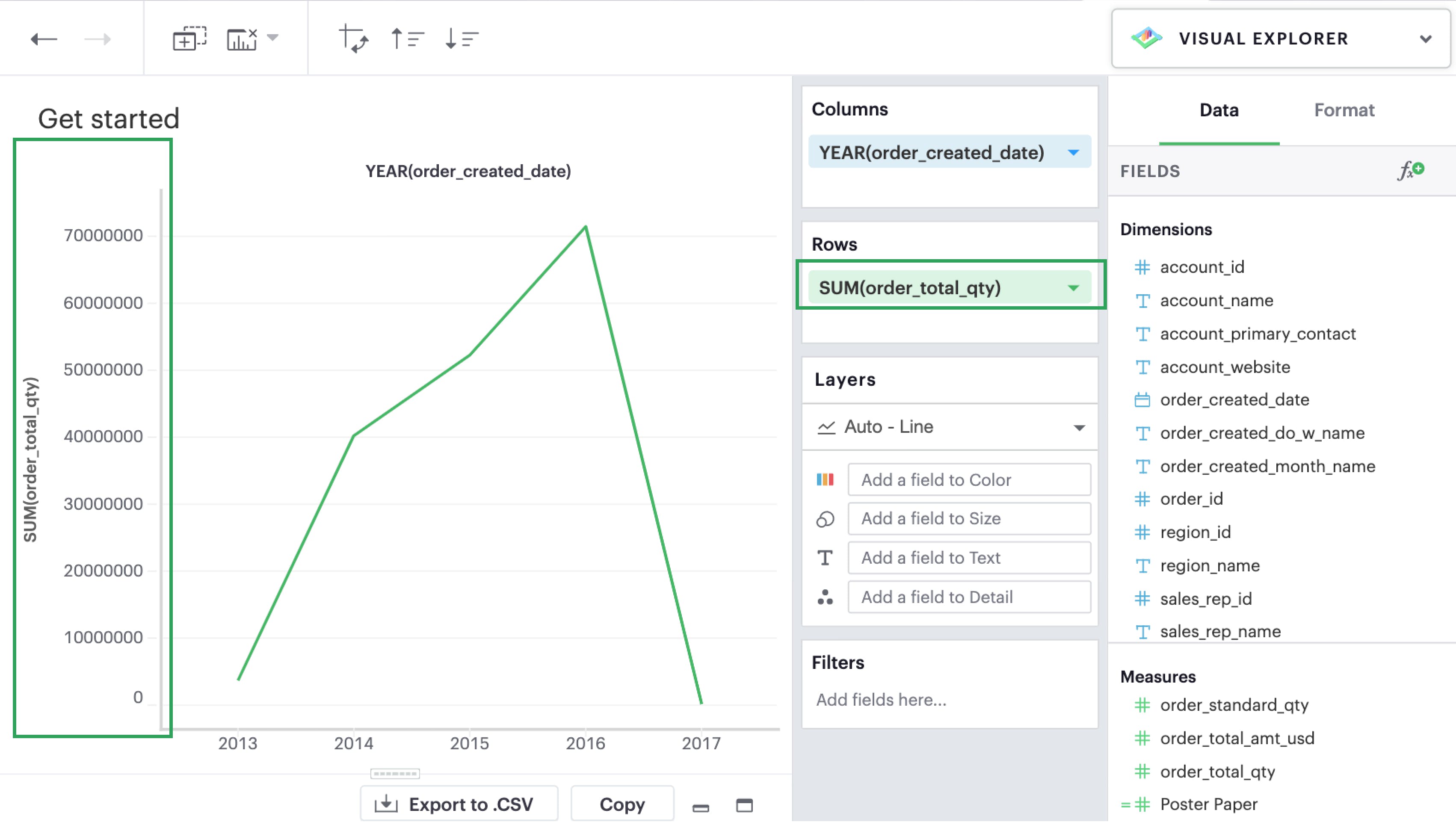
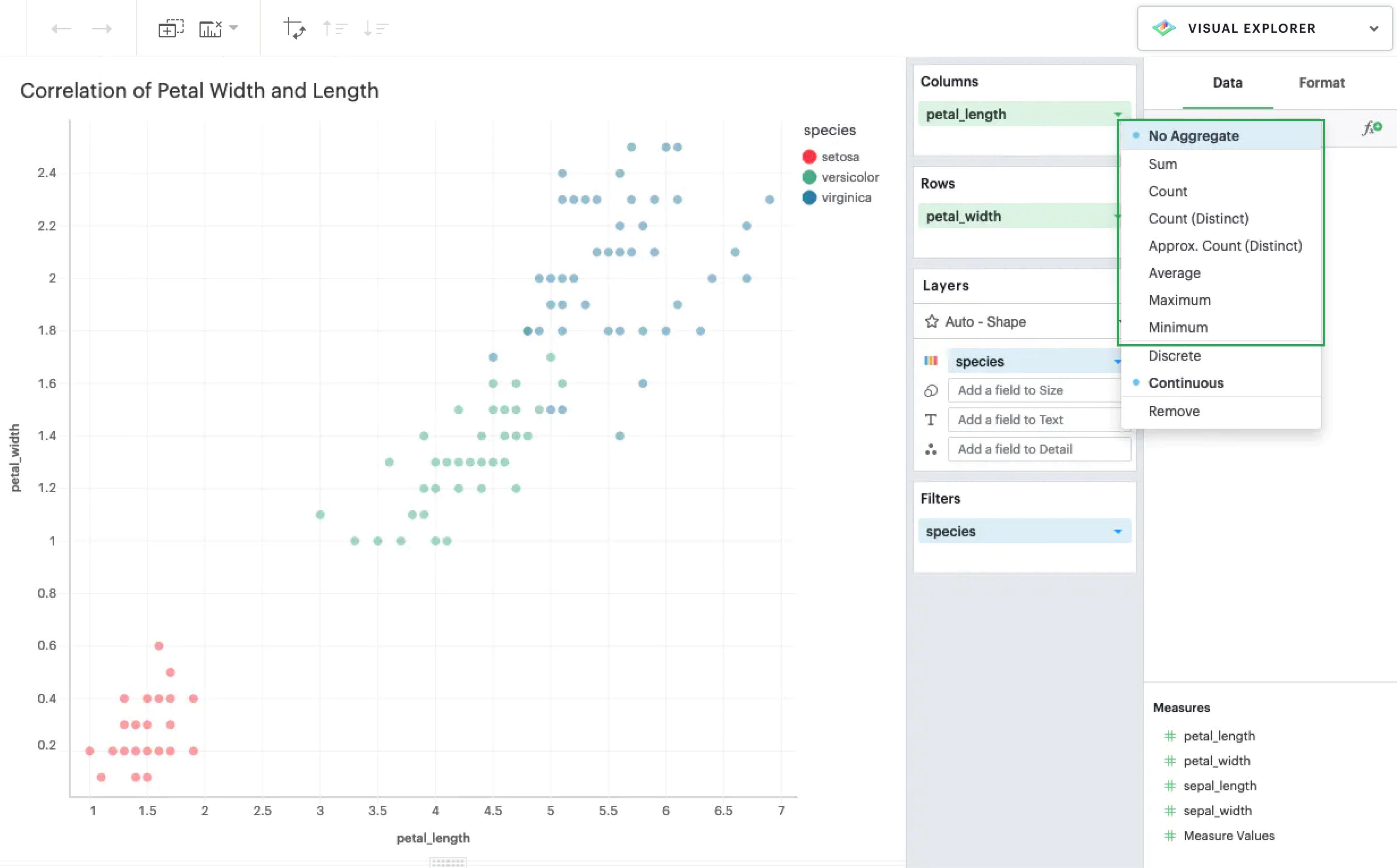
You can also choose to manually disaggregate Measures, if you want to plot specific data points on a continuous range. This is useful for numeric data that’s already meaningful without any aggregation.
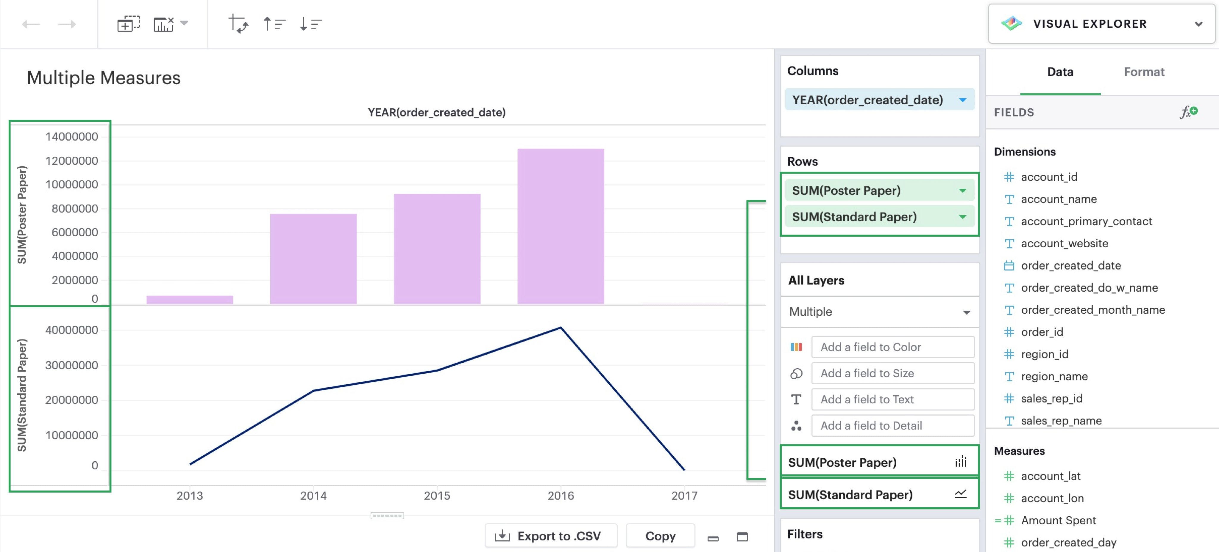
Multiple Measures
From here, you can continue to add additional Measures to your visualization if you wish. By default, every measure is plotted in its own pane because each measure introduces a new layer.
Check out our Visual Explorer field guide for a walkthrough on how to create visualizations in the Visual Explorer. There you can find possible visualizations you can build as starting points for your exploratory analysis.
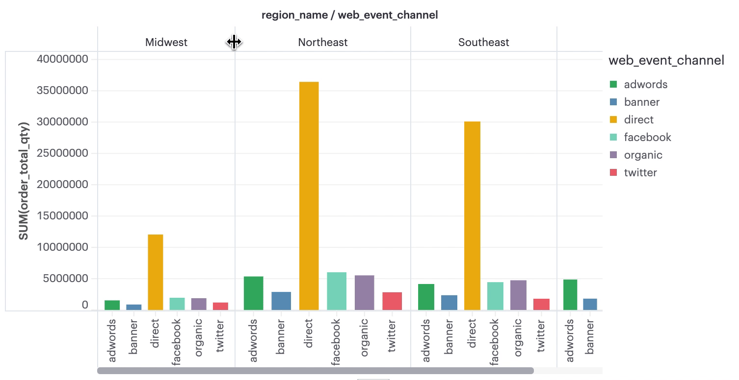
Introduce Groupings with Facets
Once you add multiple Dimensions to your Columns or Rows, your visualization will begin to nest and display facets. Nesting is a way to compare within a dimension’s values (rather than against them) and helps break down metrics across dimensions within the same plot. Think of this as equivalent to GROUP BY with multiple fields in SQL.
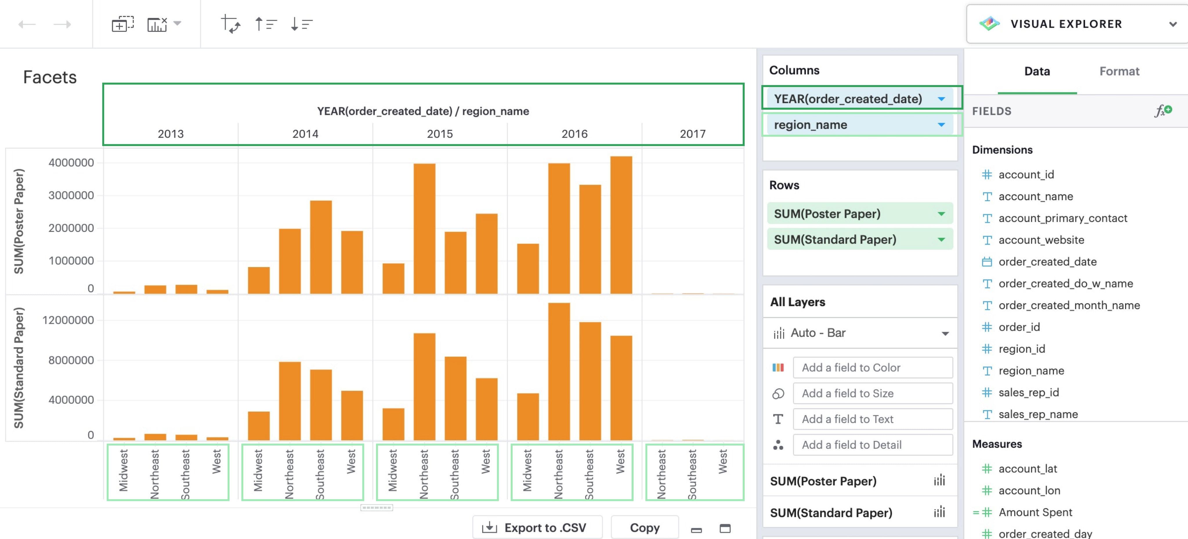
The new dimension divides the visualization into 10 panes, one for each combination of YEAR(order_created_date) and region_name.
Using Layers to Add Depth
Layers are an integral part of visual analysis because they allow you to add further context and detail to your visualizations. You can change the Layer properties of an individual measure or all measures in your visualization.
Mark Types
By default, the Mark type of your visualization will be set to Automatic — based on your configuration, Visual Explorer will try to figure out what is the optimal mark to display. The user can opt to set and change the mark type of each layer by clicking the dropdown menu to select the measure should be plotted.
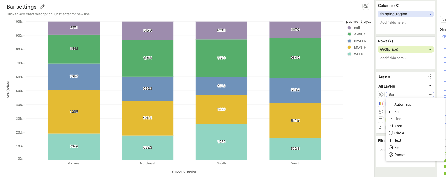
In this example, the mark type is being changed for the specific measure AVG(price).
Mark Settings
The mark settings options are available in the gear icon next to the mark type. Settings options specific to each mark type are listed below.
-
Bar Settings
- Types
-
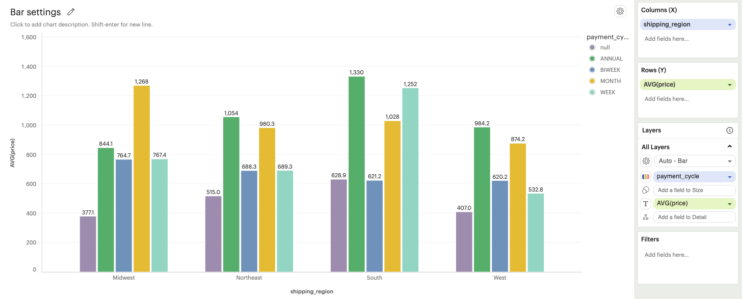
Grouped: Bars representing different categories will be displayed side by side, allowing easy visual comparison between groups.
-
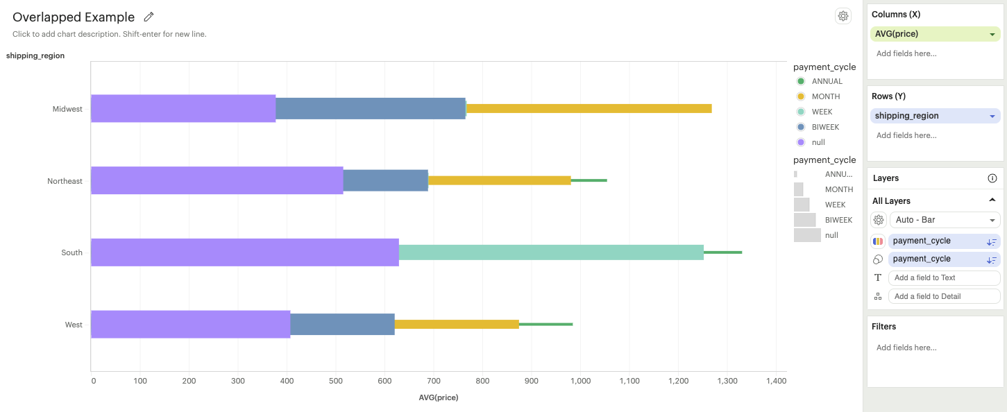
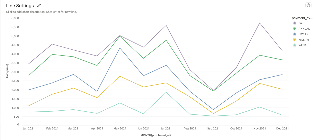
Overlapped: Bars overlap with each other. This is most useful when a field is added to the Size channel. In this example, payment_cycle has been added to the Size channel
-
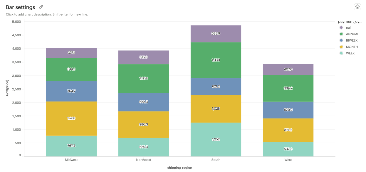
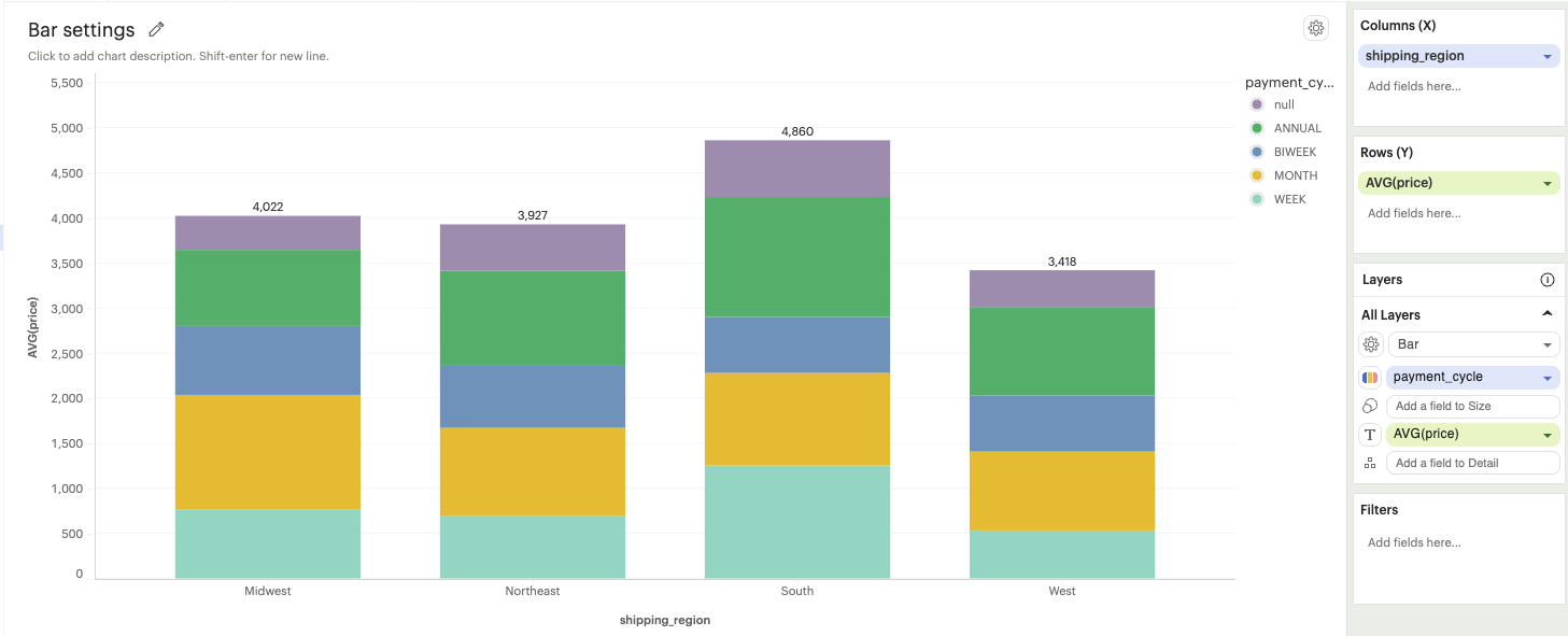
Stacked: Bars are stacked on top of each other, showcasing cumulative data for multiple categories.
-
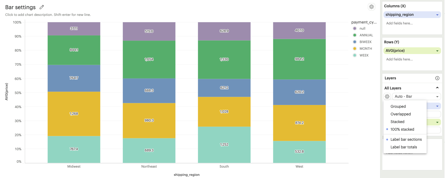
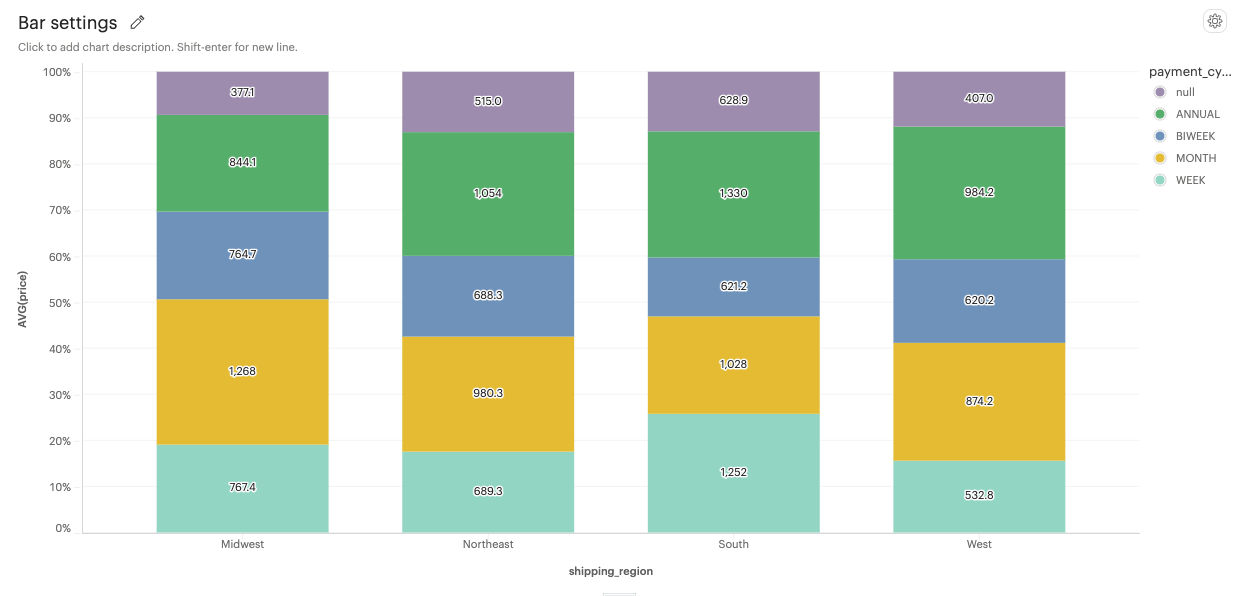
100% stacked: Bars are displayed as a percentage of the total, emphasizing the relative proportion of each category within the whole.
-
- Label options
-
Bar section: The values of individual sections within each bar are displayed.

-
Bar total: The total value of each bar is displayed on top of the bar
-
- Types
-
Line Settings
-
Types
-
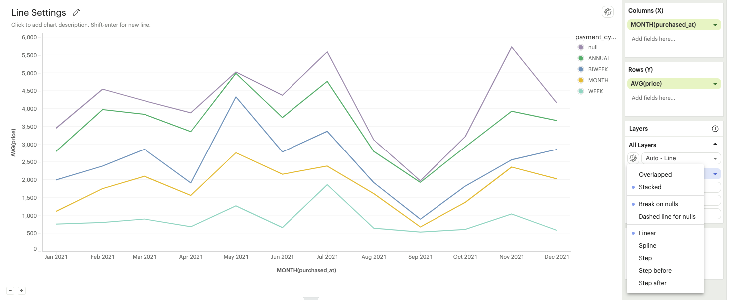
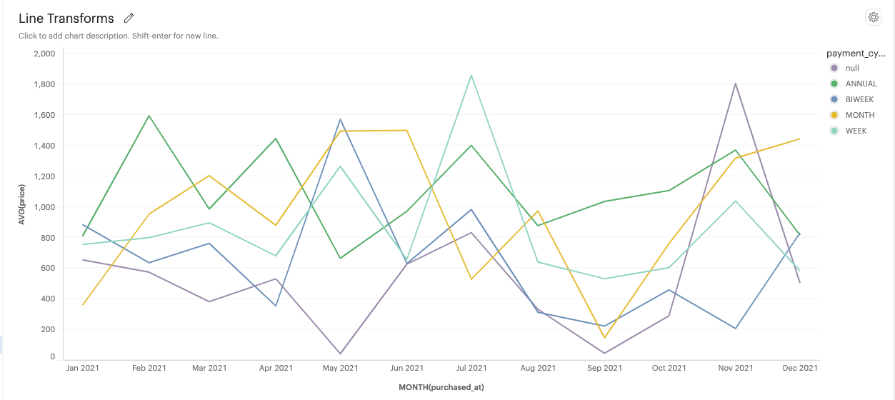
Overlapped: Multiple lines overlap each other, which can be helpful for comparing trends between different lines.
-
Stacked: Line marks will stack the lines on top of each other, showing the cumulative trend of multiple categories.
-
-
Null treatment options
-
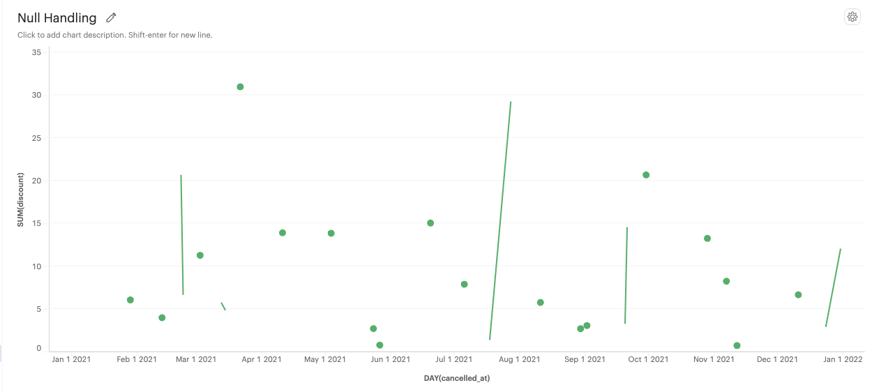
Break on nulls: Allows the line to have gaps where data points are missing
-
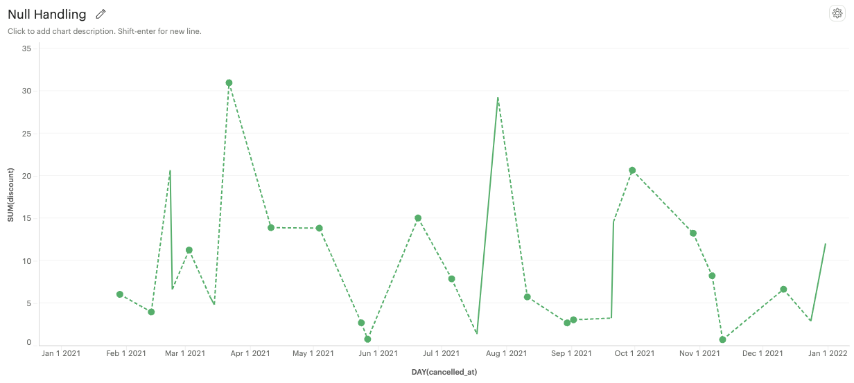
Dashed line for nulls: The line will be represented as a dashed line where data points are missing
-
-
Line interpolation options
-
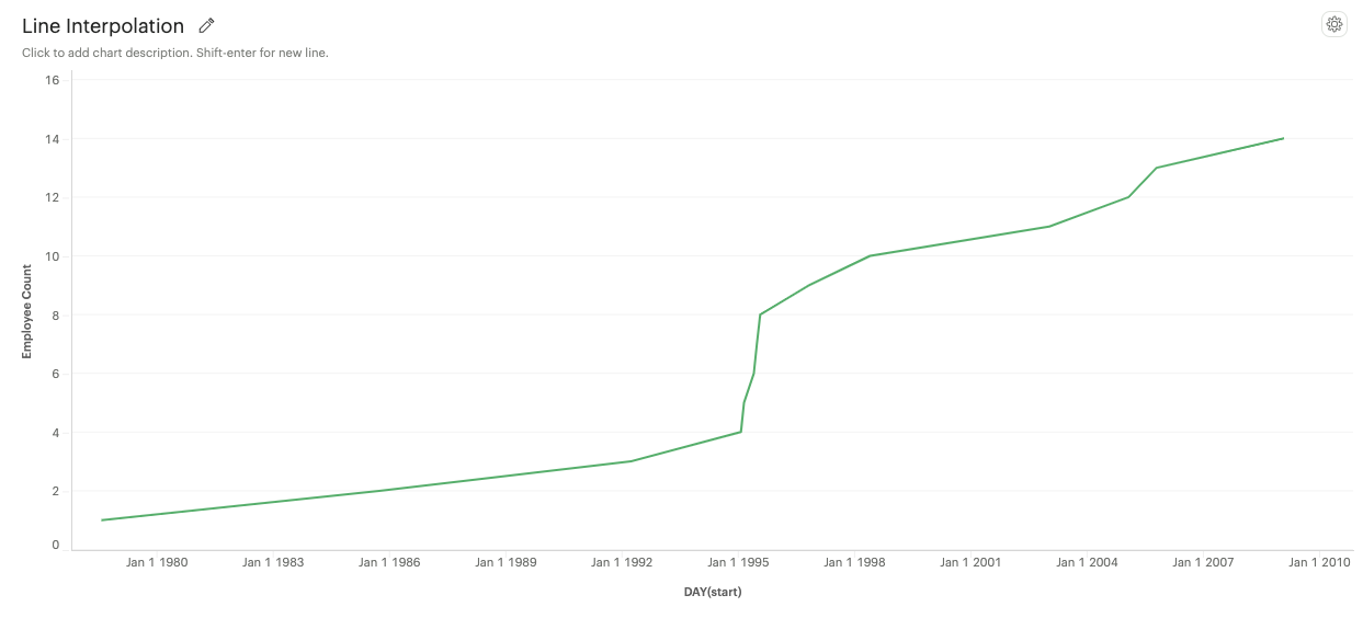
Linear: A straight line connecting data points.
-
Spline: A smooth curve connecting data points.
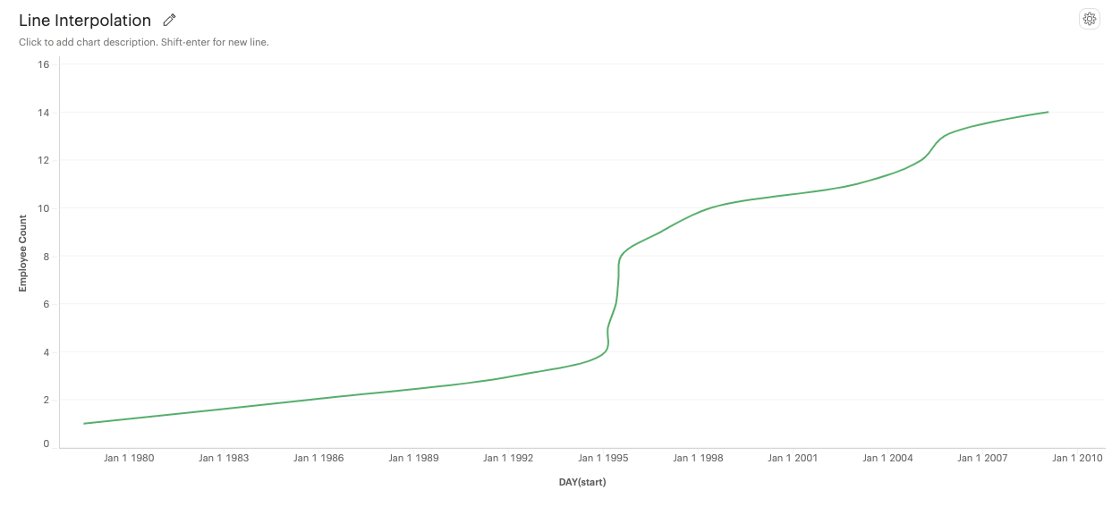
-
Step: A series of horizontal and vertical lines connecting data points.

-
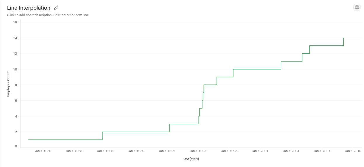
Step Before: A step line that aligns with the start of a data point.
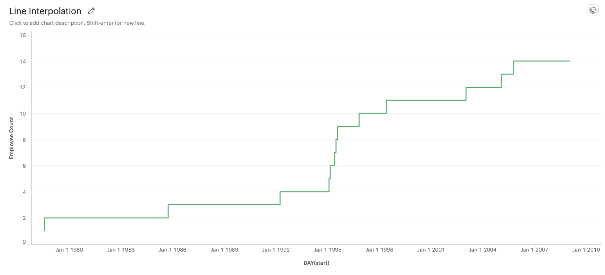
-
Step After: A step line that aligns with the end of a data point.
-
-
-
Area Settings
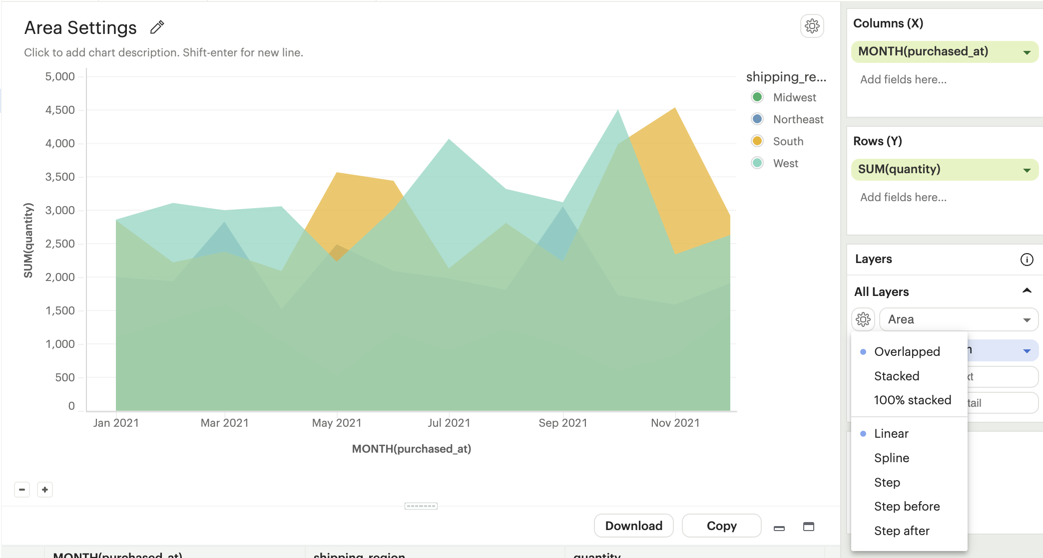
-
Types
-
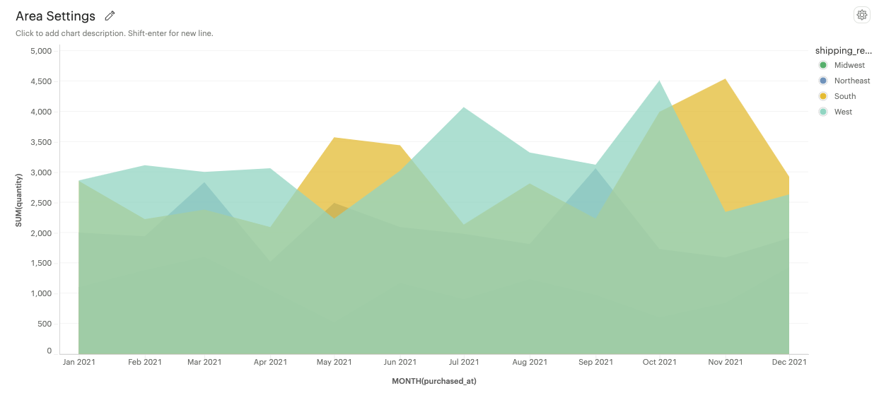
Overlapped: Areas marks overlap, allowing easy comparison of trends between different categories.
-
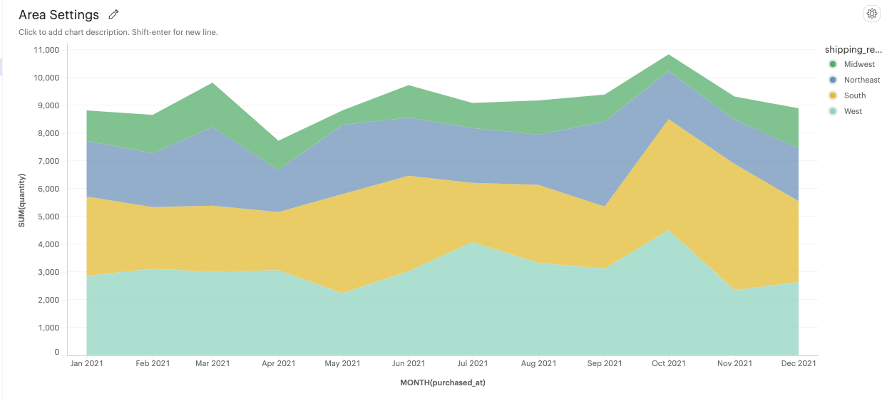
Stacked: Area marks are stacked on top of each other, showing the cumulative trend of multiple categories.
-
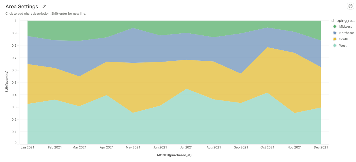
100% Stacked: Area marks are displayed as a percentage of the total, emphasizing the relative proportion of each category within the whole.
-
-
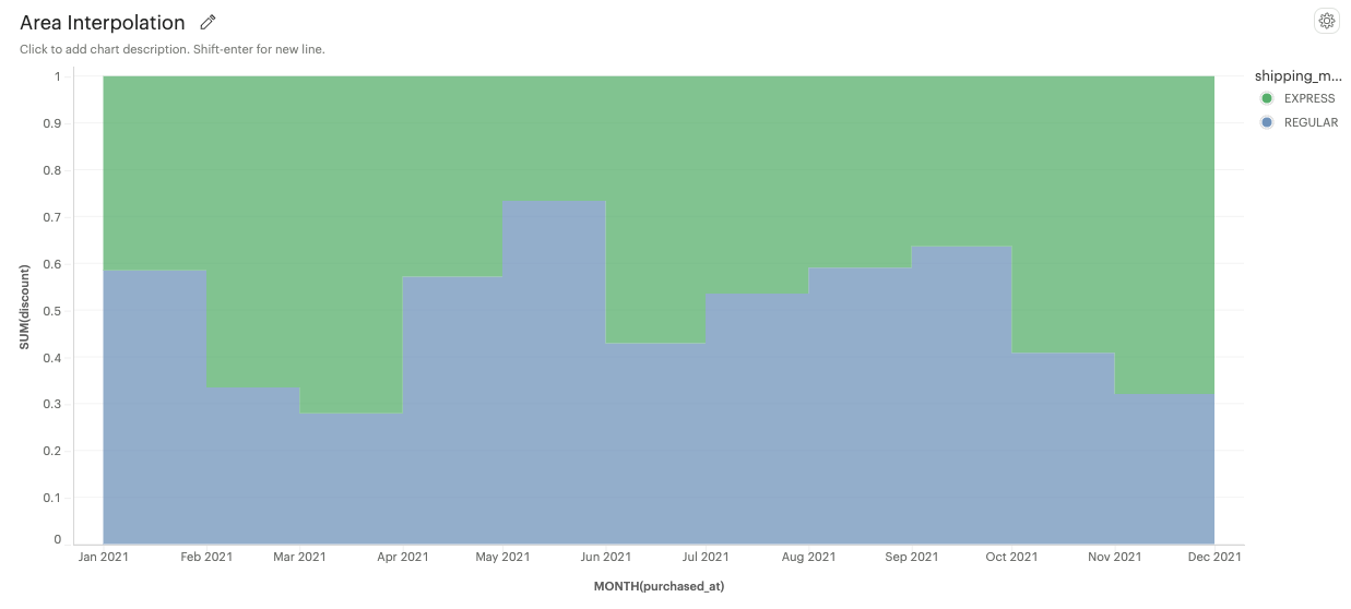
Area interpolation options
-
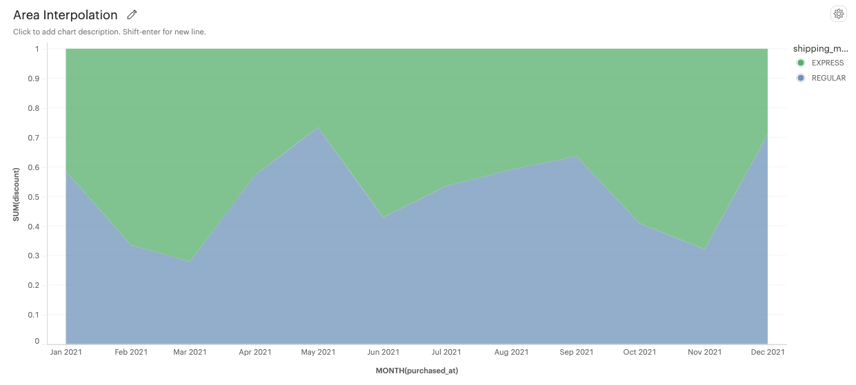
Linear: An area under a linear curve.
-
Spline: An area under a smooth curve.

-
Step: An area under a series of horizontal and vertical lines.
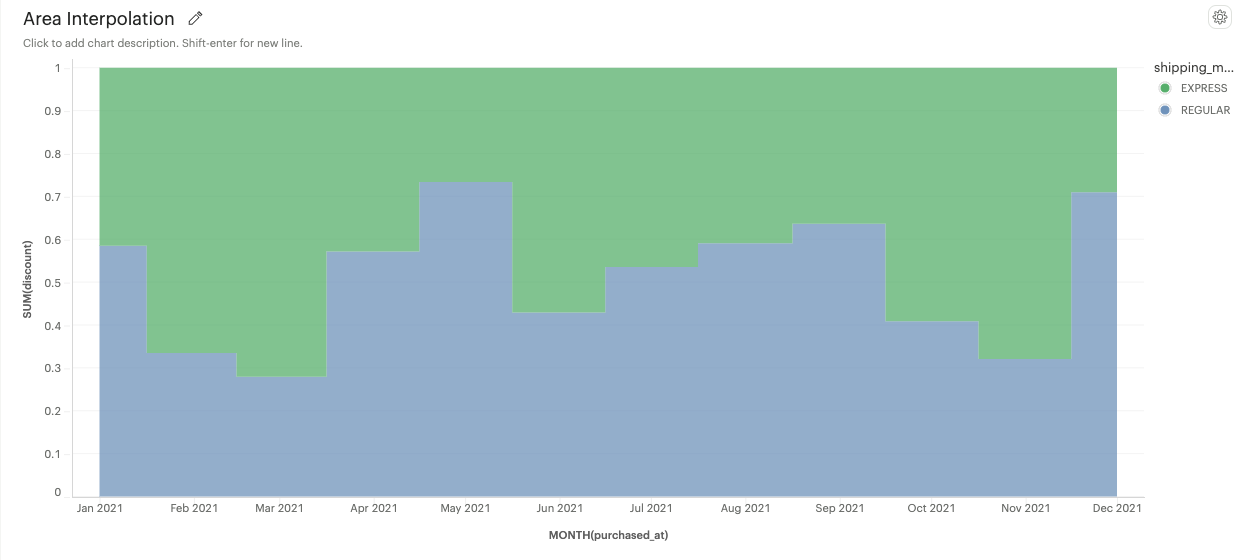
-
Step Before: An area under a step line aligned with the start of a data point.
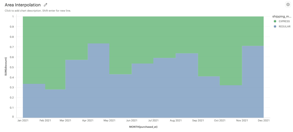
-
Step After: An area under a step line aligned with the end of a data point.
-
-
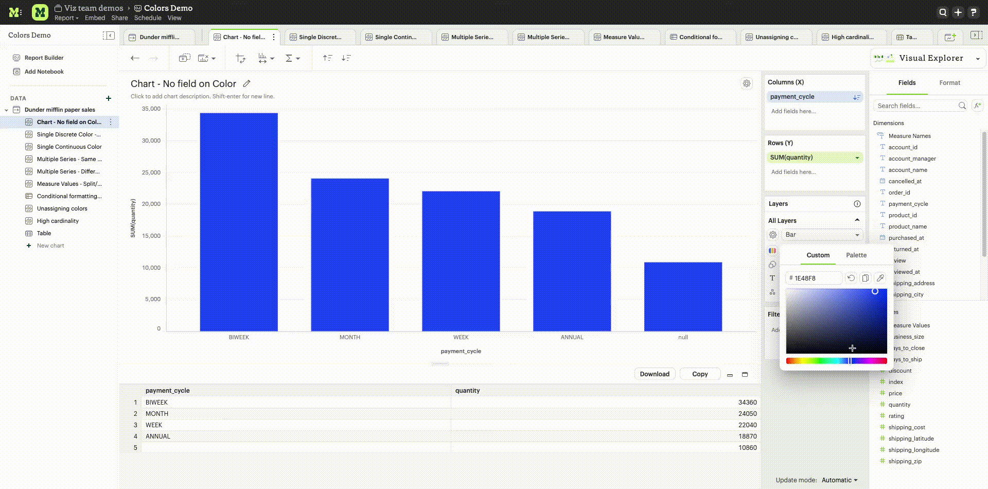
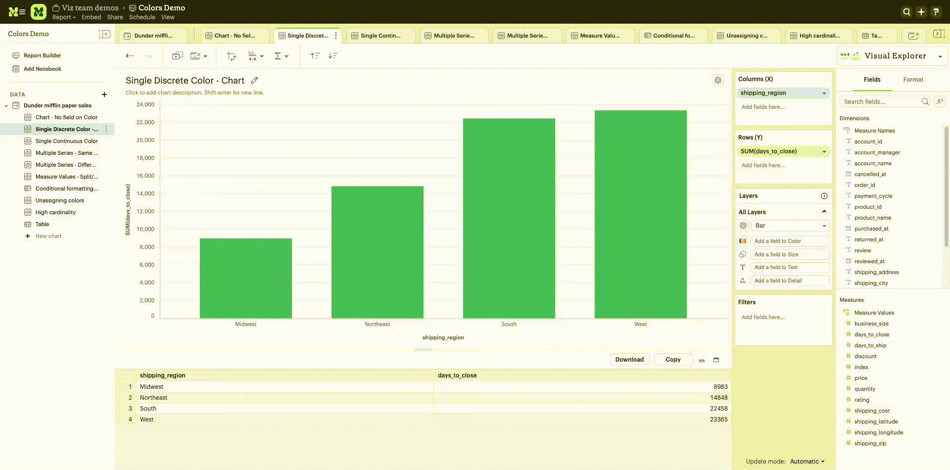
Color
When there is no specific field to color the chart by, a single default color is applied to the chart. This default color can be modified by clicking the "Edit Colors" icon.
Coloring by Dimensions
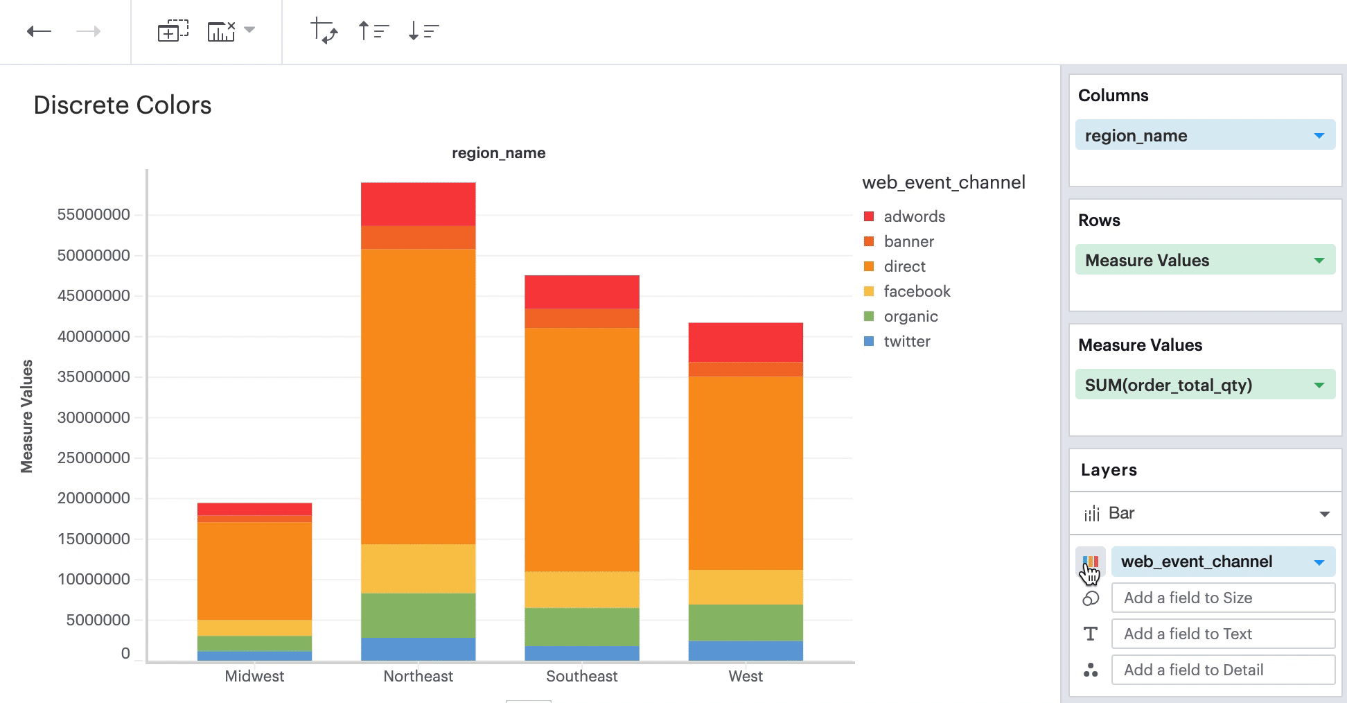
When you add a Dimension to the Color channel by dragging and dropping or using the type-ahead search, the Measure in the chart is sliced, and each value in the Dimension is represented by a different color in your chosen palette. The colors assigned to a specific value can be customized by clicking on the color swatch.
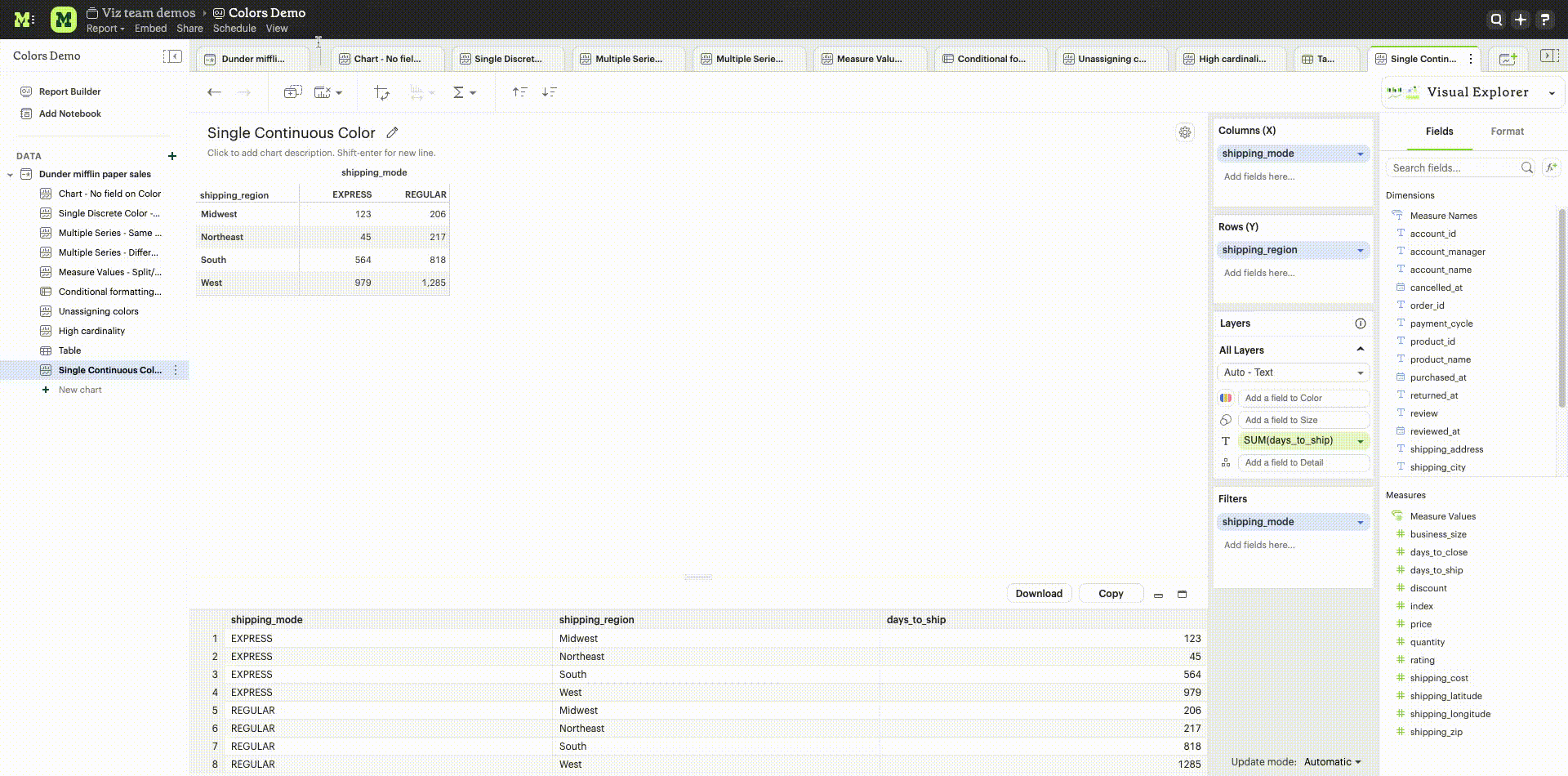
Coloring by Measures
Measures can also be added to the Color channel by dragging and dropping or using the type ahead search. This will produce a color gradient with the minimum and maximum values of that Measure based on the grouping in your visualization.
-
Color customization: The default sequential color palette can be changed to another sequential or diverging palette. The starting, ending and middle color of the diverging color ramp and the starting and ending color of the sequential color ramp can be customized. The colors in the sequential and diverging color ramp can also be reversed.
-
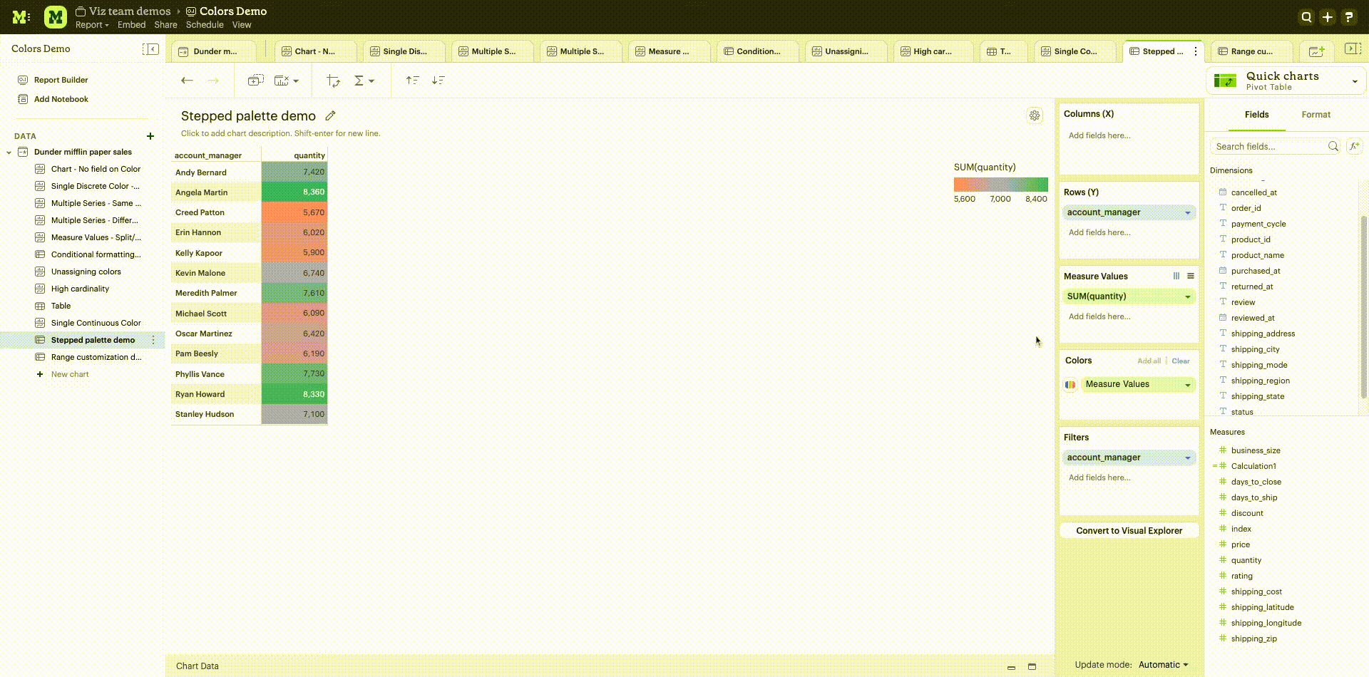
Stepped palette: A continuous sequential or diverging palette can be divided into “steps” by clicking on +/- controls to reduce cognitive load and enhance data clarity. A maximum of seven steps can be created.
-
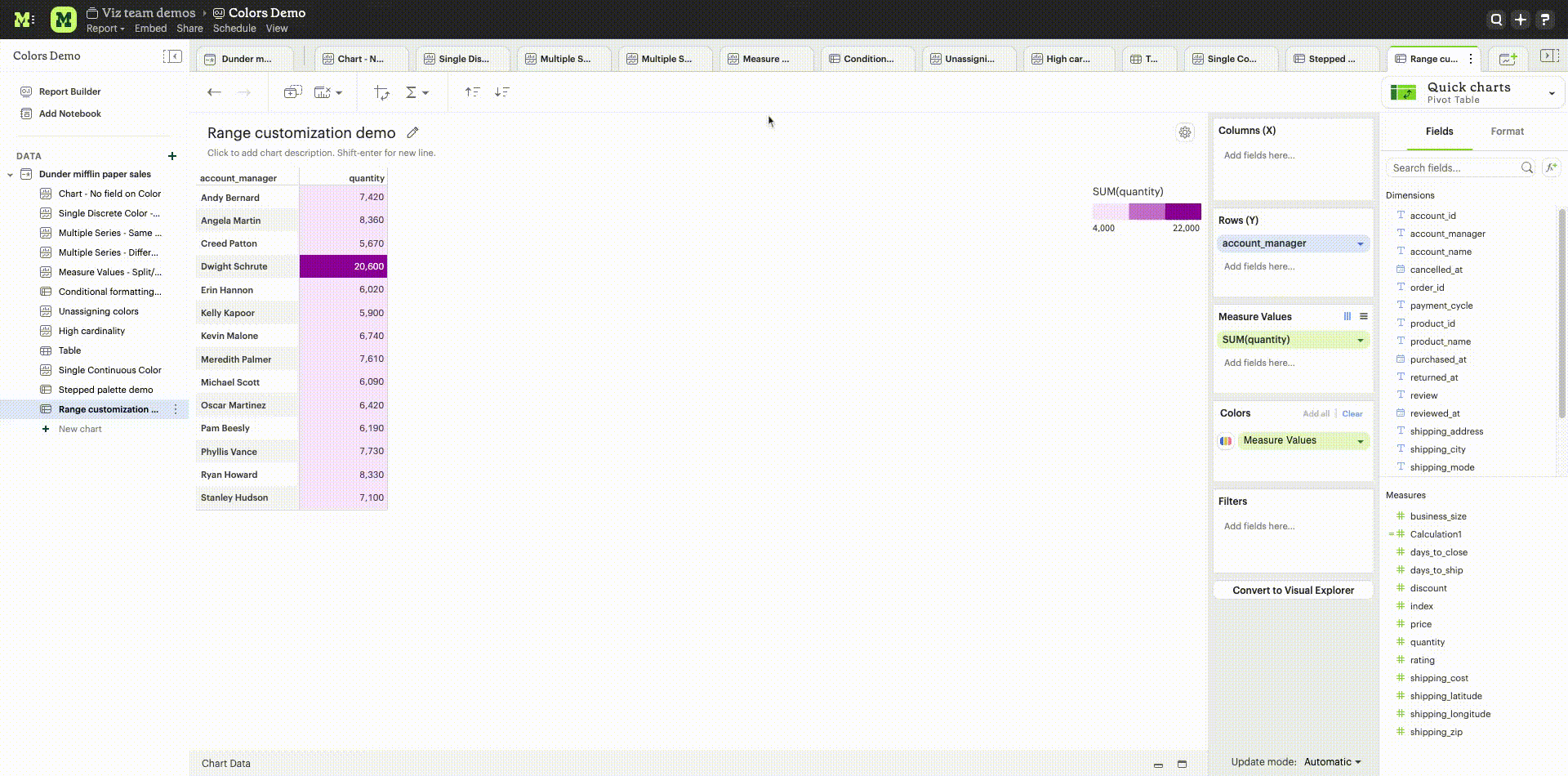
Range customization: Data boundaries (min, mid and max values) for the sequential/diverging color ramp can be set to define meaningful thresholds or intervals that match data characteristics and highlight values of interest.
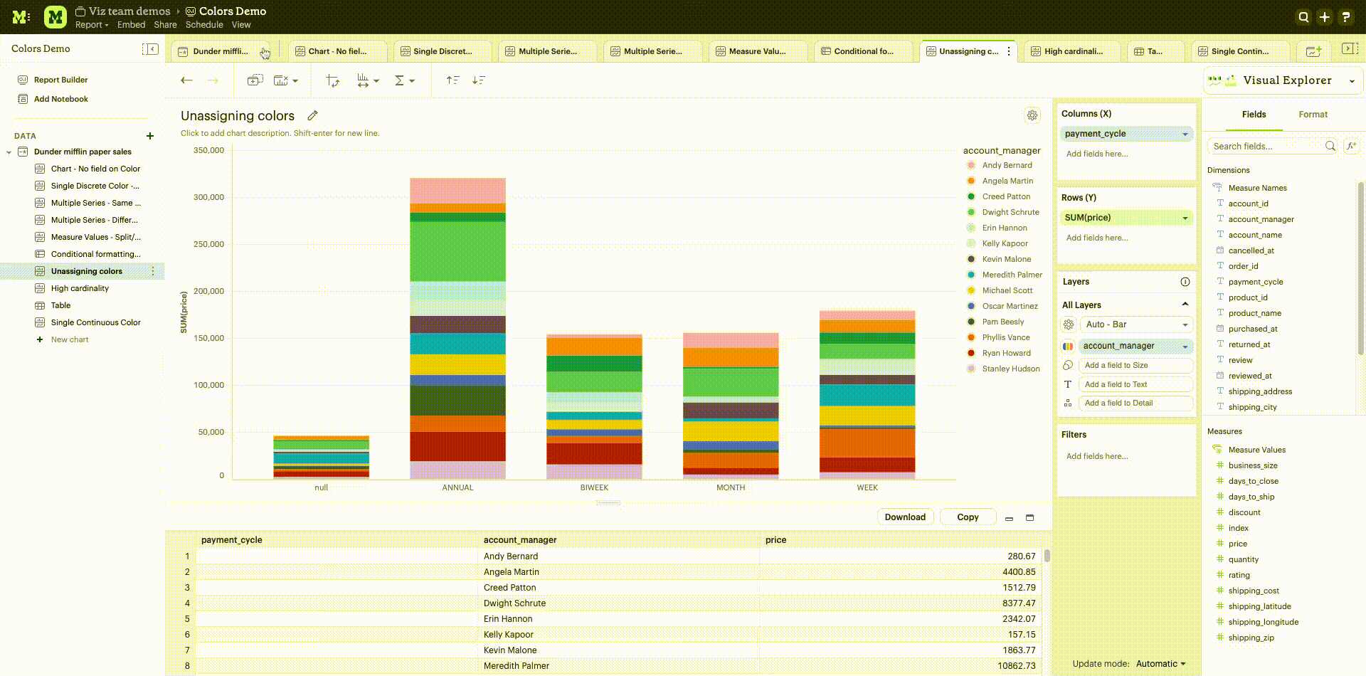
Unassigning colors
Colors assigned to a specific value can be ‘unassigned’ if needed. When a value is unassigned, it will be colored using a neutral color (default is light grey). The unassigned values color can be customized by clicking on the color swatch. The user can unassign by right clicking on a value. Bulk unassigning values is possible by using shift + right click. Re-assigning colors to a value is possible by clicking on the color swatch next to the value. There is no option to bulk assign.
High cardinality
When a field added to the colors channel has high cardinality (> 250 values), we will default assign palette colors to the first 250 values in the list. All values past the first 250 will be assigned a neutral color. The user has the option to unassign colors to values for which a palette color has been assigned or manually assign/re-assign colors by clicking on the color swatch next to a value.
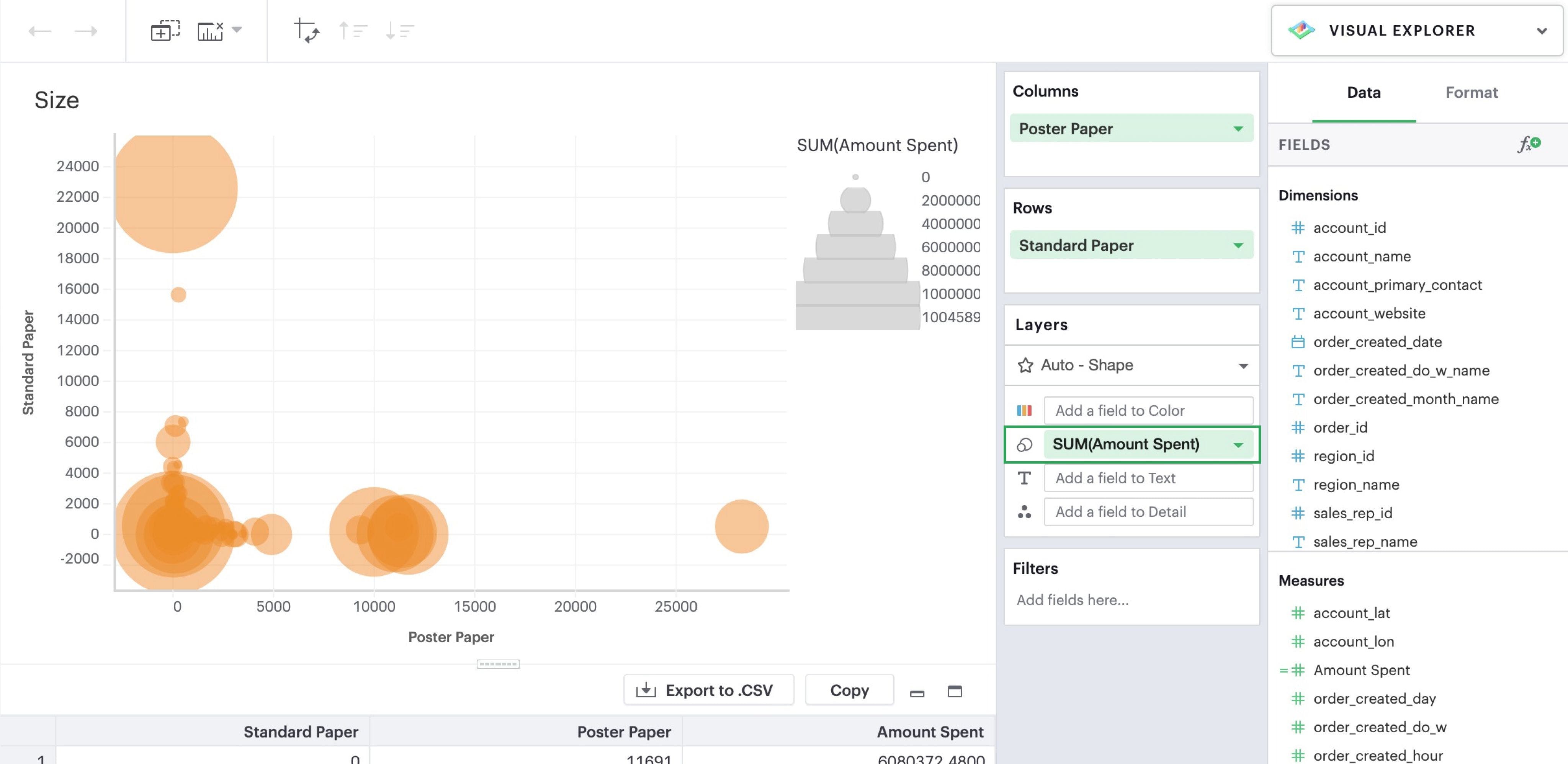
Size
Adding a continuous numeric Measure to the Size channel by dragging and dropping or using the type ahead search will reflect the value of that measure in the width of every mark in that particular layer. This is commonly used in bubble charts to provide additional information about data points relative to each other.
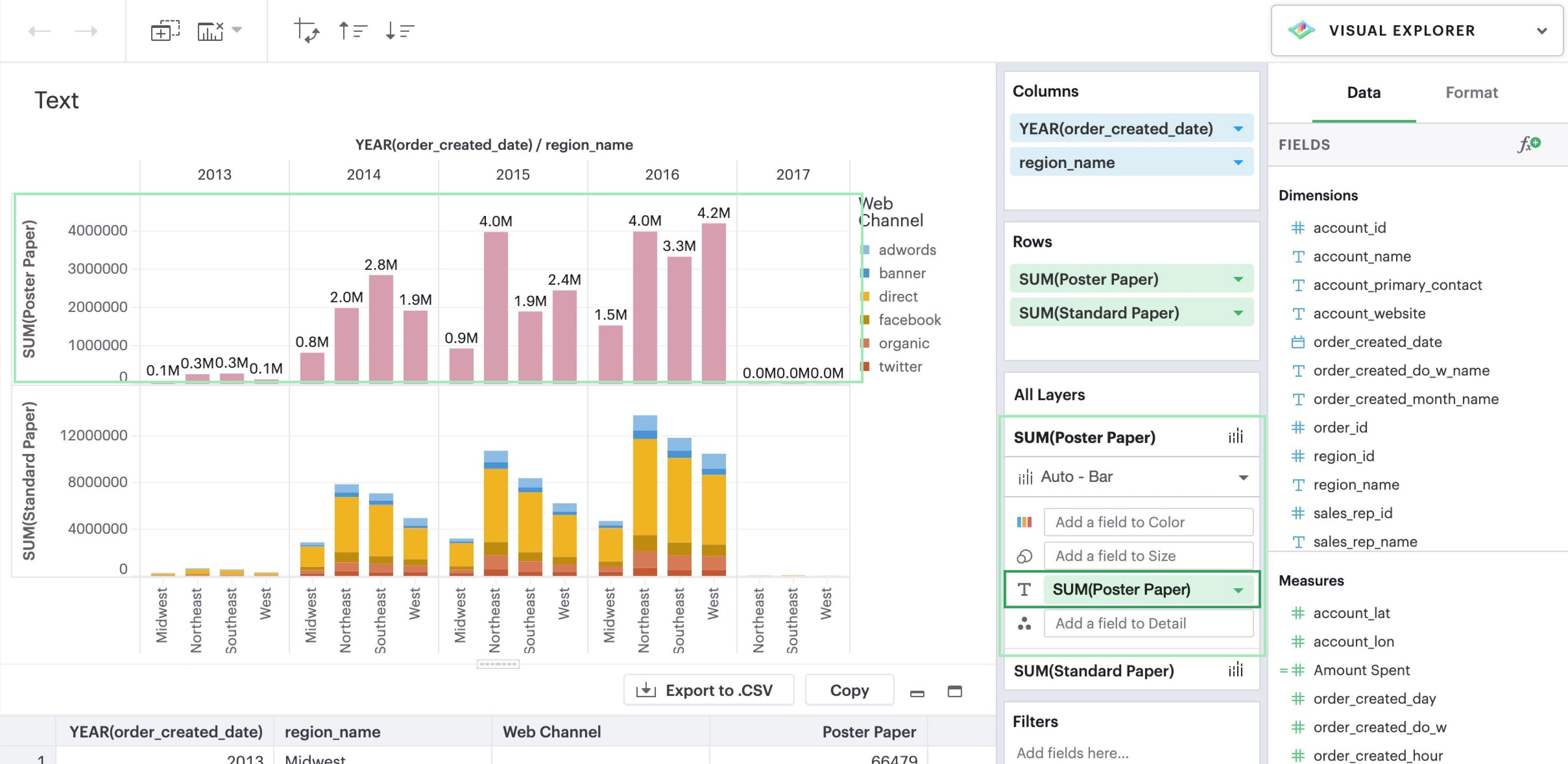
Text
Adding a field to the Text channel by dragging and dropping or using the type ahead search will display text on your visualization. This will display a text data value for every mark in that particular layer.
Detail
Like Color, when you drop a dimension onto the Detail dropzone, the marks in your visualization will be separated according to the values within that dimension. But unlike dropping a dimension on Rows or Columns, adding fields to Detail is a way to show more data without changing the table structure. However, they will appear in tooltips upon hover.
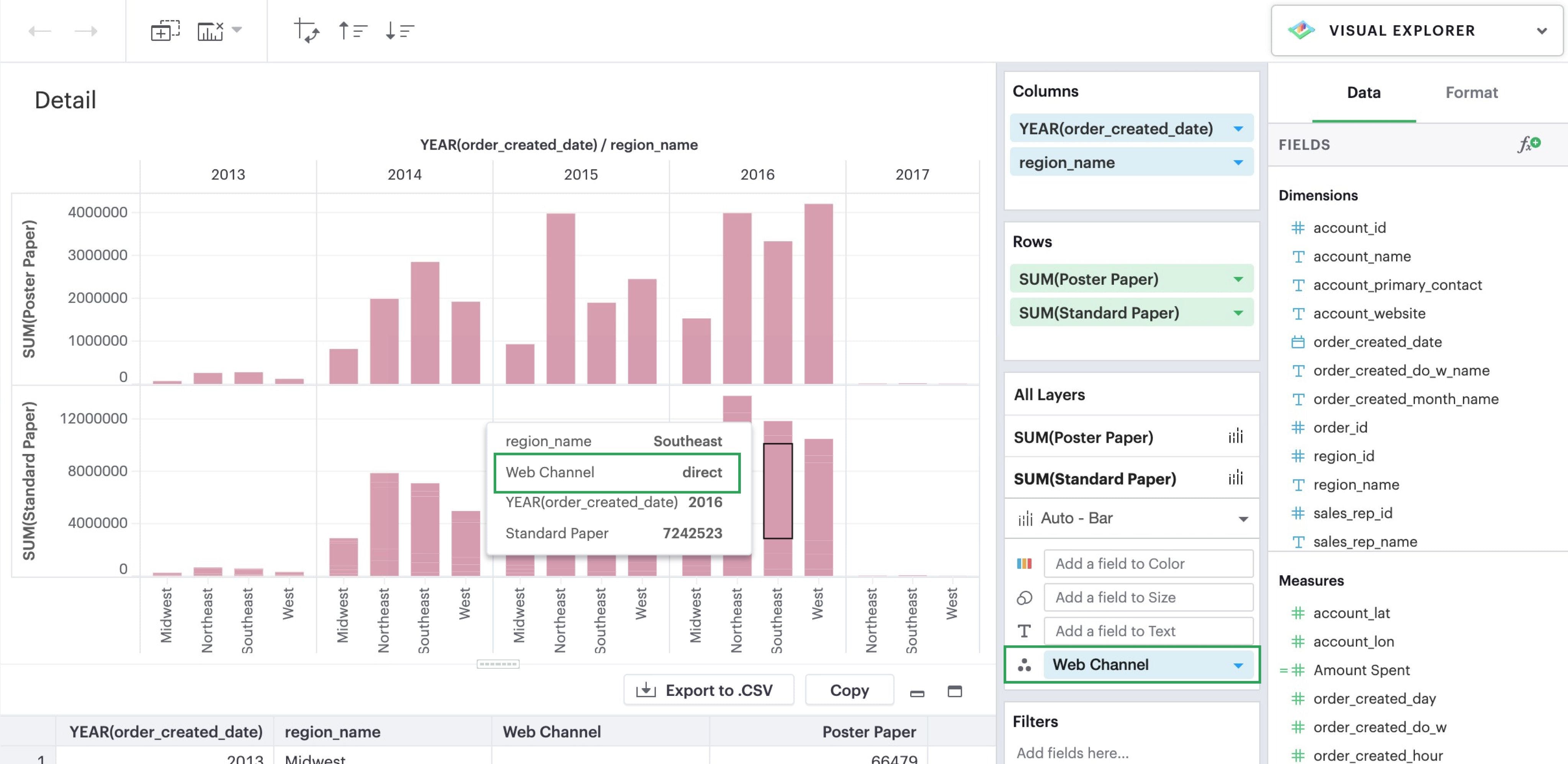
The grouping in Detail will also be factored into your calculations when you use window functions or Quick table calculations.
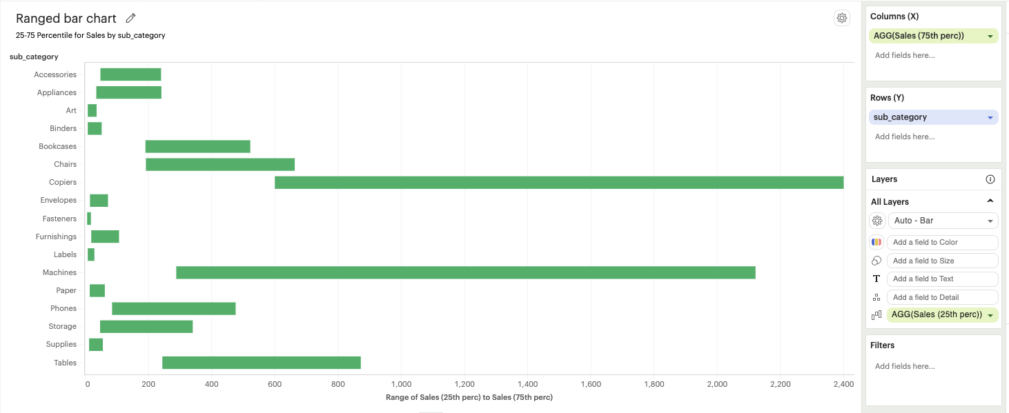
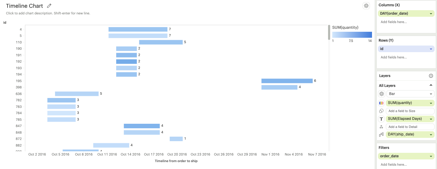
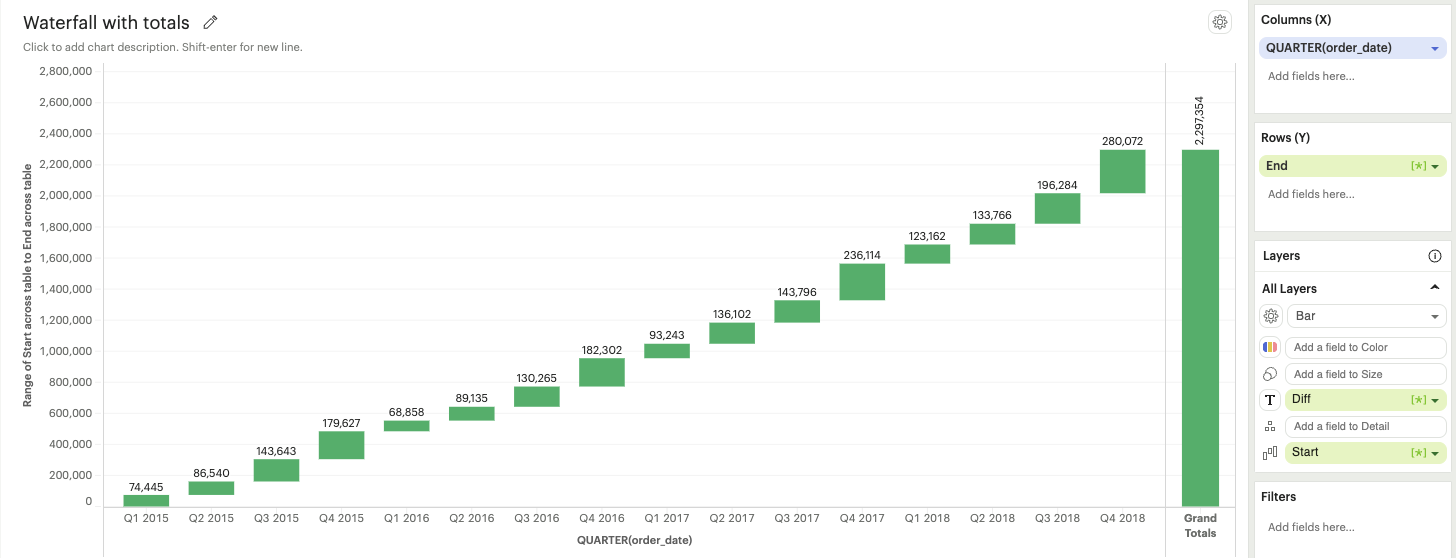
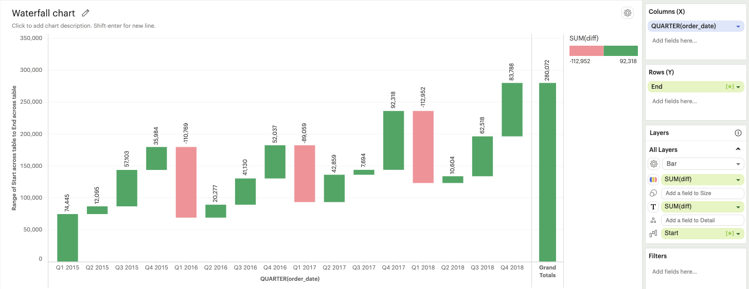
Baseline
The baseline channel is exclusively applicable to bar and area mark types. It determines the starting point of the bar or area mark. This option is particularly useful for creating timeline and waterfall charts, as shown in the screenshots below.
Building Visualizations with Multiple Measures
Measure Names and Measure Values are always available in the fields list. Unlike the other fields, they do not directly come from your dataset but are rather provided by the Visual Explorer for you to define a group of measures in your visualization.
- Measure Values contains the values of all the measures in the Measure Values shelf, collected into a single field with continuous values.
- Measure Names contains the names of all the measures in the Measure Values shelf, collected into a single field with discrete values.
By default, Measure Names and Measure Values will be empty variables for you to fill.
The combination of these two fields allow you to build certain types of views that involve multiple measures. As you’ll begin to see in some our our example configurations, Measure Names and Measure Values are integral pieces to build certain visualizations.
The Measure Values Shelf
Once you add Measure Values anywhere in your visualization configuration, a Measure Values shelf will show up for you to add your measures.
Unlike adding measures directly to Columns or Rows, this technique plots all measures in the Values dropzone in the same view.
Multiple Measures in a View
There are several ways to graph multiple measures in one view:
- Create one axis for each measure
- Blend two measures to share on axis
- Set to measures on a dual axis
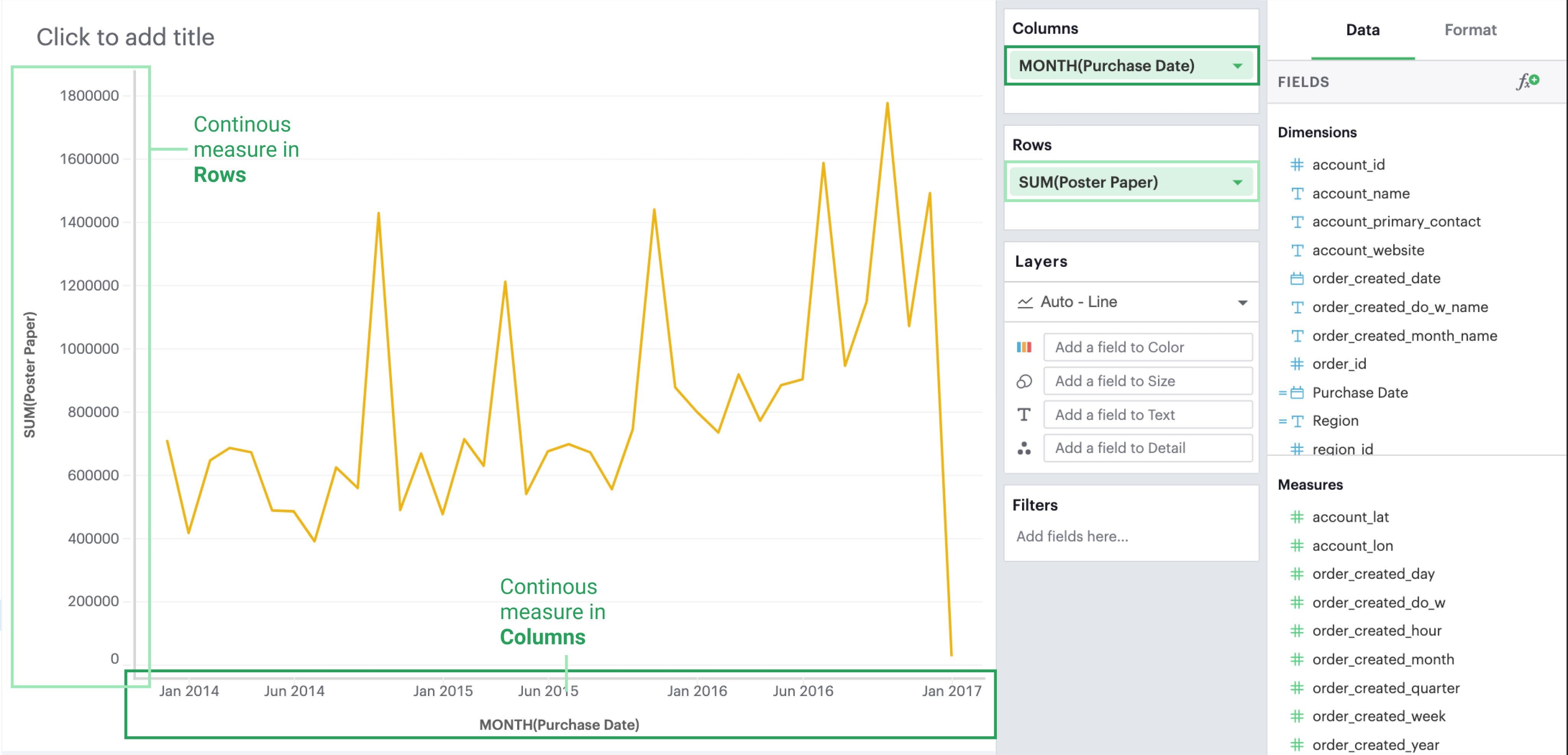
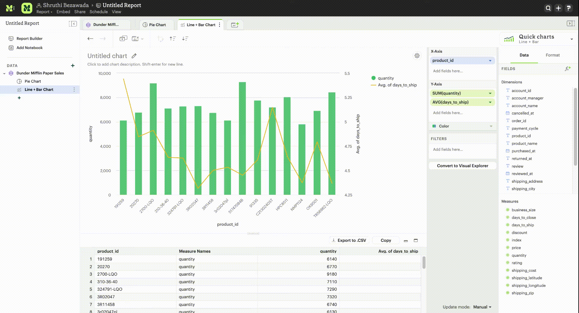
One Axis for Each Measure
By default, each measure gets its own axis when you add measures directly to either Rows or Columns.
- Adding a measure to Columns will create a new axis along the x-axis
- Adding a measure to Rows will create a new axis along the y-axis
In the example below, we have one measure in Rows and another measure in Columns. Compare that to the resulting visualization.
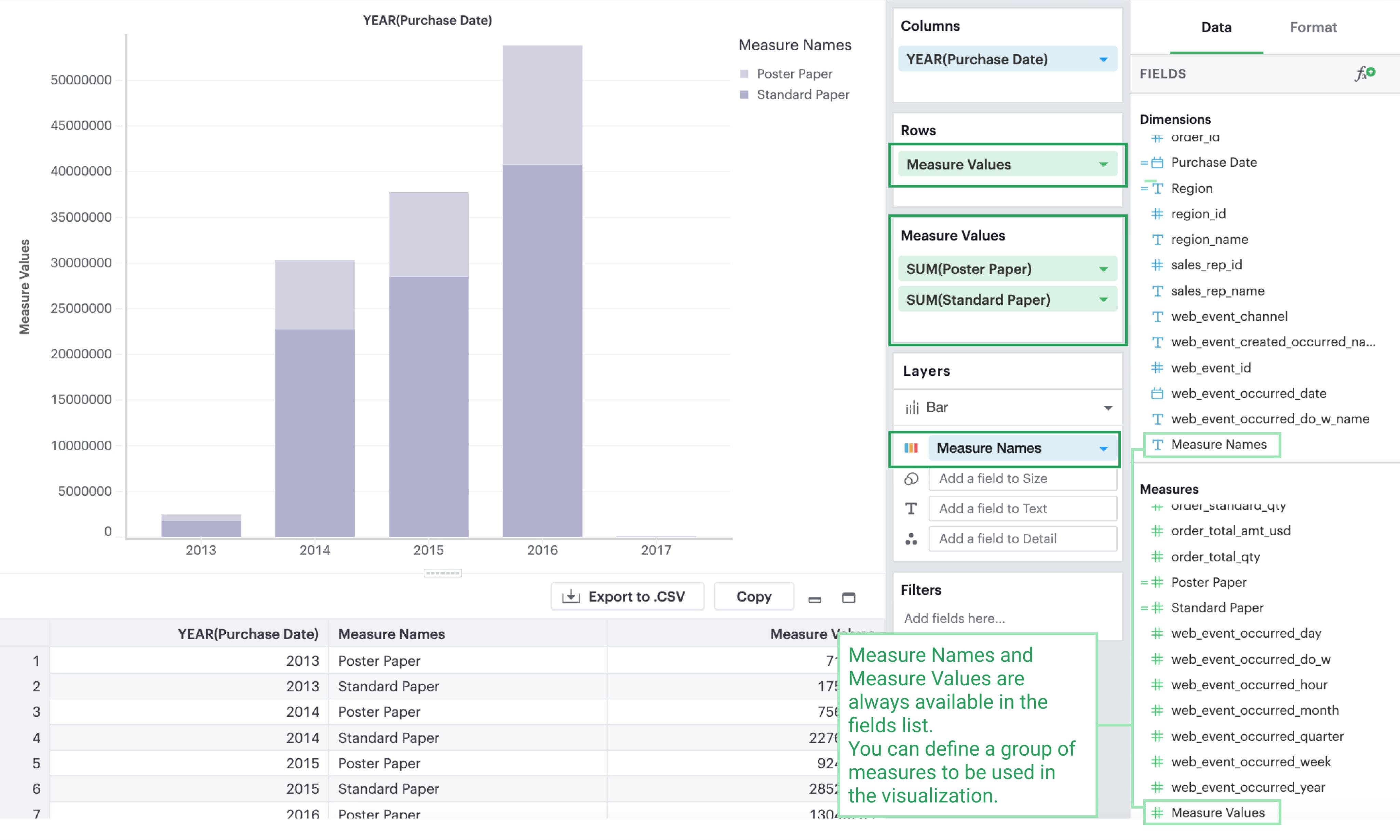
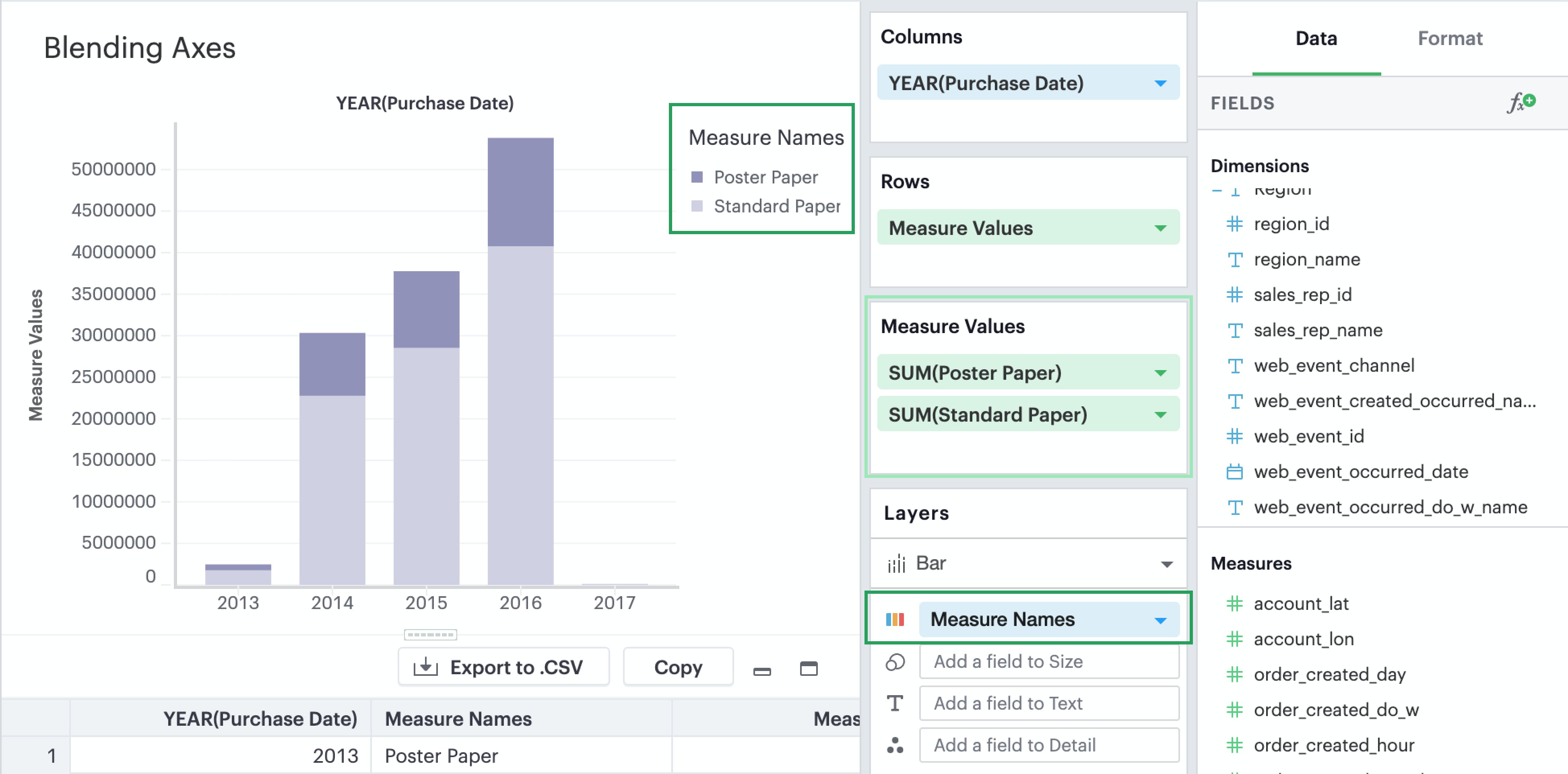
Blending Axes
If you want multiple measures to be in the same pane and axis, you’ll want to leverage Measure Values and Measure Names.
- Drag and drop or use the type ahead search to add
Measure Valuesto either Rows or Columns—whichever axis you want your measures to be on.
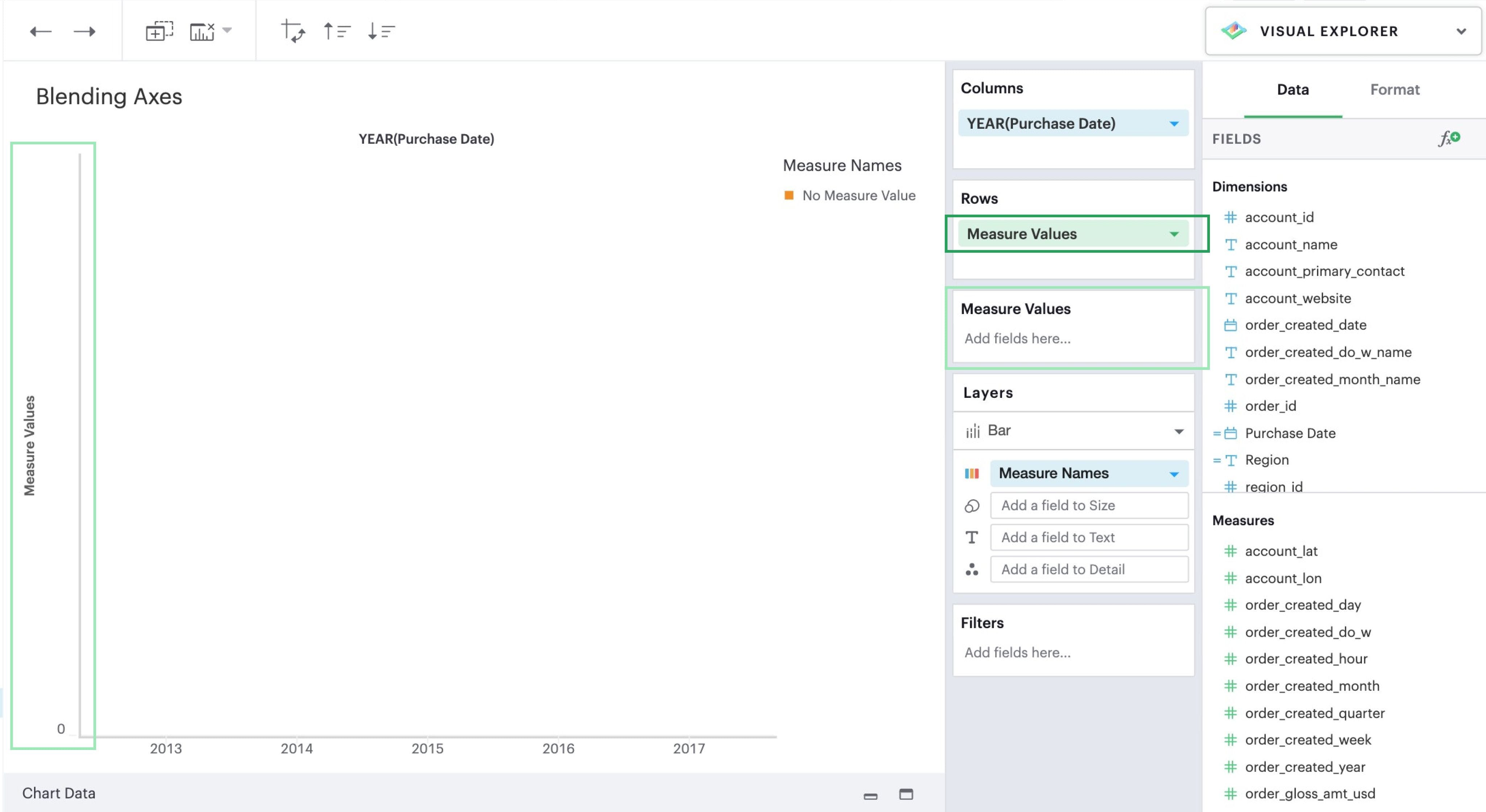
- You’ll now see that a new
Measure Valuesshelf has appeared. This is where you will add the measures you wish to include in your visualization.
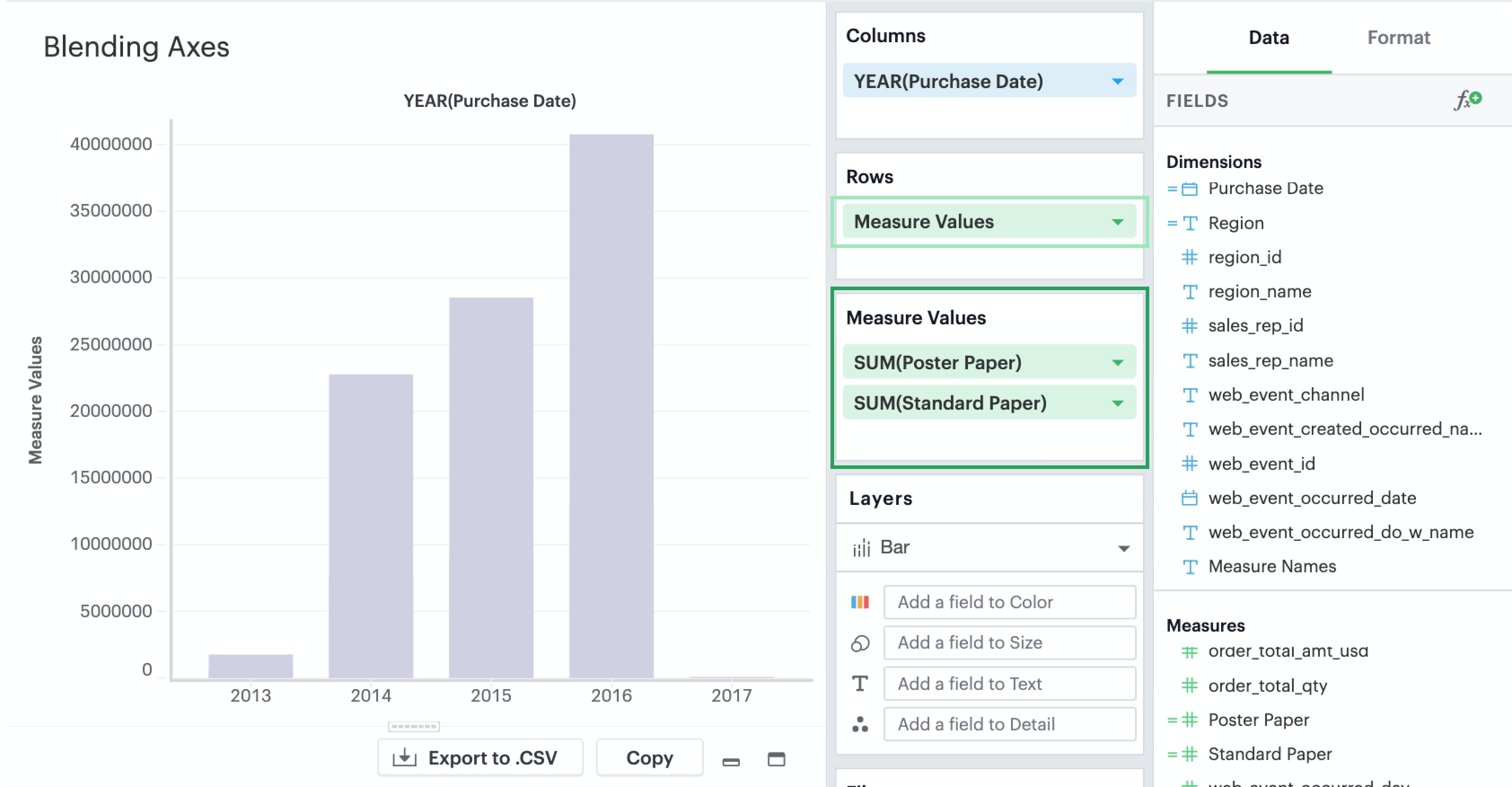
- You’ll want to add
Measure Namesto your visualization to ensure that you can distinguish between your measures. You can place it either on a Row or Column or in a layer channel like Color.
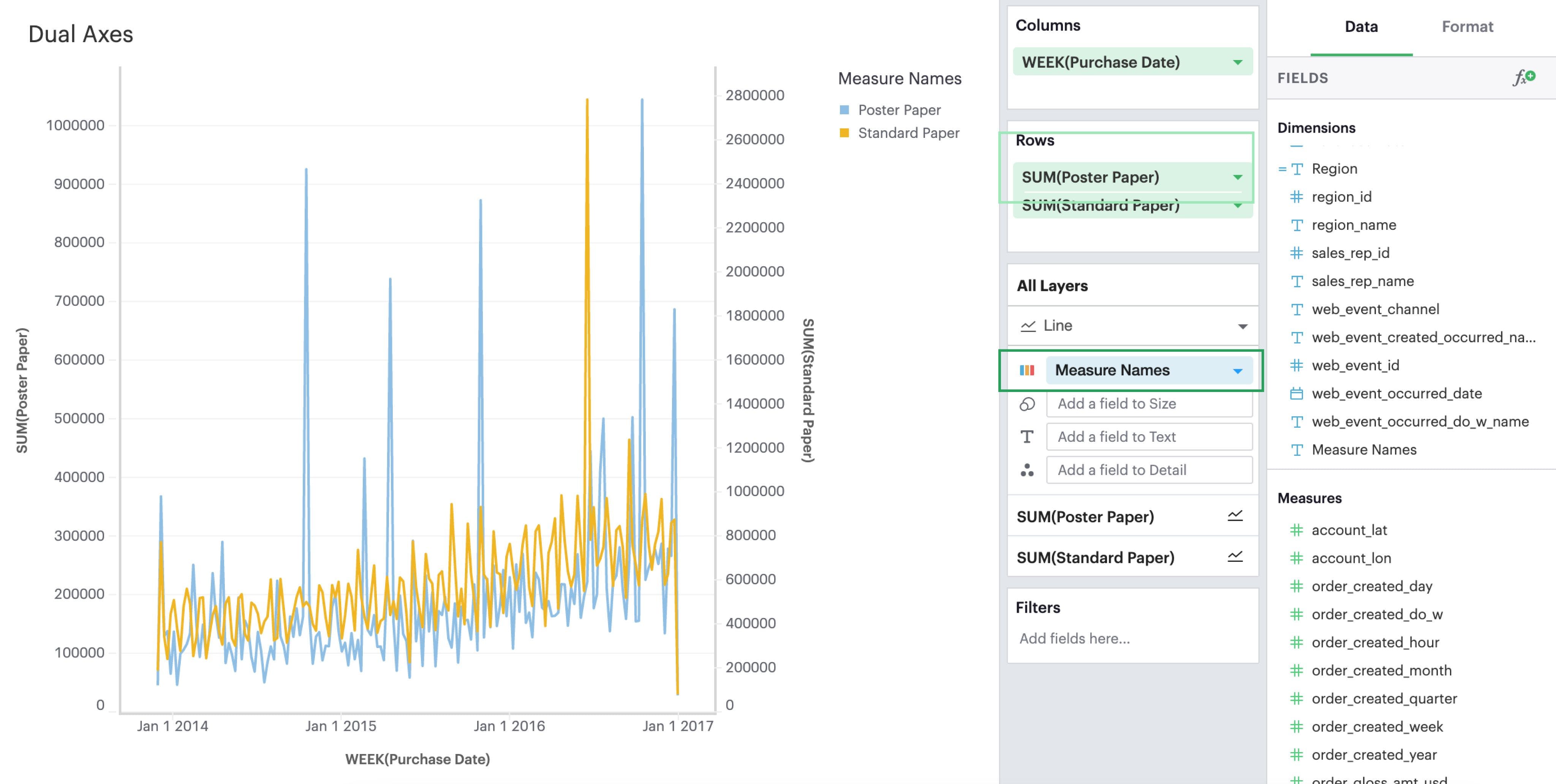
Dual Axes
Lastly, you can compare two measures on the same pane but different axes by creating visualization with a dual axis.
- Drag and drop or use the type ahead search to add at least two measures you want to graph on either Rows or Columns.
- Click on a field that you’d like to include in your dual axis. In the context menu, you should see an option to join this field and the field above on a dual axis. If it’s the outermost field and there’s no field above it, then you will not see the dual axis option.
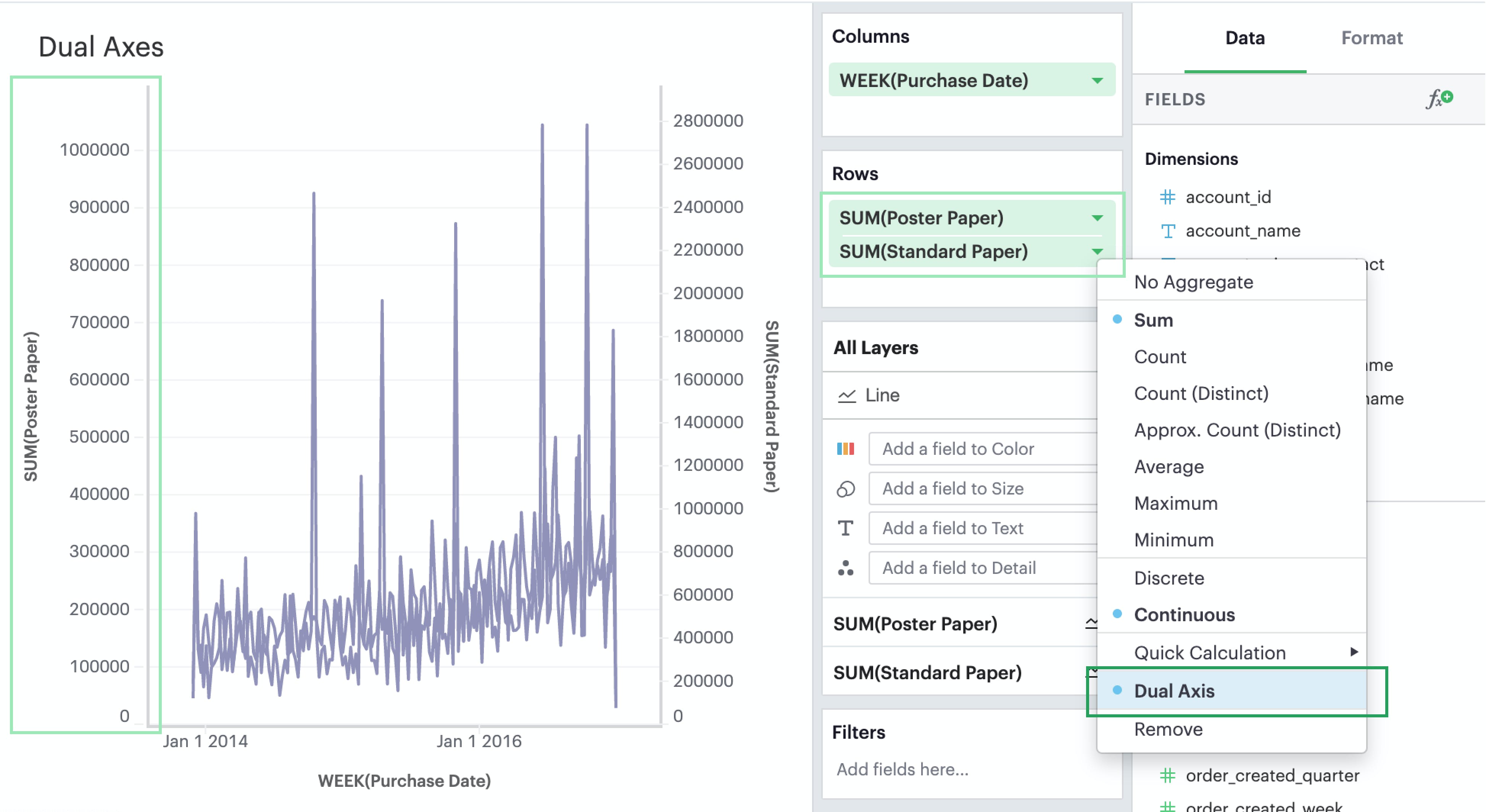
- Lastly, add Measure Names to the Color dropzone if you wish to be able to visually distinguish between the two measures.
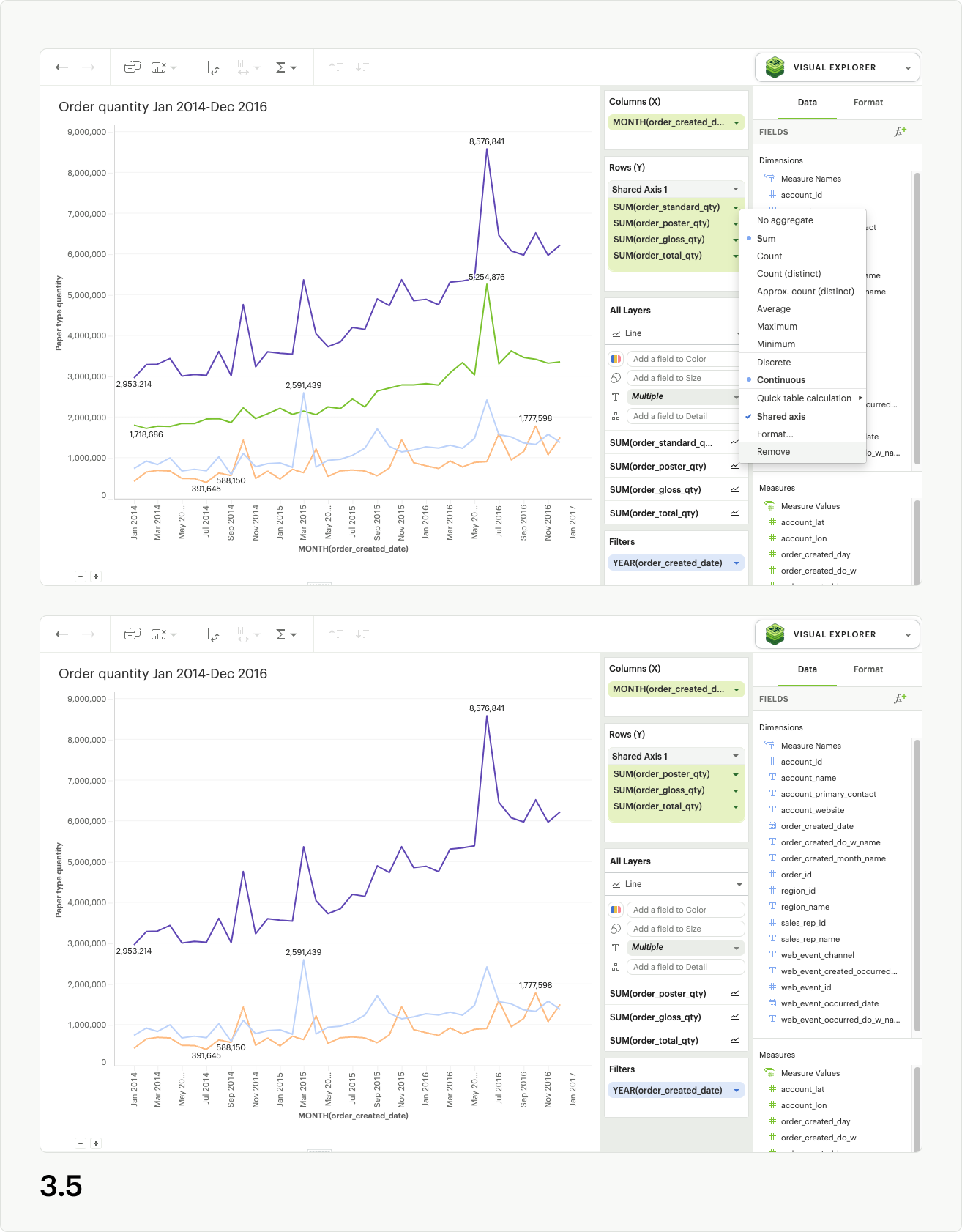
Shared Axis
Introduction
Shared axis is a feature that allows you to create composite charts that assist with comparing data. As the name implies, fields with a shared axis are plotted together along a single axis with a common scale.
With shared axis, each measure can be configured independently–including differing mark types–opening up endless possibilities for combination charts. It allows you to plot two or more measures along a single axis, and helps ensure you’re comparing data across values that are aligned.
If you’re simply looking to compare trends and patterns across measures in your data, that might have separate scales or even different units, Mode’s dual axis feature may be a better fit for your charting needs. To learn about plotting data along more than one axis, see dual axes.
Creating a Shared Axis
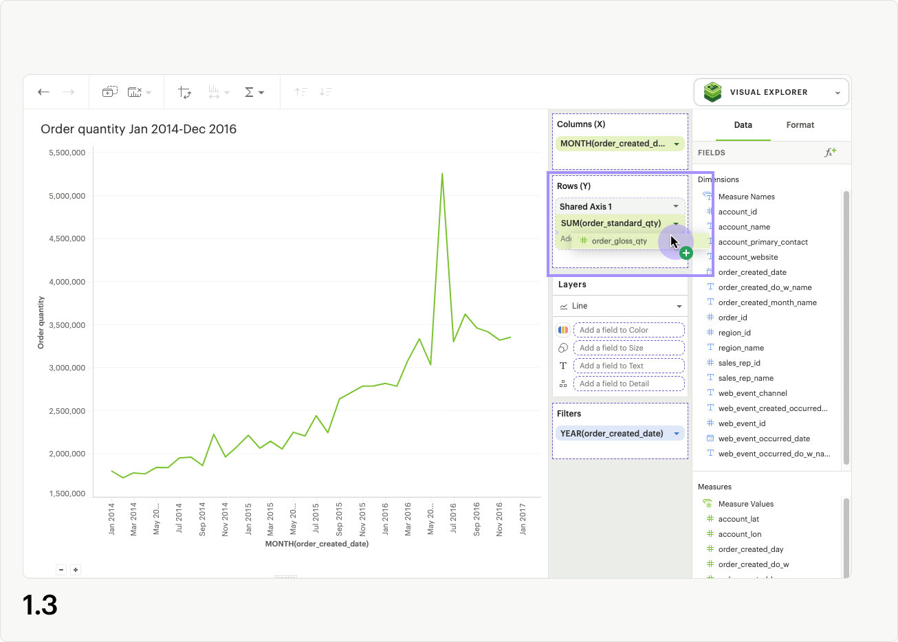
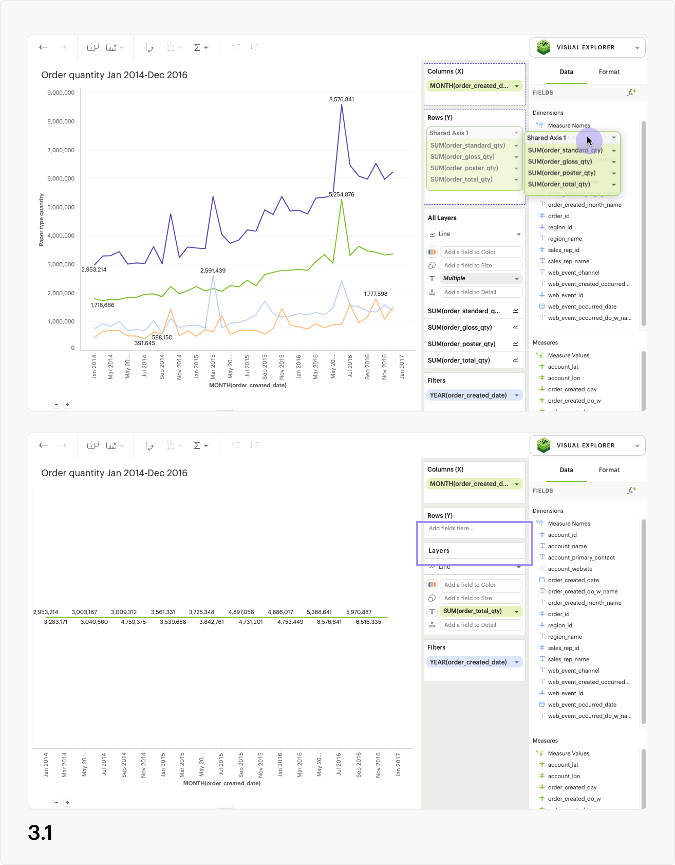
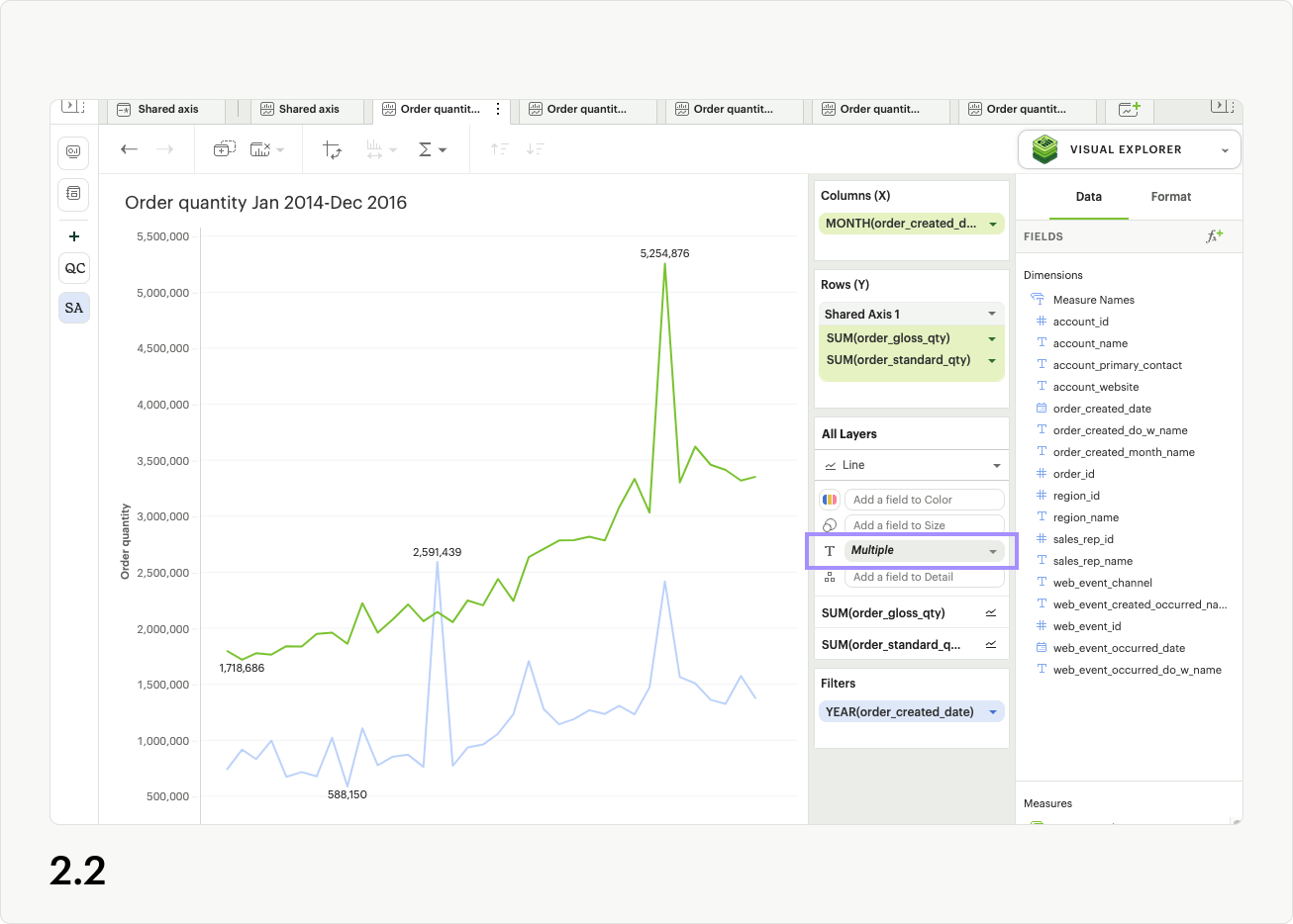
To create a shared axis, add at least one continuous field to columns or rows by dragging and dropping or by using the type ahead search. From the pill context menu (accessed via the caret on the right side of the pill), you can select “Shared axis” (fig. 1.1). When selected, a blue check will appear in the menu next to shared axis, and a new gray header and dropzone will appear around the pill (fig 1.2).
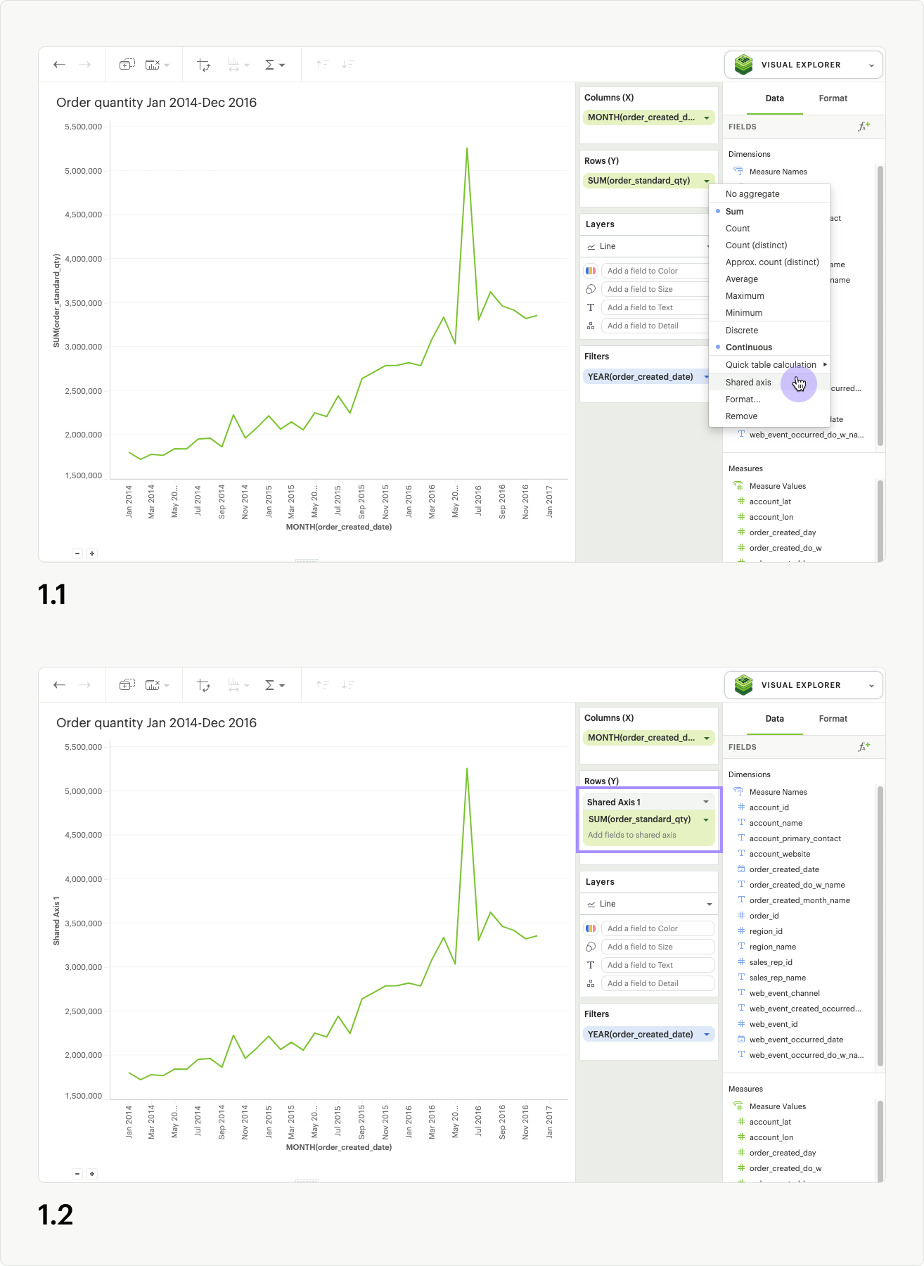
At this stage, no updates to the visualization will occur, because you still need to add additional fields to the dropzone. Drag a second continuous pill with the same units into the new shared axis dropzone (fig 1.3).
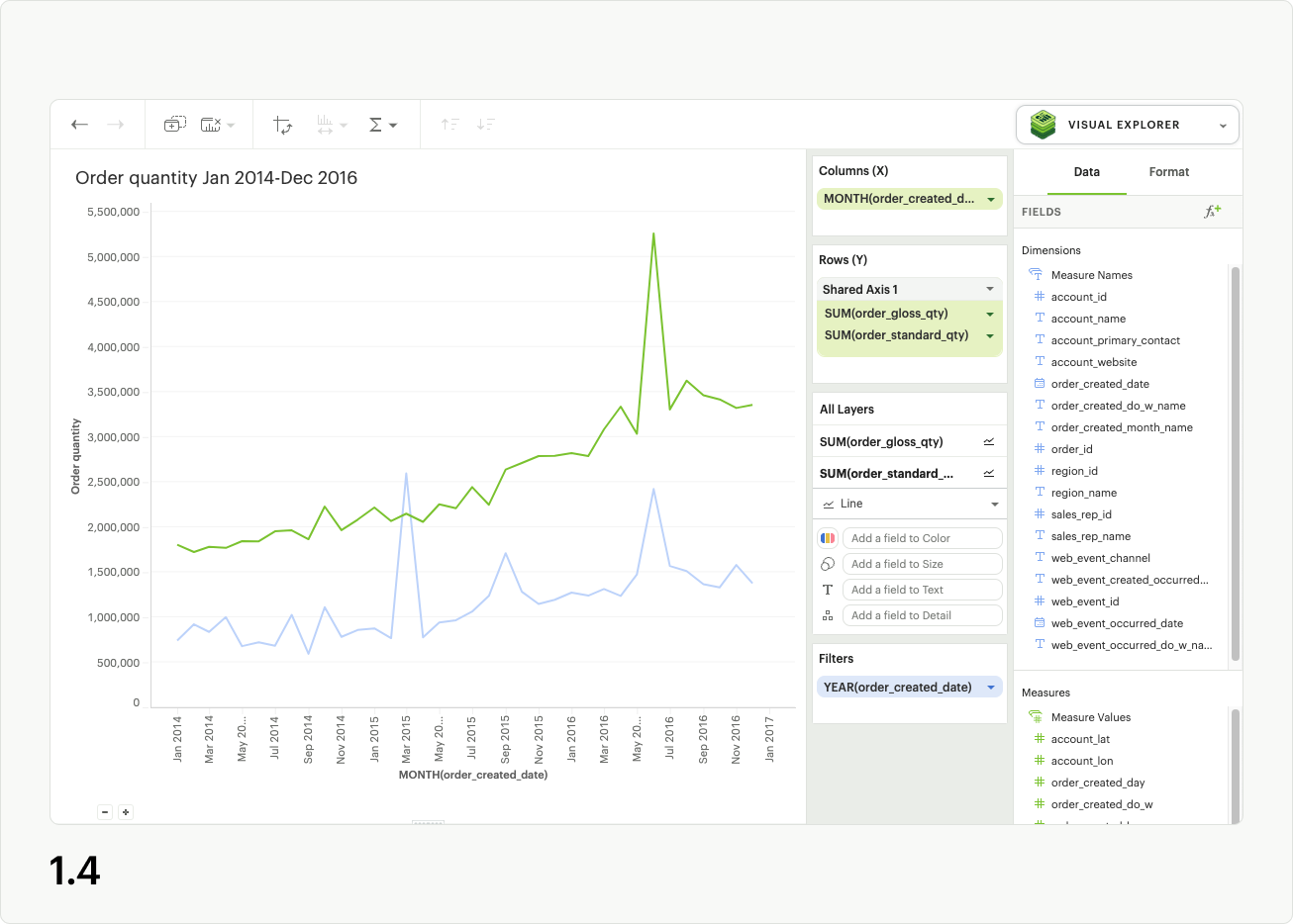
The visualization will update, and a single shared axis will be created that uses the minimum and maximum values from both sets of field data (fig 1.4). If your fields do not share the same units, the axis units will be converted to general numeric formatting.
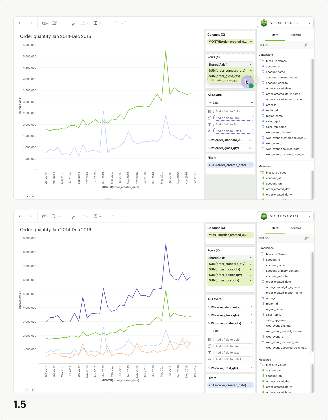
Note: In the below examples, additional color and text label formatting was applied to each series to help differentiate between data points.
You may add more continuous pills to the shared axis dropzone to plot additional series on the shared axis (fig 1.5).
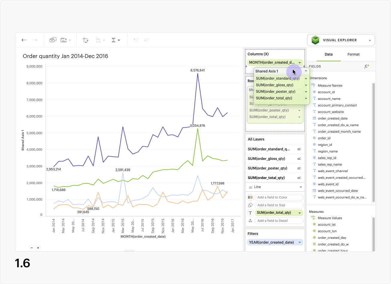
Another great feature of shared axis is the ability to move the shared axis group between dropzones. Simply click the shared axis header and drag it to move between columns and rows (fig 1.6).
Formatting a Shared Axis
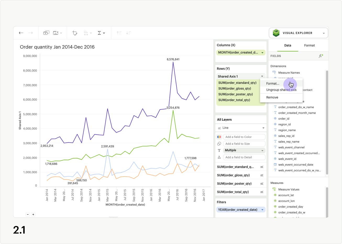
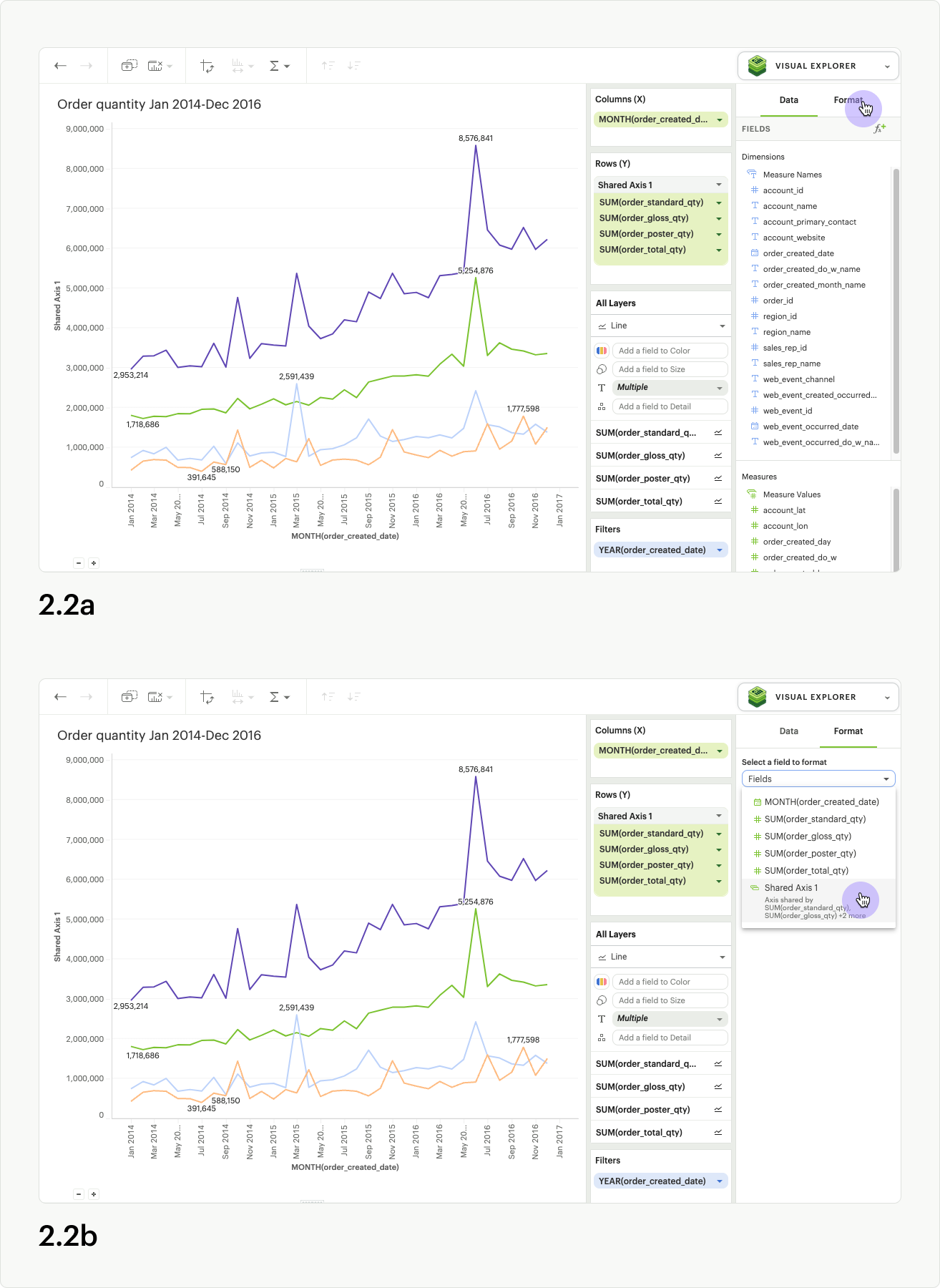
To update the axis title for the shared axis group, open the shared access context menu in the upper right of the shared axis header, and select “format” (fig 2.1). You can also click directly on the Format tab in the righthand panel of the visualization builder (fig 2.2a). If you click the Format tab directly, you must also select the name of your shared axis group from the fields list dropdown (fig. 2.2b).
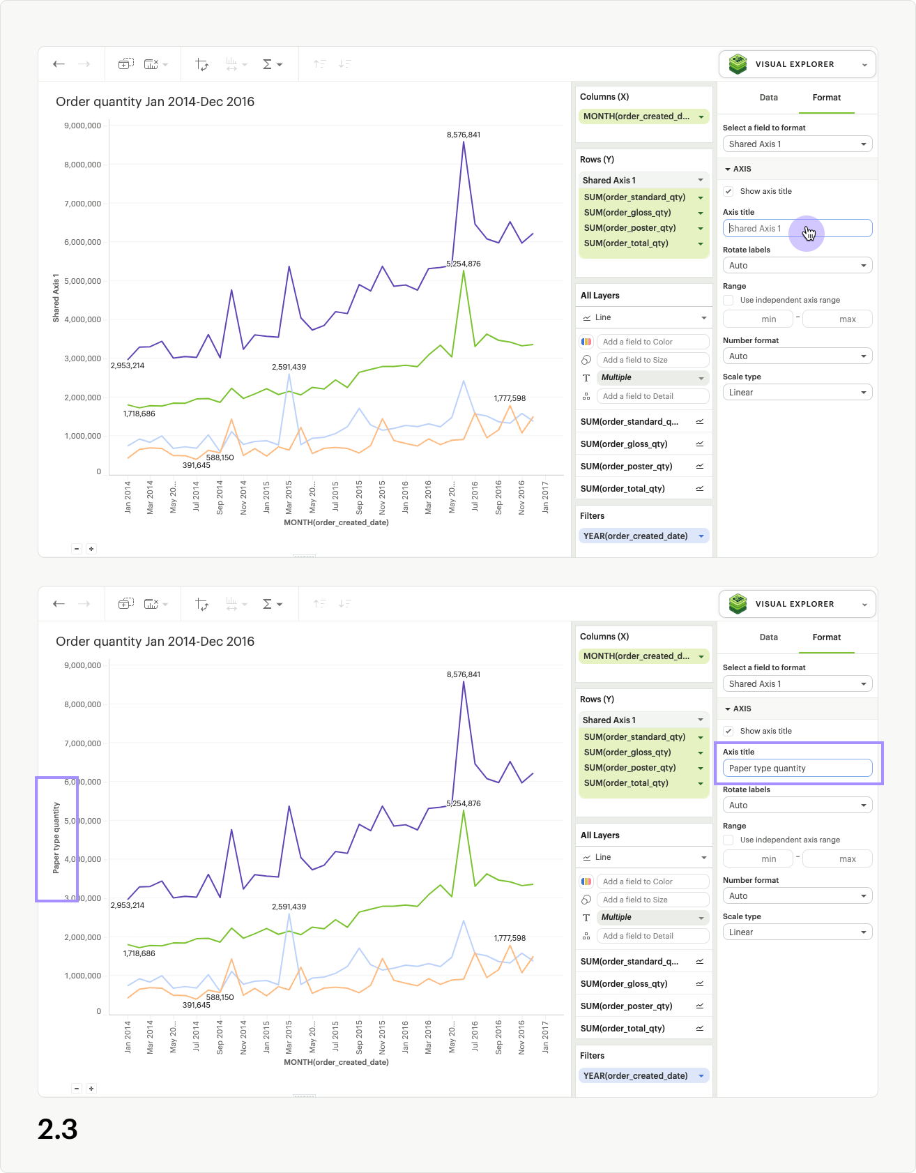
Once in the format tab, click into the Axis title input, and enter a custom name for your Shared Axis. The axis title will automatically update on the chart (fig 2.3).
Note: Updating the title of the axis for a shared axis group will only impact the chart canvas. The shared axis group will continue to be called Shared axis 1, Share axis 2, etc in the dropzones and field list dropdowns.
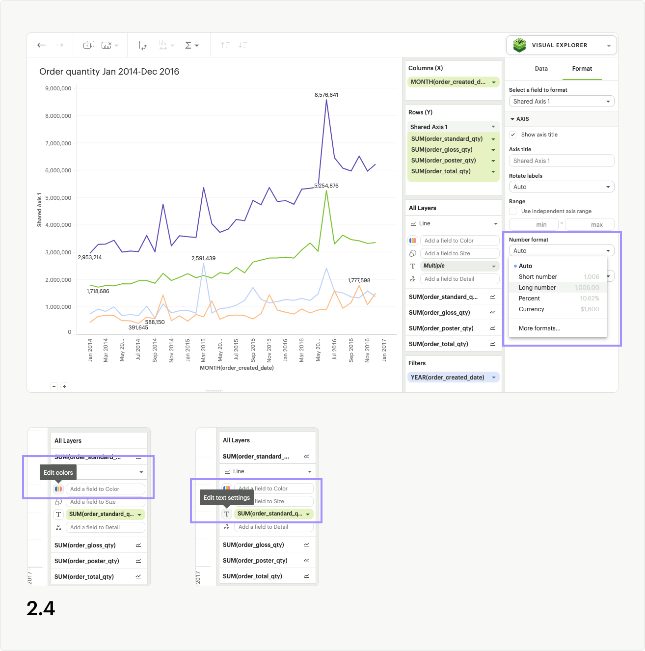
While in the formatting panel for your Shared Axis group, you can also update the axis value formatting, as long as all measures have the same units (fig 2.4).
Additional helpful formatting features for shared axis visualizations are series colors and text labels.
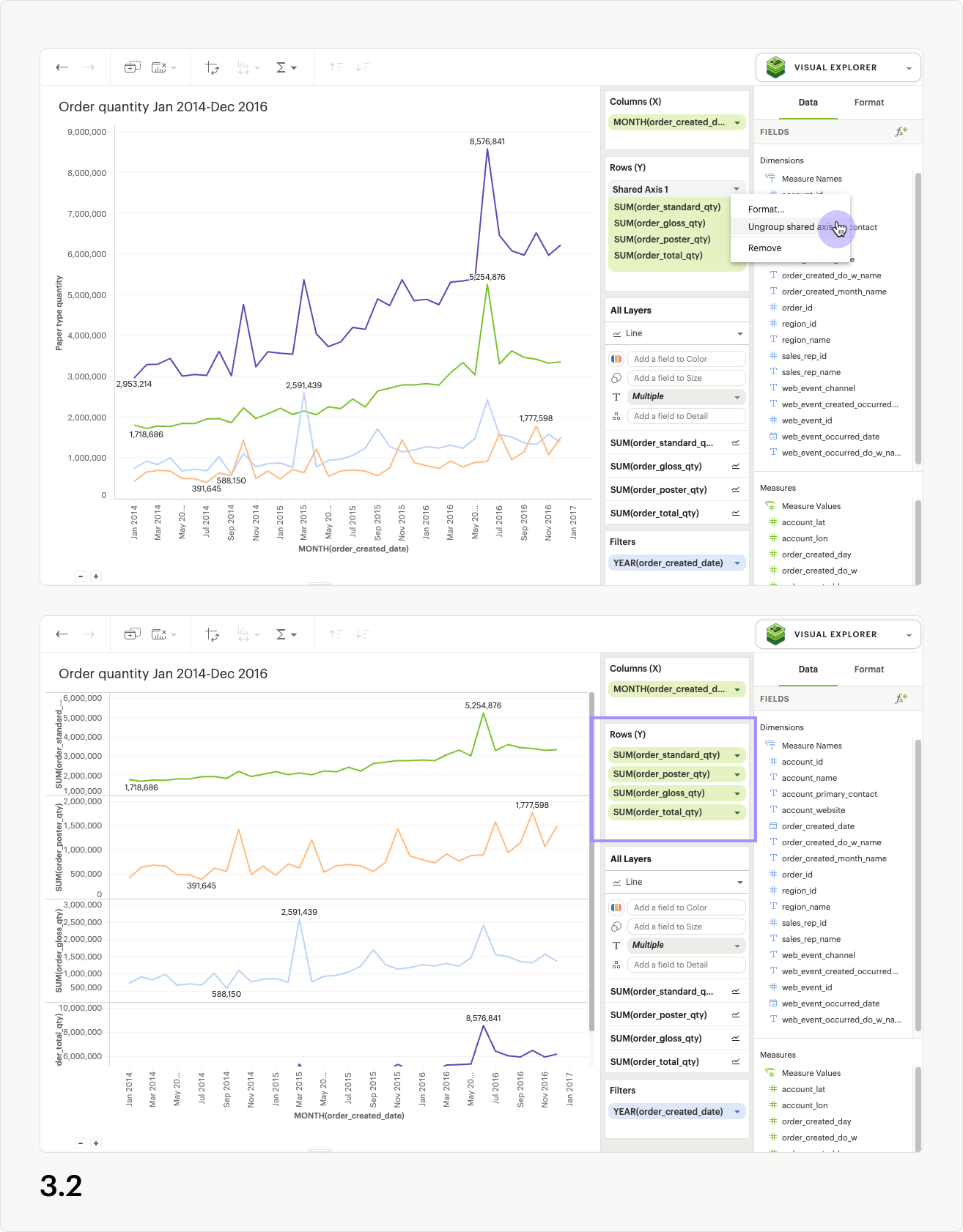
Removing a Shared Axis
There are multiple ways to remove a shared axis from your visualization. To remove the shared axis and all of the fields it contains from the visualization, simply drag the whole shared axis group out of the dropzone (fig. 3.1). All fields will be removed from the visualization, and thus the shared axis will disappear.
To remove the shared axis while still keeping its fields in your visualization, open the shared access context menu from the upper right of the shared axis header and select “ungroup shared axis” (fig 3.2). The shared axis header and dropzone will disappear, the visualization will update, and all of the fields that were part of the shared axis group will remain in the dropzone as separate pills, creating facets instead.
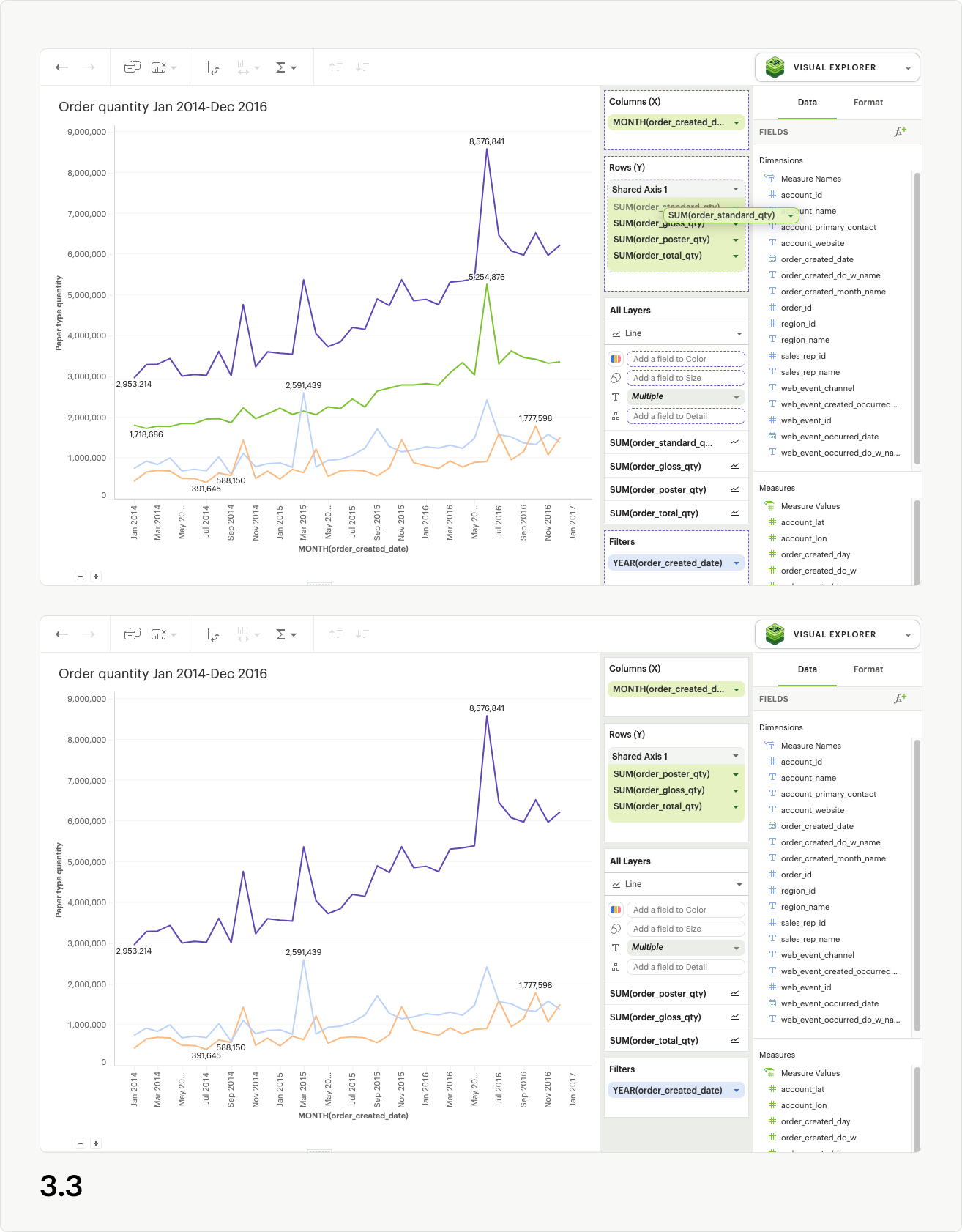
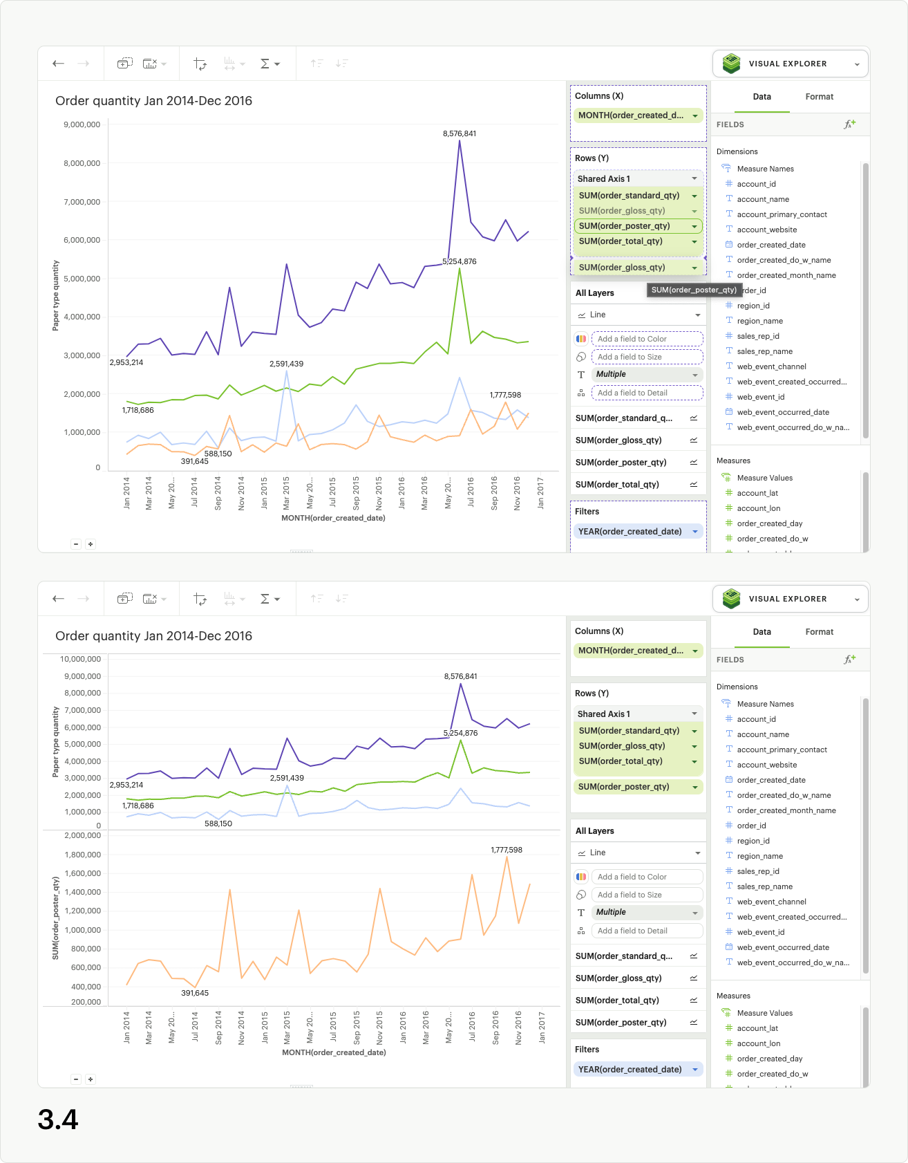
Directly dragging pills out of the shared axis group will also remove them from the shared axis in the visualization. If you drag fields out of the dropzone entirely, they will be removed from the visualization as well (fig 3.3). However, if you drag fields out of the shared axis and into another dropzone (columns, rows, layers, measure values), they will remain in the visualization (fig 3.4). You may also use the context menu for individual pills to “remove” them from the visualization entirely, which results in them being removed from the shared axis (fig 3.5).
Using Shared Axis to create combo charts
With Shared axis, you can create a wide array of visualizations from slope charts, bar chart and dot plots, to funnel charts and much more. Check out our Example Report for inspiration, and duplicate it to your own Workspace to see how the visualizations are built.
Data Limits within Visual Explorer
There are no limits to the amount of data you can pull into Visual Explorer; instead, that will be determined by your Helix tier.
However, there are browser limitations to what you can visualize. Visual Explorer will plot up to:
- 250000 individual data points (for example, in a scatter plot)
- 16000 facets in a pivot table or faceted chart
- 3000 series (lines or bars)
Dealing with High Cardinality
If you are working with datasets/fields that surpass browser limitations, there are a couple of actions you can take to render your visualizations:
- Aggregate a field:
When you add a field that exceeds one of the browser limitations, you can aggregate your field with COUNT
- Applying a filter:
You can also apply a list, top N, or bottom N filter to see a subset of your data and render your visualization.
- Turn on Manual Update Mode:
You can switch to manual mode and delay all the updates when making changes to a visualization. In manual update mode, a pop-up will appear where there are two options:
- You can hit “Apply” which will apply the change, render the visualization and continue to stay in manual mode
- You can hit "Apply & switch to automatic" which will apply the change, render the visualization and switch back to automatic mode.
Pivot Table and Chart Facet Pagination
Pivot tables or charts with many rows or columns impact visualization load time. In order to ensure a faster loading experience and reduce errors, Mode automatically paginates pivot tables and charts with high cardinality.
Pagination controls will appear below your Quick chart or Visual Explorer chart once you drag in a field with large amounts of data. Pivot tables and charts are paginated based on facets. Facets are the combinations of unique dimension values - excluding the innermost field - that define horizontal and vertical subsets of data in a pivot table or faceted chart. Pagination is based on horizontal facets.
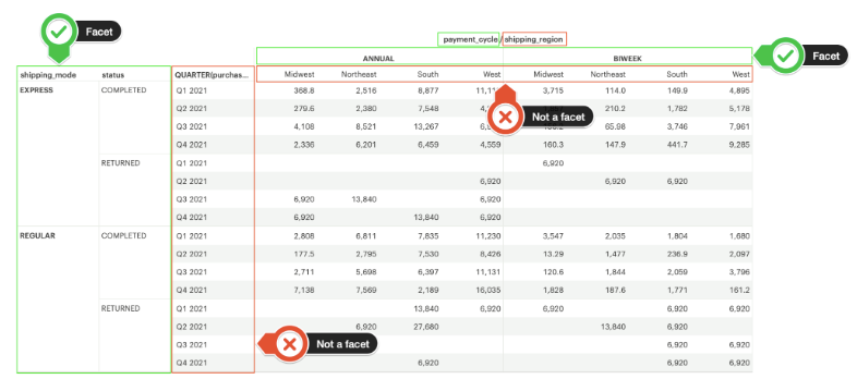
Facet pagination ensures that each page does not break up data contained within a single facet, and risk splitting related data across pages. The number of facets displayed per page of your visualization depends on your data. We optimize page size based on both the number of row facets, and the number of column facets. As a result, each chart will have a different number of facets per page to ensure optimum performance.
The back and forward buttons in your visualization toolbar do not work with the pagination. Additionally, if you navigate away from the visualization and return to it, the pivot table will reset to page 1.
Rendering errors
Even with pagination, some visualizations will be too large to render due to the number of facets or data points. In these cases, you will be presented with a modal prompting you to filter your data, aggregate it, or switch to manual chart updates. Additionally, when switching between pages of facets, it is possible to hit system limits on one page and not the other. This happens when the facet(s) on one page have many more rows or elements associated with them than the facet(s) on the previous page.
Disabling pagination
There is currently no way to disable pivot table and chart pagination. If you want to remove the pagination, you can filter your data to a smaller size, or remove fields with large amounts of data from the visualization.
Filters
Applying Top/Bottom N Filters
Top/bottom N filters enable you to see the highest or the lowest categorical levels ranked by aggregating a given measure. To apply a top or bottom N filter to your visualization:
- Add your field (text, date, and numeric fields) to the filter section by dragging and dropping or by using the type ahead search.
- Select the “Top/Bottom N” method in the filter modal and choose what you want to define along with the number of values.
- Select the field you want to filter by.
- Choose the aggregation type you want for your filter.
- Apply the filter and close.
Notes:
- Top/bottom N filters will always be applied first no matter the other filters that are added.
- In order to create a top or bottom N filter with no aggregation, you will need to select the same field you created with the by-field filter (see image below for an example).
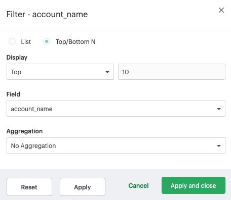
- Currently top/bottom N filters do not support ties
Sorting
Quick Sort
In the Toolbar, you have the ability to leverage our Quick Sort feature to sort your innermost discrete, categorical data by the outermost measure in either descending or ascending order.
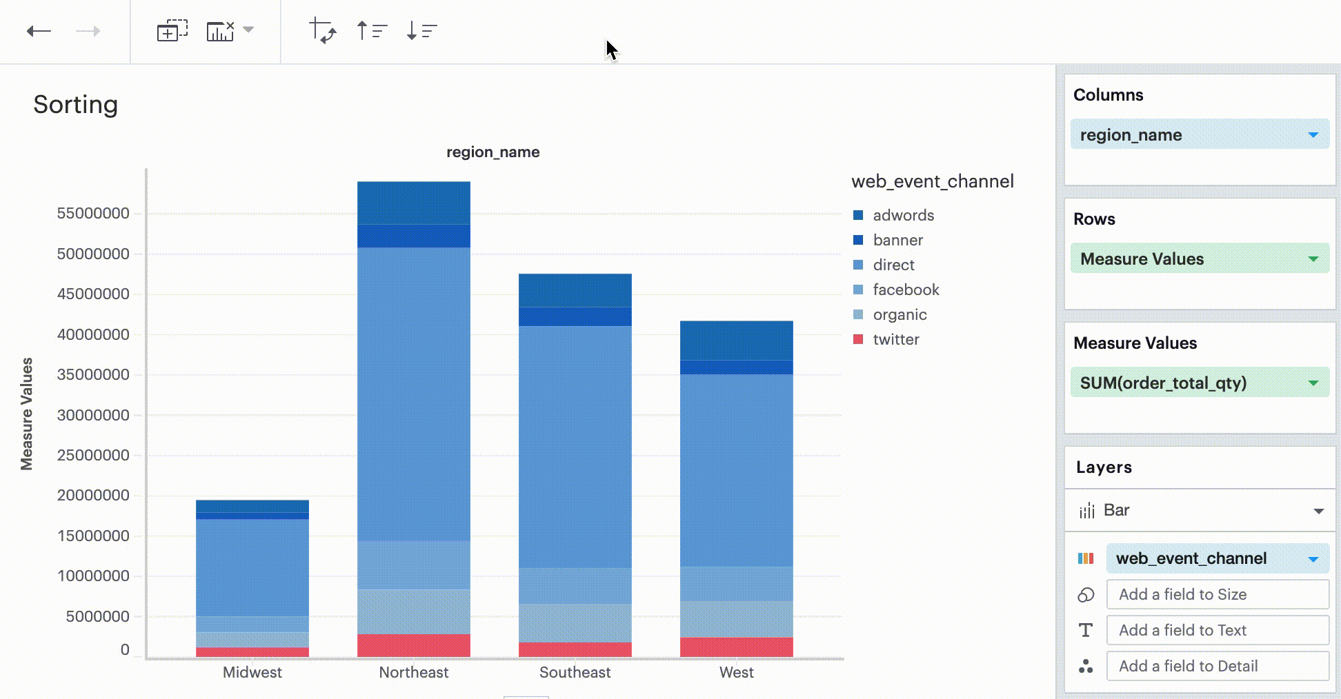
However, you also have the option to define a more granular sorting behavior. When you can click on a discrete field in your visualization to open its context menu, you will see the ability to open the sort dialogue.
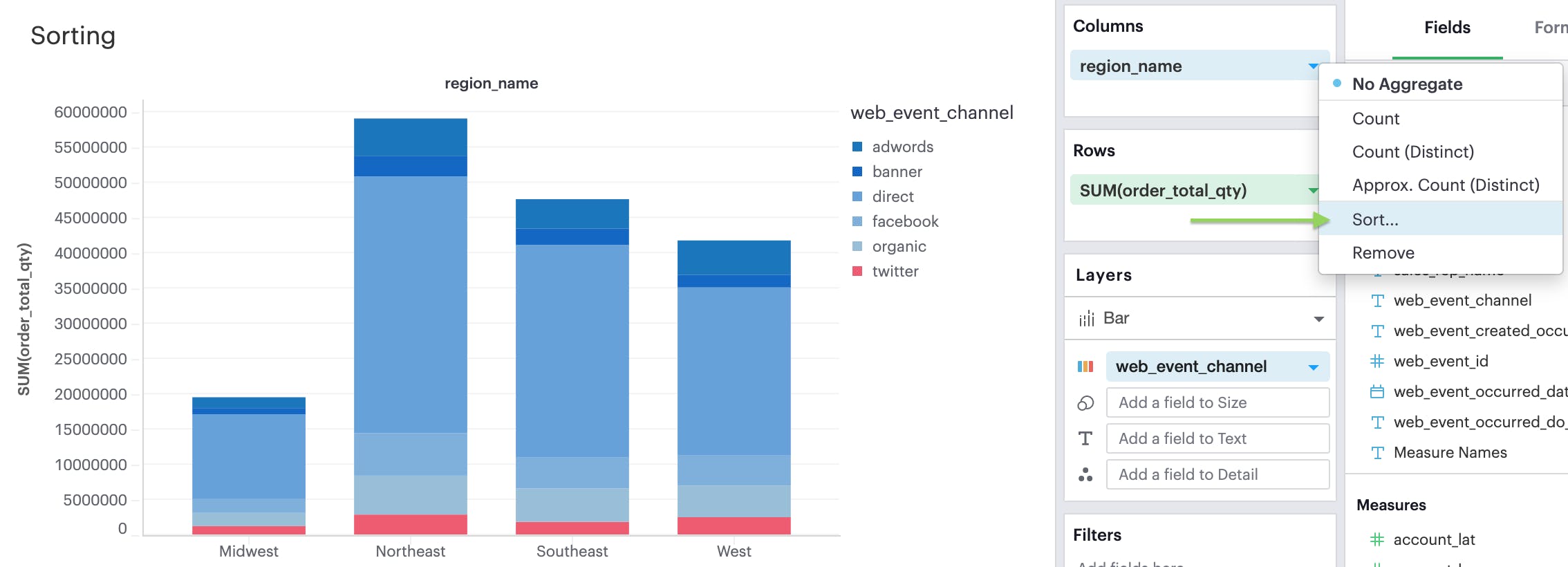
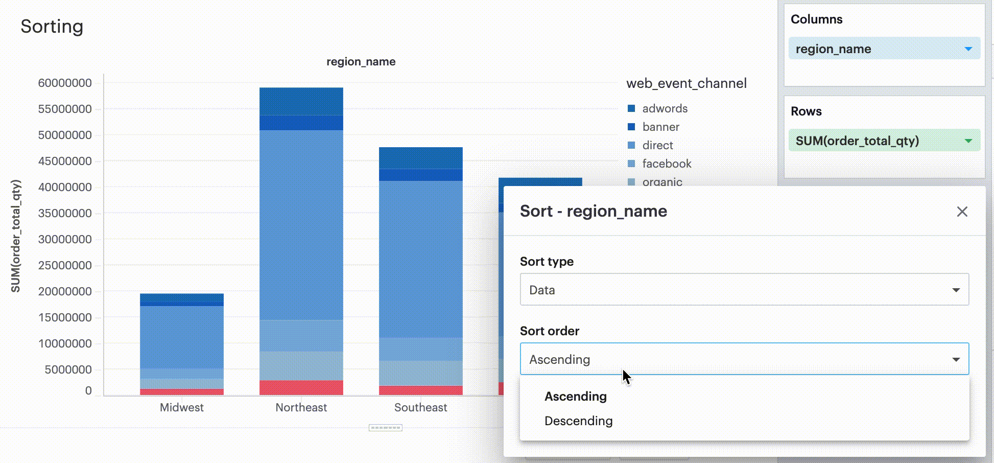
From there, you can specify exactly how you’d like to sort that discrete field. We currently support two sorting methods:
- By data value
- By field
- By manual
- By nested
Sorting by data values
This sorting method looks at the values within the field you’re trying to sort by (e.g., Midwest, Northeast, Southeast, West within the region_name field) and sorts them either in ascending or descending order.
- For numeric fields, this refers to in order of smallest to largest or vice versa
- For string fields, this refers to alphabetical order
- For date fields, this refers to chronological order
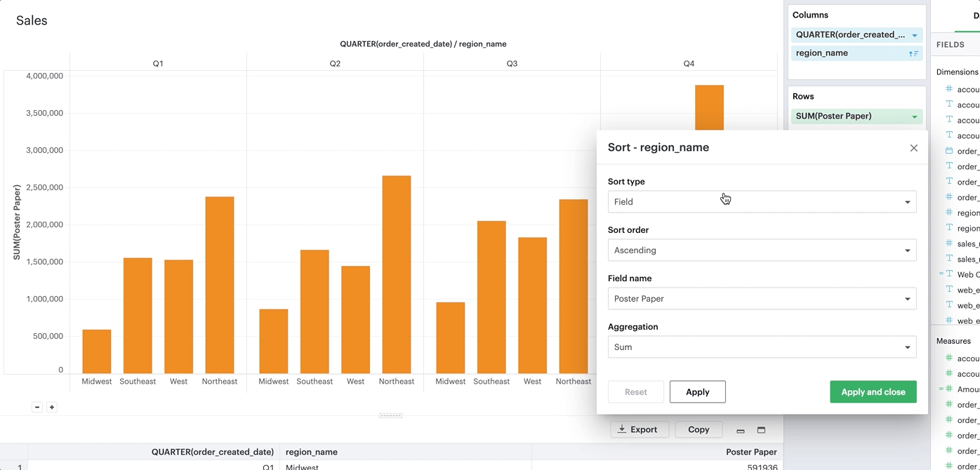
Sorting by field
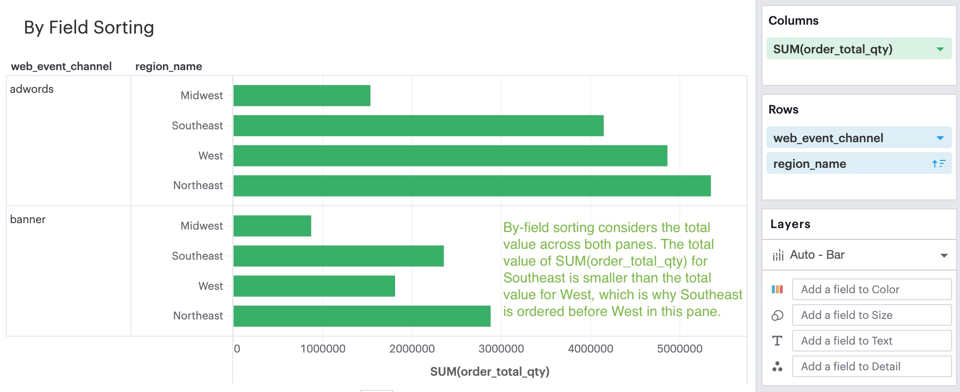
This sorting method allows you to sort a discrete field in your visualization—it could be in Columns, Rows, or one of your Layer channels—by another continuous, aggregated value. The latter field does not need to be in your chart configuration.
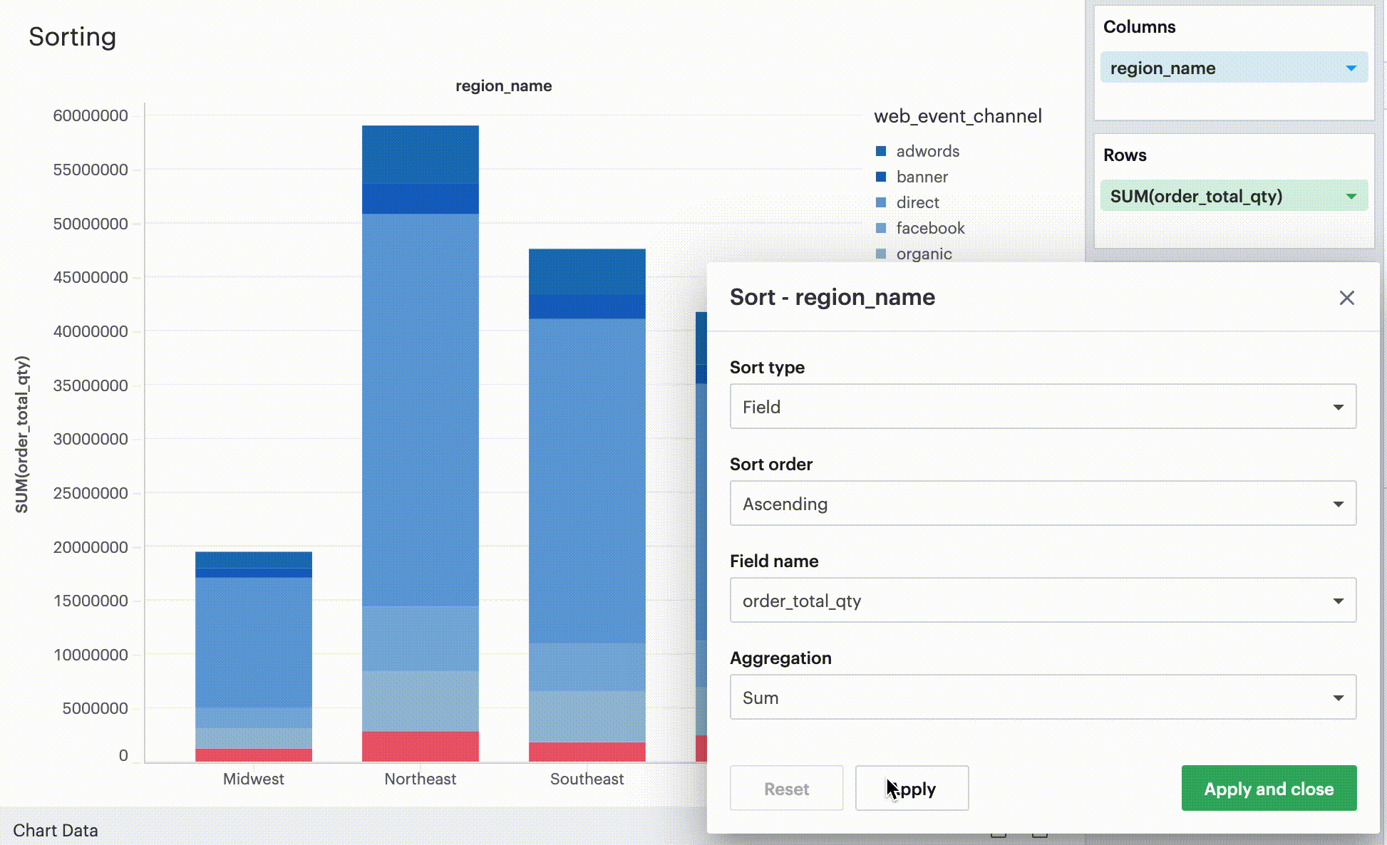
By-field is a non-nested sorting method that considers the total value across all panes and thus will have the same order of values across all panes.
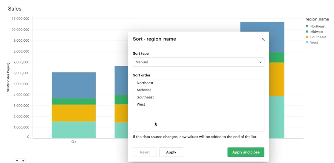
Manual Sorting
The manual sort feature gives users the ability to sort a domain of items in whichever order they choose by allowing them to create a specific order through dragging and dropping values into a customized order. Any items for the given field that have not been manually sorted with appear after the sorted items, in ascending order.
Nested Sorting
Nested sorting allows values to be sorted independently within each facet. To use nested sorting, the field you are sorting has to be under (or nested below) another field.
By field sorting and nested sorting are similar in that they allow a category to be sorted by a given variable. But while by field sorting disregards the nesting structure of faceted charts, nested sorting works within the constraints of that structure. Independent sorting is applied to the elements on each of the innermost facets.
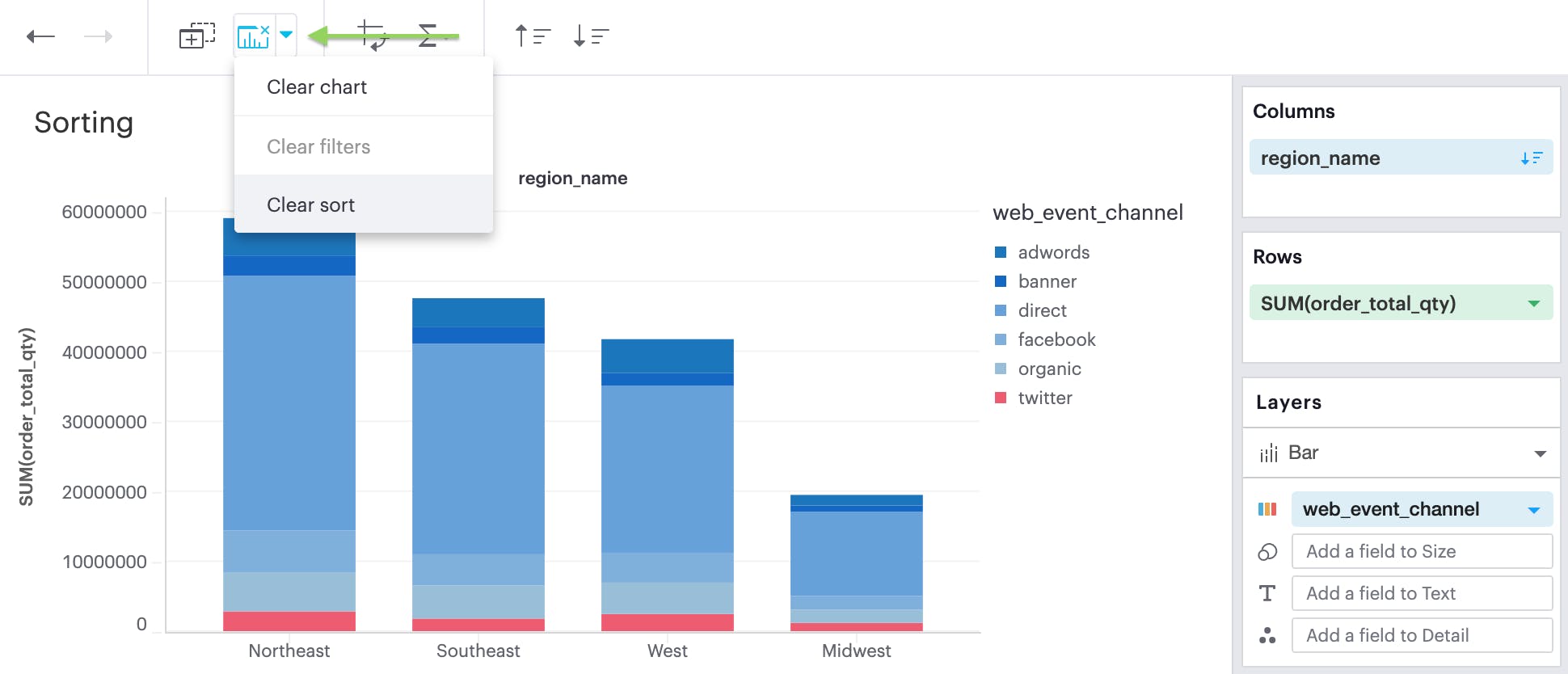
Clearing your sort
You can tell when a sort has been applied to your visualization when you see this sort icon in the pills of any one of your discrete fields. At any point, you can opt to clear the sorts you’ve applied by either clicking on the field itself to open the context menu:
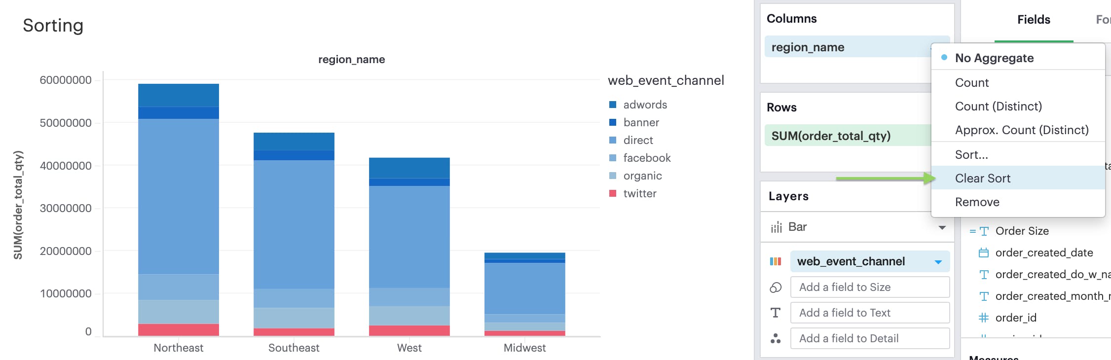
or by broadly clearing all sorts via the Toolbar:
Formatting Your Visualization
Before sharing your insights with a broader audience, you may want to format your visualization. The Visual Explorer gives you more granular control over your visualization than Quick Charts.
Anatomy of a Visualization
To understand how Formatting works in Visual Explorer, we first need to explain how we think about the parts that make up a visualization.
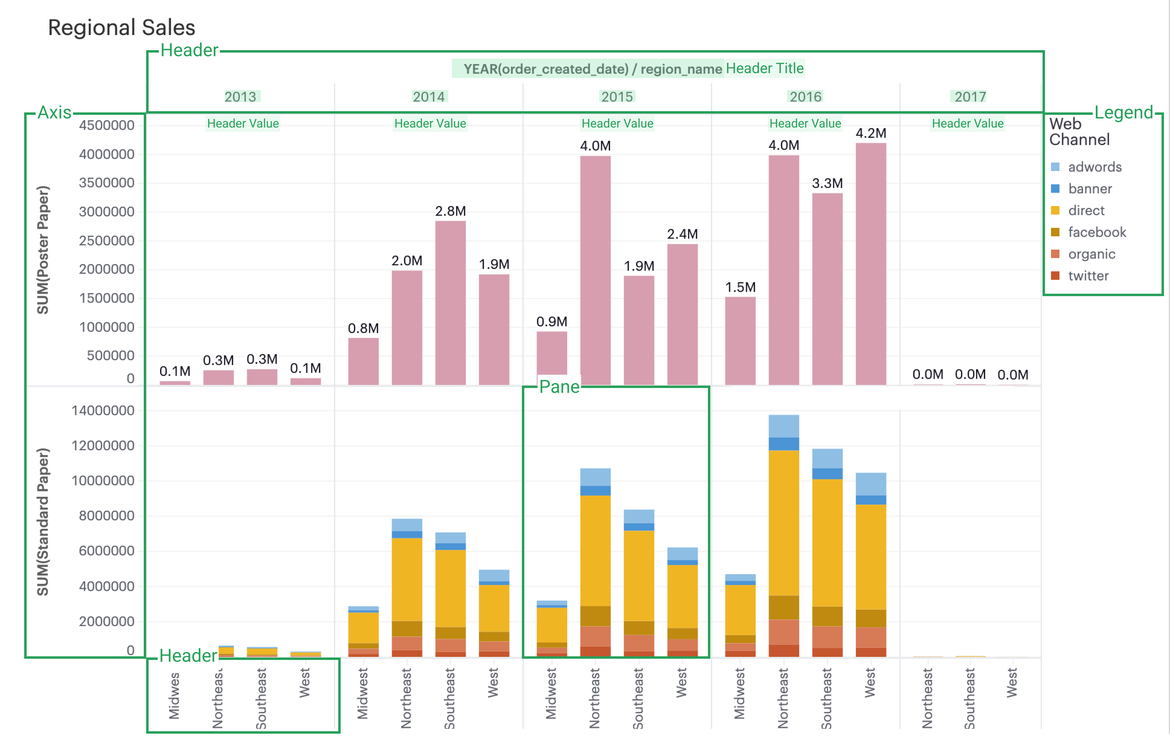
- Axis: Axes are created when you place a continuous field on Rows or Columns.
- Axis Titles are the names of your axes.
- Axes Values are the data values within an axis.
- Header: Headers are created when you place a discrete field on Rows or Columns.
- Header Titles are the names of your headers.
- Header Values are the data values within a header.
- Pane: Panes are formed when fields on Rows and Columns intersect. A visualization can be consisted of several panes.
- Legend: Legends are keys of the chart's data series to help you understand the visual representation of your data series, usually via Color or Size.
Formatting
When you click into the Format tab, you’ll notice that you’ll first be asked what field you’d like to format.
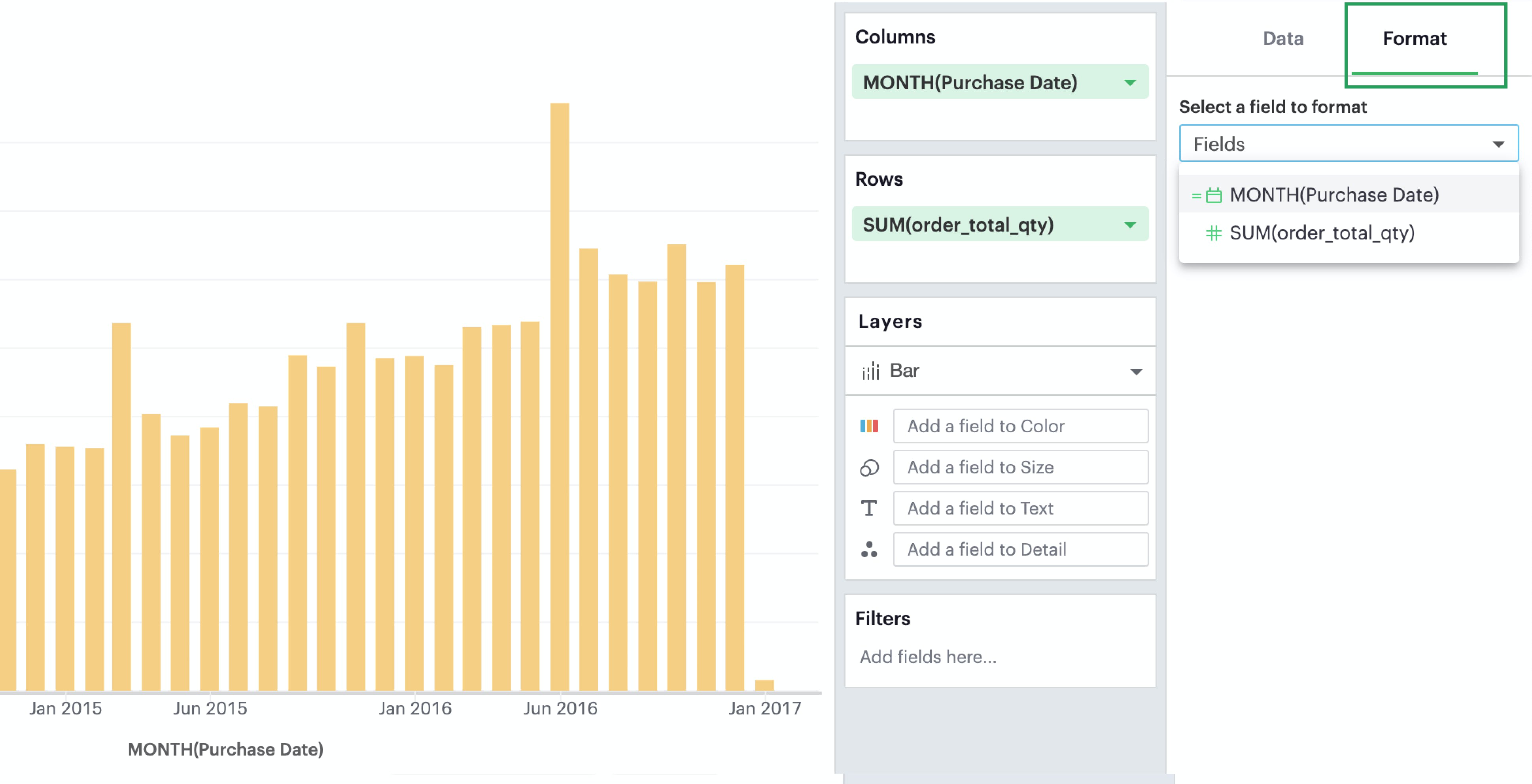
Depending on your selection, the relevant formatting configurations will then appear.
Axes
If you select a field that’s continuous or temporal, you’ll see that you’ll be able to format its corresponding axis. Note that whatever changes you make on the axes will not affect the contents in the pane.
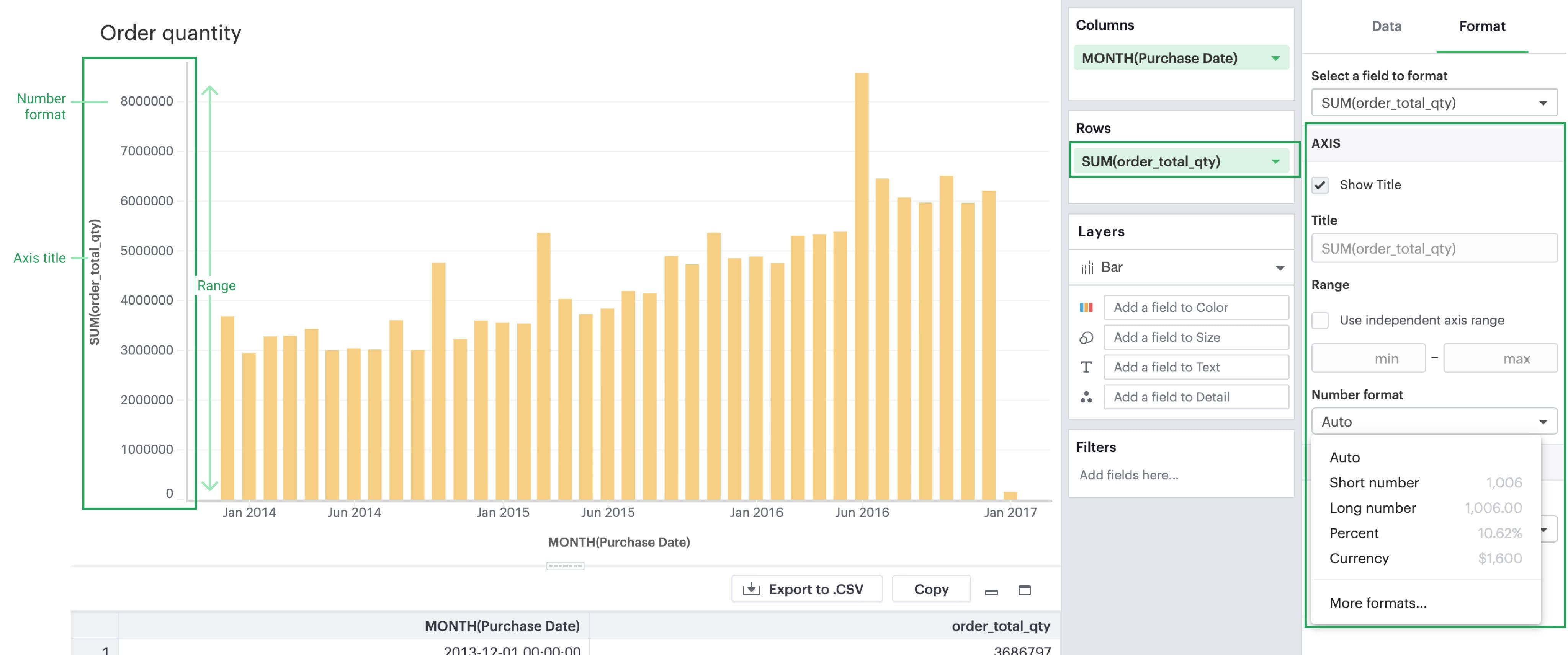
- Title: You can toggle on/off the axis title or change the name of the axis.
- Range: You can also set the axis range here for continuous and temporal axes. For continuous axes ranges, you have two options:
- Independent: By clicking on the
Independentcheckbox, you are setting all the panes that use this axis to be independent of one another. That is, if you have multiple panes (i.e. your measure is nested underneath a dimension), the range of each pane should be determined individually. - Fixed: If you decide instead to set either a fixed minimum or maximum, you are opting for a fixed axis range. This means that every pane will share the same axis range, to be determined based on the overall minimum and overall maximum across all panes.
- Independent: By clicking on the
- Number format: You have the ability to change the formatting of your axis labels to best fit your data. Note that this change will only be reflected in your axes. If you wish to change the numeric values within the pane, you’ll have to do so separately in the Pane section.
Headers
If you select a field that’s discrete, you’ll see that you’ll be able to format its corresponding header. A field can only have either an axis or a header—it cannot have both.
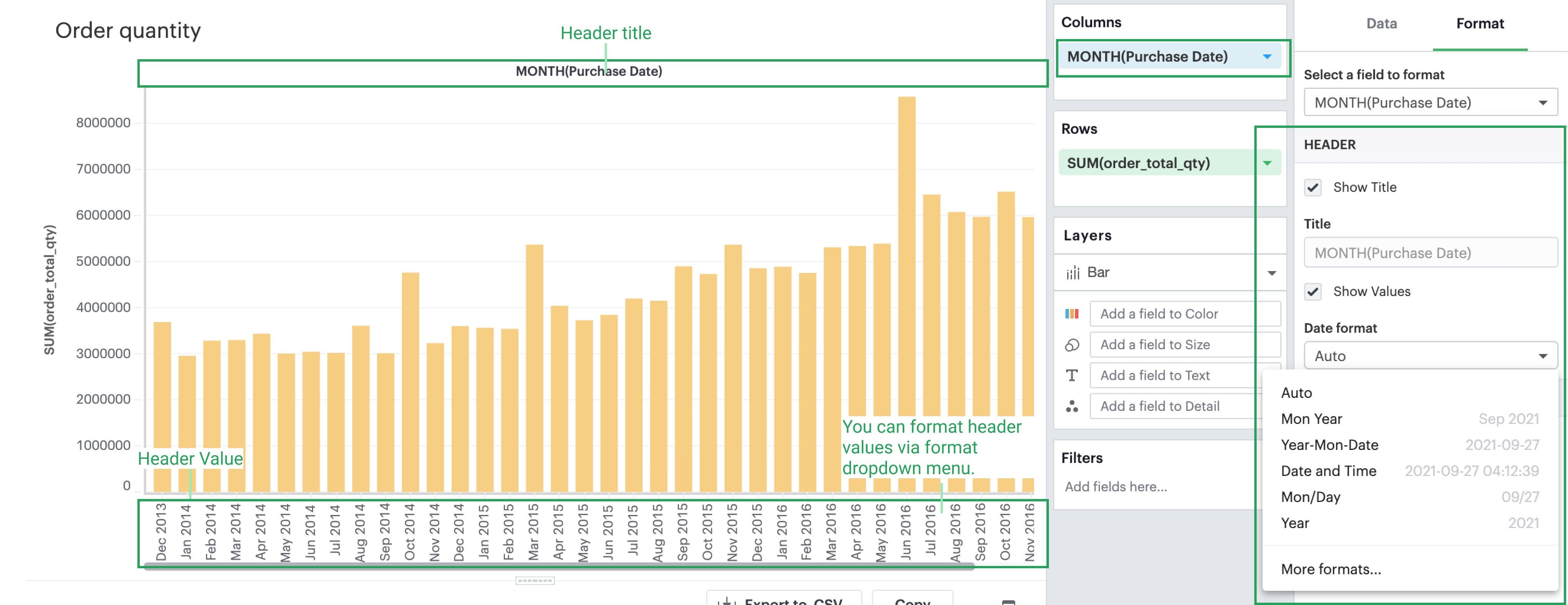
- Title: You can toggle on/off the header title or change the header title entirely. However, please note that whatever changes you make on the axes will not affect the contents in the pane.
- Show/Hide Values: You can also toggle on/off the header values.
- Format: Depending on the datatype of your discrete field (e.g. date part vs. string), you’ll see corresponding formatting options for your headers.
Panes
Whether a visualization contains an Axis vs. a Header depends on whether the field is continuous vs. discrete, but all visualizations will have a pane if there is an intersection of at least two fields. Any formatting changes you want to be reflected on your Labels or Tooltips should be made in the Pane section, as these elements all exist within the Pane.
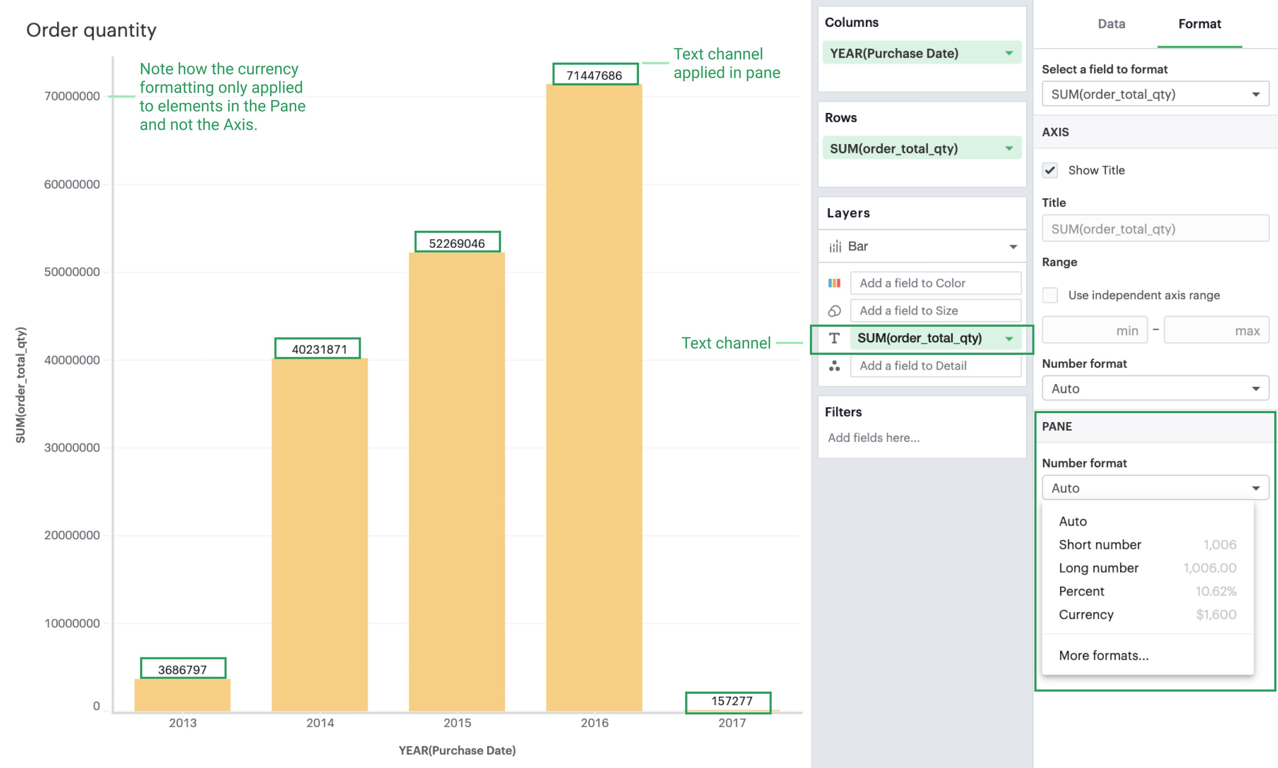
The Visual Explorer will always allow you to configure the Pane, even if the field selected doesn’t currently render a pane in your visualization. This is so that if you later reconfigure your visualization, your work will be saved.
Legends
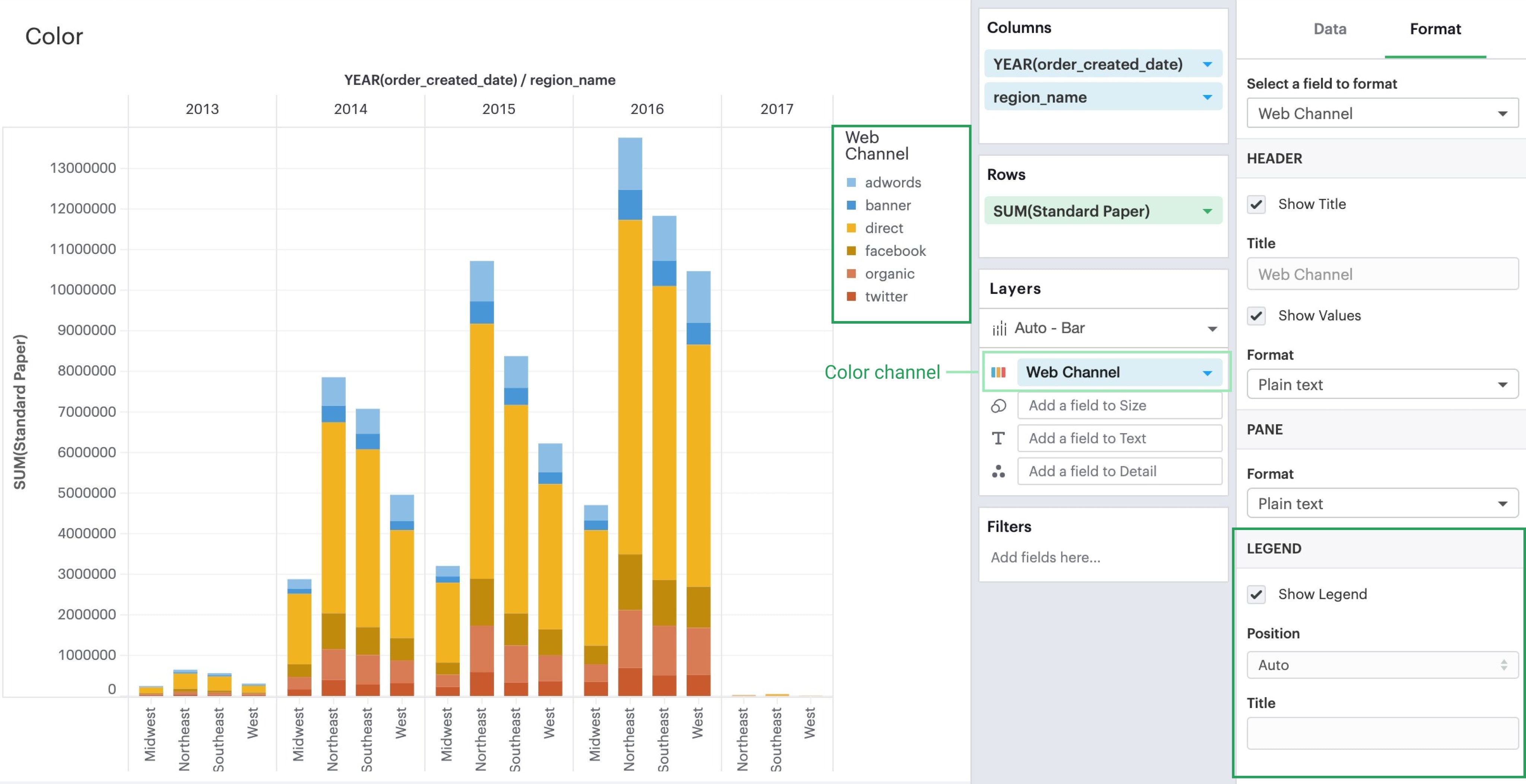
For fields that are referenced in your visualization’s legend, you will see a Legend section where you can opt to show/hide it, choose its positioning on your visualization, or rename it.
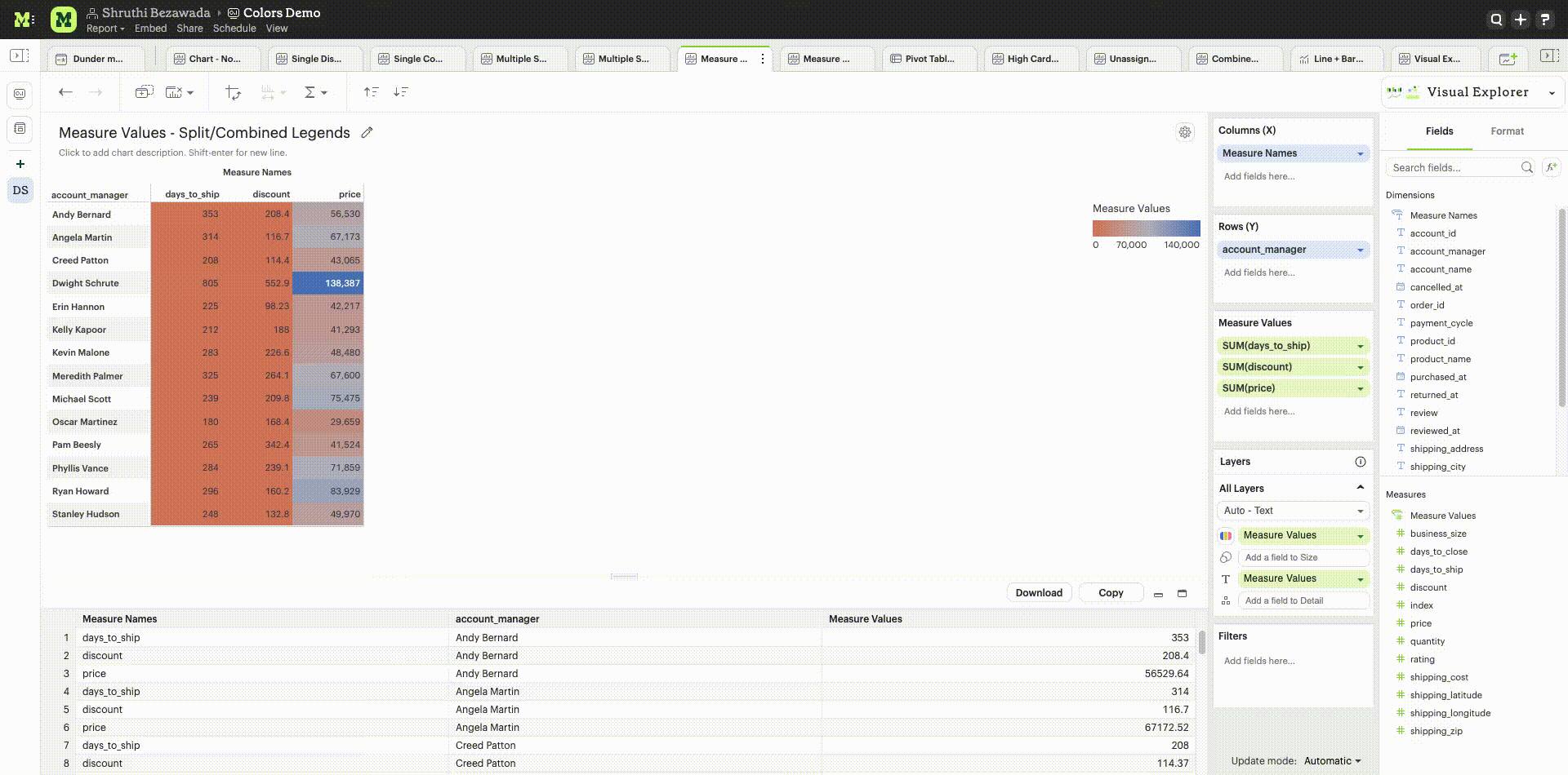
Separate Legends
Separate legends functionality lets you break out each series you’ve included in your visualization on the Measure Values shelf into distinct legends. You can additionally assign unique color ramps to those series, allowing you to easily compare values within and across measures. To access split legends, add Measure Names onto either columns or rows, and Measure Values into the colors dropzone on the Layers shelf. We recommend adding at least one additional discrete field onto columns or rows, and at least two continuous fields to the Measure Values shelf that has now appeared. This will allow you to see separate legends once enabled.
Combined legends
The default setting for legends when using Measure Values is Combined legends, and results in all values from fields on the Measure Values shelf being represented by a single color ramp. The color ramp’s minimum and maximum values correlate to the minimum and maximum values of all data from fields on the Measure Values shelf. Combined legends facilitates comparisons across categories that share units, and can help you to understand the relative distribution of specific field data within a larger set of fields.
Manually resize columns
You can manually resize the widths of your column headers or axes:
- Place your cursor at the right of the label of the column you wish to adjust
- When you see the resize cursor, click and drag the border left or right
Make charts fit to screen
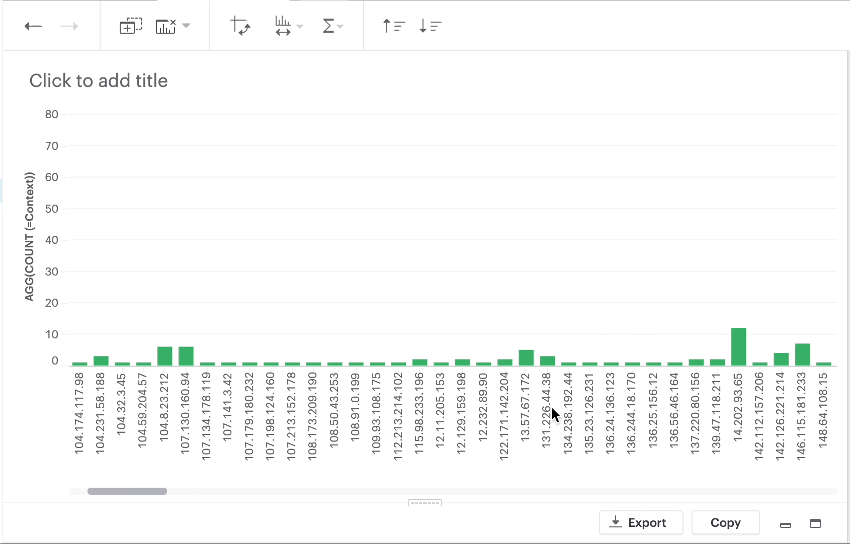
"Fit to screen" is a formatting option for visualizations based on a discrete axis.
When you chose "Fit to screen", the visualization is compressed so that it can be displayed in its entirety in the current viewport. That eliminates the need for a scrollbar. In order to accomplish that, some of the axis tick values are also dropped.
Follow the steps below to enable this for a chart:
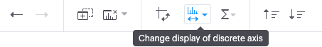
- Click “Change display of discrete axis” button
- There are two choices: “Fit to screen” and “Fit to data” (default)
- Select “Fit to screen”NOTE: The "Change display of discrete axis" button will be enabled when you have continuous values.
Add customized text labels
Intro
Text settings enables you to quickly label important data points in your visualization, and provide at-a-glance insight for complex charts. Through a simple modal, you can customize the text labels shown for each series in your visualization, providing helpful context that is tied directly to the data. Text settings are not available for tabular layouts, since text labels are displayed for all cells in a table format.
Learn more about using the text layer.
Customizing text labels
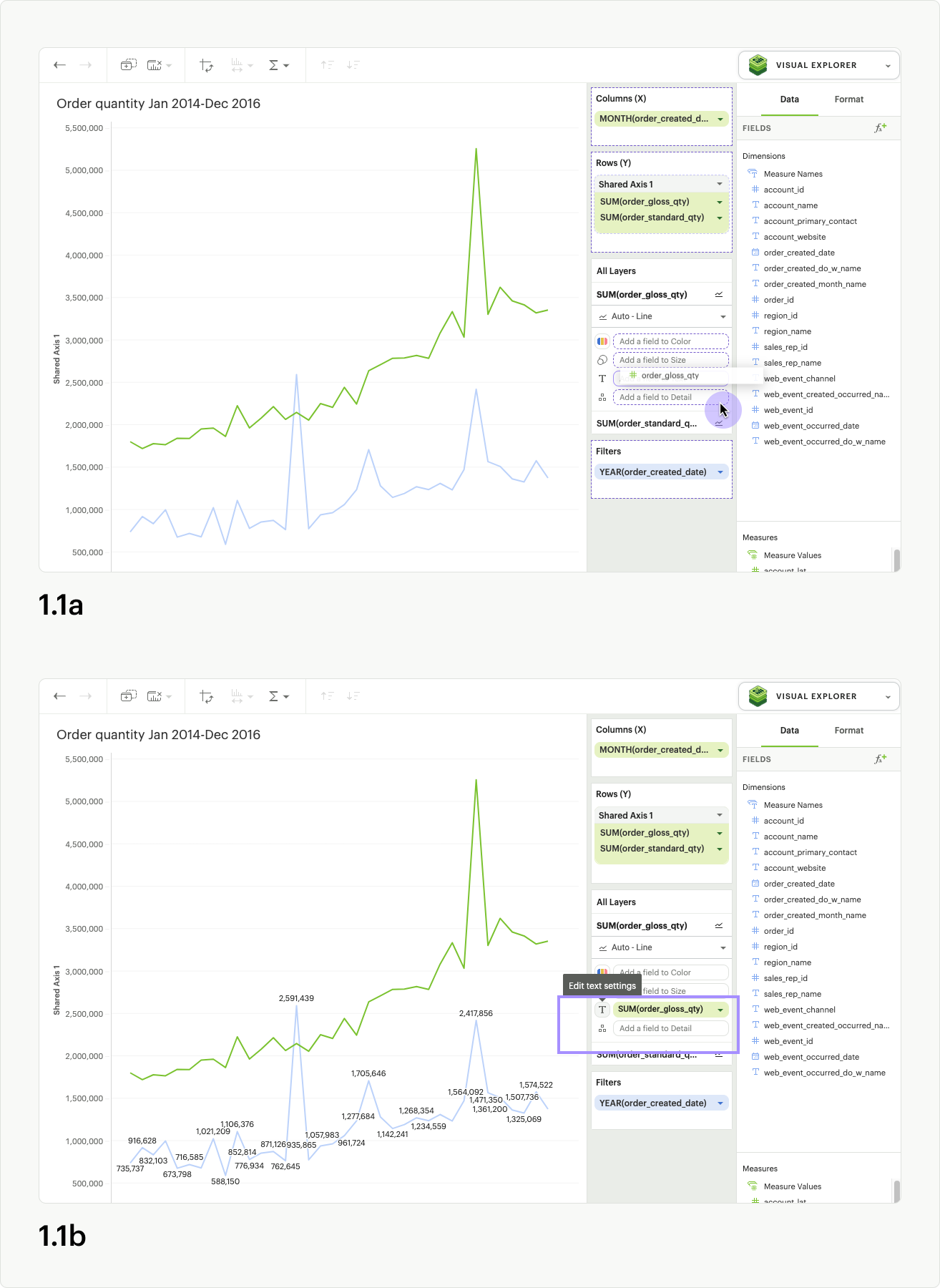
To access text settings, add a pill into the text dropzone on the layers card (fig 1.1a) for a non-table chart. A button outline will appear around the text icon, and you can click it to launch the Text Settings modal (fig 1.1b).
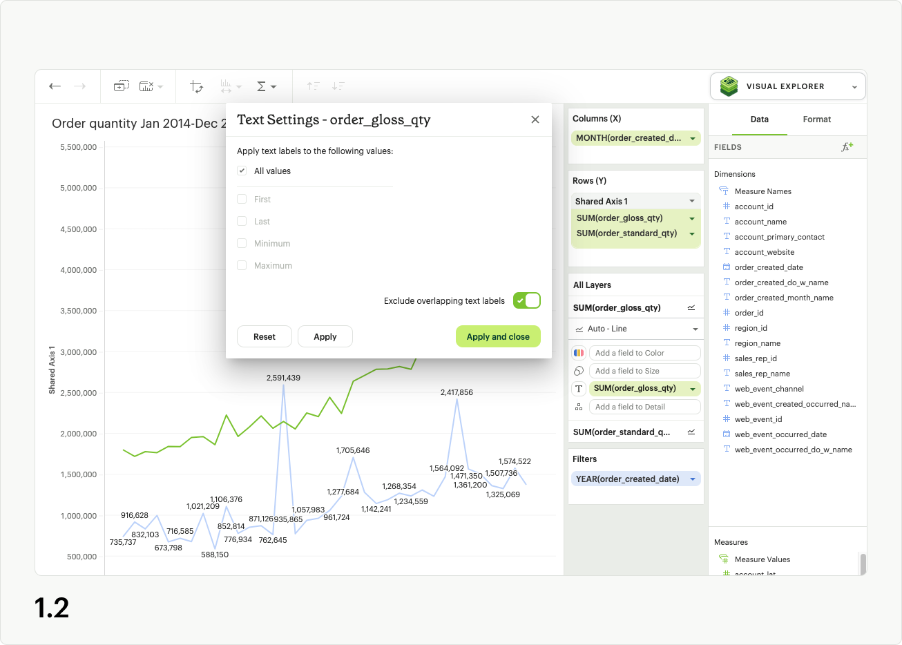
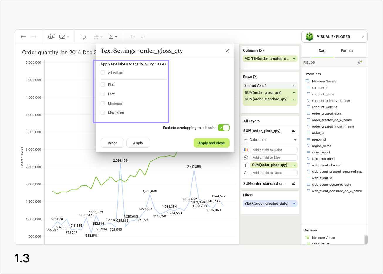
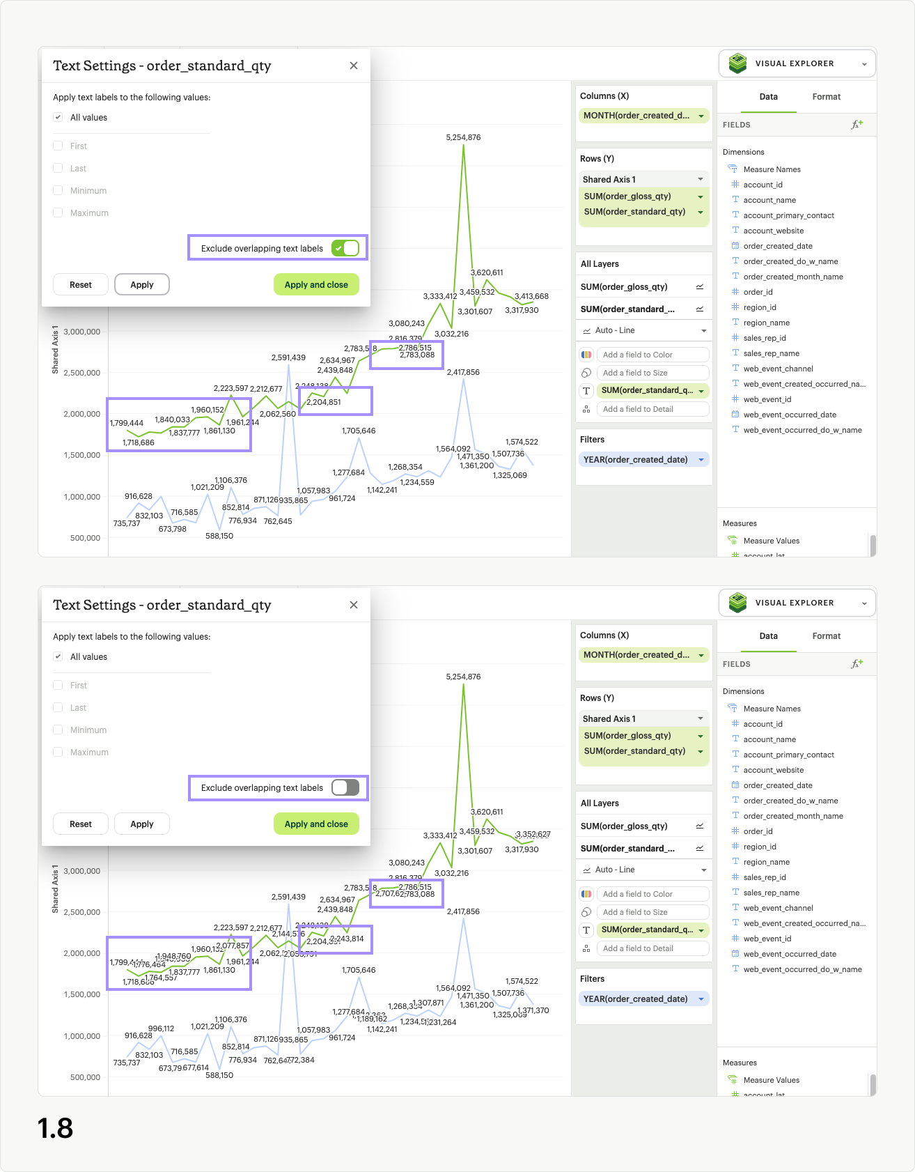
In the modal you’ll see five checkboxes: All values, Minimum, Maximum, First, and Last (fig 1.2). When All values is selected, your visualization will display text labels for every value in the series. The other four checkbox options control a subset of labels, and you must uncheck All values to use them (fig 1.3).
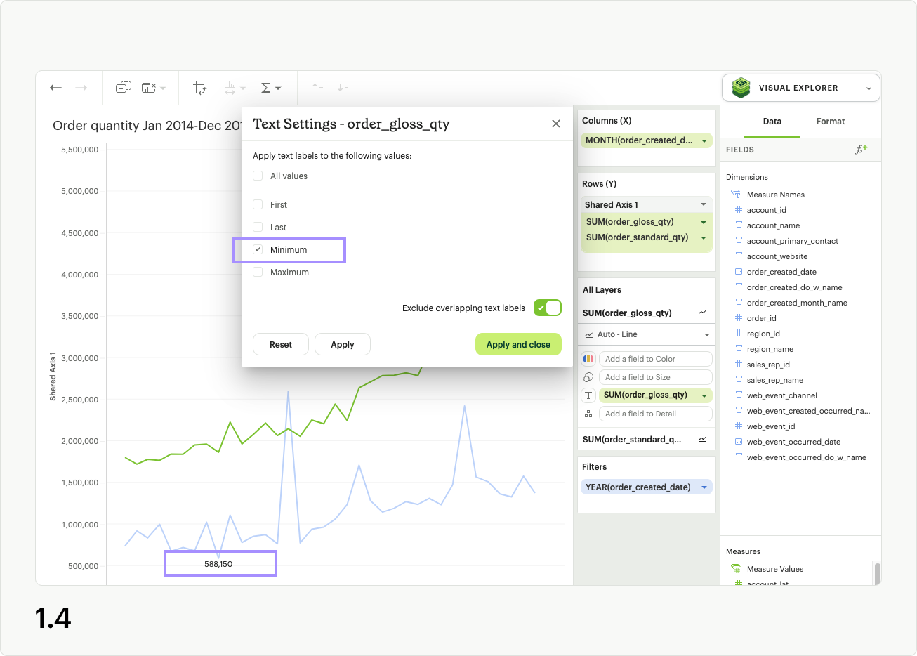
The Minimum control adds a label to the lowest value of the series in the Text layer (fig 1.4). In the case of multiple data points all having the same lowest value, they will each be labeled in the visualization.
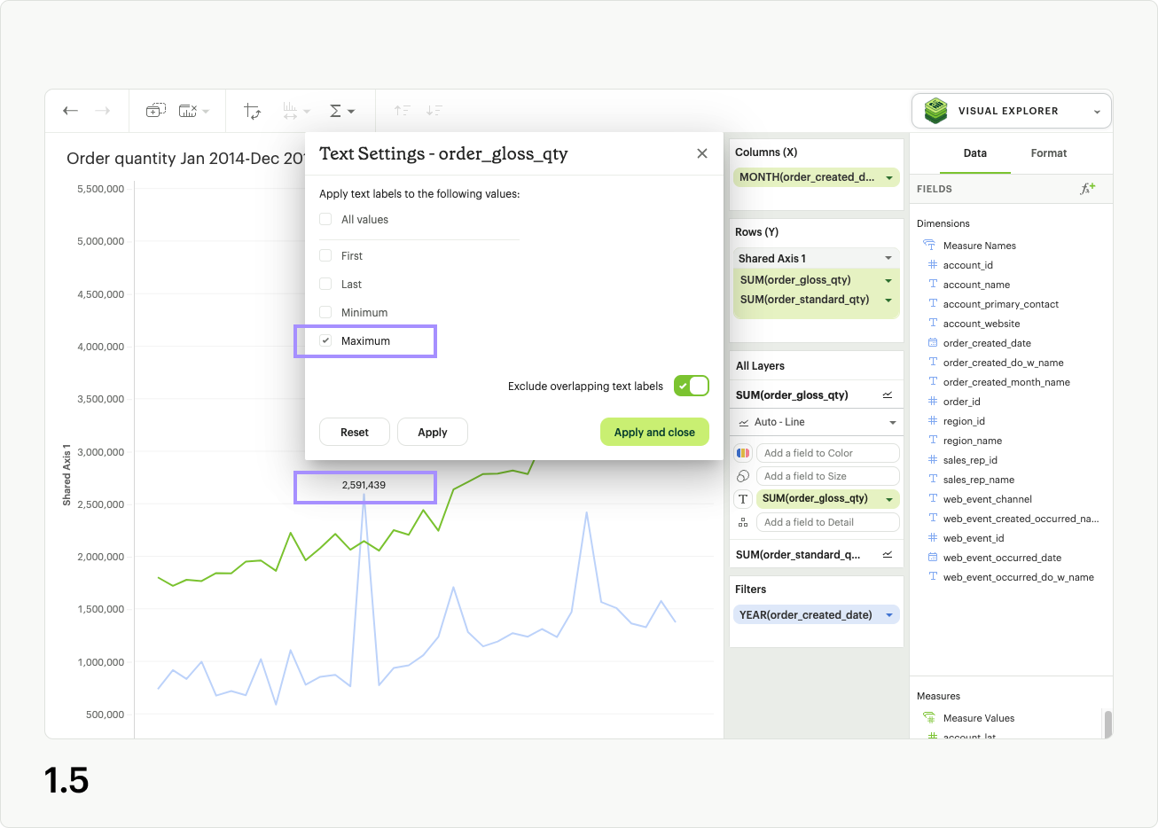
The Maximum control adds a label to the highest value of the series in the Text layer (fig 1.5). In the case of multiple data points all having the same highest value, they will each be labeled in the visualization.
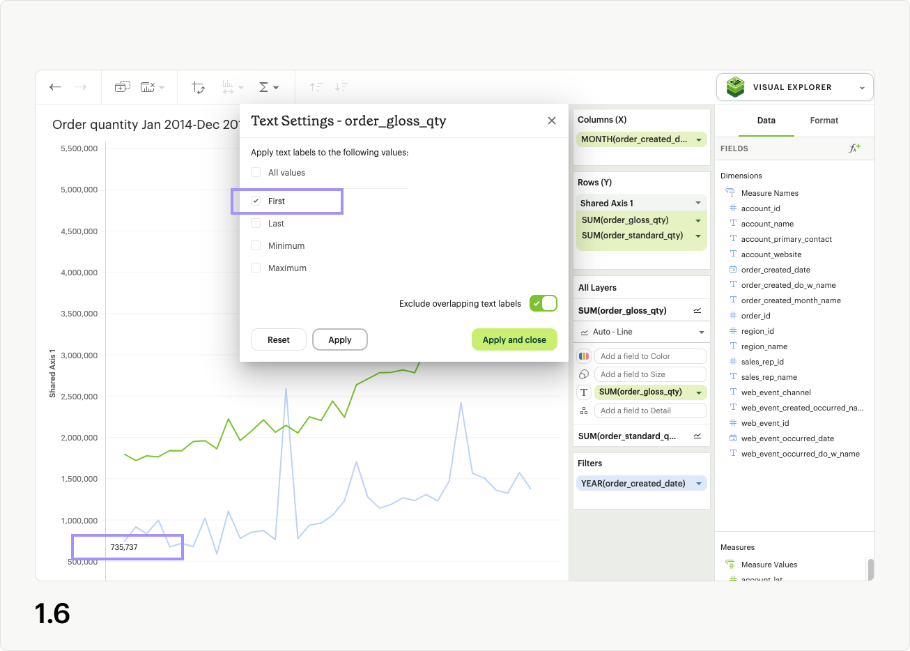
The First control adds a label to the first value of the series in the Text layer (fig 1.6). For individual series, only one value can be labeled using this control.
The Last control adds a label to the last value of the series in the Text layer (fig 1.7). For individual series, only one value can be labeled using this control.

At the bottom right of the modal, you’ll see a toggle that reads “Exclude overlapping text labels”, which is enabled by default (fig 1.8). When enabled, this smart control hides text labels that stack on top of each other in the visualization, in an attempt to prevent the labels being unreadable. Excluding overlapping labels is useful in data-dense visualizations, or when you intend to shrink down a visualization to a small size for inclusion in a Report. No underlying data is removed by enabling this setting, as it only applies to the label display.
Labeling all series
To apply the same text labels to all series in your visualization, simply drop the field you would like to use as a label onto the Text dropzone for All Layers (fig 2.1). When you open text settings from here and apply your changes, all series will inherit the customization.
If you are in All Layers in the layers dropzone, and see a non-interactive Multiple pill in the text channel (fig 2.2), this indicates that individual series have pills in their text channels, and those will have to be removed before you can customize labels using All Layers.
Removing text labels
To remove text labels from your visualization, simply drag any pills out of the text channel dropzone for all series (fig 3.1).
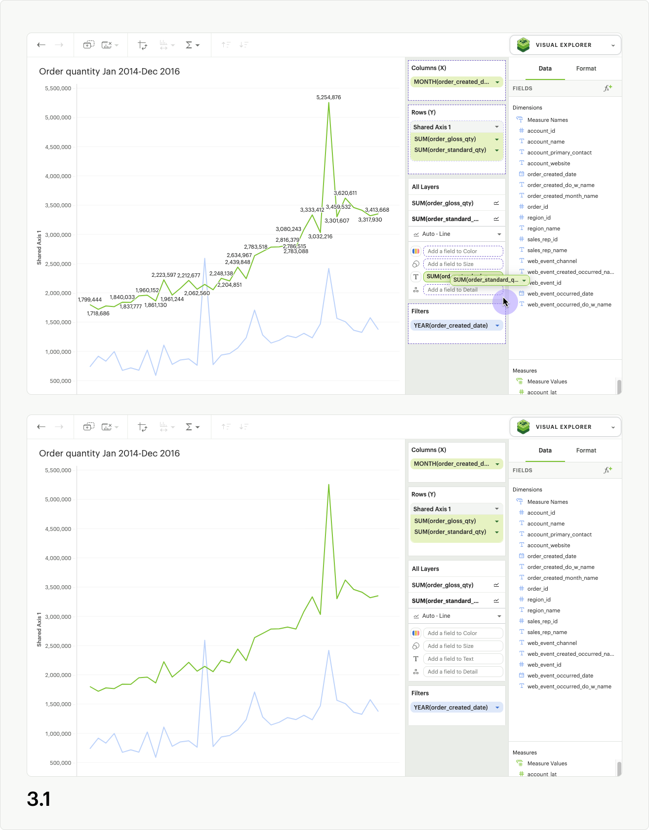
Chart descriptions
Text descriptions (with a 360 character limit) can be added to Quick Charts and Visual Explorer visualizations to set context or communicate insights. They can be added in the chart designer or in the Report Builder.
Users have the flexibility to display the description above or below the chart. The descriptions can also be hidden from view if needed.
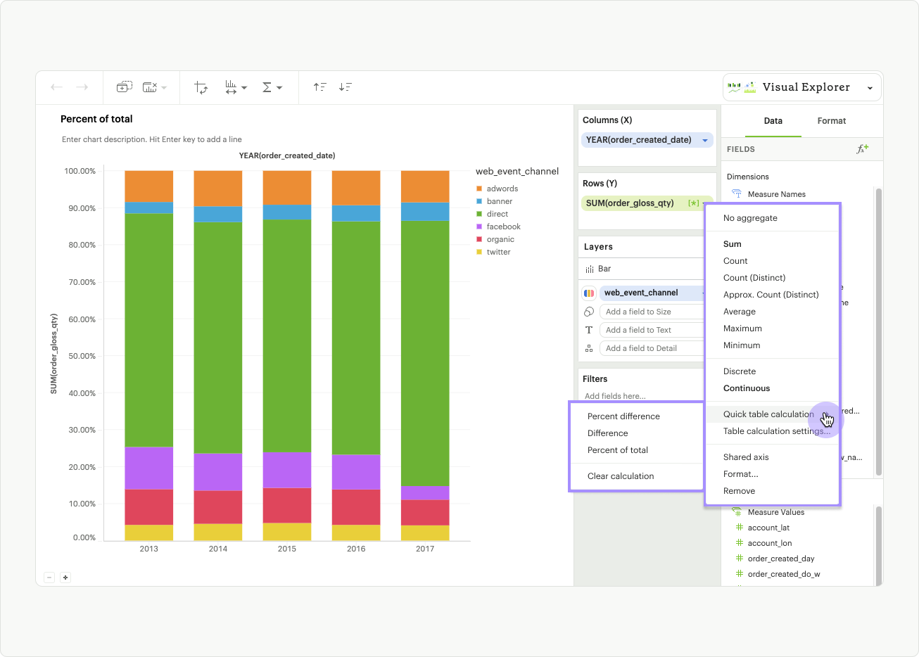
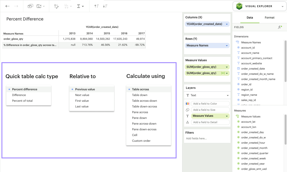
Quick Table Calculations
Intro
Quick table calculations allow you to quickly apply an analytic calculation to the data in your visualization. In addition to choosing the Quick table calculation type, you can also specify the level and direction you want to calculate.
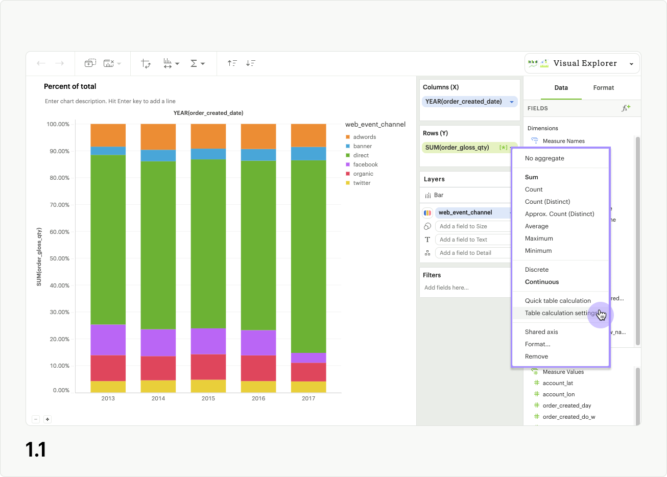
You can access quick table calculations by clicking on the pill context menu for any aggregated, continuous field and selecting Quick table calculation, or Table calculation settings.

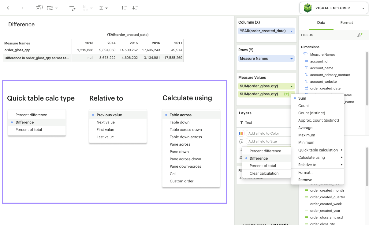
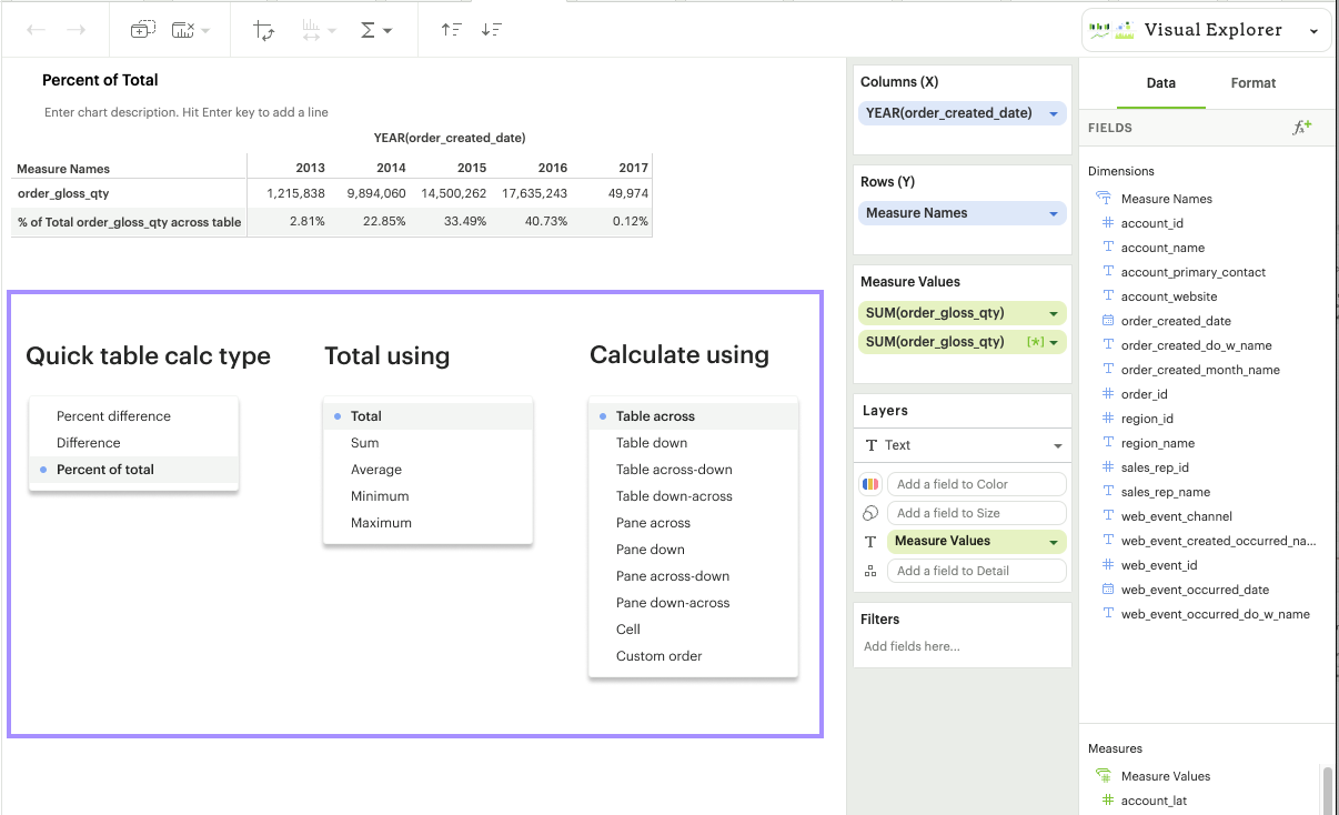
Calculation Types
There are three Quick calculation types we currently offer: Percent difference, Difference, and Percent of total.
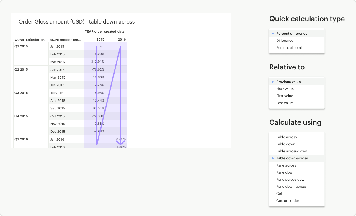
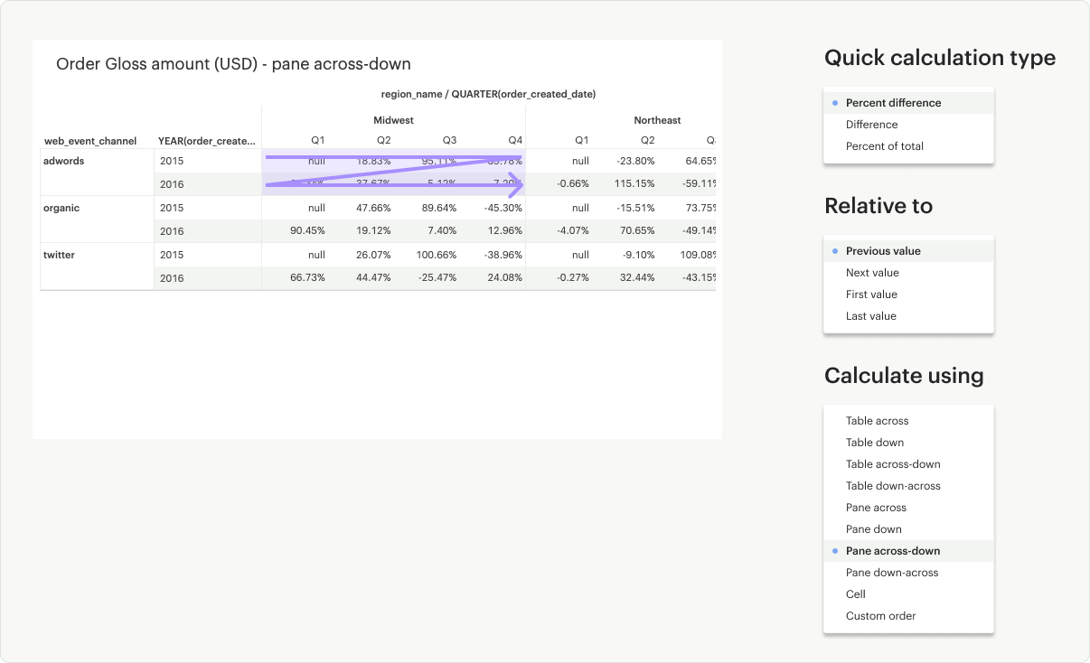
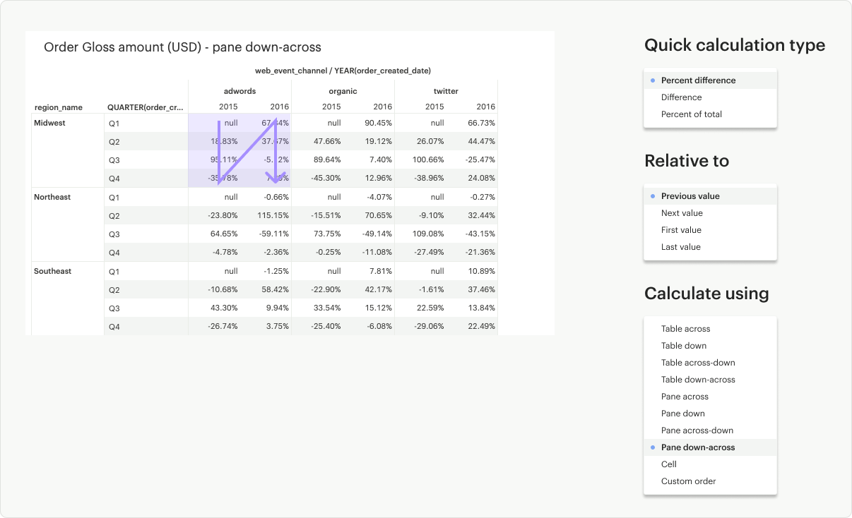
Percent Difference: Calculates the percent difference between the current value and another specified value for each mark in the visualization. In addition to the usual level and direction, you can also specify which value you’d like to anchor the difference calculation relative to.
Difference: Calculates the difference between the current value and another specified value for each mark in the visualization. In addition to the usual level and direction, you can also specify which value you’d like to anchor the difference calculation relative to.
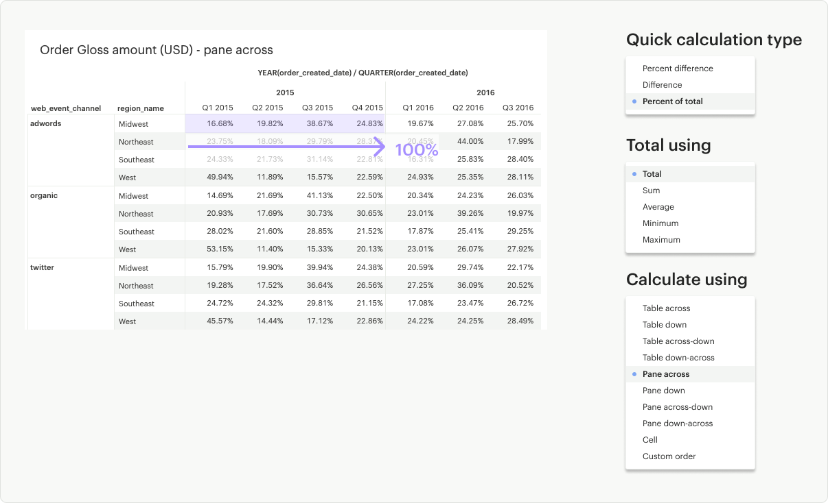
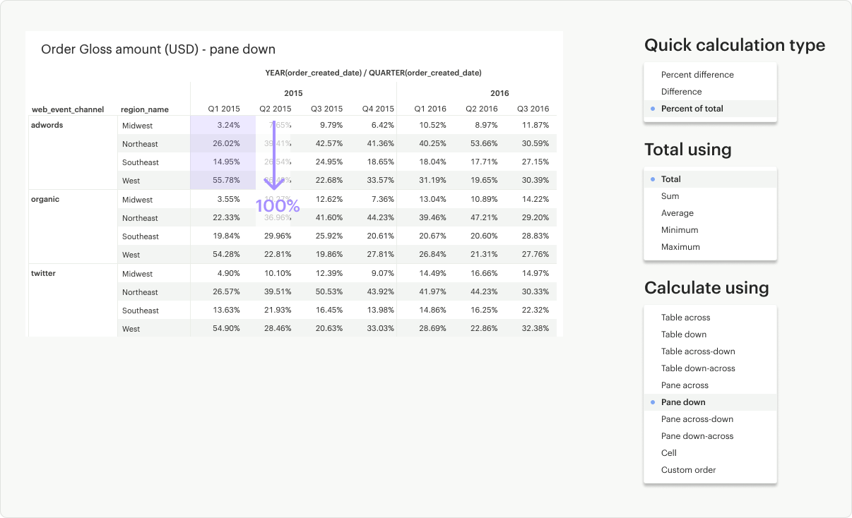
Percent of Total: Calculates the value as a percentage of all values within a specified window in the visualization.
Customizing Your Quick Calculation
In addition to choosing the calculation type, you can also specify the direction (e.g. across vs. down) and the level (e.g. table vs. cell) you wish to calculate over. To customize the direction and level of a calculation, go to Table calculation settings in the pill context menu.
Table Across: Calculates across (left to right) the entire table and restarts after every partition
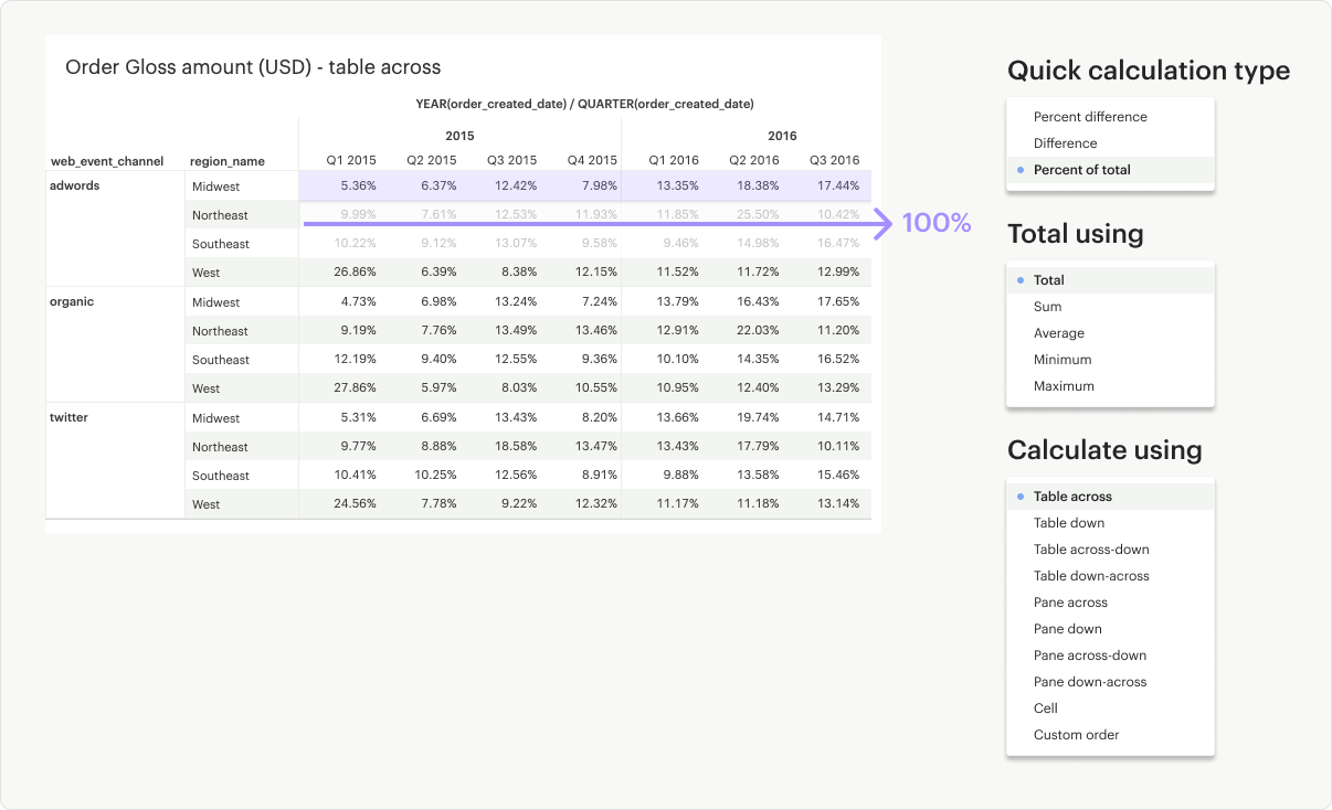
Table Down: Calculates down (up to bottom) the entire table and restarts after every partition
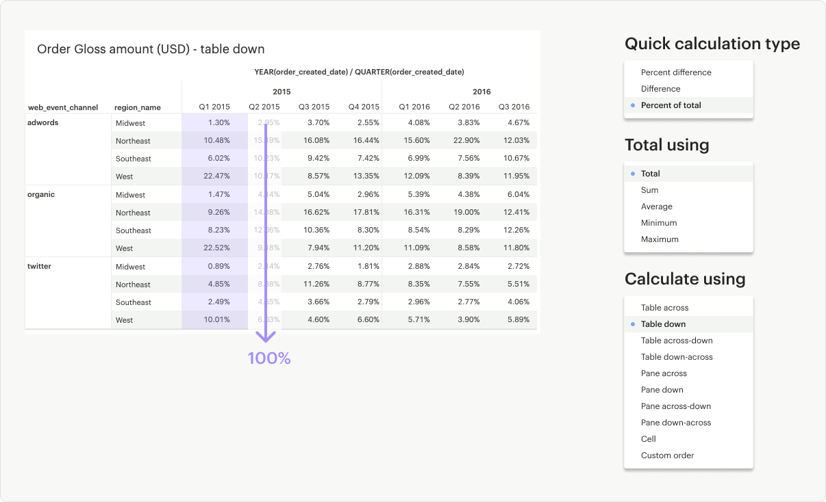
Table Across-Down: Calculates across (left to right) the table but does not restart after every partition
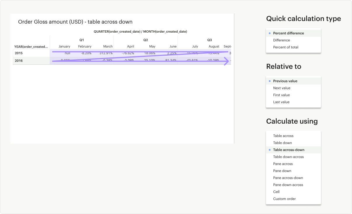
Table Down-Across: Calculates down (up to bottom) the length of the table but does not restart after every partition
Pane Across: Calculates across (left to right) the pane and restarts after every partition
Pane Down: Calculates down (up to bottom) the pane and restarts after every partition
Pane Across-Down: Calculates across (left to right) the pane but does not restart after every partition
Pane Down-Across: Calculates down (up to bottom) the pane but does not restart after every partition
Cell: Calculates within a single cell
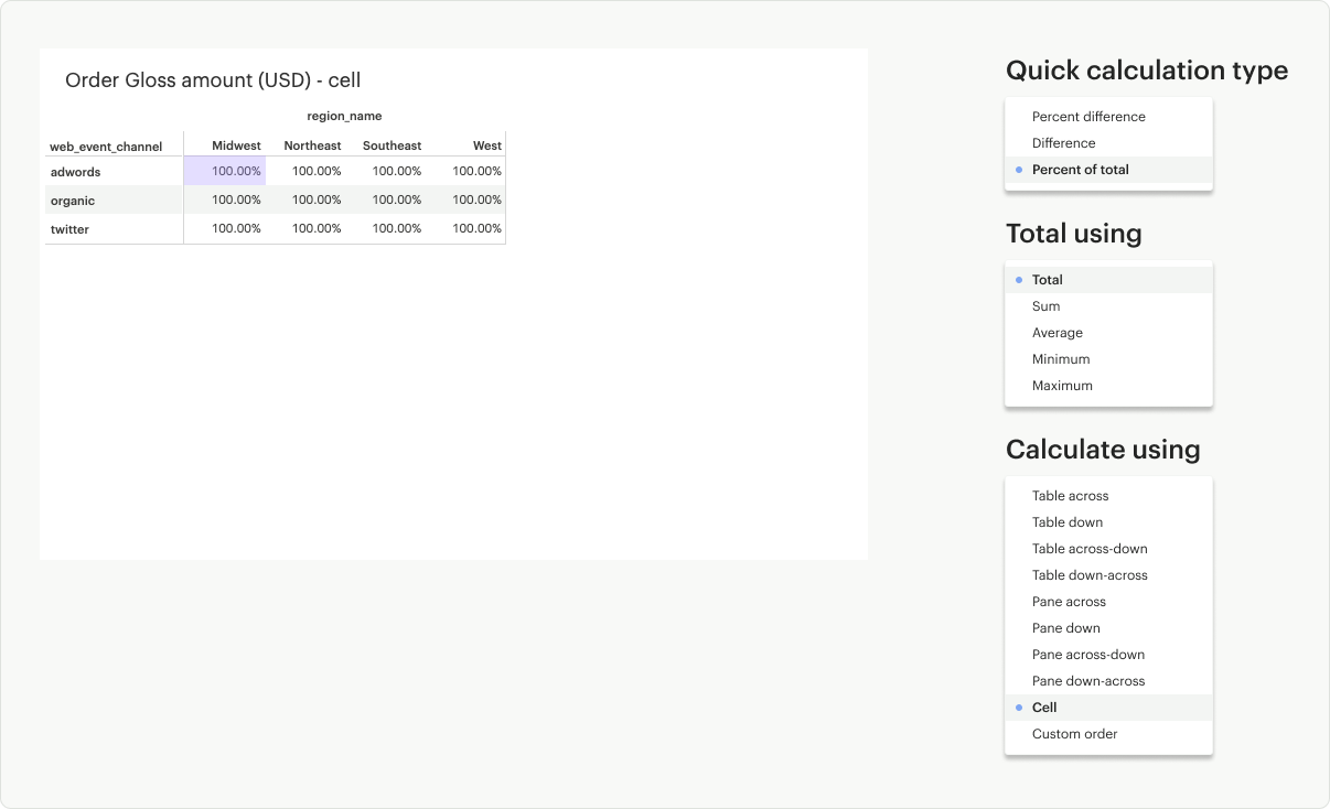
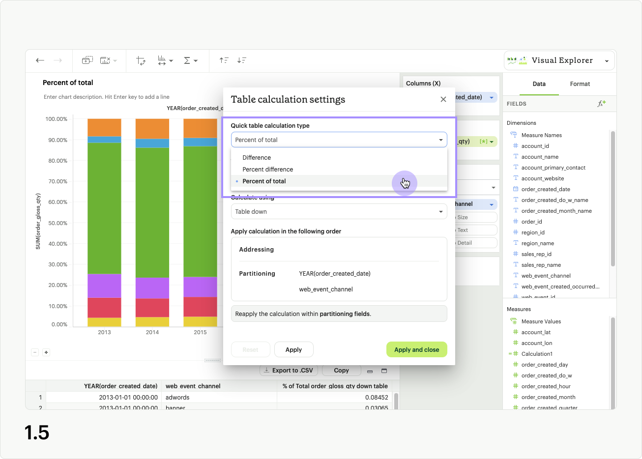
Table Calculation Settings
Intro
Table calculation settings is an advanced feature that allows users to further customize the way an analytic formula is applied to their data in a visualization.
Accessing table calculation settings
After applying a quick table calculation to a field, or dropping a calculated field into a dropzone, a field’s context menu will display an additional option labeled Table calculation settings (fig 1.1). Clicking this option will open the Table calculation settings modal. It provides additional options that allow you to reorder fields present in your visualization, and specify the way they should be used in the application of the table calculation (1.2).
Note: Both quick table calculations and calculated fields are types of table calculations, so both will have this additional customized setting available to them.
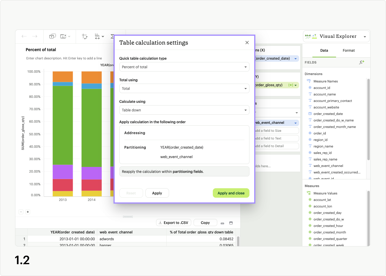
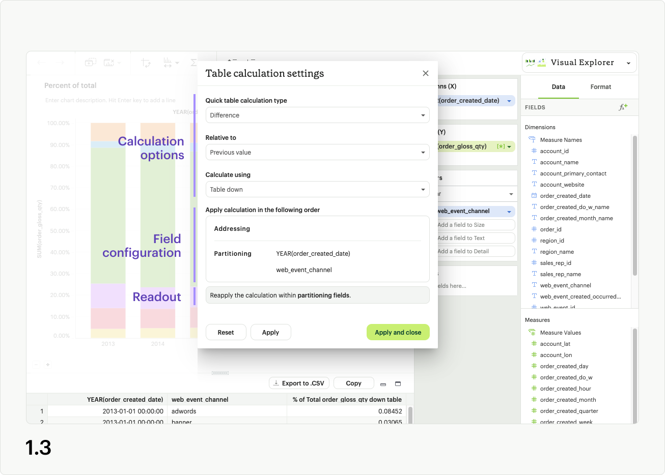
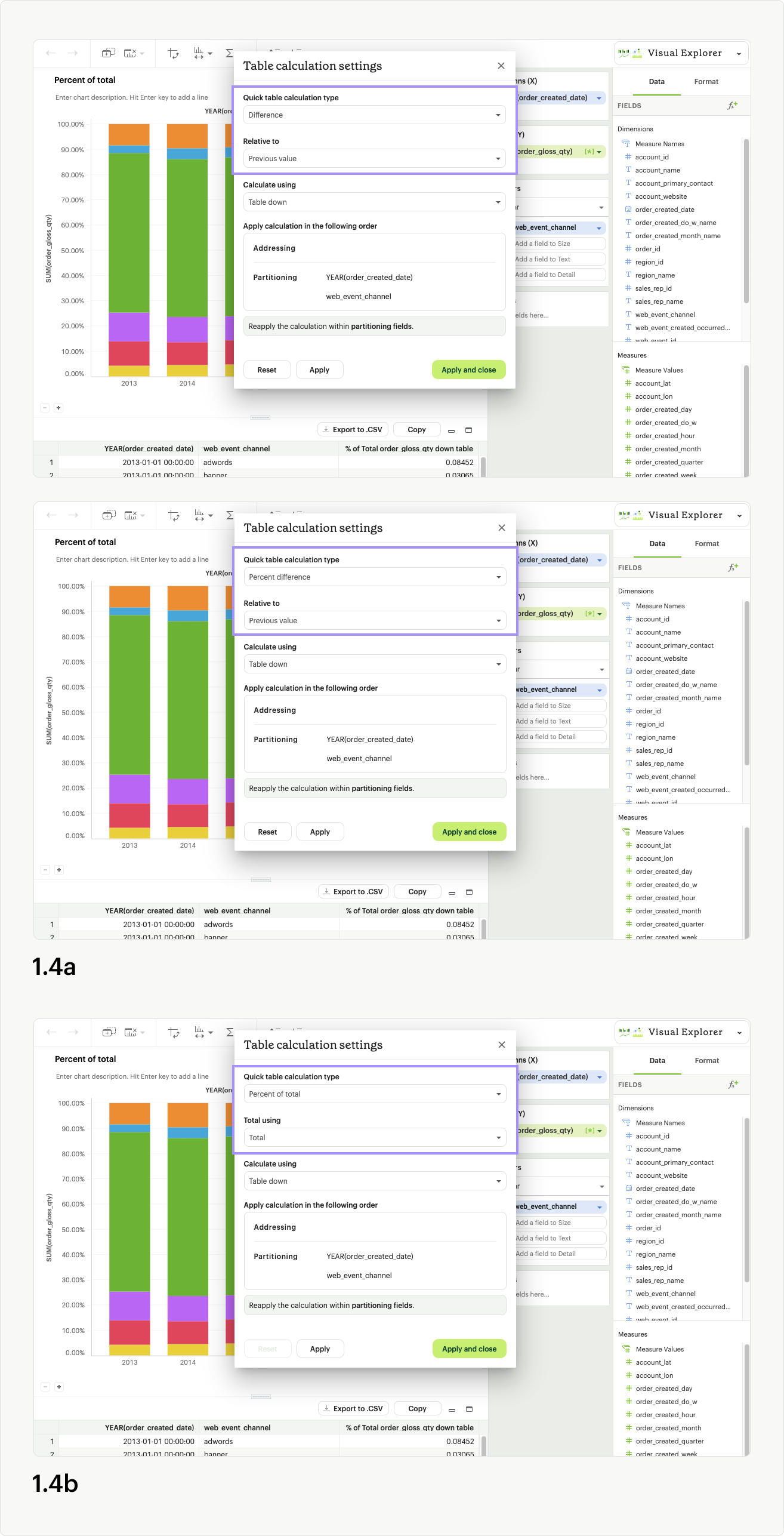
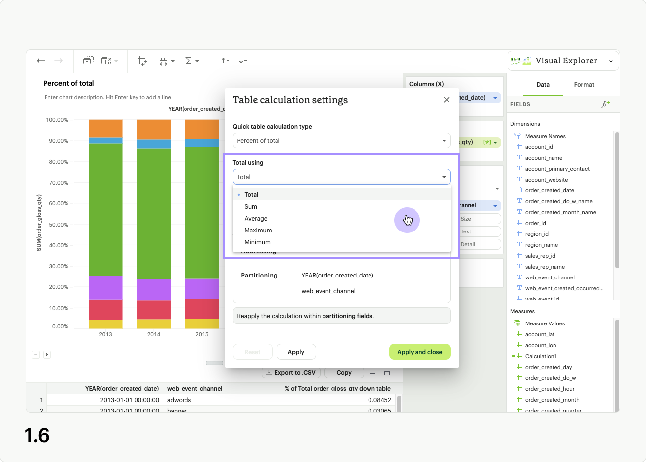
For non-calculated fields, you’ll see dropdowns for Quick table calculation type, Calculate using, as well as a draggable list and banner readout indicating how the calculation will apply based on your choices (fig 1.3). Different UI options will appear if you’ve selected Percent difference or Difference (fig 1.4a), and Percent of Total (fig 1.4b)as your calculation type. Calculated fields do not have a Quick table calculation type option in the modal.
Quick table calculation type determines the out-of-the-box analytic formula applied to your visualization (fig 1.5).
Calculate using allows you to choose between preset options for applying your table calculation (Table across, table down, etc.), or a Custom order of partitioning and addressing fields (fig 1.6).
Learn more about quick table calculation directions.
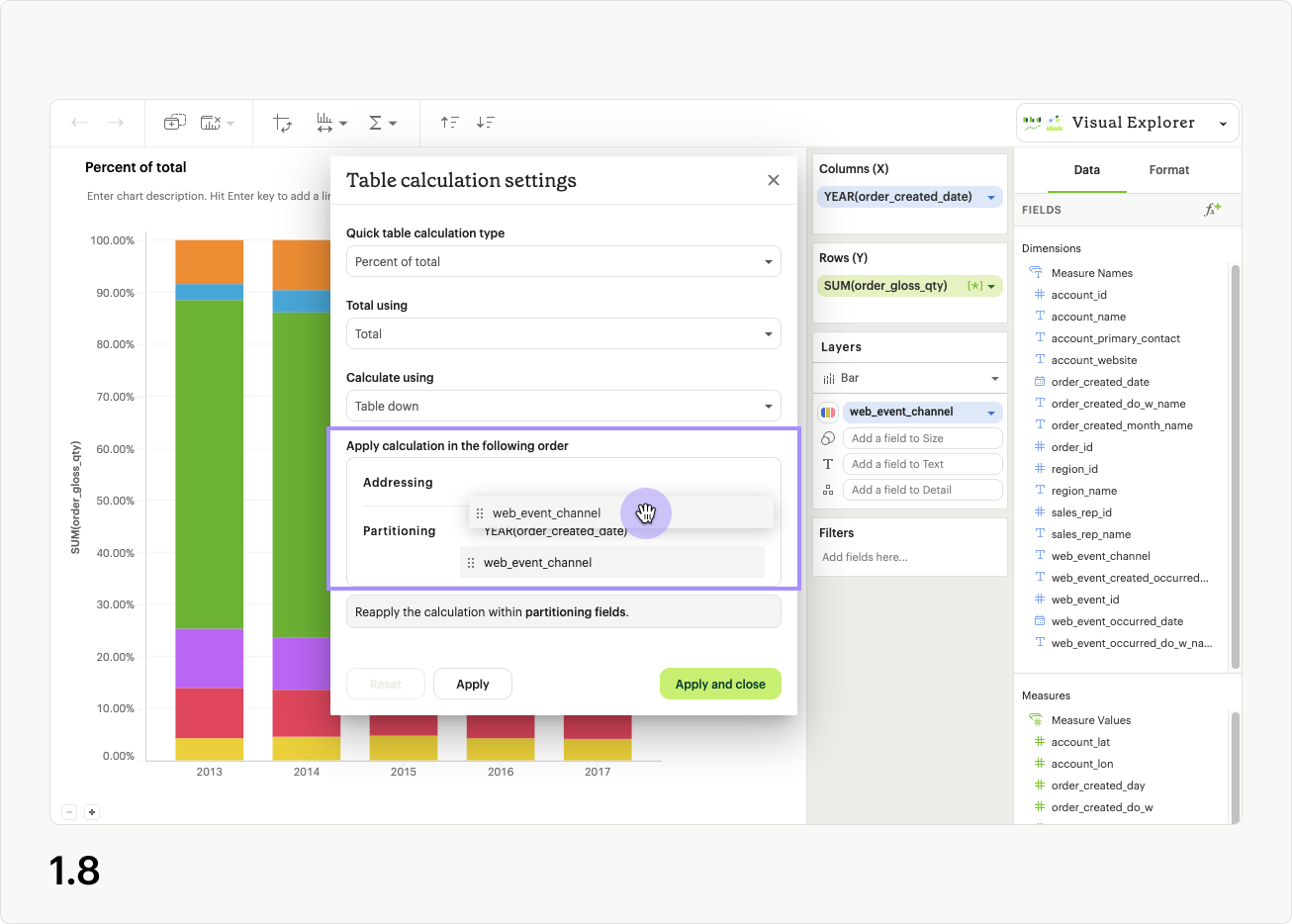
No matter which option you choose in Calculate using, you are designating a set of fields from your visualization that the table calculation should be reapplied to (partitioning fields), and a set of fields that should be used for calculation within those sets (addressing fields) (fig 1.7). Each time you select a different Calculate using preset, the fields are either being assigned as addressing or partitioning fields.
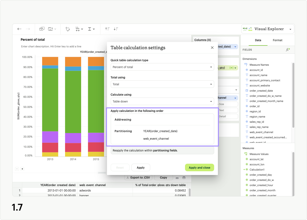
The Custom order option in Calculate using lets you set the grouping and order of the addressing and partitioning fields. You can drag fields within and between the categories to control how the table calculation will be applies. If you reorder the fields after selecting a preset option from Calculate using, the value will be changed to Custom order.
Error states
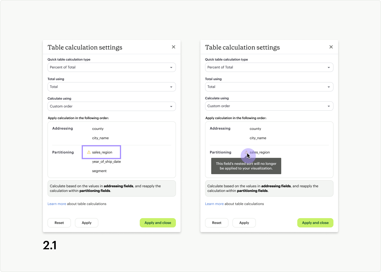
There are two main reasons errors appear in the table calculation settings modal. The first error state appears if a nested sort has been applied to a field that is now listed as a partitioning field. When a field is used as a partitioning field for the table calculation, the nested sort will not apply. As a result, you will see a warning icon and tooltip message (fig 2.1). You can ignore this warning, knowing the nested sort will not work, or you can move the field into the Addressing section to resolve the error.
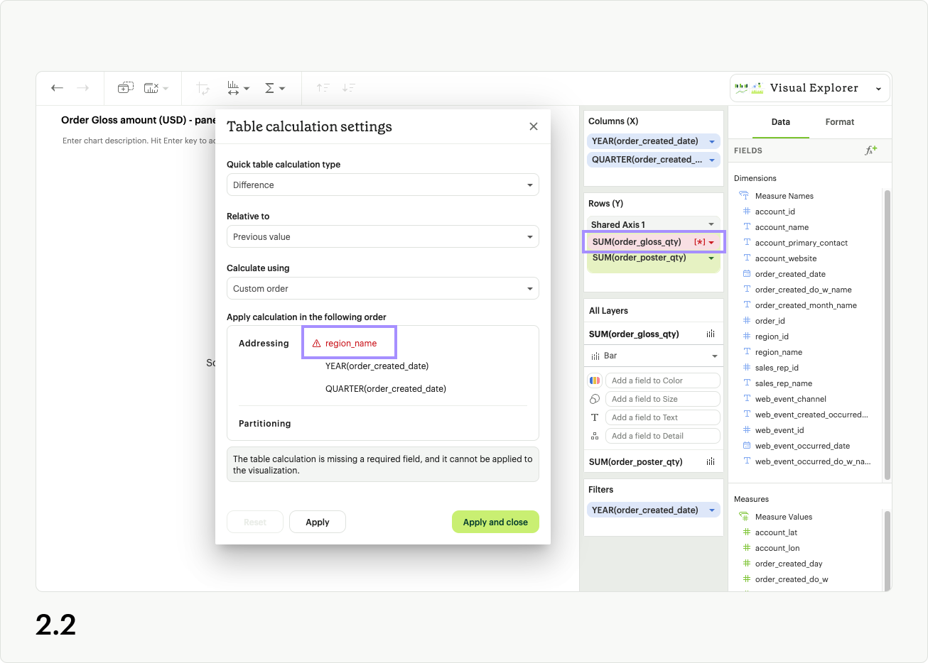
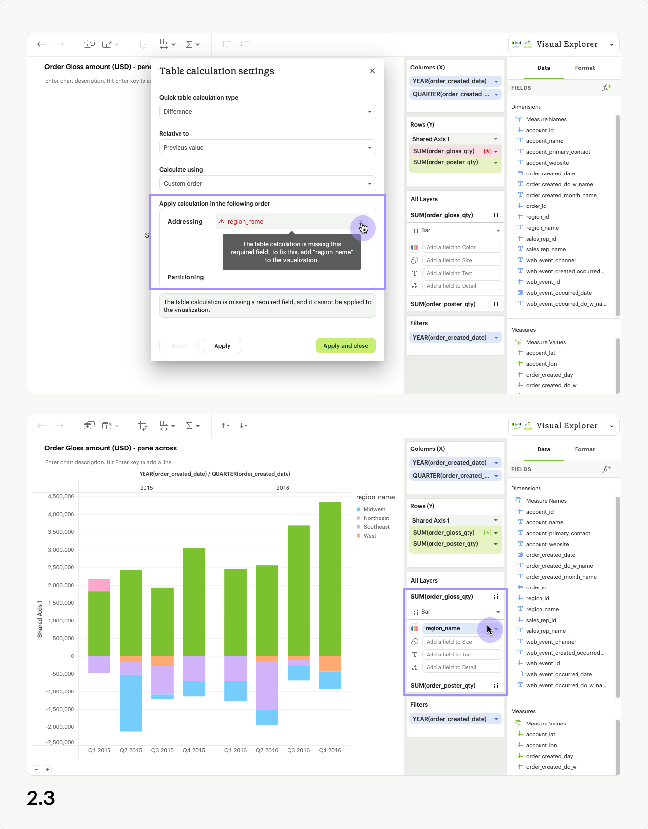
The second error appears when a field used in the table calculation is removed from the dropzones of your visualization. The field with the table calculation will appear red in the dropzone, and also have a red warning icon and text in the Table calculation settings modal (fig 2.2). To resolve this error, you can either re-add the missing field to you visualization, or remove the error field using the close icon in the Table calculation settings modal (fig 2.3).
Binning
In Visual Explorer, users can bin a measure or numeric dimension on various chart components such as the X or Y axis, size, detail, text, and/or color channel by using the bin option in the field context menu as shown in the demo below. The recommended bin size is determined by the minimum and maximum values of the field in the underlying data. The bin size can be updated using the bin settings option in the same field context menu The default for the bin label is the lower limit of the numerical range assigned to that bin. The bin label format can be updated to a continuos range using the axis labels option for binned fields in the format panel.
FAQs
Q: How do I customize tooltips?
You can add a field to the Detail layer channel. The field values will appear in the tooltip without affecting how the visualization looks.
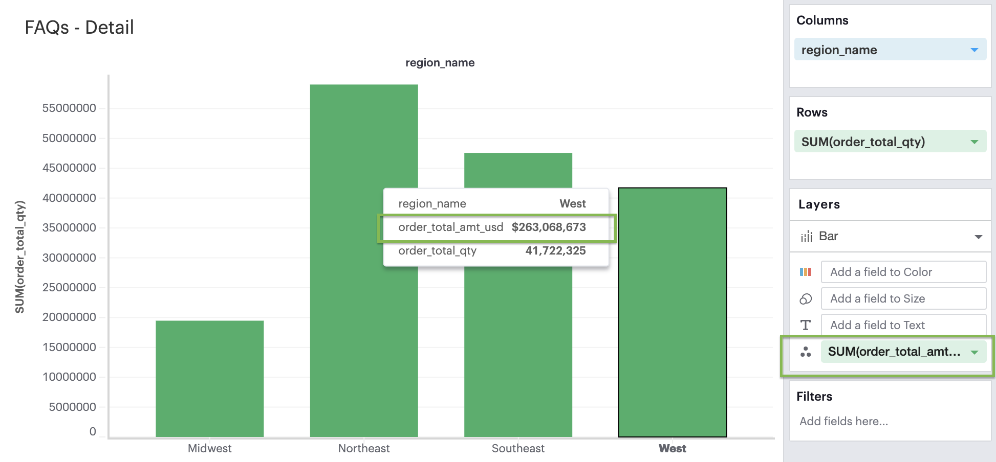
Adding a dimension will separate the marks in your visualization to the values within that dimension, while adding a measure will not because it will be pivoted along the same dimensions.
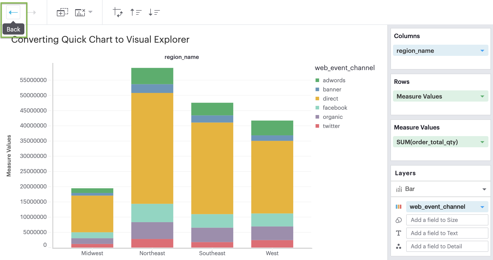
Q: Can I convert a Quick Chart to the Visual Explorer environment?
If you’re unsure how to get started in the Visual Explorer, a great way is to begin your visualization using our Quick Charts and then convert your work over to Visual Explorer by opening the Environment Switch.
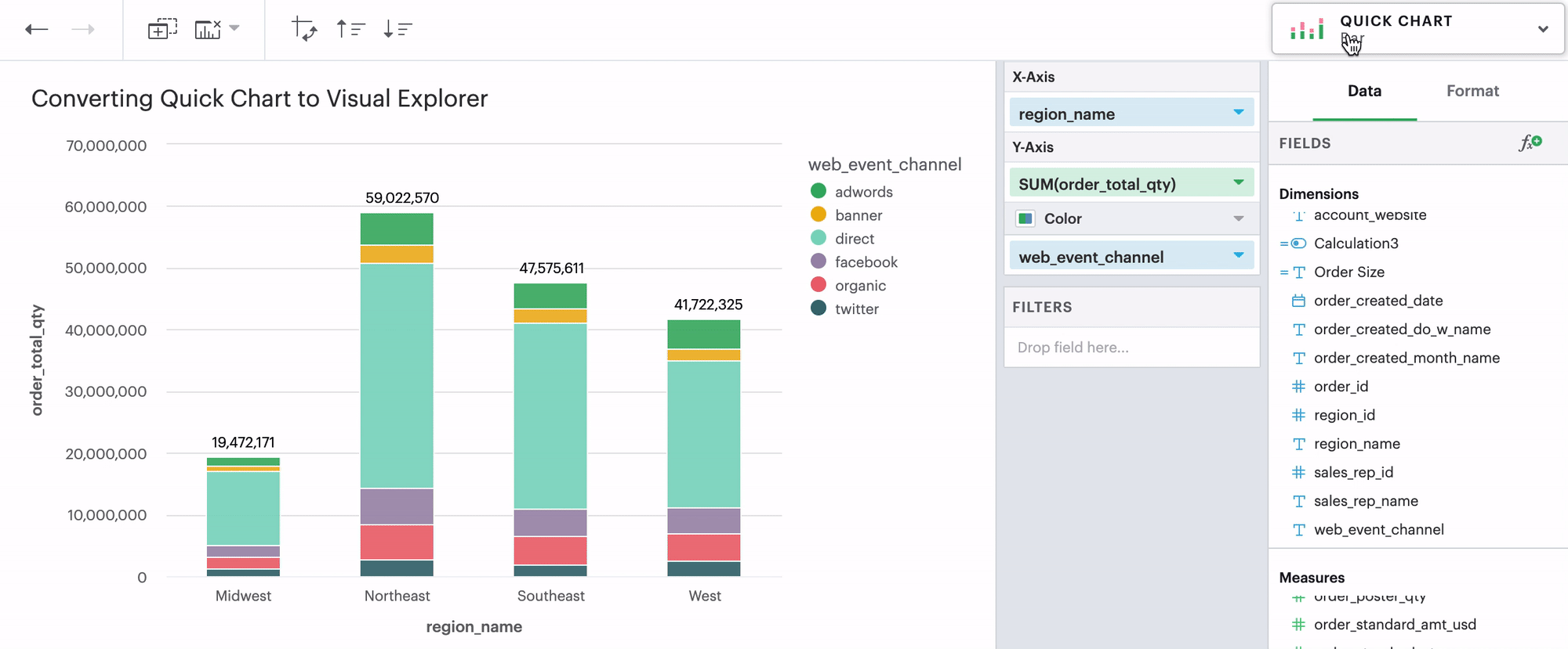 We support all Quick Chart conversions except for Tables and Big Values. We do not support converting Visual Explorer visualizations back to Quick Charts, though you can use the Back and Forward buttons in the Chart Editor.
Q: How do I assign a specific color to a specific value in my visualization?
The Visual Explorer gives you more granular control over parts of your visualization than Quick Charts do. One of those controls is colors.
No Field in Color Channel
When you don’t have any field in your Color channel and you click on the Color icon to edit your colors, choosing any color will directly apply to that series.
Discrete Field in Color Channel
When you have a discrete field in your Color channel and you click on the Color icon to edit your colors, you’ll see your palette selection on the left hand side and the data values within your discrete field on the right hand side.
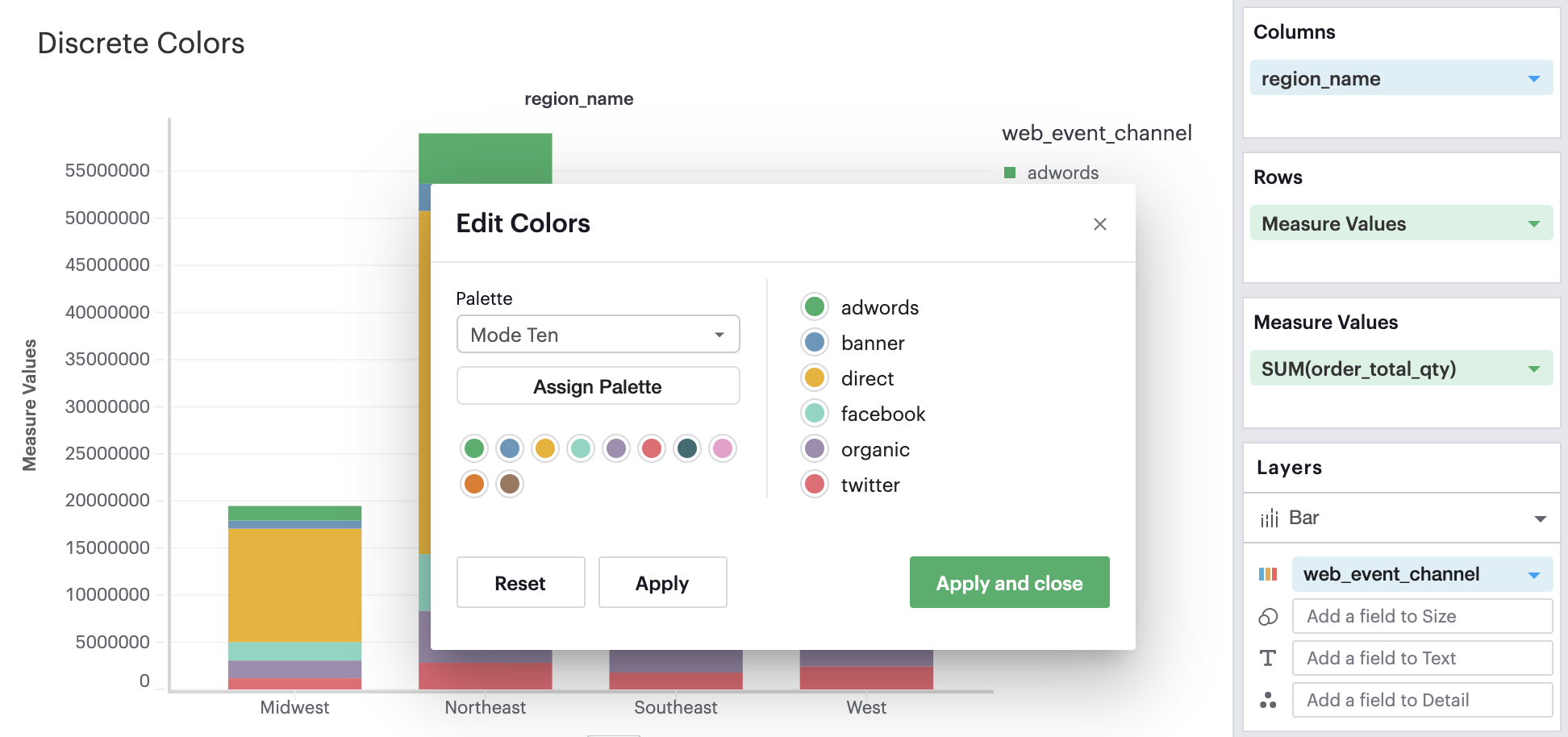
On the left, you can change and apply different palettes to your visualization. On the right, you can select individual data values and pick the specific color from any palette that you wish to apply to that selected data value.
Continuous Field in Color Channel
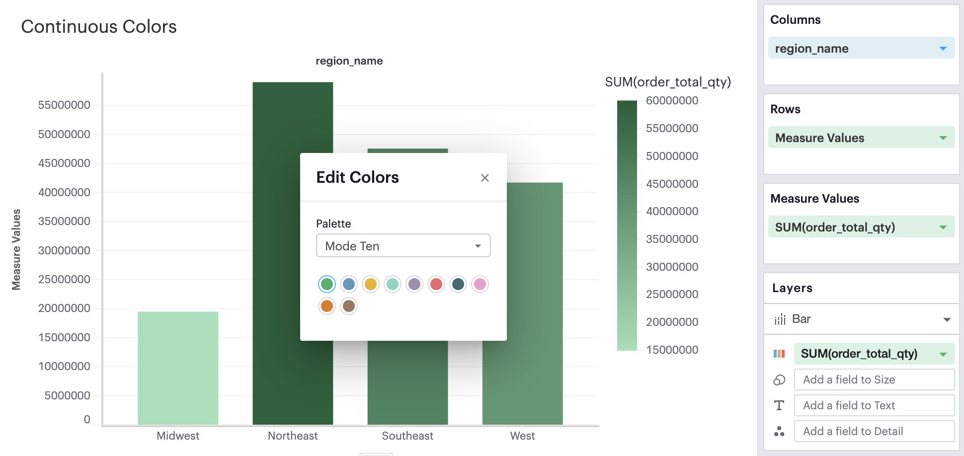
When you have a continuous, field in your Color channel and you click on the Color icon to edit your colors, you’ll see the ability to select the anchor color that will generate a continuous palette.
Q: How do I sort in Visual Explorer?
In the Toolbar, you have the ability to leverage our Quick Sort feature to sort your innermost discrete, categorical data by the outermost measure in either descending or ascending order.

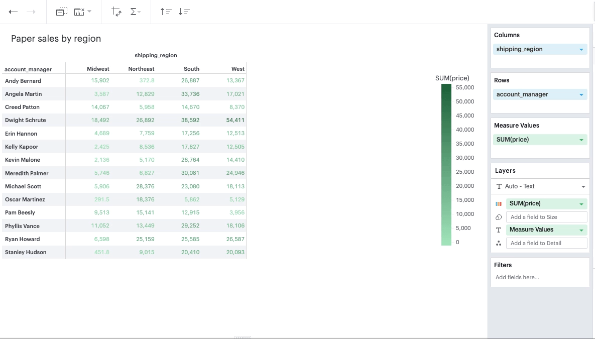
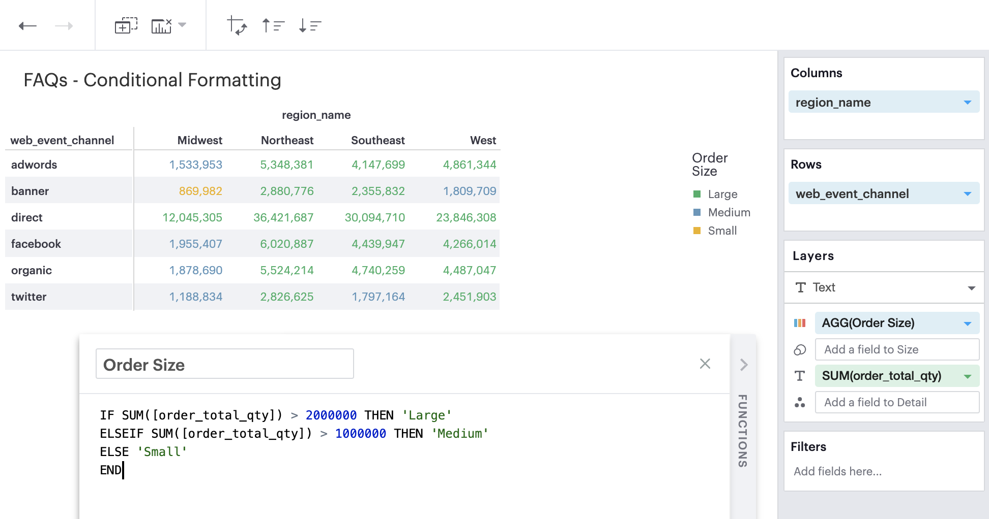
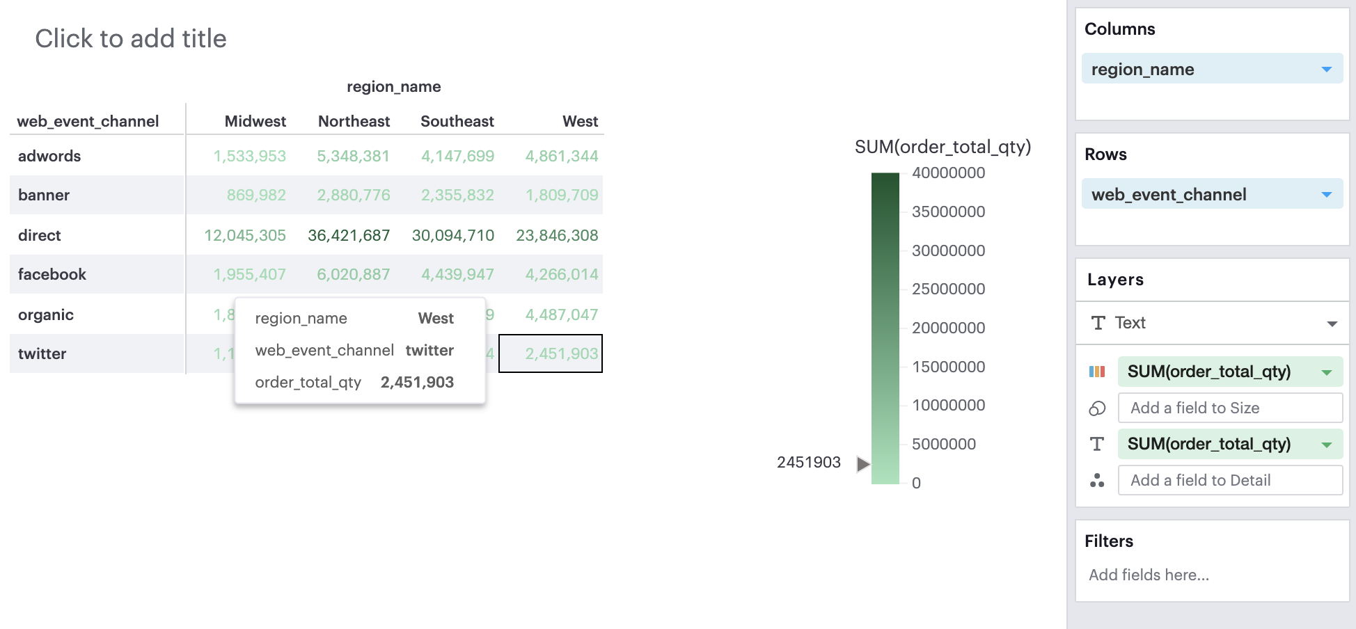
Q: Can I apply conditional formatting to my pivot table?
You can add color to the text or background in your pivot table based on some specifications by leveraging the color channel.
Discrete Field in Color Channel
You can create a calculated field with IF or CASE statement to form a categorical groupings that you can then apply to your pivot table.
Continuous Field in Color Channel
You can add a continuous, aggregated field to the Color channel. This will color the values in your pivot table based on the the cell’s value according to that field. The smaller the value, the lighter the color; the larger the value, the darker the color.
Q: Can I have multiple fields in a Layer channel?
Visual Explorer currently only supports one field per channel in a given Layer.
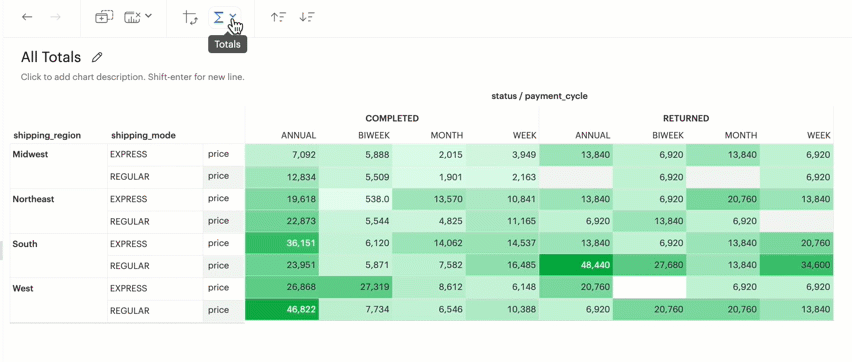
Q: Can I display Grand Totals and Subtotals in my chart?
You can toggle on and off either or both Column Grand Totals and Subtotals and Row Grand Totals and Subtotals using the Toolbar.
You will need more than one dimension and at least one measure under Columns or Rows in order to toggle on Subtotals.
Grand Totals and Subtotals will take on the same aggregation method as the measure, for example, it will sum all the values if your measure is SUM(field) or it will average across all the values if your measure is AVG(field).
Was this article helpful?