October 11, 2017 • 2 minute read
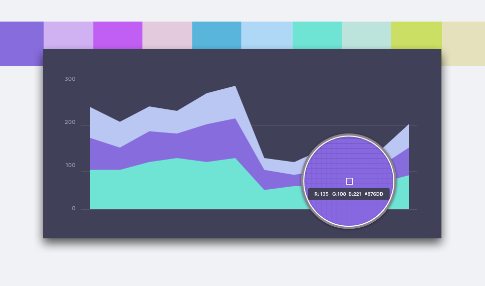
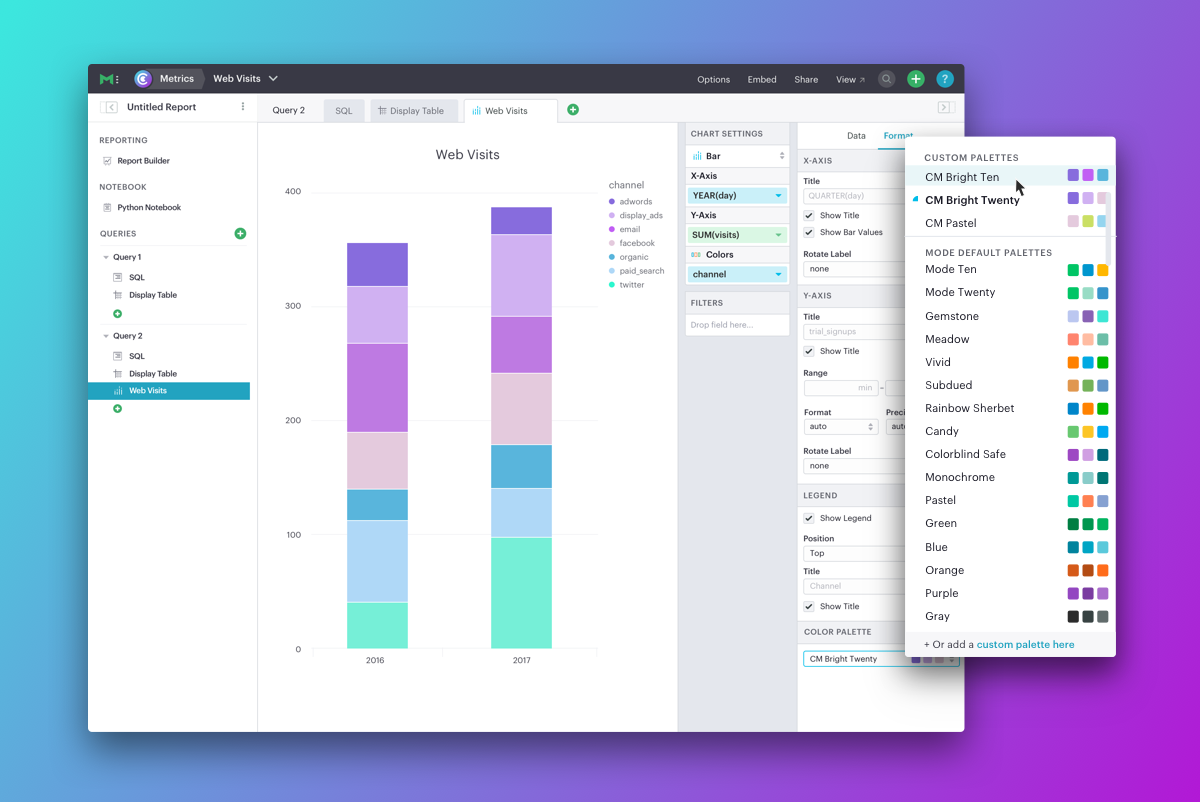
Colors are key to understanding data visualizations. They represent your data and guide people through charts and dashboards, making them easier to digest. Colors also represent your brand, providing a recognizable look and feel to everything your company produces.
July 13, 2017 • 3 minute read
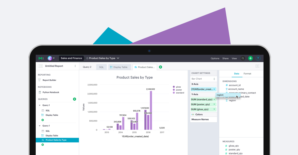
Phase II of this summer's code-free data exploration rollout is now live: drag-and-drop data exploration.
March 14, 2017 • 6 minute read
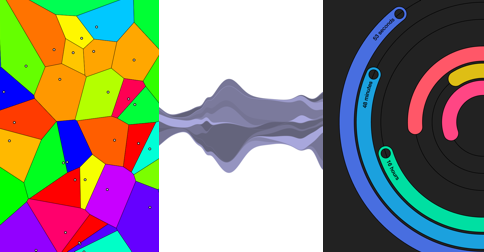
From streamgraphs to voronoi to polar clocks, there's essentially no limit to the types of data visualizations you can make with the JavaScript library D3.
March 9, 2017 • 3 minute read
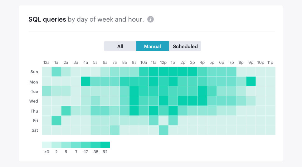
Presenting data effectively is a critical part of communicating insights. Making reports look appealing or building interactive charts isn't simply a vanity project—it's an effective way to ensure key insights resonate with your audience.
October 26, 2016 • 5 minute read
Sometimes the median and mean aren't enough to understand a dataset. Are most of the values clustered around the median? Or are they clustered around the minimum and the maximum with nothing in the middle? When you have questions like these, distribution plots are your friends.
August 30, 2016 • 5 minute read
You've probably heard of the Pareto principle, even if you didn't realize it at the time. Here are a few examples: