
Mode Help
The Mode Playbook
Report overviewHow do I calculate user retention and churn rate?
Reading this reportInterpreting the resultsUsing this with your dataStep-by-step instructionsDatabase notes
How do I calculate user retention and churn rate?
This article helps you get started with the Describing Retention report from the User Retention Playbook.
We recommend opening the report in another window or tab so you can consult the methodology and set-up steps as you explore the report. If you'd like a bit more of an overview of how Mode Playbook reports work generally, please read this article.
Report overview
The Describing Retention report creates a few basic charts that help you understand your users' retention rates. These charts cohort your users by the time period that they first appeared, and shows how users of different age cohorts retain over time. For a more detailed discussion of this type of retention analysis, check out this great Christoph Janz post, on which this report is based.
Reading this report
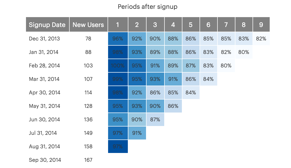
This report show three triangular tables. While each table measures retention in different ways, they all shares some basic similarities. In all tables, the two left columns show how many new users started using your product in each time period. Each row of the shaded triangular table on the right corresponds to that user cohort---in other words, the numbers on each row describe retention metrics for just that user cohort.
Columns of the triangular table represent the age of the user cohort. For example, in the first table, the column labeled "2"; shows retention metrics for the 2nd time period (month or week) after a user signed up. Importantly, this is a different time period for different rows---the users on the first row signed up in January of 2014, so the column labeled "2"; represents retention metrics for March of 2014. For the February 2014 row, this column represents April of 2014.
The charts have their triangular shape because the later rows---which represent recent signups---haven't been users for long enough to populate the right side of the table. We clearly can't measure the 8-week retention rates for users who joined two weeks ago, so these cells are left blank.
MixPanel has a more detailed discussion of these charts. MixPanel and Mode share a common methodology for analyzing retention and churn.
Though each table shows retention metrics, they all look at it from different perspectives.
Table 1: This table shows the percent of users who retain. The column labeled "1"; shows the of percent of users who signed up in the corresponding period and retained for at least one additional period. Given that users often drift away over time, the numbers typically get smaller as you move left to right.
Table 2: This table shows the percent of total users signed up who churn in each period. The first column shows the percentage of users who were lost in the first period, the second column shows the percentage lost in the second time period, and so on. This can be easily calculated from Table 1; if retention in period 1 was 50%, and retention in period 2 was 25%, the churn rate for period 1 will be (100% - 50%) = 50%, and the churn rate for period 2 will be (50% - 25%) = 25%.
Table 3: This table also shows churn rates, but it shows the percentage of users who churned from the previous period. To use the same example from above, if retention in period 1 was 50%, and retention in period 2 was 25%, this table would show a churn rate of (100% - 50%)/100% = 50% for period 1 and a churn rate of (50% - 25%)/50% = 50% for period 2.
Interpreting the results
The Christoph Janz post mentioned above does an excellent job of describing how to interpret the results of these reports. All three tables are typically read in two ways. First, reading the values from left to right shows how retention rates change as users age. If you see a period that where retention drops off sharply, that indicates that users of that age tend not to stick around. Looking at the numbers from left to right also helps identify when retention rates stabilize.
Second, these charts are often read top to bottom as well. If retention rates are rising (or churn rates are falling) as you move down a column of the table, that indicates that retention is improving. If your product is doing a worse job of retaining users, however, you would see rates retention rates falling (or churn rates rising) as you go down columns.
Importantly, there isn't really a standard retention rate across products. Some things, which target narrow audiences, are very sticky; other apps tend to churn through users quickly. This report can be very valuable because it shows how retention is changing within your product, rather than trying to compare it to some "average"; which may not represent your product at all.
Using this with your data
This report requires the standard events and users tables.
Step-by-step instructions
-
From the Report, click the
 button to the right of Export and then click Duplicate.
 -
In the box that pops up, select the Workspace you want to duplicate the report to.
-
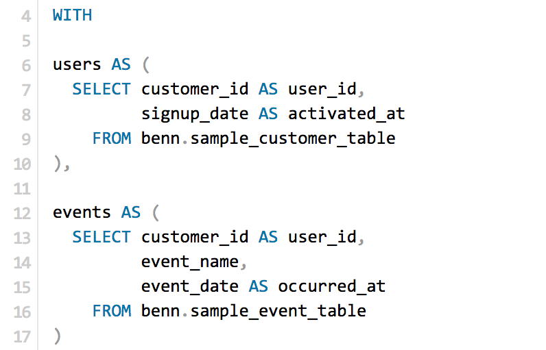
Modify the common table expression (more info) in lines 4-17 to reference your database tables and relevant columns.
-
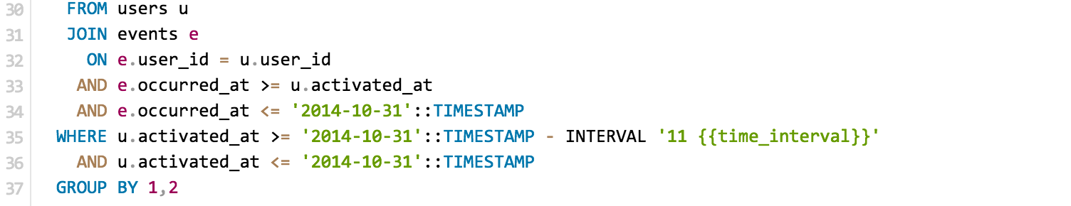
Change the timestamp on lines 47, 48, and 49 to a current timestamp function. For details on how to do this for your database, see the notes below.
-
Click Run.
-
Click Report and then Publish to change the report name and description.
-
Share with your colleagues.
Database notes
This query uses window functionFour parts of this query can be database-specific. For details on how to adapt these to your database, see our Database Notes.
- Window functions. The
MAX()andLAG()functions are used several times on lines 20 through 29. - Current timestamp function. This function is used on lines 47, 48, and 49.
- Adding or subtracting a fixed time period to a date. This function is used on line 48.
DATE_TRUNCfunctions. This function is used on line 32.- Calculating time intervals between two dates. These functions are used on lines 35 through 39. Note that these functions differ for weeks and months.