


Now Live: Faster, Easier, and More Customizable Visualizations in Mode

Christine Sotelo, Director of Product & Customer Marketing
March 29, 2023
NaN minute read

Visualizations are an essential product area for any BI platform as they allow teams to easily and quickly understand complex data, identify patterns and trends, and make informed decisions based on data-driven insights.
A flexible, exploratory visualization system enables teams to do more than just visualize known concepts—they can actually uncover new insights while exploring their data visually. At the same time, out-of-the-box templates for common chart types can make it easier for anyone to understand their data quickly without learning a complex new system.
This month, we’re delivering a number of updates to both Mode’s flexible, powerful Visual Explorer and its easy-to-learn Quick Charts to help teams work more efficiently and create the visualizations that they need more easily, no matter how customized or templated.
Let’s take a look.
Customization & simple chart creation helps business teams get insights faster
We’ve released a number of updates recently that continue to give teams more control over customizing their reports and quickly creating easy-to-read charts. These updates aim to bring teams to insights faster through tailoring reports and charts to suit their business needs.
Conditional color formatting in pivot table quick charts.
With conditional color formatting, colors are automatically applied to the background of your pivot tables when building them in Quick Charts. For times when you need more customization, you can edit the colors, apply them to the text instead of the background, or remove it entirely.


Conditional color formatting is also available in pivot tables built with Visual Explorer, but it will not be applied automatically. For more information on conditional color formatting, see the Help site.
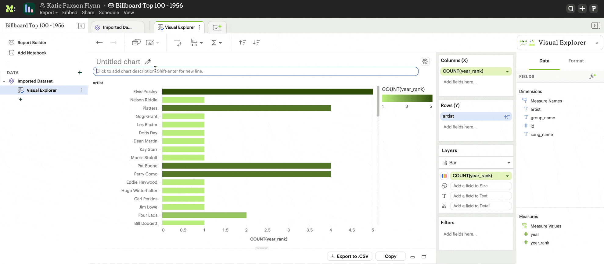
Split legends in Visual Explorer
Split legends allow you to separate legends for each measure and apply different colors to each. This makes it easier to compare different elements in the same visualization, and understand it more easily.


We've also made a few other UI enhancements to improve consistency in the legends across chart types, including between Quick Charts and Visual Explorer, and to improve the appearance of visualizations with legends. Enhancements include:
Tooltips for truncated values
Pagination and scroll functionality for long legends
Top-to-bottom arrangement of legends to save space
Read more about split legends here on our Help site.
Start-of-week customizations
Customize your visualizations to better match the way your business is measured, using Start-of-Week Customization—making it easier to analyze your data. This feature enables you to choose what day of the week your weeks begin on.


Chart Descriptions
Adding more context to visualizations provides a way to quickly explain the purpose and/or main insights of a visualization. Now, when users transition from exploration to presentation, they can add text descriptions to their visualizations to ensure they can clearly communicate their findings and call attention to the most important insights found.
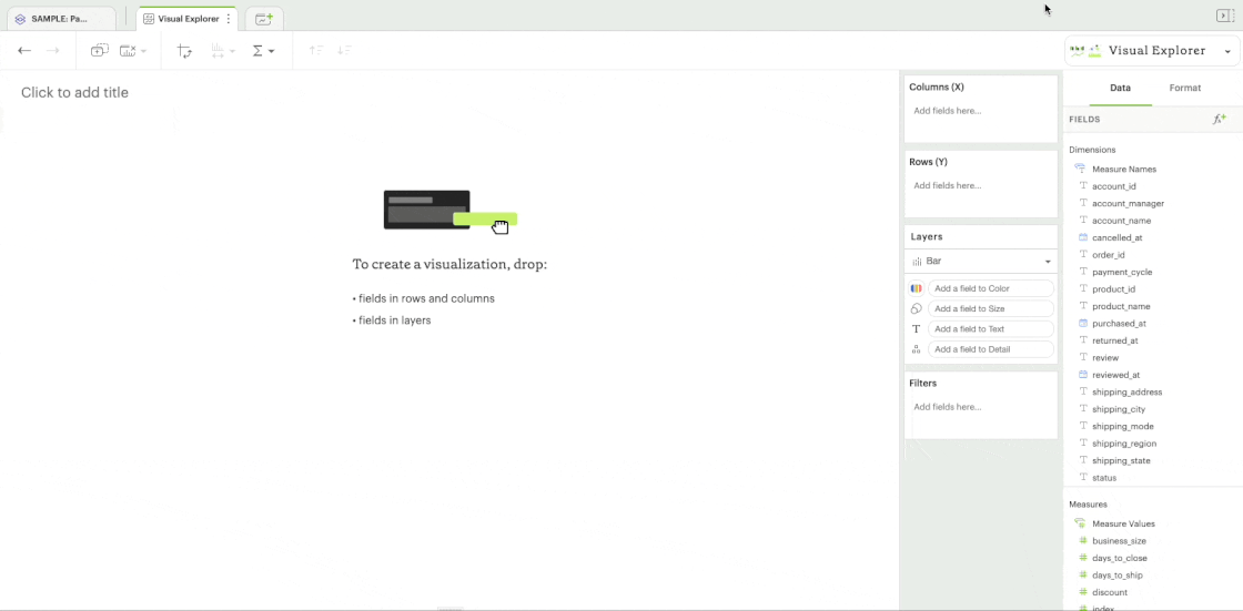
Build visualizations faster using typeahead search
Typeahead search makes it faster and easier to find the fields you need by enabling you to pull up a list of relevant fields by typing instead of dragging and dropping.
This expedites the process of building a visualization, especially when working with wide datasets or those that contain similarly-named fields. (For example, you may have many fields that contain the word "Account," like Account ID, Account Owner, Account Status, etc.).
Increase efficiency with faster load times
We’re constantly looking for ways to improve efficiency and reduce time to insights for your team. Now with automatic pagination in pivot tables and faceted charts, you’ll see faster loading times—leading to increased efficiency.
When building visualizations that contain large amounts of data, charts and pivot tables will load faster, and result in fewer errors with automatic pagination.
This means that Mode now brings only a subset of the data into the visualization, instead of all of the data, loading one page at a time and allowing you to move between the pages. Pagination controls will appear below your Quick Chart or Visual Explorer chart once you drag in a field with large amounts of data.


Deeper comparisons and new chart types with Shared Axis
Shared Axis was released back in January but we couldn’t pass up the opportunity to mention it here as it brings even more flexibility and power to visualizations within Mode, and adds functionality that most BI tools aren’t able to match. This Visual Explorer feature enables the creation of layered visualizations. All layers share a single, synchronized axis, making it easier to compare visual elements across their respective visualizations. Shared Axis brings a new level of reporting capabilities to Mode users, that comes with several benefits.
Improved comparison. Shared axis allows for easy comparison of two or more data sets on the same chart, which can help identify trends and patterns that might be missed when viewing each dataset separately.
Space-saving. By sharing the axis, shared axis charts take up less space than separate charts for each dataset, making them ideal for displaying multiple datasets on a single page or screen.
Clarity. Shared axis charts can provide a clearer and more concise view of data by allowing users to see how different variables or factors are related to each other, rather than presenting them in isolation.
Simplification. Shared axis charts can simplify complex datasets by highlighting the relationships and correlations between variables, making it easier for users to interpret the data.
Enhanced insights. Shared axis charts can provide enhanced insights into datasets by displaying them in a more visually compelling way. This can help users identify trends, anomalies, and other patterns that might not be immediately apparent in a table or separate charts.
Take a look at a few charts built using shared axis here.
Bar chart + dot plot
This shared axis chart plots out individual data points for shipping values compared to the averages by state.


Moving averages
Compare multiple averages at different time spans, allowing users to determine if new events are a trend.


Bar, circle, and line chart
Here we can see the bars have a color channel for showing whether it's above or below the target. The target has its own text channel showing a label here using the text settings. And then this running average is a circle and has its own color assigned.


If you’re interested in learning more about Shared Axis, check out our Help site for a detailed walkthrough of how to leverage Shared Axis in your analysis.
More to come
Visualizations are a key focus area for Mode this year and beyond, and you’ll see us continuously rolling out big and small updates within this space. You can follow along with all our updates here.
Get our weekly data newsletter
Work-related distractions for data enthusiasts.

