


Sourav Dey is a Partner at DataHoliks, a data-science consulting firm founded to help organizations apply data science without committing to expanding their organization or recruiting hard-to-find data scientists. Sourav and his team have been working with Mode customer Highfive to help focus their customer success and product efforts. Here is the first part of their story. The second part explores predicting Highfive's customer engagement with machine learning.
Head into a conference room at RueLaLa or Expensify and you’ll probably see something special: people actually enjoying meetings. They’ve got Highfive, makers of a modern meeting room collaboration and video conferencing solution, to thank. The Highfive hardware installs right on top of a TV and pairs with cloud-based apps installed on employee computers, tablets or smartphones. Every employee on a domain is able to wirelessly screen share or join a video meeting from any device. Instead of per-user fees, companies choose a specific pricing bundle and pay per room based on their subscription choice.
Defining success
With over 1,500 companies using Highfive, their team had an increasing need to better understand how customers engage with their products and services. Specifically they wanted to:
- Understand what factors affect customer engagement
- Predict long-term engagement early in the customer journey
- Design and measure the effect of interventions on improving engagement
To do these three things, they needed a “North Star” metric they could focus on improving. We kicked off the project by working with Highfive to quantify customer engagement.
Picking the right customer engagement metric
Finding the right metric is crucial, but it’s rarely easy. Fundamentally, Highfive wanted a proxy for customer lifetime value (LTV) that they could use to identify valuable customers and nurture them. Highfive already had certain key metrics that they tracked, but they wanted a single metric that they could look at per customer to understand the high level health of the account.
To that end, we worked with a few stakeholders inside the company including the CTO, VP of Customer Success, and VP of Product to figure out the best metric. After some long discussions, we developed some key requirements for the metric:
- Simple to compute. We wanted something simple to compute from the data that is already logged.
- Objective. We did not want subjective metrics that would have to be determined by humans, we wanted it computed purely from logs.
- Normalized. No matter what the size of the company (and how many Highfive devices and users they had) we wanted to be able to compare this metric apples to apples.
- Robust to noise. There is a natural day-to-day variation of Highfive usage by customers, but we wanted our metric to average out that noise to get at the steady, sustained usage.
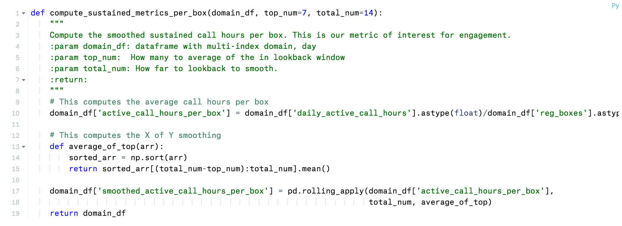
After some brainstorming and iteration, we settled on a metric we all liked called the “sustained call hours/device/day” (SCH/BD). It’s a moving average of the hours of Highfive usage per day normalized by the number of Highfive devices. Mathematically, the SCH/BD can be expressed as:
- n is day index
- CH/B[n] = Total HighFive Call Hours[n]/ Total number of Registered Highfive Devices [n]
- SCH/BD[n] = Average of the Top 7 CH/B[n] of the last 14 days
The SCH/BD fulfilled all the requirements we had:
- It was simple to compute from the raw log data. Highfive has instrumented their devices, apps, and infrastructure to log everything and send that data into Google BigQuery. All we had to do was aggregate the total hours of Highfive usage per day and the total number devices registered.
- It was completely objective. Usage was logged in immutable log files.
- It was normalized. Since we divided by the number of devices a customer’s SCH/BD was not higher simply because they had more devices than another customer.
- It was robust to noise. Here we used a trick. Instead of straight 14-day trailing average, we used the top seven usage days of the last 14 and averaged those. Doing so made the SCH/BD robust to weekends and holidays. Except for the long winter holiday season, if business day usage was stable, SCH/BD would be stable.
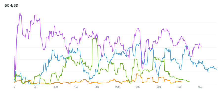
We prototyped the SCH/BD calculation using a combination of SQL and Python in Mode. See below for the core Python function that did the smoothing:
After finalizing the logic using Mode, the SCH/BD is now computed with a nightly cron job and written back to BigQuery. This graph below illustrates a Mode graph for the SCH/BD for various companies over the first few hundred days after signup. As the chart shows, customer engagement varies. Some companies immediately start using the Highfive devices over two hours a day. And others have slowly growing usage that stabilizes after a few months.
Once we had our metric and could compute it reliably, we needed to “play with the data.”
Using Python to segment customer engagement
Human learning should happen before machine learning.
Like other data scientists we know, we sometimes find ourselves jumping the gun, trying to throw data into a machine learning algorithm way too early in the process. There's a lot to gain from slowing down and doing more data exploration upfront. Looking at a few plots of example data is not enough. You need to look at hundreds of examples to really understand what is going on.
Mode’s simple graphing capabilities are great, but very quickly we wanted to do other pivots of the data that were beyond the scope of SQL. In these situations, Python is our go to language because it can perform analysis and ship code to production systems. We joke internally sometimes: “If you can’t do it in Python, it’s probably not worth doing.”
In our old workflow, we had to export the data out of BigQuery, fire up Python on our laptops, and do our analysis there. Exporting the data broke the chain of analysis—to ensure we had the most up-to-date data, we had to re-export the data from BigQuery every time.
With the new Mode Python Notebooks we could suddenly skip these tedious steps. We simply wrote a SQL query that extracted the first 100 days of SCH/BD for every Highfive customer and could then, in one click, switch over to the integrated Python notebook where the results of the query were available to us as a Pandas dataframe.
Once there we could use the power of the Python scientific stack to explore our data. One of the most useful analyses we did was cluster the first 100-day of usage using the scikit-learn package (i.e. clustering in 100 dimensional feature space). We used k-means clustering with a high k (to be robust to outliers) and found some clear structure in the data:
- Non-activated customers. These companies dabble at beginning, falling off to almost no usage.
- Middling engagement. These companies use about 30 mins per day consistently.
- Engaged. These companies use > 1 hour per day consistently. There were many sub-clusters in this group. Some companies use around 1 hour per day, some use 2 hours per day, some grow quickly to their steady state, some more slowly.
Below are three plots representing some of these clusters. The blue represents the centroid (mean) of the cluster. The green bars represent the 25th and 75th quantiles, i.e. +- 25 percentiles from the mean. We made all of these plots using the matplotlib graphing package in Python.
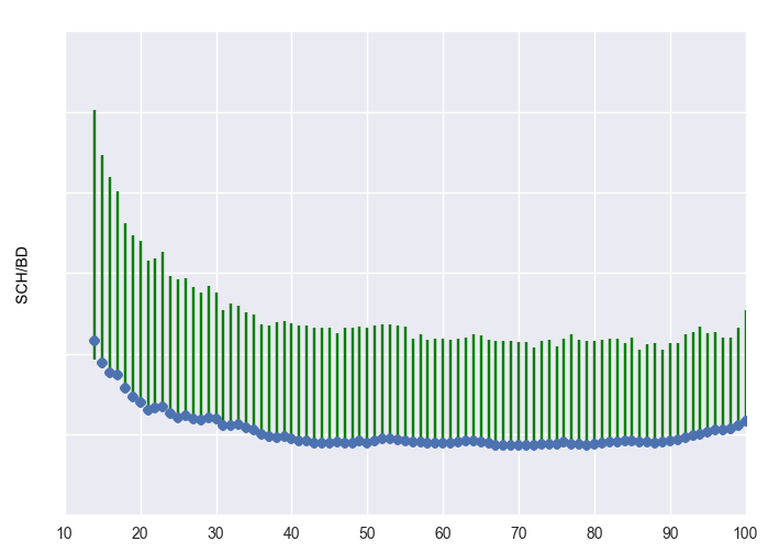 Non-activated customer cluster
 Middling engagement cluster
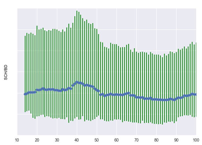 Engaged cluster, with rapid activation
Mode Python Notebooks make this exploration process seamless and repeatable. We can skip the data exports, avoid permissioning everyone's laptops to connect to BigQuery, and we don't have to use three different tools and hold that context in our heads. We just fire up Mode and are ready to explore.
Even better, we can easily share the analysis between the data scientists on our team. No need to make sure we were looking at the right version of the file or table. ‘Cause let’s be honest, in the exploratory stage, naming conventions quickly degenerate to this:
SCHBD_final
SCHBD_final_v2
SCHBD_final_april_30_v3
SCHBD_bugfix
SCHBD_messedup
SCBHD_real_final
SCBHD_for_realz_final
And as Highfive acquires more customers, we don’t have to go through the entire manual process over and over again. We can just refresh the report to update the clustering. It’s seamless.
Key takeaways
These clusters confirmed two things for Highfive:
- Despite all the noise, there was a signal—something learnable—in the data.
- The clusters validated Highfive’s intuition that some customers fail to activate. These customers don’t use the product enough to get over the initial hump.
With a better understanding of usage patterns it was time to move out of the exploratory analysis phase, and start building a machine learning model to predict (and improve) long-term engagement. Stay tuned for the next post!
About DataHoliks: DataHoliks helps its clients across a host of industries take a more data-driven approach to customer engagement, growth, and retention. For more information about how DataHoliks can help your company using Mode, see our offerings here.

