


Product Updates: January 2023

Katie Paxson Flynn, Director, Product Marketing — Core
February 3, 2023
NaN minute read

January product updates: Investing in even more powerful visualizations, analyst team efficiency, and more
Last year, we built and launched a number of features that would make Mode not just a platform for analysts, but one that enables anyone across the business to self-serve and build their own reporting. This shift transformed Mode into a modern BI platform that can be the central hub for analytics for your entire business.
This year, we’re continuing to invest in self-serve capabilities, but we haven’t lost sight of the data teams that drive the strategy and are responsible for truly turning data into a tool that helps companies make great business decisions. The first product updates of the year are a preview of two core investment areas in 2023 - flexible, powerful visualizations, and analyst team efficiency.
Flexible, Powerful Visualizations: Deeper comparisons and new chart types with Shared Axis
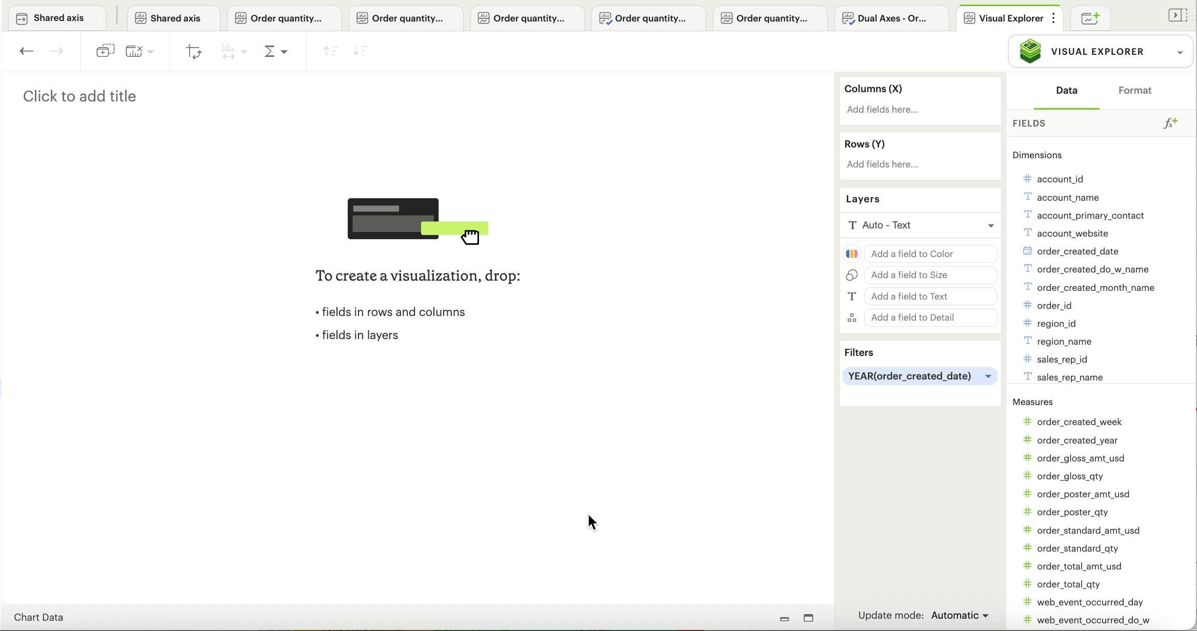
Shared Axis is a new Visual Explorer feature that enables the creation of layered visualizations. All layers share a single, synchronized axis, making it easier to compare visual elements across their respective visualizations. Layered visualizations allow all comparisons to be made in the same context, avoiding the difficulties of looking for patterns across multiple charts, axes, or facets. Less cognitive load means faster insights.
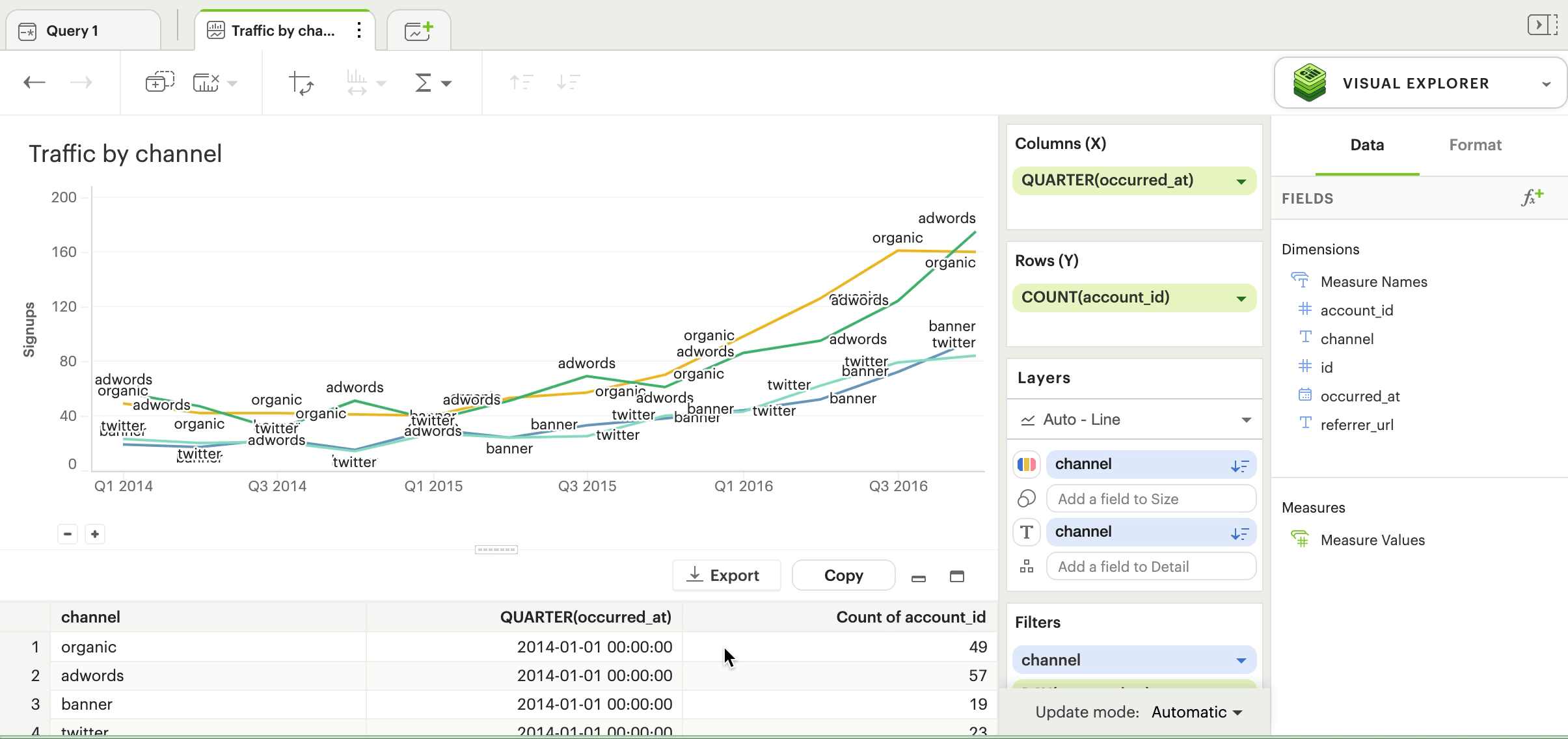
Let’s go through a quick example. In analyzing a dataset of paper sales, you want to compare the quantity of sales for 3 different product lines—standard paper, glossy paper, poster paper—and their total sales by month. You can plot all of these onto the same chart using Shared Axis, making it easier to see how each one is doing compared to the others.


Shared Axis also unlocks the ability to create common chart types, such as funnel charts, charts with reference lines, band plots and more, that weren’t previously possible in Mode without using Python, R, or custom JavaScript. The charts below are only a few of the almost endless visualizations you can create using this new feature in Mode. Check out more examples of Shared Axis here - and feel free to clone the report to rebuild these charts in your own workspace.


Check out our Help site for a detailed walkthrough of how to leverage Shared Axis in your analysis.
Quick and easy Pivot Tables
Adding Pivot Tables to Mode’s Quick Charts makes it easier than ever to create a pivot table, which is where many people want to start their analysis. Pivot tables provide a simple way for anyone to get an understanding of the summary of data before potentially diving into more complex visualizations. Now, you can quickly aggregate and summarize data right from a query or an Exploration by dragging and dropping columns, rows, and values. Read more about how to create Pivot Tables in Quick Charts here.

Analyst Efficiency: We’re making analysts’ lives easier with simple formatting, report building, and data cleanup enhancements
We hear from our customers that little tweaks have a surprisingly big impact on their teams’ ability to work efficiently. These just-released enhancements make it simple and seamless to do the small actions you repeat many, many times a day while doing your analysis.
Cleaner visualizations with Text settings
Text settings give you more control over the text labels that appear on your chart, enabling you to make your visualizations cleaner and easier to read.
Choose from First, Last, Minimum, Maximum, or a combination to label only the most important points of your visualization. You can also use label controls to identify individual series in context, eliminating the need for a legend on your chart entirely.
Move charts around Reports with one click
The “Move” feature in the Report Builder allows you to move charts around your reports with one click. No more endless scrolling to move a new visualization from the bottom of your chart to a prominent position at the top, or quickly between rows.
When editing a report, you can move charts up or down by one row, or you can jump them to the bottom or top of your report. Click the ‘Edit’ icon on any chart in the Report Builder, and you’ll see a new option in the toolbar labeled “Move”.
Get our weekly data newsletter
Work-related distractions for data enthusiasts.

