


Sometimes communicating data is as simple as sharing out a basic chart. Sometimes telling an impactful data story means creating a knock-out data visualization beyond what out-of-the-box reporting options provide. But delivering something custom can be a complicated process.
After pulling the data and coding up the visualization, you still need a server to host the code, a web application that runs the code, and pipelines to connect query results to the application. Once that's done, you have to monitor and maintain the pipelines to make sure the data is up-to-date.
Setting up all this infrastructure often requires waiting on engineering and—worse still—keeps you from tackling new analysis.
Mode automates away all of the tedious tasks in this process. Every Mode report can be modified with HTML, CSS, and JavaScript, allowing you to customize your reports with headers, images, and text, or build whatever visualizations you dream up—without setting up servers or maintaining web apps.
It's a somewhat hidden feature. Case in point, Nate Sanders at Canopy Tax recently told us: “You HAVE to talk about building completely custom reports with HTML and CSS and JavaScript libraries. When I finally understood that, Mode became much more than just a powerful SQL-driven analyst tool.”
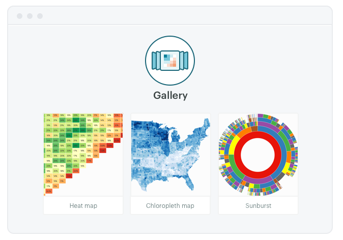
Introducing the Example Gallery
We hear you, Nate! Today we're opening up many of the examples we've built for customers over the years to show how analysts are using Mode to present data in unique and useful ways. The new Example Gallery contains code snippets you can use to present SQL query results in new ways. Start simple by modifying our existing chart types or go wild by building something completely custom from the ground up.
To get started, write a SQL query that returns the data you want to present. Switch over to the Report Builder and open the HTML editor. From here, you can write your own custom code to specify font styles, colors, dimensions—pretty much anything—or copy over code from the Example Gallery.
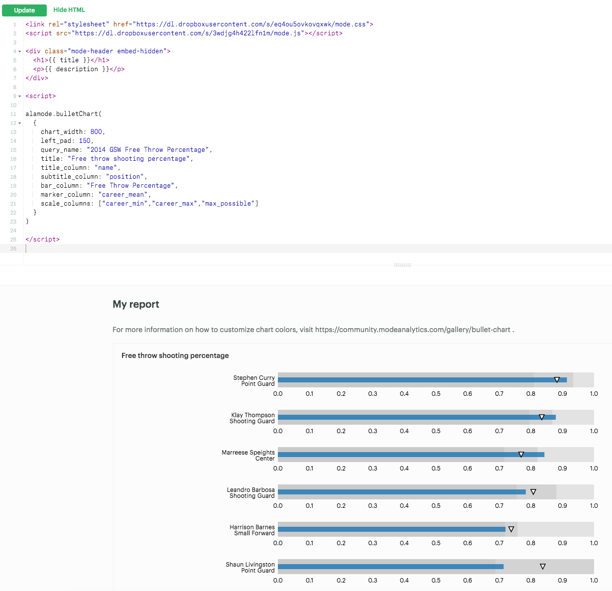
The bulk of the code is in an open-source library called alamode.js, which provides an easy way to build some of the most popular visualizations used by our customers. All of the charts in the Example Gallery can be created in a few simple lines. If you have any charts or modifications you want to share—or see ways we can improve the gallery—please submit a pull request on Github!
Check out the documentation, here.
More is yet to come
What's possible extends well beyond the examples included, but we hope it serves as a useful source of inspiration. The majority of these examples originated from customer questions—keep the requests coming! Have you built custom reports that might be useful to other analysts? We'd love to feature your work!
Check out the gallery and send us feedback at hi@modeanalytics.com.

