Visual Explorer Guides
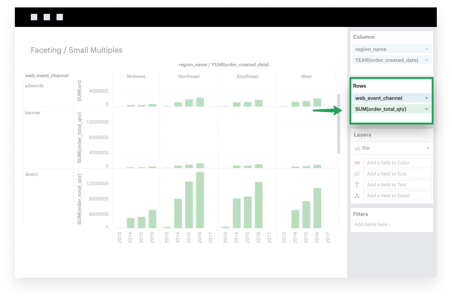
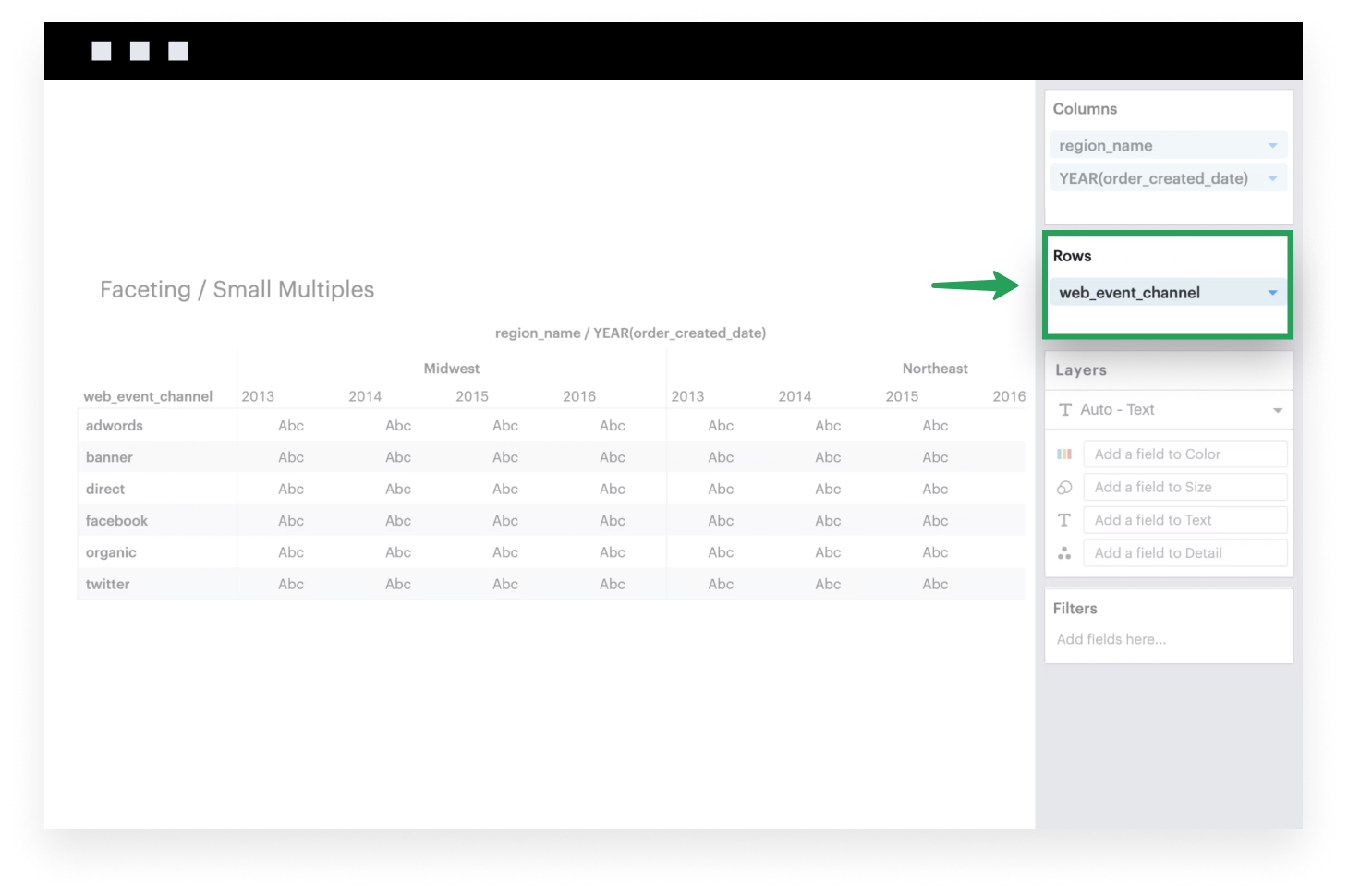
Faceting / Small Multiples
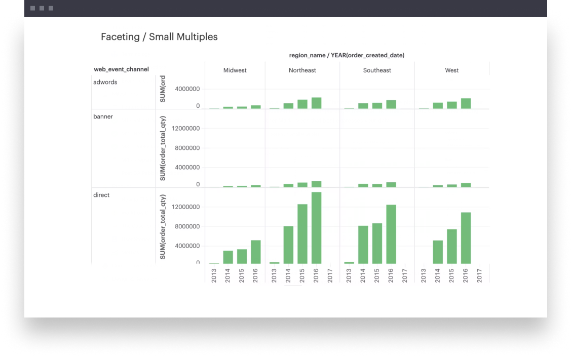
This example will walk you through how to create a small multiples visualization. This is a great way to compare trends across groups on the same scale and axes.
- Add a dimension (or multiple dimensions) to Columns. These discrete fields will be plotted along the x-axis of your visualization, with groups formed based on the unique set of intersecting values of your dimensions.
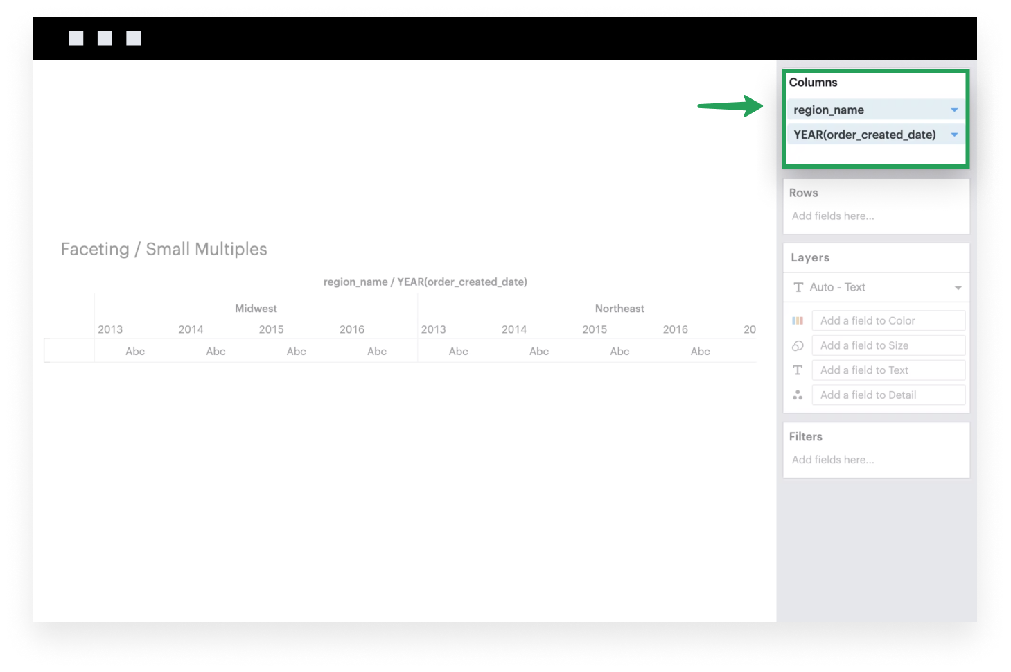
- Add a dimension (or multiple dimensions) to Rows. Similarly, these discrete fields will be plotted along the y-axis of your visualization, with groups formed based on the unique set of intersecting values of your dimensions.
- Add a measure to Rows. This continuous field will be plotted along the rows of your visualization. The example below uses the Bar mark, but you can choose among other Mark Types that best expresses your data.