
Python Tutorial
Learn Python for business analysis using real-world data. No coding experience necessary.
Start Now
Mode Studio
The Collaborative Data Science Platform
Python Histograms, Box Plots, & Distributions
Starting here? This lesson is part of a full-length tutorial in using Python for Data Analysis. Check out the beginning.
Goals of this lesson
In this lesson, you'll learn how to:
- Discern the distribution of a dataset
- Describe the shape of the data with basic statistics
- Make histograms
- Compare distributions with histograms
- Make box plots
Using flight data, you'll learn how to better compare trends among airlines, adjusting your analysis based on how many flights an airline flies. By the end, you'll know which airlines and airports are more or less reliable—and maybe even make it to Thanksgiving on time this year!
Loading data into Mode Python notebooks
Mode is an analytics platform that brings together a SQL editor, Python notebook, and data visualization builder. Throughout this tutorial, you can use Mode for free to practice writing and running Python code.
For this lesson, you'll be using records of United States domestic flights from the US Department of Transportation. To access the data, you’ll need to use a bit of SQL. Here’s how:
- Log into Mode or create an account.
- Navigate to this report and click Duplicate. This will take you to the SQL Query Editor, with a query and results pre-populated.
- Click Python Notebook under Notebook in the left navigation panel. This will open a new notebook, with the results of the query loaded in as a dataframe.
- The first input cell is automatically populated with
datasets[0].head(n=5). Run this code so you can see the first five rows of the dataset.
datasets[0] is a list object. Nested inside this list is a DataFrame containing the results generated by the SQL query you wrote. To learn more about how to access SQL queries in Mode Python Notebooks, read this documentation.
Now you’re all ready to go.
Getting oriented with the data
This lesson uses data about US flight delays. For a data dictionary with more information, click here.
After following the steps above, go to your notebook and import NumPy and Pandas, then assign your DataFrame to the data variable so it's easy to keep track of:
import pandas as pd
import numpy as np
data = datasets[0] # assign SQL query results to the data variable
data = data.fillna(np.nan)
data.head() # our flight data, including delay minute counts by type, and total delay upon arrival
| flight_date | unique_carrier | flight_num | origin | dest | arr_delay | cancelled | distance | carrier_delay | weather_delay | late_aircraft_delay | nas_delay | security_delay | actual_elapsed_time | |
|---|---|---|---|---|---|---|---|---|---|---|---|---|---|---|
| 0 | 2015-01-02 | AA | 1 | JFK | LAX | -19.0 | 0.0 | 2475.0 | NaN | NaN | NaN | NaN | NaN | 381.0 |
| 1 | 2015-01-03 | AA | 1 | JFK | LAX | -39.0 | 0.0 | 2475.0 | NaN | NaN | NaN | NaN | NaN | 358.0 |
| 2 | 2015-01-04 | AA | 1 | JFK | LAX | -12.0 | 0.0 | 2475.0 | NaN | NaN | NaN | NaN | NaN | 385.0 |
| 3 | 2015-01-05 | AA | 1 | JFK | LAX | -8.0 | 0.0 | 2475.0 | NaN | NaN | NaN | NaN | NaN | 389.0 |
| 4 | 2015-01-06 | AA | 1 | JFK | LAX | 25.0 | 0.0 | 2475.0 | 0.0 | 0.0 | 0.0 | 25.0 | 0.0 | 424.0 |
Distributions
Flying can be a frustrating and long endeavor in the U.S., especially around holidays and hurricane season when flights are delayed hours, sometimes days. As consumers, we're generally aware of those trends, but what about the day-to-day trends of air travel delays? Which airlines are doing better at getting you there on time, and which airports are the worst to fly out of?
One of the best ways to answer questions like these is to look at the distributions of the relevant variables. You can think of the distribution of a dataset or variable as a list of possible values, and some indication as to how frequently each value occurs. For a quick refresher on distributions, check out this lesson.
Before you look at the distributions of delays across airlines, start by exploring which airlines have the most delays.
First, build the series indicating whether or not flights are delayed, just as you did in the previous lesson:
data['delayed'] = data['arr_delay'].apply(lambda x: x > 0) #from previous lesson
Now count the number of delayed flights for each airline. Since you're only after one value for each airline, you don't have to use .groupby(), .size(), and .unstack() as in the previous lesson. Instead, just filter the dataset, the count up the rows for each carries using .value_counts():
delayed_flights = data[data['delayed'] == True] #filter to only rows where delayer == True
delayed_flights['unique_carrier'].value_counts() #count the number of rows for each carrier
WN    21150
EV    11371
OO    10804
AA     9841
DL     9803
UA     8624
MQ     8060
US     6353
B6     4401
NK     2133
AS     2104
F9     1848
HA     1354
VX      781
Name: unique_carrier, dtype: int64
It might be a good idea to look at the proportion of each airline's flights that were delayed, rather than just the total number of each airlines delayed flights.
ABC of Analysis: Always Be Curious: A great analyst will always be skeptical and curious. When you reach a point in your analysis where you might have an answer, go a little further. Consider what might be affecting your results and what might support a counterargument. The best analysis will be presented as a very refined version of the broader investigation. Always be curious!
Proportion of flights delayed
To calculate the proportion of flights that were delayed, complete these 4 steps:
1. Group by carrier and delayed
Group flights by unique_carrier and delayed, get the count with .size() (as you did in the previous lesson, use .unstack() to return a DataFrame:
data.groupby(['unique_carrier','delayed']).size().unstack()
| delayed | False | True |
|---|---|---|
| unique_carrier | ||
| AA | 8912 | 9841 |
| AS | 3527 | 2104 |
| B6 | 4832 | 4401 |
| DL | 17719 | 9803 |
| EV | 10596 | 11371 |
| F9 | 1103 | 1848 |
| HA | 1351 | 1354 |
| MQ | 4692 | 8060 |
| NK | 1550 | 2133 |
| OO | 9977 | 10804 |
| UA | 7885 | 8624 |
| US | 7850 | 6353 |
| VX | 1254 | 781 |
| WN | 21789 | 21150 |
Since you're going to use this for further analysis, it will be helpful to use .reset_index() to clean up the index. While you're at it, assign the new DataFrame to a variable.
delayed_by_carrier = data.groupby(['unique_carrier','delayed']).size().unstack().reset_index()
delayed_by_carrier[:5]
| delayed | unique_carrier | False | True |
|---|---|---|---|
| 0 | AA | 8912 | 9841 |
| 1 | AS | 3527 | 2104 |
| 2 | B6 | 4832 | 4401 |
| 3 | DL | 17719 | 9803 |
| 4 | EV | 10596 | 11371 |
2. Create total flight count column
Create a simple derived column that sums delayed and on-time flights for each carrier. If you want a refreshed on derived columns, return to this lesson:
delayed_by_carrier['flights_count'] = (delayed_by_carrier[False] + delayed_by_carrier[True])
delayed_by_carrier[:5]
| delayed | unique_carrier | False | True | flights_count |
|---|---|---|---|---|
| 0 | AA | 8912 | 9841 | 18753 |
| 1 | AS | 3527 | 2104 | 5631 |
| 2 | B6 | 4832 | 4401 | 9233 |
| 3 | DL | 17719 | 9803 | 27522 |
| 4 | EV | 10596 | 11371 | 21967 |
3. Calculate the proportion of total flights delayed
Divide the number of delayed flights by the total number of flights to get the proportion of delayed flights. Store this as another derived column:
delayed_by_carrier['proportion_delayed'] = delayed_by_carrier[True] / delayed_by_carrier['flights_count']
delayed_by_carrier[:4]
| delayed | unique_carrier | False | True | flights_count | proportion_delayed |
|---|---|---|---|---|---|
| 0 | AA | 8912 | 9841 | 18753 | 0.524769 |
| 1 | AS | 3527 | 2104 | 5631 | 0.373646 |
| 2 | B6 | 4832 | 4401 | 9233 | 0.476660 |
| 3 | DL | 17719 | 9803 | 27522 | 0.356188 |
4. Sort by the proportion of flights delayed
Finally, output the whole table, sorted by proportion of flights delayed by carrier:
delayed_by_carrier.sort_values('proportion_delayed', ascending=False)
| delayed | unique_carrier | False | True | flights_count | proportion_delayed |
|---|---|---|---|---|---|
| 7 | MQ | 4692 | 8060 | 12752 | 0.632058 |
| 5 | F9 | 1103 | 1848 | 2951 | 0.626228 |
| 8 | NK | 1550 | 2133 | 3683 | 0.579147 |
| 0 | AA | 8912 | 9841 | 18753 | 0.524769 |
| 10 | UA | 7885 | 8624 | 16509 | 0.522382 |
| 9 | OO | 9977 | 10804 | 20781 | 0.519898 |
| 4 | EV | 10596 | 11371 | 21967 | 0.517640 |
| 6 | HA | 1351 | 1354 | 2705 | 0.500555 |
| 13 | WN | 21789 | 21150 | 42939 | 0.492559 |
| 2 | B6 | 4832 | 4401 | 9233 | 0.476660 |
| 11 | US | 7850 | 6353 | 14203 | 0.447300 |
| 12 | VX | 1254 | 781 | 2035 | 0.383784 |
| 1 | AS | 3527 | 2104 | 5631 | 0.373646 |
| 3 | DL | 17719 | 9803 | 27522 | 0.356188 |
This paints a very different picture - Southwest is squarely in the middle of the pack when it comes to the percentage of flights delayed.
Basic statistics: mean, median, percentiles
But what about the length of time passengers are delayed on each airline? It's plausible that the proportion of flight delays may be lower for some airlines, but the length of those delays may be much longer. Passengers care more about longer flight delays than shorter ones, and they might choose a different airline given a record of long delays. For passengers, which airlines seem more reliable? Or in more measured terms, How many minutes are flights delayed on average, for each airline?
Mean
The mean, or the average, gives you a general idea of how many minutes flights were delayed for each airline. .pivot_table() calculates the mean of the aggregated values by default. You can pivot on the column unique_carrier to see the mean delay time aggregated by airline:
data.pivot_table(columns='unique_carrier', values='arr_delay').sort_values(ascending=False)
unique_carrier
MQ    35.627406
F9    28.836953
NK    22.779670
OO    19.031663
EV    18.358520
UA    16.094772
AA    15.616299
B6    13.576129
WN    11.273536
US     7.671557
HA     6.458937
DL     4.118949
VX     3.833908
AS     1.731951
Name: arr_delay, dtype: float64
Note that because .pivot_table calculated mean by default, the above is effectively the same as if you were to explicitly pass the argument like this (and it produces the exact same results):
data.pivot_table(columns='unique_carrier', values='arr_delay', aggfunc=np.mean).sort_values(ascending=False)
unique_carrier
MQ    35.627406
F9    28.836953
NK    22.779670
OO    19.031663
EV    18.358520
UA    16.094772
AA    15.616299
B6    13.576129
WN    11.273536
US     7.671557
HA     6.458937
DL     4.118949
VX     3.833908
AS     1.731951
Name: arr_delay, dtype: float64
Basic statistics with .describe()
.describe() is a handy function when you’re working with numeric columns. You can use .describe() to see a number of basic statistics about the column, such as the mean, min, max, and standard deviation. This can give you a quick overview of the shape of the data.
Before using describe(), select the arr_delay series for all Southwest flights:
southwest = data[data['unique_carrier'] == 'WN']['arr_delay']
62030    18.0
62031    11.0
62032     9.0
62033    44.0
62034    42.0
Name: arr_delay, dtype: float64
In case that was confusing, here's what just happened, evaluated inside-out, then left to right:
data['unique_carrier'] == 'WN']creates a boolean index that returnsTruefor rows that represent Southwest flights- Wrapping that in
data[...]applies the boolean index to the DataFramedata. ['arr_delay']reduces the columns to just the ['arr_delay'] column (and the index).
You can now run .describe() on this new object you've created to get basic statistics:
southwest.describe()
count    42020.000000
mean        11.273536
std         36.438970
min        -55.000000
25%         -9.000000
50%          1.000000
75%         19.000000
max        535.000000
Name: arr_delay, dtype: float64
This is a feature that really sets python apart from SQL or Excel. It would take a lot of work to get this information in either of those tools, but here it is as easy as adding the .describe() method.
Here's a quick breakdown of the above as it relates to this particular dataset:
count: there are 42,020 rows in the dataset, which is filtered to only show Southwest (WN).mean: the average delay.std: the standard deviation. More on this below.min: the shortest delay in the dataset. In this case, the flight was very early.25%: the 25th percentile. 25% of delays were lower than-9.00.50%: the 50th percentile, or themedian. 50% of delays were lower than1.00.75%: the 75th percentile. 75% of delays were lower than19.00.max: the longest delay in the dataset:535.00.
Practice Problem
Get the basic statistics for arrival delays for flights originating in
Chicago. Use the .describe() method.
Histograms
If all of Southwest's flights are delayed five minutes, but American Airlines' flights are sometimes delayed a full day, you might say that the uncertainty of American Airline's delays are higher. It's also possible that when the flights aren't late, they're early, and it’s arguable that that's a point in favor of the airline. There’s a lot of nuance to this problem that would be best explored visually.
You can visually represent the distribution of flight delays using a histogram. Histograms allow you to bucket the values into bins, or fixed value ranges, and count how many values fall in that bin.
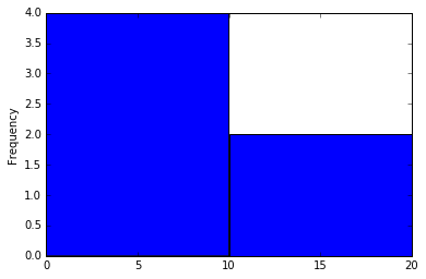
Let's look at a small example first. Say you have two bins:
A = [0:10]
B = [10:20]
which represent fixed ranges of 0 to 10 and 10 to 20, respectively.
And we have the data:
[1, 2, 5, 9, 12, 20]
Therefore, our bins contain:
A = [1, 2, 5, 9]
B = [12, 20]
So the histogram would look like this:
pd.Series([1, 2, 5, 9, 12, 20]).plot(kind='hist', bins=[0,10,20]) # `bins` defines the start and end points of bins
Something very important to note is that histograms are not bar charts. In a bar chart, the height of the bar represents a numerical value (such as number of delayed flights), but each bar itself represents a category—something that cannot be counted, averaged, or summed (like airline).
In a histogram, the height of the bars represents some numerical value, just like a bar chart. The bars themselves, however, cannot be categorical—each bar is a group defined by a quantitative variable (like delay time for a flight).
One way to quickly tell the difference is that histograms do not have space between the bars. Because they represent values on a continuous spectrum, a space between bars would have a specific meaning: it would indicate a bin that is empty. Bar charts can have spaces between bars. Because they show categories, the order and spacing is not as important.
Check out this blog post by Flowing Data for a great explanation of histograms.
numpy .arange()
Say you’re interested in analyzing length of delays and you want to put these lengths into bins that represent every 10 minute period. You can use the numpy method .arange() to create a list of numbers that define those bins. The bins of ten minute intervals will range from 50 minutes early (-50) to 200 minutes late (200). The first bin will hold a count of flights that arrived between 50 and 40 minutes early, then 40 and 30 minutes, and so on.
bin_values = np.arange(start=-50, stop=200, step=10)
print bin_values
[-50 -40 -30 -20 -10   0  10  20  30  40  50  60  70  80  90 100 110 120
 130 140 150 160 170 180 190]
Let's plot the distribution of Southwest flight delays as a histogram using the bin_values variable created above:
wn_carrier = data[data['unique_carrier'] == 'WN']
wn_carrier['arr_delay'].hist(bins=bin_values, figsize=[14,6])
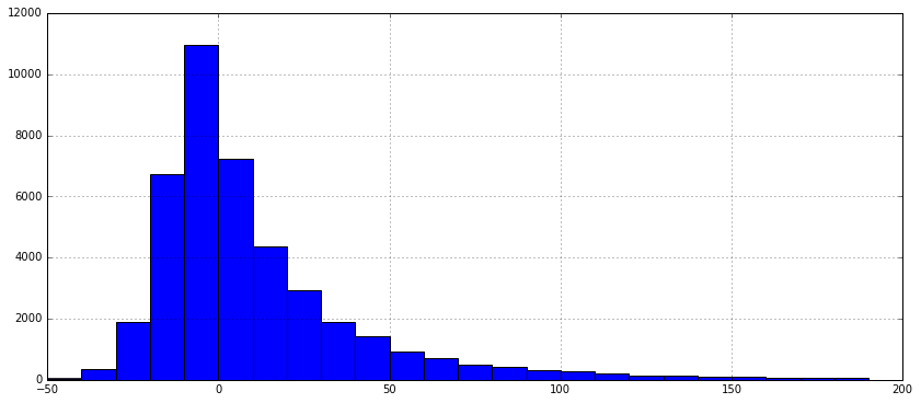
Great! You can see that the vast majority of Southwest flights weren't more than 30 minutes late. Though the airline has many flights, the majority of them aren't late enough to make you regret going on vacation.
Practice Problem
Plot Virgin America's flight delays at five-minute intervals from -50 minutes to 200 minutes.
View Solution
Practice Problem
Let's dig into the Virgin America flights that were unexpectedly delayed. Which flights were delayed between 20-25 minutes? Was there a given reason? What hypotheses might you make about why there are more flights in that bin as opposed to the 15-20 minute bucket? Select the flights using boolean indexing, then count the origin airports for those flights.
View SolutionComparing distributions with histograms
Seeing one distribution is helpful to give us a shape of the data, but how about two?
Compare the distribution of two airlines with a similar number of total flights, US Airways and Envoy Air:
bin_values = np.arange(start=-50, stop=200, step=10)
us_mq_airlines_index = data['unique_carrier'].isin(['US','MQ']) # create index of flights from those airlines
us_mq_airlines = data[us_mq_airlines_index] # select rows
group_carriers = us_mq_airlines.groupby('unique_carrier')['arr_delay'] # group values by carrier, select minutes delayed
group_carriers.plot(kind='hist', bins=bin_values, figsize=[12,6], alpha=.4, legend=True) # alpha for transparency
unique_carrier
MQ    Axes(0.125,0.125;0.775x0.775)
US    Axes(0.125,0.125;0.775x0.775)
Name: arr_delay, dtype: object
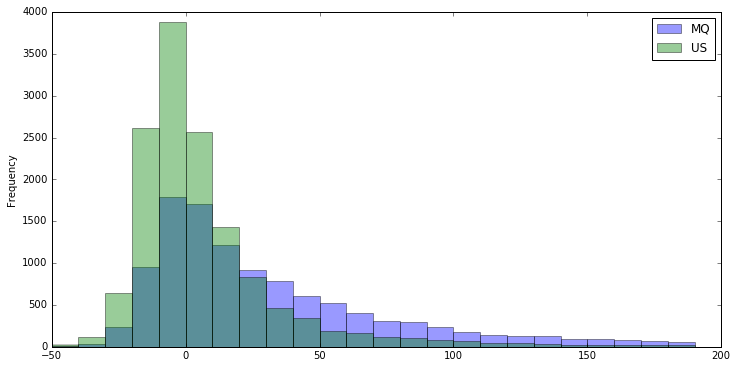
The two distributions look similar, but not the same (the third color is where they overlap). You can use .describe() to see key statistics about the carriers:
group_carriers.describe()
unique_carrier
MQ              count    11275.000000
                mean        35.627406
                std         58.444090
                min        -51.000000
                25%         -2.000000
                50%         17.000000
                75%         53.000000
                max        788.000000
US              count    13972.000000
                mean         7.671557
                std         34.672795
                min        -59.000000
                25%        -10.000000
                50%         -1.000000
                75%         13.000000
                max        621.000000
dtype: float64
Looks like delays on Envoy Airlines are more distributed than delays on US Airways, meaning that the values are more spread out.
Standard deviation
One of the measures you see above is std, standard deviation, which describes how flight delays are dispersed. In comparing the histograms, you can see that US Airways' delays are most concentrated between -20 to 20 minutes, while Envoy Air's flight delays are more distributed from 0 to 200 minutes. You can say that Envoy Air's delays are more dispersed than US Airways' delays, meaning that for a given flight on either airline, you would be less certain about the length of the delay for the Envoy flight.
The standard deviation measure is based on the statistical concept of normal distribution, or a common expected shape of distribution among various types of data. The value for standard deviation defines a range above and below the mean for which a certain percentage of the data lie. You can see in this visualization that, for a normal distribution:
- 34.1% of records fall between the mean and one standard deviation higher.
- 34.1% of records fall between the mean and one standard deviation lower.
So you might say that 68.2% of data falls within one standard deviation of the mean.
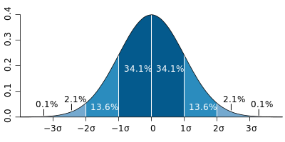 Image from Wikipedia.
It's easiest to understand this by taking a look at just the standard deviations from the output above:
print 'Envoy Air', group_carriers.describe()['MQ']['std'], 'minutes from the mean', group_carriers.describe()['MQ']['mean']
print 'US Airways', group_carriers.describe()['US']['std'], 'minutes from the mean', group_carriers.describe()['US']['mean']
Envoy Air 58.4440903966 minutes from the mean 35.627405765
US Airways 34.6727946615 minutes from the mean 7.67155740052
You can see that Envoy Air has a mean of about 35 minutes and a standard deviation of about 58 minutes. This means that 62.8% of the Envoy Air flights are between 23 minutes early (35 - 58 = -23) and 93 minutes late (35 + 58 = 93).
By contrast, US Airways has a lower mean, indicating that its flights, on average, are less delayed. US Airways also has a lower standard deviation, meaning delays are typically closer to the mean. More specifically, 62.8% of US Airways flights fall between 27 minutes early (7 - 34 = -27) and 41 minutes late (7 + 34 = 41).
Based on this information, you might say that US Airways delays have lower dispersion than Envoy Air.
Where not to vacation in the middle of January
Let's look at another very real dimension of this data—flight delays segmented by airport. Airports suffer from various challenges, such as weather, runway design, and congestion that impact on-time flight departures, so let's find out how they stack up. We don't want to get stuck in the mountains over New Years (or do we?).
To make things easier, you can look at the 20 highest volume airports by origin:
hi_volume = data['origin'].value_counts()[:20]
hi_volume
ATL    12678
ORD    10046
DFW     9854
DEN     7441
LAX     7434
IAH     5762
PHX     5610
SFO     5551
LAS     4902
MCO     4318
LGA     4075
DTW     4048
CLT     3959
MSP     3789
EWR     3754
SLC     3740
BOS     3738
SEA     3639
JFK     3609
FLL     3052
Name: origin, dtype: int64
hi_volume_airports_names = hi_volume.index.tolist()
print hi_volume_airports_names
['ATL', 'ORD', 'DFW', 'DEN', 'LAX', 'IAH', 'PHX', 'SFO', 'LAS', 'MCO', 'LGA', 'DTW', 'CLT', 'MSP', 'EWR', 'SLC', 'BOS', 'SEA', 'JFK', 'FLL']
Filtering a list of values with .isin()
To create a boolean index where you’re looking for values matching anything in a list, you must use .isin() with the desired list of matches.
You can create a boolean index filtering for the records that originated ('origin') in the 20 highest volume airports.
hi_volume_airports = data[data['origin'].isin(hi_volume_airports_names)]
hi_volume_airports.head()
| flight_date | unique_carrier | flight_num | origin | dest | arr_delay | cancelled | distance | carrier_delay | weather_delay | late_aircraft_delay | nas_delay | security_delay | actual_elapsed_time | delayed | |
|---|---|---|---|---|---|---|---|---|---|---|---|---|---|---|---|
| 0 | 2015-01-02 | AA | 1 | JFK | LAX | -19.0 | 0.0 | 2475.0 | NaN | NaN | NaN | NaN | NaN | 381.0 | False |
| 1 | 2015-01-03 | AA | 1 | JFK | LAX | -39.0 | 0.0 | 2475.0 | NaN | NaN | NaN | NaN | NaN | 358.0 | False |
| 2 | 2015-01-04 | AA | 1 | JFK | LAX | -12.0 | 0.0 | 2475.0 | NaN | NaN | NaN | NaN | NaN | 385.0 | False |
| 3 | 2015-01-05 | AA | 1 | JFK | LAX | -8.0 | 0.0 | 2475.0 | NaN | NaN | NaN | NaN | NaN | 389.0 | False |
| 4 | 2015-01-06 | AA | 1 | JFK | LAX | 25.0 | 0.0 | 2475.0 | 0.0 | 0.0 | 0.0 | 25.0 | 0.0 | 424.0 | True |
For comparison, the above use of .isin() in Python is equivalent to the following SQL query:
SELECT * FROM tutorial.flights
  WHERE origin IN ('ATL', 'ORD', 'DFW', 'DEN', 'LAX', 'IAH', 'PHX', 'SFO', 'LAS', 'MCO', 'LGA', 'DTW', 'CLT', 'MSP', 'EWR', 'SLC', 'BOS', 'SEA', 'JFK', 'FLL');
Box plots
Now that you have a DataFrame of flights originating from high volume airports, you might ask: where did the longest flight delays originate in January 2015?
You can create a pivot table that pivots the flight date on the airport, where the values are the mean of the flight delays for that day.
hi_volume_airports_pivots = hi_volume_airports.pivot_table(index='flight_date', columns='origin', values='arr_delay')
hi_volume_airports_pivots
| origin | ATL | BOS | CLT | DEN | DFW | DTW | EWR | FLL | IAH | JFK | LAS | LAX | LGA | MCO | MSP | ORD | PHX | SEA | SFO | SLC |
|---|---|---|---|---|---|---|---|---|---|---|---|---|---|---|---|---|---|---|---|---|
| flight_date | ||||||||||||||||||||
| 2015-01-02 | 3.327536 | 3.590580 | 0.509317 | 20.526899 | 36.049598 | -6.842809 | 8.316993 | -0.543307 | 12.156187 | 3.688742 | 13.709512 | 16.500000 | -2.947712 | 5.834734 | 1.193333 | 4.590062 | 16.547325 | 12.254717 | 8.371429 | 4.534161 |
| 2015-01-03 | 15.428112 | 30.471616 | 13.768340 | 51.186292 | 37.604138 | 22.738007 | 37.370229 | 15.666667 | 39.844037 | 31.882979 | 18.550685 | 26.117338 | 15.606426 | 17.511364 | 20.027586 | 37.995702 | 19.783843 | 13.771812 | 11.773364 | 13.465190 |
| 2015-01-04 | 21.423343 | 26.867857 | 23.325077 | 52.495238 | 38.360104 | 35.771626 | 53.617978 | 25.293651 | 20.464286 | 55.445578 | 19.564767 | 28.159016 | 32.450704 | 39.847025 | 19.461279 | 83.225619 | 20.180085 | 10.291262 | 19.251092 | 15.503125 |
| 2015-01-05 | 3.095000 | 11.208609 | 6.051672 | 29.899200 | 28.705263 | 24.696594 | 22.674051 | 13.711864 | 8.450505 | 19.554422 | 17.229381 | 15.788618 | 34.984177 | 14.929204 | 23.874564 | 63.916667 | 13.665217 | 5.418060 | 13.225806 | 2.003356 |
| 2015-01-06 | 6.361725 | 43.310580 | 13.294964 | 15.344029 | 11.534626 | 35.078616 | 43.104530 | 23.425926 | 3.622642 | 43.359073 | 13.330579 | 7.234004 | 61.165049 | 29.996785 | 9.435088 | 42.356183 | 12.156658 | 4.372180 | 8.582716 | 0.581481 |
| 2015-01-07 | 0.944276 | 10.651316 | 4.869565 | 33.301095 | 10.428762 | 13.403727 | 22.030508 | 11.254464 | 10.490476 | 15.536680 | 7.498652 | 5.442446 | 46.063973 | 8.977918 | -1.666667 | 38.479361 | 7.348028 | 9.467925 | 5.289216 | 2.977941 |
| 2015-01-08 | 3.033099 | 6.807692 | 10.484568 | 14.569873 | 11.217450 | 20.593060 | 15.419463 | 2.558442 | 1.571121 | 2.749091 | 8.597911 | 6.171329 | 3.575221 | 9.152648 | 47.264605 | 96.695578 | 8.000000 | 8.738351 | 5.141487 | 12.619718 |
| 2015-01-09 | 1.833499 | 21.045603 | 5.742331 | 21.551237 | 8.591810 | 34.665653 | 22.632107 | 1.808696 | 7.611354 | 43.294964 | 4.487245 | 8.144112 | 42.325581 | 8.758410 | 6.834459 | 46.355837 | 2.160550 | 7.464029 | 9.425178 | 3.878893 |
| 2015-01-10 | -5.473046 | 3.763547 | -1.658915 | 2.822014 | 5.501582 | 2.584906 | 0.422680 | -5.172269 | 0.937888 | 1.259259 | 2.564706 | 2.709746 | -11.311475 | 0.273273 | 8.542857 | 16.635209 | 2.213483 | -2.761506 | 0.621622 | 2.718894 |
| 2015-01-11 | -2.118085 | -2.569767 | 5.789286 | 16.045977 | 19.767313 | 5.808725 | -1.670543 | -3.008734 | 17.064904 | -2.964158 | 40.793103 | 24.195531 | -7.576923 | -2.242991 | 2.264493 | 22.578704 | 11.557143 | 6.381132 | 27.650633 | 5.946043 |
| 2015-01-12 | 42.375375 | 8.254777 | 14.975524 | 22.791444 | 19.114820 | 24.692771 | 8.219780 | 8.960699 | 22.710526 | 4.297101 | 12.710526 | 10.982175 | 16.641509 | 21.563863 | 1.274510 | 31.676056 | 5.371230 | 7.318519 | 27.918719 | 7.051546 |
| 2015-01-13 | 2.812957 | -9.384106 | 0.086505 | 9.789279 | 7.248656 | -2.710692 | -2.901024 | -7.118721 | 1.415274 | -13.214559 | -2.937853 | -1.553506 | -0.883234 | -1.462295 | -5.660959 | 23.323259 | 2.083990 | 3.267176 | 11.153652 | 0.528090 |
| 2015-01-14 | -1.400000 | -3.091216 | -1.681250 | -0.638838 | 2.690160 | -1.903727 | -5.456446 | 3.360360 | -0.530120 | -14.911877 | -3.695418 | -2.958559 | 0.002994 | 1.885350 | -7.691030 | 2.735369 | -1.161593 | -1.134831 | 1.324455 | -5.717949 |
You can use .describe() to see the mean and dispersion for each airport:
hi_volume_airports_pivots.describe()
| origin | ATL | BOS | CLT | DEN | DFW | DTW | EWR | FLL | IAH | JFK | LAS | LAX | LGA | MCO | MSP | ORD | PHX | SEA | SFO | SLC |
|---|---|---|---|---|---|---|---|---|---|---|---|---|---|---|---|---|---|---|---|---|
| count | 13.000000 | 13.000000 | 13.000000 | 13.000000 | 13.000000 | 13.000000 | 13.000000 | 13.000000 | 13.000000 | 13.000000 | 13.000000 | 13.000000 | 13.000000 | 13.000000 | 13.000000 | 13.000000 | 13.000000 | 13.000000 | 13.000000 | 13.000000 |
| mean | 7.049522 | 11.609776 | 7.350537 | 22.283364 | 18.216483 | 16.044343 | 17.213870 | 6.938287 | 11.216083 | 14.613638 | 11.723369 | 11.302481 | 17.699715 | 11.925022 | 9.627240 | 39.274123 | 9.223535 | 6.526833 | 11.517644 | 5.083884 |
| std | 12.798122 | 15.004838 | 7.499172 | 16.171575 | 12.854437 | 15.286101 | 18.718574 | 10.452380 | 11.488504 | 22.619487 | 11.574100 | 10.193057 | 23.428830 | 12.647029 | 14.971524 | 28.195169 | 7.051518 | 4.795902 | 8.742399 | 5.910367 |
| min | -5.473046 | -9.384106 | -1.681250 | -0.638838 | 2.690160 | -6.842809 | -5.456446 | -7.118721 | -0.530120 | -14.911877 | -3.695418 | -2.958559 | -11.311475 | -2.242991 | -7.691030 | 2.735369 | -1.161593 | -2.761506 | 0.621622 | -5.717949 |
| 25% | 0.944276 | 3.590580 | 0.509317 | 14.569873 | 8.591810 | 2.584906 | 0.422680 | -0.543307 | 1.571121 | 1.259259 | 4.487245 | 5.442446 | -0.883234 | 1.885350 | 1.193333 | 22.578704 | 2.213483 | 4.372180 | 5.289216 | 2.003356 |
| 50% | 3.033099 | 8.254777 | 5.789286 | 20.526899 | 11.534626 | 20.593060 | 15.419463 | 3.360360 | 8.450505 | 4.297101 | 12.710526 | 8.144112 | 15.606426 | 8.977918 | 6.834459 | 37.995702 | 8.000000 | 7.318519 | 9.425178 | 3.878893 |
| 75% | 6.361725 | 21.045603 | 13.294964 | 29.899200 | 28.705263 | 24.696594 | 22.674051 | 13.711864 | 17.064904 | 31.882979 | 17.229381 | 16.500000 | 34.984177 | 17.511364 | 19.461279 | 46.355837 | 13.665217 | 9.467925 | 13.225806 | 7.051546 |
| max | 42.375375 | 43.310580 | 23.325077 | 52.495238 | 38.360104 | 35.771626 | 53.617978 | 25.293651 | 39.844037 | 55.445578 | 40.793103 | 28.159016 | 61.165049 | 39.847025 | 47.264605 | 96.695578 | 20.180085 | 13.771812 | 27.918719 | 15.503125 |
It's tough to compare airports simply by looking at a big table of numbers. This will be easier if you group the records for each airport and overlay them, as you did with Envoy Air and US Airways:
airport_bins = numpy.arange(-10,100,3)
hi_volume_airports_pivots.plot(kind='hist', bins=airport_bins, figsize=[12,6], alpha=.4, legend=True)
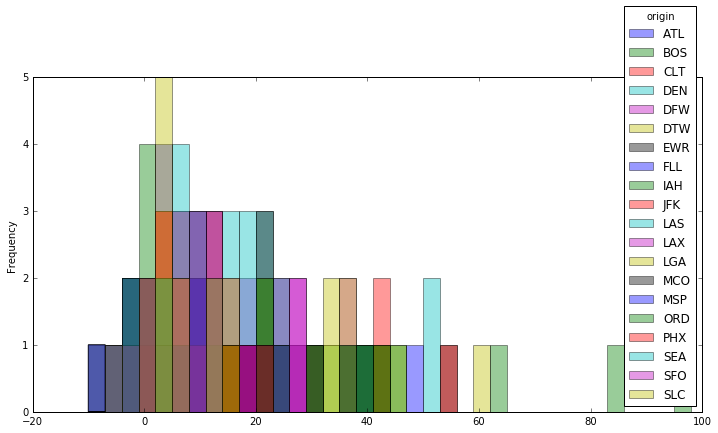
Well, that's also tough to read. The method of overlaying distributions has limits, at least when you want to compare many distributions at once. Luckily, there's a one-dimensional way of visualizing the shape of distributions called a box plot.
Box plots are composed of the same key measures of dispersion that you get when you run .describe(), allowing it to be displayed in one dimension and easily comparable with other distributions. The components of box plots are:
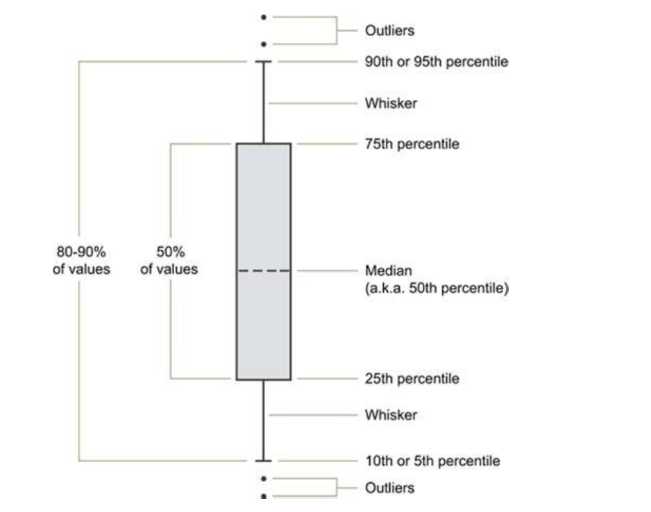 — Information Dashboard Design, Stephen Few
Try using box plots to compare the day-to-day distribution of delays at each airport:
hi_volume_airports_pivots = hi_volume_airports.pivot_table(index='flight_date', columns='origin', values='arr_delay')
hi_volume_airports_pivots.plot(kind='box', figsize=[16,8])
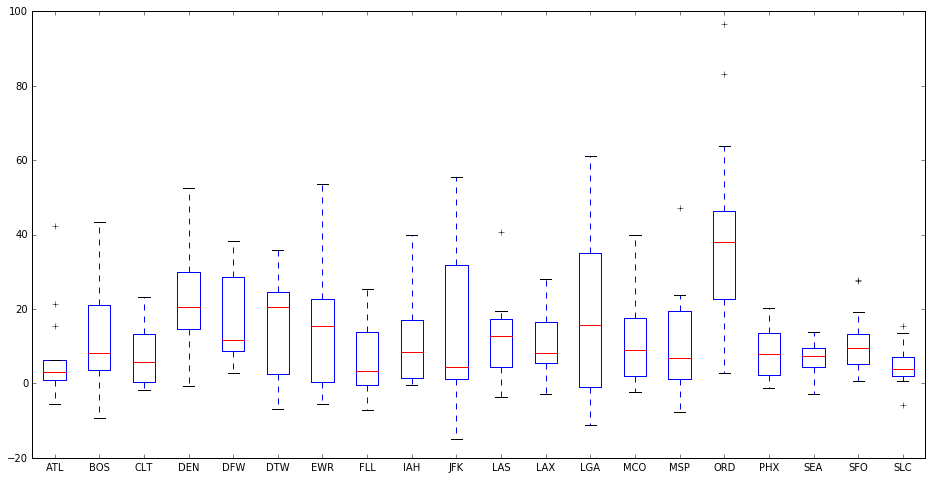
As you can see, it's visually simpler to compare many distributions with box plots. Airports like JFK had significant dispersion of delays, while LGA was evenly distributed around the most frequent average delay. ORD, however, was almost twice as delayed all the time, compared to every other high volume airport. Expect snow delays in Chicago in January!
Leading into this analysis, we posed a few key questions. To answer the last, Which airports are the worst to fly out of?, you can now say that you will (almost certainly) be delayed if you are flying out of Chicago in January, based on 2015 data. If you can help it, avoid connecting flights in Chicago.
Practice Problem
Visualize the average arrival delay by date and carrier using box plots.
View Solution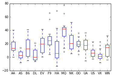
Lesson summary
As you've seen in this lesson, placing data in contrast enables you to better understand it. While it’s clear that all airlines and airports suffered from some delay, you can use statistics to quickly draw out abnormal trends and occurrences across the data. The deviation of data from a trend is often clearly revealed in visualization, which allows yous to visually identify unusual events, and dig deeper.
In this lesson, you learned how to:
- Discern the distribution of a dataset
- Describe the shape of the data with basic statistics
- Make histograms
- Compare distributions with histograms
- Make box plots
Next Lesson
Resources for Further Learning