


On my first day at Mode, I was given a list of basic business questions to answer. How many SQL queries do our customers write each day? How many employees are using Mode in the average organization?
I pulled up our database schema and started exploring. Most of my first months involved learning what each table contained and how they all fit together by trial and (way too much) error.
Like a lot of young companies, Mode doesn't have a schema chart or a codebook. Creating these resources by hand would take time away from much-needed analysis. Plus, our database is constantly changing, quickly rendering any detailed data documentation obsolete.
An unclear understanding of what tables are important and how they relate to each other can lead to wasted time, redundancy, and frustration—not just for new hires, but for anyone who works with our data.
My solution was born on Mode's recent hack day. I created an (easily updatable) visual representation of our tables as a network. The result is a snapshot of the various connections that exist across our database. While a traditional schema chart focuses on the universe of possibilities that could happen, this network visualization taps into how employees actually query our database.
 This is Mode’s actual database!
With this visual guide to how our data ecosystem works in practice, new hires can hit the ground running more quickly. Analysts can prioritize understanding the most important tables and get to the real meat of analysis: answering questions.
Armed with your database query logs, you can visualize the connections between tables in your database. All of the code below is in R, so you just need a little input data.
If you're a Mode customer you can skip everything below and simply email us. We’ll send you:
- a static image of your database network visualization shown above AND
- data and a file to make an interactive version like this one
If you're interested in exploring how to do this yourself in R, read on or check out the R file in full.
Make Your Own Database Network Visualization
Below is a step-by-step tutorial for visualizing the connections between tables in your own database. Here’s what you need:
- A familiarity with R (usually we’re champions for SQL, but we believe in using the best suited tool for the job).
- A table of the text of queries run on your database (which we'll refer to later as
queries.csv). This should be a two-column table where each row contains (1) a unique identifier for each query and (2) the text of that query. - A table of names of existing tables in your database (which we'll refer to later as
tables.csv). This should be a two-column table where each row contains (1) a unique identifier for each table and (2) the table name.
Loading your Data in R
1. Install and load the packages.
install.packages(c("stringr", "tm", "igraph"), dependencies = TRUE)`
library(stringr)
library(tm)
library(igraph)
Three packages are required to process and analyze the data:
stringris for manipulating and processing strings in R. This package contains a series of functions that parse strings — splitting, combining, extracting, and much more. See Hadley Wickham’s site for more information.tmis for text mining and will be used to construct a term-document matrix. In a term-document matrix, each row represents one term, each column represents one document, and the number in each cell indicates the number of times that a particular term appears in a particular document.igraphis for network analysis and will be used to convert the term-document matrix into an adjacency matrix and create the visualization. In an adjacency matrix, each row and each column is a term, and the cells indicate how many documents contain both the term indicated in the row and in the column.
2. Read in the data.
queries <- read.csv("~/queries.csv")
tables <- read.csv("~/tables.csv")
If you check the first row of queries, you should get something like:
> head(queries,1)
  query_id
1 1360481
  query
1 SELECT created_at,\n DATE_TRUNC('day', created_at) AS day,\n DATE_TRUNC('minute', created_at) AS minute\n FROM accounts\n
The first rows of tables should look like:
> head(tables)
  tables
1 queries
2 report_run_parameter_digests
3 domain_permissions
4 activity_feeds
5 tables
6 table_imports
3. Create an empty data frame where the number of rows equals the number of queries you're analyzing**.**
x <- data.frame(rep(0,length(queries$query)))
4. Populate the data frame with data from the query text and table names.
for (i in 1:length(tables$tables)) {
x[,i] <- str_extract(queries$query, as.character(tables$tables[i]))
}
In the data frame x , think of each row as a query and each column as the name of a table from your database. Each cell, then, is an indicator for whether a particular table name appears in a particular query.
The code above searches each query and extracts all the tables referenced in that query. This should result in a data frame with lots of missing values.
5. Name each column for the table it represents. Replace all of the NAs with zeroes.
colnames(x) <- tables$tables
x[is.na(x)] <- 0
The non-zero cells identify the name of the table called on in each query. In the example below, you can see that the table analytics_events appears in query 5, which means the fifth query run called on this table.
> x[5:10,9:12]
  analytics_ignored_accounts analytics_events data_source_table_columns uploads
  5                          0 analytics_events                         0       0
  6 analytics_ignored_accounts analytics_events                         0       0
  7                          0                0                         0       0
  8                          0                0                         0       0
  9                          0                0                         0       0
  10                         0                0                         0       0
6. Concatenate each row into a single string. Clean out the zeroes and the whitespace.
x_args <- c(x, sep = " ")
x$list <- do.call(paste, x_args)
x$list <- str_trim(gsub(0, "", x$list))
x$list <- gsub("[ ]+", " ", x$list)
This should produce an output such that each element of x$list contains a string of all of the tables called in that query. For example, here is a set of five queries and the tables referenced.
> x$list[520:524]
[1] "report_runs accounts reports"
[2] "report_runs accounts reports"
[3] "report_runs reports"
[4] "accounts user_accounts"
[5] "accounts user_accounts"
In this example, the 520th query contains three tables (report_runs, accounts and reports), while the 524th query contains two tables (accounts and user_accounts).
7. Use the tm package to convert each element of x$list into a document. Collect those documents into a corpus.
corpus <- Corpus(VectorSource(dat$tables))
8. Create and manipulate the term-document matrix. Convert the corpus into a term-document matrix and coerce the data into a matrix class (a matrix class is not the same as a TermDocumentMatrix class and behaves differently in R).
tdm <- TermDocumentMatrix(corpus)
termDocMatrix <- as.matrix(tdm)
In this matrix, the rows contain the tables from the database and the columns contain the queries run against the database. The value in each cell [i,j] is the number of times that table i is called in query j.
9. Transform the data into a term-term matrix, then into a graph adjacency matrix.
termMatrix <- termDocMatrix %*% t(termDocMatrix)
g <- graph.adjacency(termMatrix, weighted=T, mode = "undirected")
10. Clear out the loops and set the labels and degrees of the vertices.
g <- simplify(g)
V(g)$label <- V(g)$name
V(g)$degree <- degree(g)
Creating Your Schema
Take a preliminary look at the network:
plot(g, layout=layout_in_circle(g))
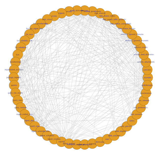
To interpret this visualization, a few definitions are helpful:
- Each dot around the periphery is called a vertex. Here, each vertex is represents a single table in the database.
- Each line connecting two dots is called an edge. Edges indicate that two tables are called together in at least one query.
- The number of connections a vertex has to other vertices is called its degree. A table with lots of lines connecting to it will have a high degree.
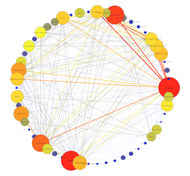
In this example, you can see 54 different table names, with varying numbers of edges originating from each vertex. Some tables, like accounts and rollup_periods, have high degrees, while others, such as table_columns and stars, have low degrees.
This preliminary visualization allows us to see the tables our database contains and how they are connected, but it's hard to read. Time to make a few tweaks.
The code below makes the size of a vertex correlate with its level of connectivity by scaling it by degree. The bigger the vertex, the more connected the table. It also adds a color code so that vertices with higher degrees are red and vertices with lower degrees are blue. This makes it easy to pick out which tables have the most unique joins (just look for the big red vertices).
To better understand the dependencies of the database, the code below scales each edge by its weight. The thickness and color of the edge connecting two vertices indicates how many times two tables are joined together. A thick red edge indicates more joins, and a thin blue edge indicates less joins.
V(g)$label.cex <- 3 * (0.06125 * V(g)$degree / max(V(g)$degree) + .2)
V(g)$label.color <- rgb(0, 0, .2, .49 * V(g)$degree / max(V(g)$degree) + .5)
V(g)$frame.color <- rgb(0, 0, .2, .39 * V(g)$degree / max(V(g)$degree) + .6)
egam <- (log(E(g)$weight)+.4) / max(log(E(g)$weight)+.4)
E(g)$color <- rgb((colorRamp(c("blue", "yellow", "red"))(E(g)$weight/max(E(g)$weight)))/255)
E(g)$width <- egam
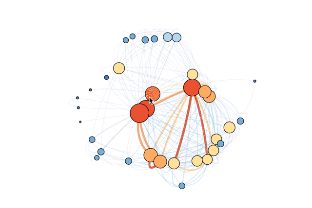
plot(g, layout=layout_on_sphere(g), vertex.color = rgb((colorRamp(c("blue", "yellow", "red"))(degree(g)/max(degree(g))))/255), vertex.size = ((V(g)$degree)*2/3)+2, edge.width = 5 * E(g)$weight / max(E(g)$weight))
This revised visualization incorporates these modifications.
Now you can clearly see that the most connected table is accounts. This makes sense: the accounts table contains the full list of account ID numbers for all users and organizations. Mode accesses accounts every time we want individual users or organizations to be the unit of analysis (for instance, when looking at daily signups).
You can also see the tables most frequently joined to the accounts table. One of the strongest connections is with data_sources, a table that contains identifiers for each connected database. We frequently want to know which organizations have connected databases, and the answer requires connecting these two tables.
Now What?
Rather than thinking about a database of tens or hundreds of tables, you can isolate the five or ten most frequently used tables. And because this visualization can be quickly updated (by re-running the R code with a newer set of query text), it can adapt to changes in the structure of your database.
Again, if you want to save some time, we’re happy to generate this visualization for any Mode customer. Or if you want to tweak the R code to customize this visual, we can send you your queries.csv and tables.csv. Either way, ping us and we’ll get right on it.
Update
A more efficient approach is to use the str_detect() function in the stringr package, which eliminates the need to create a term-document matrix with the tm package. The resulting visualization conveys the same information, though the ordering of the vertices changes. Plus, you cut down on your lines of code (always a good thing!). Thanks to Hadley Wickham for the suggestion.
Here's the updated R code.

