Sometimes you just want to put two charts next to each other.
Now you can.
Today we're rolling out a new drag-and-drop report builder that makes it faster and easier to organize a report's layout.
Since the recent launch of multi-query reports, we've seen analysts share reports with an increasing number of charts. Whether composing a data story that walks a viewer through the ins-and-outs of your analysis, or building a dashboard to deliver key metrics, the new layout tool helps you get the job done more quickly.
Drag, Drop, Resize
To get started, build a report with a few charts and tables. Then jump into the Report Layout.
When you hover over a chart, you'll see some new options. Click and hold on a chart you'd like to move. As you start to drag, blue areas will show where you can drop the chart. You can also swap charts by dropping one over another one.
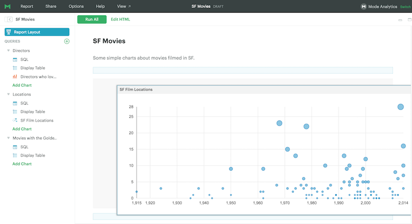
When you hover over a chart, you'll also see new grab icons on each side. Use these icons to change the chart's width.
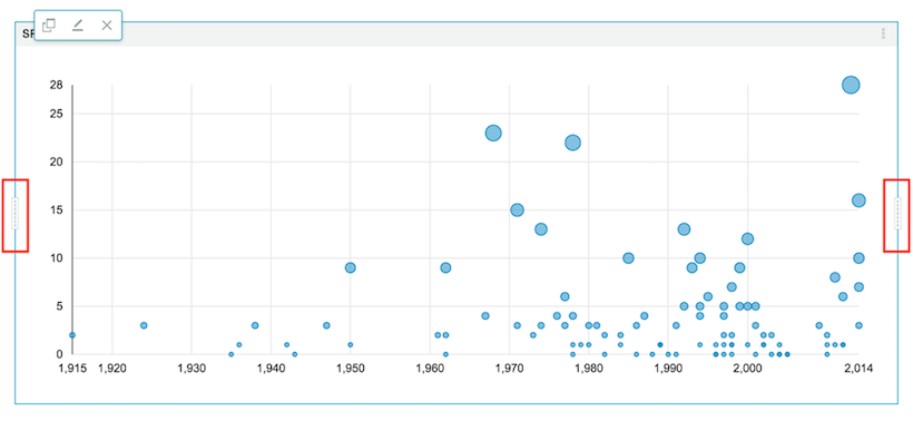
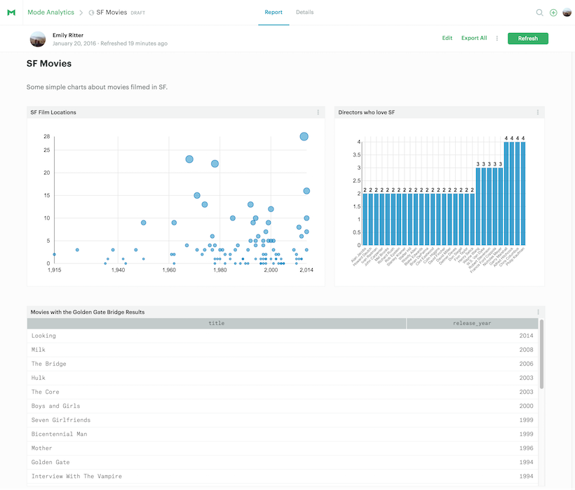
With a quick bit of resizing and rearranging, you can create reports like this:

Roll up your sleeves with HTML
From the early days of Mode, we've been on a mission to make simple things easy and complex things possible.
The new report layout tools were built to make a simple thing easier. At the same time, we wanted to continue allowing analysts to build completely custom visualizations with libraries like D3. If you open the HTML panel, you'll see the code behind the report updates in a clean, predictable way as you resize and rearrange charts on the 12-column grid.
You'll quickly find that you can add custom elements—think paragraphs, images, links—using <div> tags. We recommend positioning and rearranging your charts before modifying the HTML as <div> tags with custom content are not draggable (yet). Check out this report to explore how you might weave together charts and commentary. Use the Details tab to inspect the HTML code and see how it works.
Dive in!
Jump in to Mode to experiment with the new report layouts. Be sure to ping us on Intercom if you have any questions or comments. We're excited to hear what you think!
