How to Create a Great In-App Analytics Page

Joel Carron, Data Scientist at Mode
February 1, 2018
NaN minute read

So you've built a software product, and you have some users. You're generating data about how users interact with your product. You want to share this data with those users. You want to do so in a way that benefits both your users and your company.
You're not alone. The presentation of customer data through a Stats page (also referred to as in-app analytics) is becoming increasingly common. But why?
It turns out that in-app analytics can provide a lot of value for vendors and customers alike. We recently wrote about our own experience building Mode's Stats page as a way to provide our customers with insight into their use of Mode, as well as to showcase our White-Label Embeds feature.
The priorities that defined our Stats page will invariably differ from those that define the Stats page of another company. Every organization has different needs. But the considerations and decisions required to establish those priorities are pretty universal. If you're kicking off a project to build your own in-app analytics, keep these considerations in mind:
Quantified Value
In-app analytics pages typically begin with an indication of total usage - a number (or set of numbers) meant to provide the highest-level view of how much value is being created. For most businesses, there are a few different metrics that could serve as this primary number.
A common primary indicator of value is a measurement of the total volume of actions taken by users. This is an advantageous metric to highlight for software that involves lots of user interaction, like a messaging or software development platform. Github, for instance, places the total number of Commits front and center on the first page of the app. Slack not only emphasizes how many messages are sent within the app, they base their monetization strategy on a message-volume threshold.
On the other hand, many very successful businesses provide value passively; for instance, cybersecurity software companies. These companies frequently emphasize how little activity was required on the user's part in order to prevent security risks by highlighting background tasks the software acted on without requiring user input.
Or, the number could be related to the total amount of some thing being stored in the app, common in document storage or CRM software.
Whichever metric you include at the top of your stats page, it should be directly aligned with communicating the value your business provides.
Universal Relevance
Your stats page should include metrics that are universal enough to be relevant to all of your customers, yet specific enough to be valuable and worth examination by individuals.
This is easier said than done. The more varied your business, the harder it'll be to find these metrics. A paper company that sells two types of paper, for instance, would find it very easy to provide relevant metrics to their customers: Here's how much of Paper 1 you bought, here's how much of Paper 2.
On the other hand, a marketing agency that provides digital ad placement for some clients, PR services for other clients and social media management for others would be hard-pressed to find one universally valuable metric. If there is no single way to measure your customers, you may need to create different in-app analytics pages for different categories of your business.
Positive Framing
The presentation of the metrics you include is almost as important as the numbers themselves.
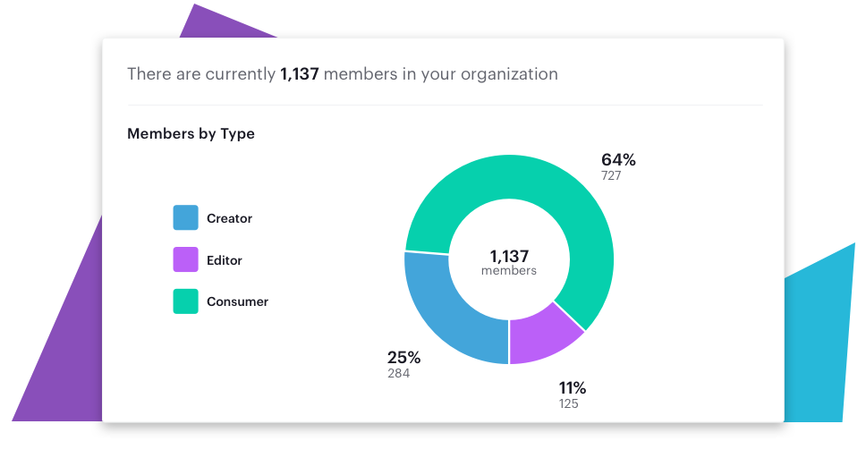
Some metrics will look more impressive when presented as ratios. Some will look more impressive when presented as absolutes. For instance, adoption rate may be best presented as the ratio of high-usage seats to low-usage seats. This can show that your product is getting traction across the company, or that a customer is getting a lot of value out of the seats they're paying for. On the other hand, the primary metric you use to quantify value will likely look stronger when presented as a growing trend over time, or as an absolute. Take the time to consider which visual format will most positively frame the information presented in this page.
A great opportunity for positive framing can also come in the form of a Most Popular list. With ten of anything, you can create a Most Popular Ten list, be it documents, channels or projects. The benefit here is that simply including an item among the Most Popular list asserts that the item is popular, even if the most popular item in one customer's list gets as much attention as the least popular item in another customer's list. The mere existence of a Most Popular section can help make your product or service appear more popular.
Stickiest Features
One of the first things a software company typically does in its pursuit of growth is identify which features are “sticky”. Sticky features are those for which usage correlates with a higher likelihood to become a paying customer, or at least remain a user of the software.
By getting more users to adopt your stickiest features, you increase the likelihood they stick around (heh) and become more valuable customers. So you want to expose as many users as possible to these features. You can do so in your Stats page by including charts that surface these features, and show how much they're used.
When someone is looking at an in-app analytics page, they're examining the way they use your product. They're in the exact mindset to learn about features that can help them get more out what you're building. This is a great opportunity to get them to the “aha moment”, when the value of the product clicks for the user. Show them a chart that compels them to use your those features and find the “aha moment”!
Scalable Overhead
Serving up timely usage metrics to your customers will inevitably create a significant draw on your database, especially if you reach a rapid growth stage. You'll need to structure the page so that the database overhead is scalable as you quickly add customers.
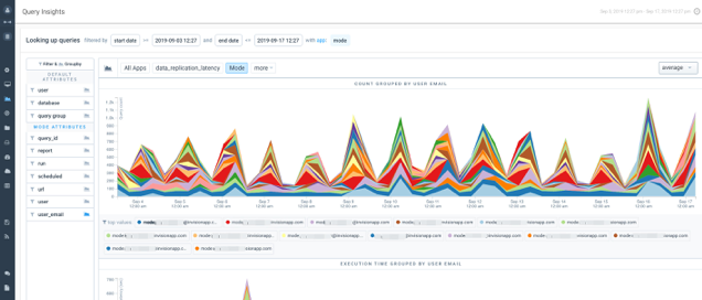
Maintaining a scalable stats page requires a deft balance of cost and detail. Cost is determined primarily by three factors: the query functions that inform the charts on the page, the period of time that they include, and the rate at which they are refreshed. More complex functions will be more expensive but may provide more interesting detail. Charts showing shorter time periods simply don't need to calculate as much data, reducing database load. And a high refresh rate will be more costly, but will keep the page more up to date.
In addition to run cost scalability, there's also database load to consider. Some Stats pages are built to refresh for all customers at once, on a set schedule. This can put a heavy burden on the database and cause significant slowdown to other work. This can be partially alleviated by structuring a Stats page to trigger a refresh only when a user looks at it. This will space out the timing of runs and will likely reduce the frequency of runs in general. But as your business grows, this won't completely prevent heavy database load, as there will inevitably be hot areas of activity, like Monday mornings, or periodic budget reviews. So it'll take an additional safeguard to reduce slowdowns. This safeguard can come by refreshing the results when a user visits the page, unless it's been refreshed within the last (timeframe you decide). This will make sure the results are always fairly recent, but a surge of page views won't overwhelm your database.
Keep in mind that you'll inevitably encounter some challenges on the back end that you'll need to address as you grow. And when you make decisions between detail and recency, remember you can always add more detail in the future, but it's harder to take detail away once customers are accustomed to it.
Solvable Pain Points
In-app analytics can set your product apart from the competition in your industry by going above and beyond typical expectations. The best way to do this is to find a way for the Stats page to deliver information that solves a pain point for customers beyond simply understanding how they're using your software.
We found our opportunity for a Stats page value-add as Mode customers frequently asked about ways they could get reports to run faster. We found out that many teams would schedule large reports to run in the middle of the business day, when ad-hoc work was also going on, which slowed down their own results and the work of other analysts. So we included a heat map of runs in our Stats page, which can help customers space our their scheduled runs without slowing down the analysis that happens in a typical workday.
Addressable pain points like this will be different for every business, and there's no silver bullet that can help you identify your own. The best way to find it is to get to know your customers and listen closely to the questions they ask.
In-app analytics can be a great way to turn the data you already have into more value for your product. If you've deferred a project like this due to a lack of engineering resources, you may want to look into White-Label Embeds.
Download our report

The State of Self-Serve Analytics
Earlier this year, we conducted a survey with more than 650 customers about self-service analytics. The results are in and we wanted to share what we found out.
Get our weekly data newsletter
Work-related distractions for data enthusiasts.


