How to Demystify Skewed Data and Deliver Analysis

Nate Coleman, Data Scientist
December 20, 2019
NaN minute read
Exploring the distribution of data can surface meaningful patterns, trends, or significant errors in data that simple summary statistics like mean and median cannot capture. This is why after wrangling together the data I need for an analysis, my first step is always to look at how my data is distributed.
In this post we’ll cover:
“Data distributions can surface meaningful patterns, trends or significant errors in your data.”
To understand the importance of visualizing data distributions, let’s try and answer some real-world questions. Let’s say we’re going after some funding for our new and exciting startup that makes monocles for dogs (oh my, this actually exists). To get a sense of how much funding to expect, we’d like to understand how much funding other startups have recently received and investigating the distribution of startup funding is a great place to start. We’ll be able to answer important questions such as: 1.) How much funding does the typical startup receive? 2.) Do most startups raise money within a narrow range, or is funding spread widely? 3.) What is the minimum and maximum funding we should expect?
Four charts for data exploration
In order to answer these questions, we’ll look at Crunchbase data, which among other information, contains records of startup funding amounts as of Feb 5, 2014. To investigate the distribution of data, I like to look at four charts: dot-diagrams, box-plots, histograms, and the empirical cumulative distribution function.
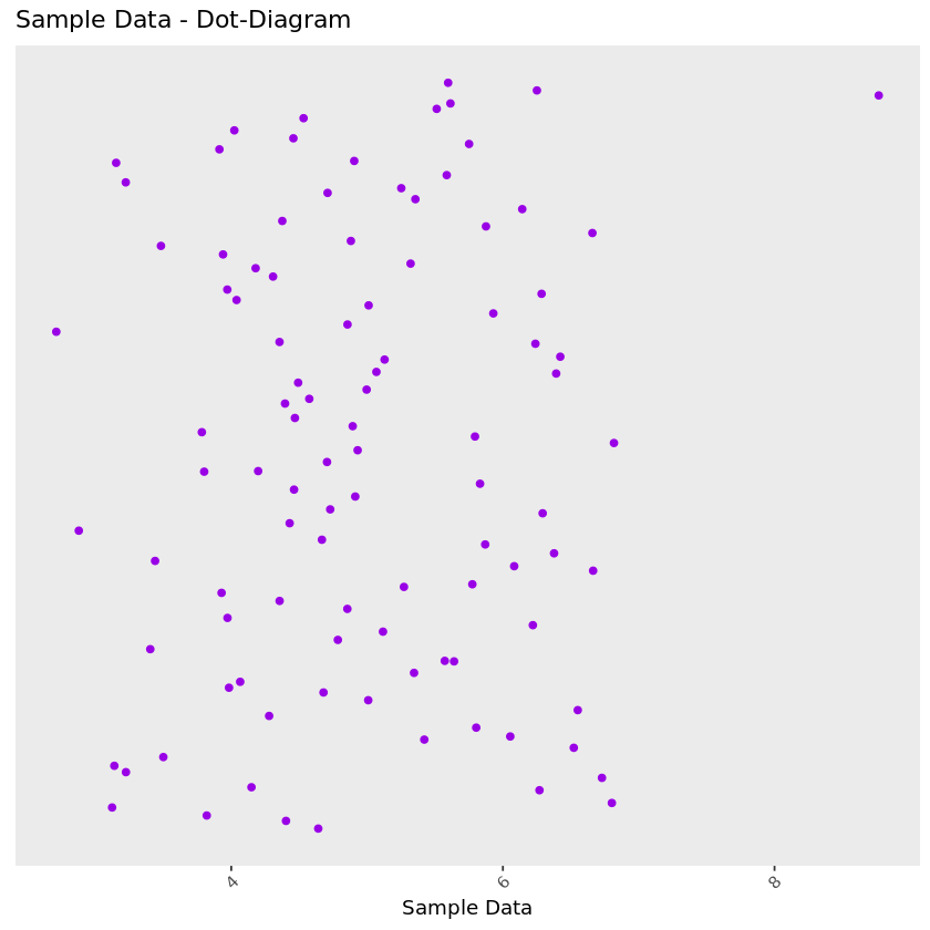
Dot-diagram: This is possibly the most basic representation of your data—each data point is represented by a dot. In these plots, the x-axis represents a data point’s value, while the y-axis holds no meaning. Differences in positions on the y-axis are created by a “jitter” which allows overlapping points to be separated in the plot. This plot can help us easily identify potentially interesting clusters of data points. In the plot below, we can see that the data is distributed fairly evenly with one outlier in the top-right corner of the plot.
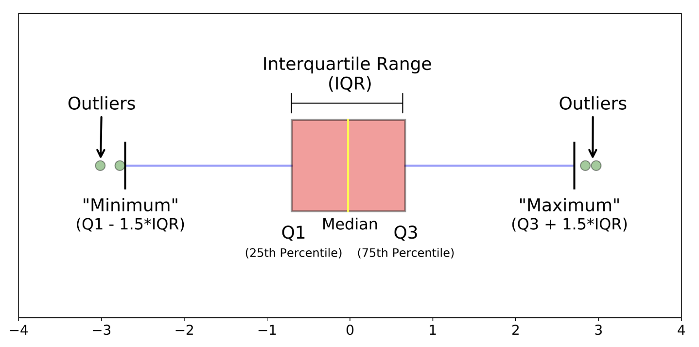
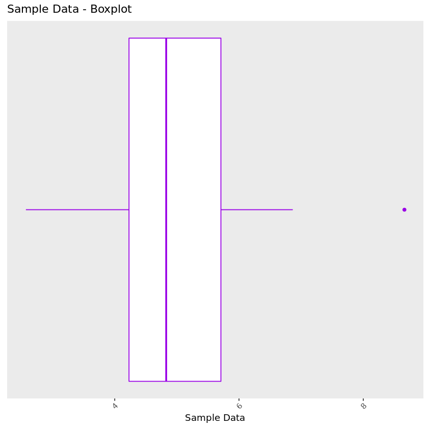
Box-plot: Also referred to as a box-and-whisker plot, a box-plot visualizes a distribution’s core descriptors—, namely, the median, represented by a thick line in the middle of the box, and the interquartile range which is contained inside the boundaries of the box (the left-most boundary representing the 25th percentile and right-most boundary representing the 75th percentile).
There are different variants of this plot, but it is standard to see lines extend from the edge of the box with lengths of 1.5*interquartile range. Points beyond this range are plotted individually and considered outliers. In other stylings of this plot, you may see the lines extend the entire range of the data with no points plotted individually.
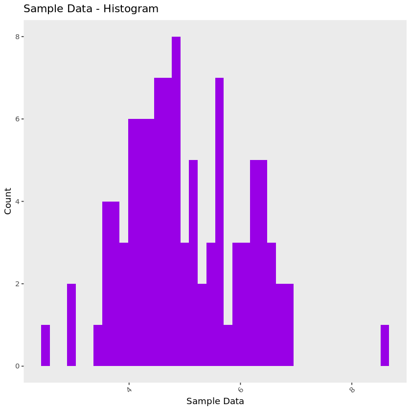
Histogram: A histogram displays the counts of data points that fall within a specified interval. The size of intervals are often called a histogram’s bin-width. This can be thought of as a version of the dot plot where points that fall within each bin are stacked on top of each other and displayed in each bin’s bar. Similar to the dot plot, the x-axis represents the value of the data, while in this case the y-axis depicts the number of data points that fall into each bin.
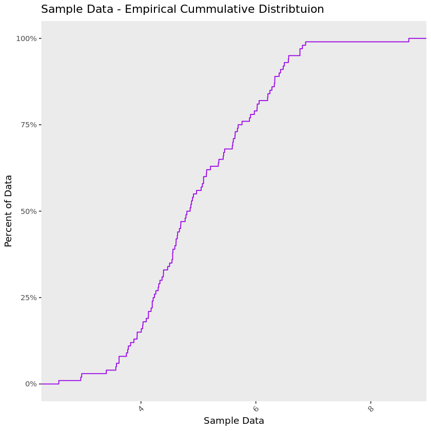
Empirical Cumulative Distribution Function: This plot draws a line showing us what percent of our data falls below a certain value on the x-axis. Here the x-axis displays the value of the data and the y-axis the percent of our data that falls below a specific value on the x-axis.
On the chart below, take the point 6 on the x-axis and use your finger to trace a straight path up until you hit the line—the value on the y-axis at the point you hit the line is about 75%. So 75% of the data in the example below are lower than 6.
So now let’s build these four visualizations for our Crunchbase data and answer our questions.
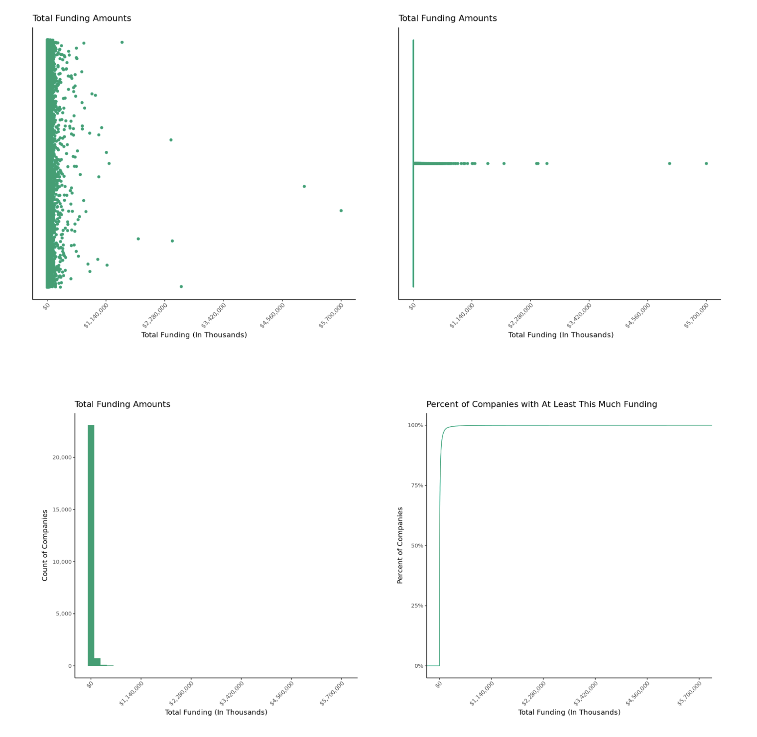
Okay, well as you can see, we uh, understand what our data looks like, right? So, definitely not. Creating these out-of-the-box plots only tells us one thing: Our data is highly-skewed. Before we dive into what skewed data is, let’s define its opposite - symmetric data.
How to tell if your data is symmetric
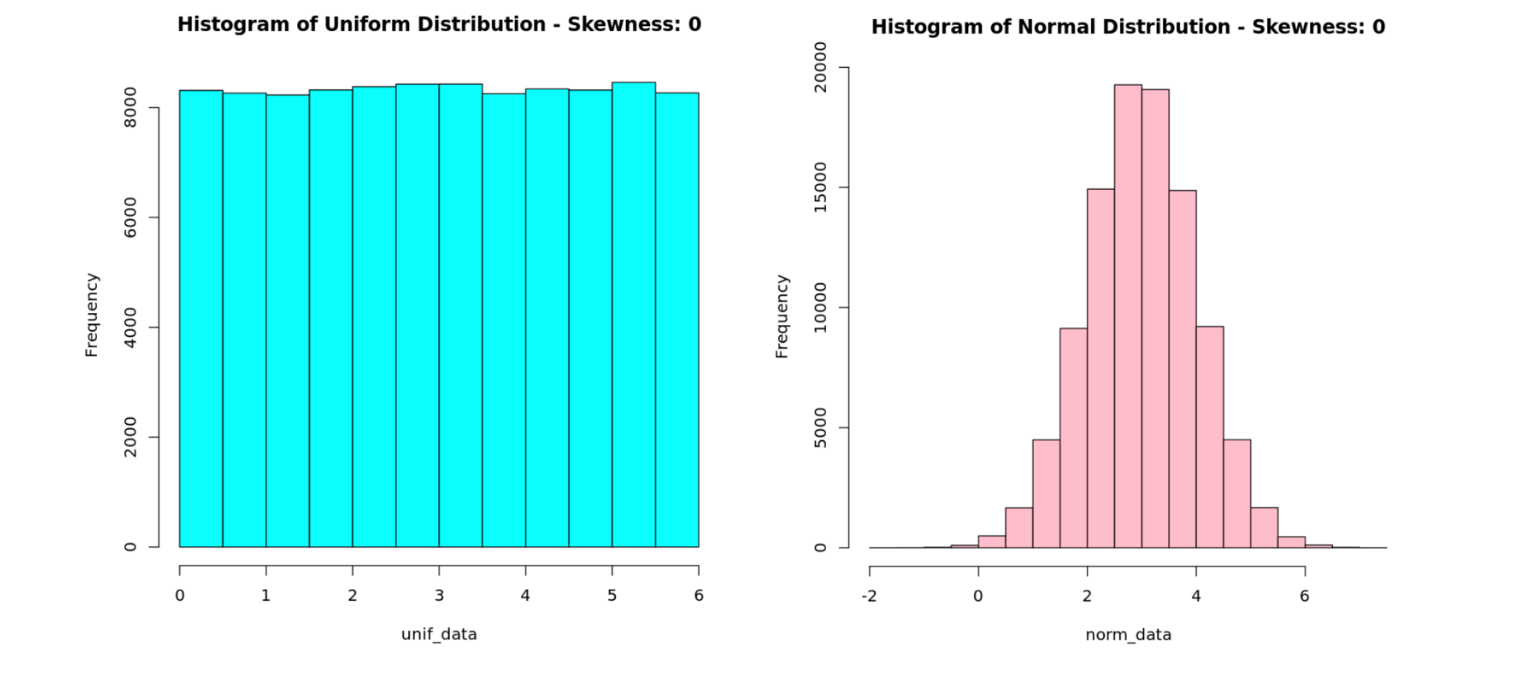
Data that is balanced on both sides of its mean is symmetric. For example, in the histograms below, we see that the data falls symmetrically around a mean of 3.
How to tell if your data is skewed
Skewed data on the other hand, does not have a balanced shape on both sides of its mean. You can see the difference in the charts below. In both examples, the data fall asymmetrically around a mean of 3 - there is a higher concentration of low values, and a few extreme high values. These distributions are said to have “long-right tails.”
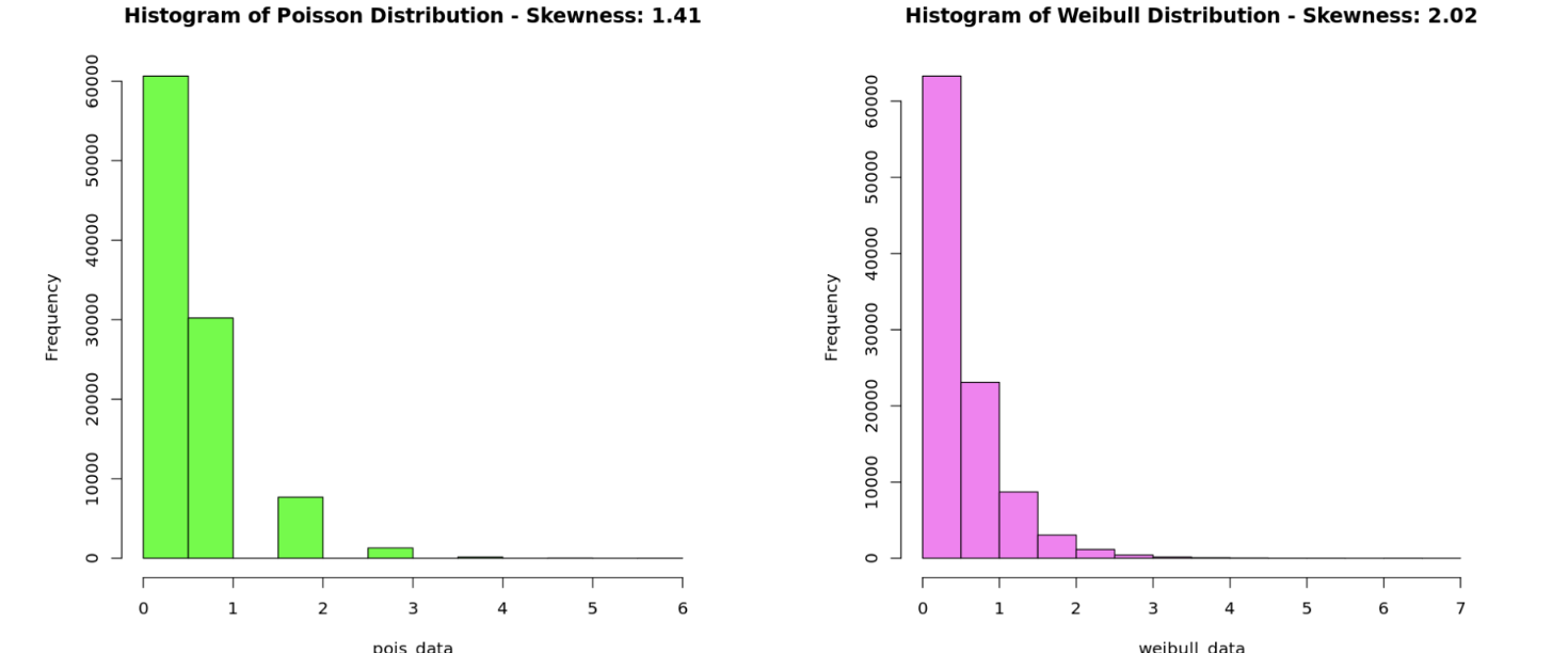
We can quantify how skewed our data is by using a measure aptly named skewness, which represents the magnitude and direction of the asymmetry of data: large negative values indicate a long left-tail distribution, and large positive values indicate a long right-tail distribution. The closer skewness is to 0, the more symmetric its distribution will look. Distributions that have a skewness value <-1 or >1 are typically classified as "skewed."
Now that we understand that all data aren’t necessarily going to have a pretty, symmetric shape, let’s jump back to our Crunchbase data. We saw that our data is quite skewed - in fact it has a skewness of 41 - so let’s see if we can make some adjustments to help answer our questions.
Luckily, there is a trick we can apply to paint a better picture of our skewed data, and this is to plot our it on a logarithmic scale.
Logarithmic scales show us the shape of our skewed data
A logarithmic scale manifests itself in the chart by representing the distance between 1 and 10, 10 and 1,000, and 1,000 and 10,000 as the same. Specifically, we are applying common-logarithm (or logarithm with base 10). Using a common-logarithm transformation is best practice when your data spans several orders of magnitude like the Crunchbase data.
To find the common logarithm of a number Z, just find the number X such that 10^x = Z. For instance, the common logarithm of 10,000 is 4 since 10^4 = 10,000.
Let’s look at the same charts but plotted on a logarithmic scale.
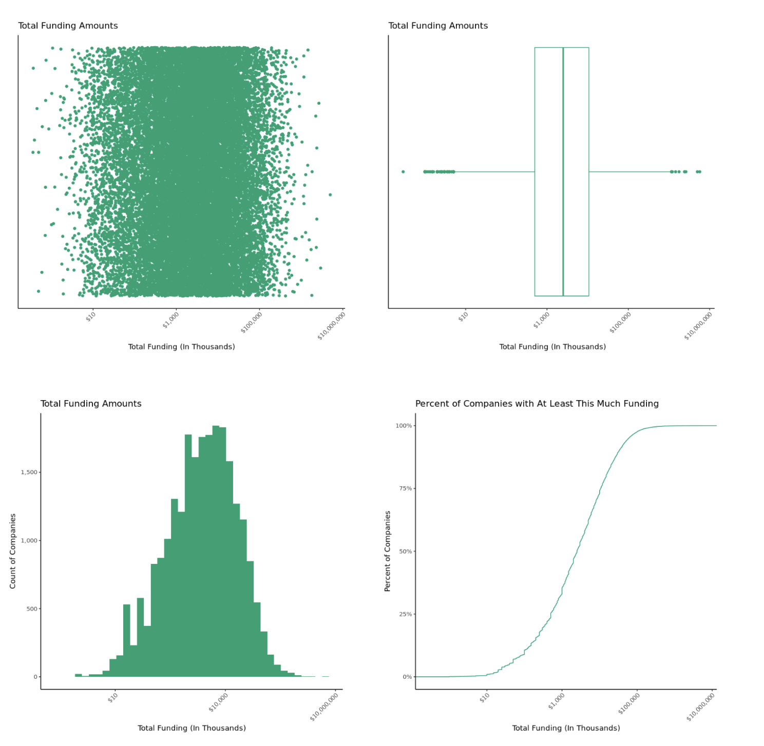
Much more clear, right? These plots give us a good sense of the shape of our data as well as visual representations of some summary statistics. We can use this information to answer our original questions:
1.) How much funding does the typical startup receive? The typical startup raised $2.5M. Without any other information about these companies, this would be a good guess for the amount of funding we could expect.
2.) Do most startups raise money within a narrow range, or is funding spread widely? Half of startups raise between $500K and $10M, which is a pretty wide range. We would need to find companies that look similar to ours to get a more precise estimate of potential funding.
3.) What is the minimum and maximum funding we should expect? Some companies raise as little as $10K, whereas others raised as much as $5.7B. Although dog monocles are bound to be a hit, we probably shouldn’t expect anything outside this range.
In addition, we were able to see that there isn’t any strong evidence of data discrepancies (though it may be worth looking at some of the companies raising scant amounts).
If we were to extend our question set to include what explains a startup’s funding amount, we might build a statistical model to help answer this. The knowledge that startup funding has an asymmetric distribution is crucial information to building a proper model.
One downside of using a logarithmic scale is that it can make your head hurt to try and guess values on the x-axis between tick marks, but a solution to this is to just add more marks, which can easily be done in R or Python. The R Notebook linked to this post has a description of how to do this.
Speaking of the R Notebook, you can actually clone the linked _Mode report _and use this code as a template for creating your own charts. There are some basic instructions included to help you plug-and-play - so, go forth and explore!
Get our weekly data newsletter
Work-related distractions for data enthusiasts.


