


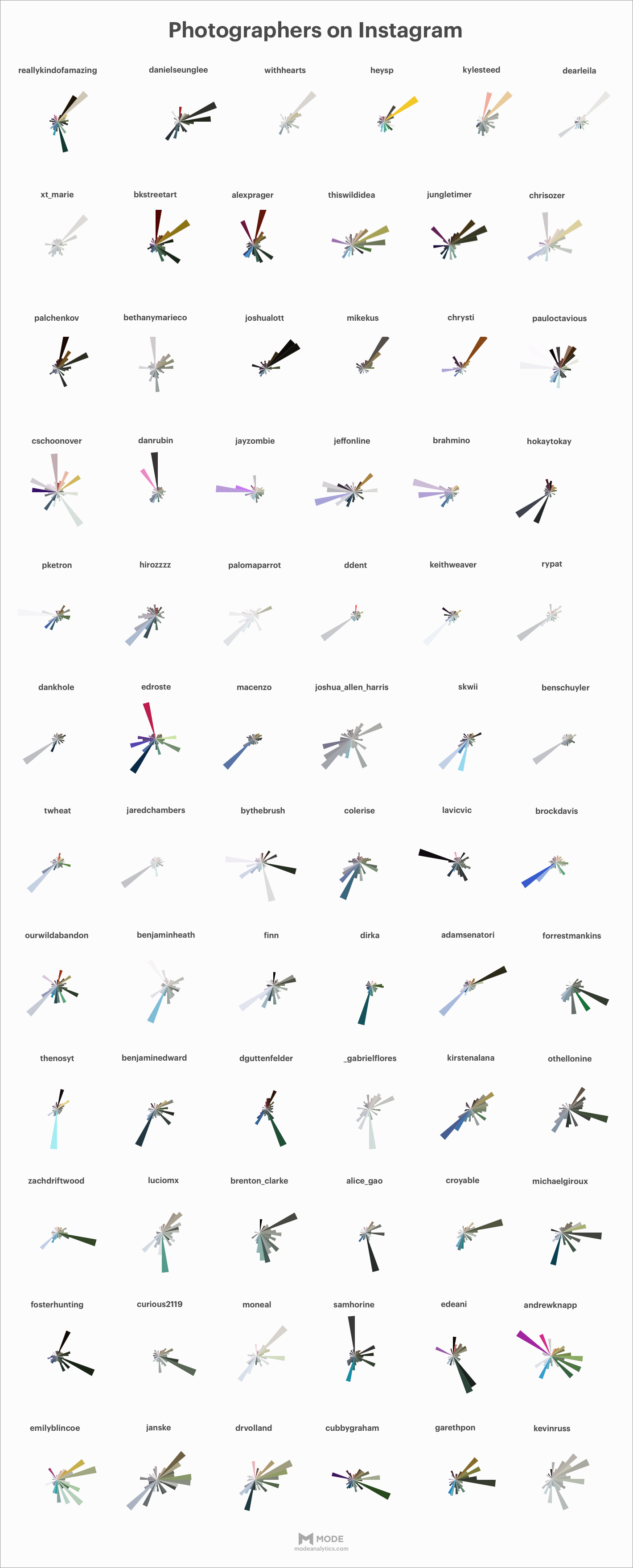
Yesterday, we explored how brands use colors on Instagram. Today, we're looking at trends in Instagram's early-adopter photographer community.
Many of these folks have large followings, in part because they were featured on the “suggested users list,” hand-curated by the community team at Instagram early on. It was a tactic Instagram employed to encourage popular photographers on Flickr to bring their networks over to a new platform and drive engagement.
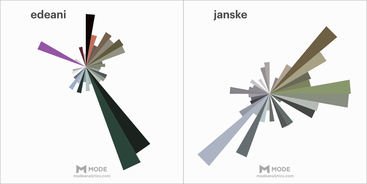
It's interesting to compare this group to the brightly-colored brand pinwheels. Here, most of the pinwheels have muted color palettes. Compare the urban setting of Ike Edeani's (@edeani) photographs to Janske Kaethoven's (@janske) dreamy, foggy landscapes. The subject matter comes through—his pinwheel is dominated by dark gritty shades, urban grays and browns, and a few pops up of color; hers is entirely earth tones, with foggy gray wedges and desaturated greens and blues. Despite the varied subjects, they still have a similar feel.
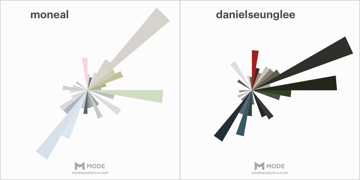
The pinwheels also reveal how certain photographers make use of light. Michael O'Neal (@moneal) is a master at capturing huge swaths of natural light—in waves, in skies, in fog, in snow—which has been distilled into a collection of whites and grays in his pinwheel. Daniel Seung Lee (@danielseunglee), on the other hand, tends to play more with shadows and dark backgrounds, hence the darker wedges in his pinwheel.
However, if you squint, you'll notice that their pinwheels are similarly shaped. If you imagine the pinwheels as a clocks, both Seung Lee and O'Neal have big wedges at the two o'clock, three o'clock, and seven o'clock positions, as well as a medium-sized wedge around 12 (the pink and the red). That means that their photos include similar hues, just at different light intensities. For instance, they're both using blue (at the seven o'clock position), but O'Neal posts more light-blue photos and Seung Lee post more dark-blue photos.
This group isn't without its colorful pinwheels. The wedge of yellow in Sarah Palmer's (@heysp) pinwheel is probably a reflection of her method—she often arranges and shoots everyday brightly colored objects like puzzle pieces, legos, and candy corn. Jessica Zollman (@jayzombie), famous for photographing bougainvillea, has an awesome pop of purple. They really stand out—see if you can spot them!
Click the image below to open it in full size.
Methodology
So, how did we do it? First, we found all the photos an Instagram account posted in 2015 (for some, this meant 50 photos; for others, it meant thousands). Then we used Charles Leifer's method to extract the most dominant color from each photo. We loaded the data into Mode and started playing around with ways to explore the data.
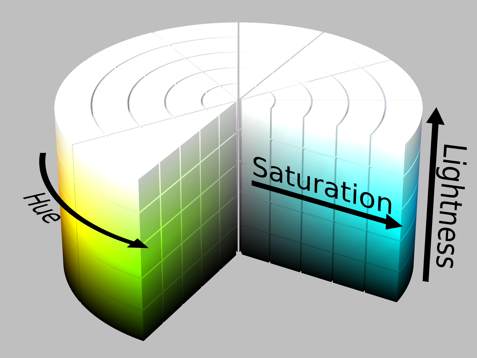
As data, color is an interesting subject. Though there's no universal way to classify and compare colors, the major color frameworks—RGB, HSL, LAB—define colors along three dimensions. RGB and LAB have other useful characteristics (LAB, for instance, allows you to measure the “distance” between two colors”) but they don't lend themselves well to visual analysis. HSL (which stands for Hue, Saturation, Lightness), which is based on a traditional color wheel, does.
 Via Wikipedia user SharkD
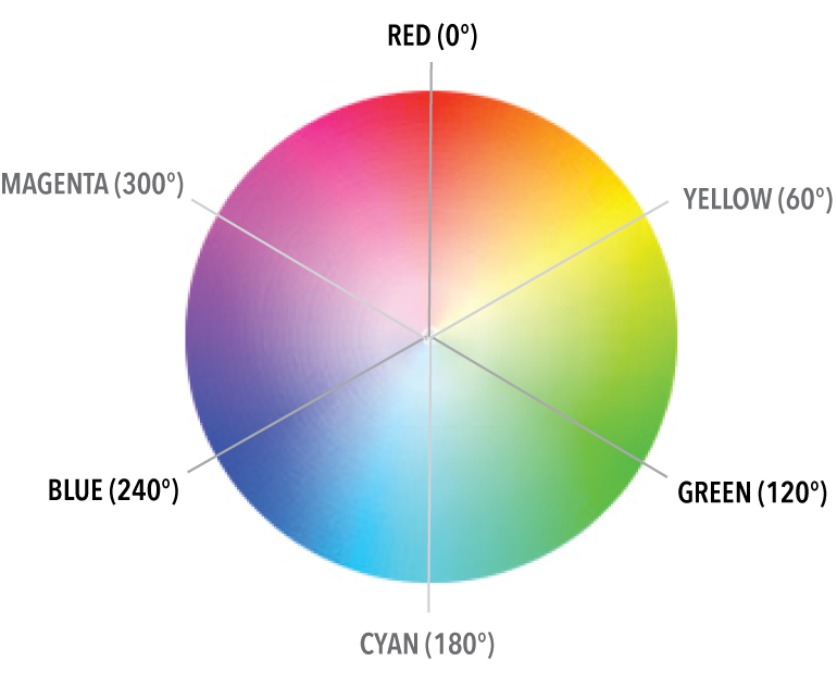
Imagine a particular color as a cube in this cylinder. The closer the cube is to the outside of the circle, the more saturated the color . The higher up the cube, the lighter the color. The hue of the color is represented by the angle around the center of the color wheel, illustrated below. For instance, yellow is at 60 degrees and blue is at 240 degrees.
 Via Dudley Storey
With these three variables, we can plot any color as a coordinate on the color wheel. In our analysis, each pinwheel is based on the color wheel. The wheel is divided into 36 wedges and each wedge is divided into 100 blocks. Our analysis determines which blocks in each slice is most overrepresented relative to the colors across all Instagram accounts. The shade of that slice matches the most overrepresented color; the radius of the wedge represents how overrpresented the color is relative to other wedges.
TL;DR We divided the color wheel up into 3,600 pieces, and looked at what pieces were most overrepresented by each Instagram account.
Data is everywhere!
The analysis and data visualizations in this post were done by our chief analyst Benn Stancil. If you want to look at our dataset in detail, we've made it publicly available on Mode. It includes many other Instagram accounts we didn't feature here, including airlines, beauty products, and celebrities.
There are tons of cool things you can do with this dataset. Dive in to Mode and start exploring!

