Visual Explorer Guides
Scatter
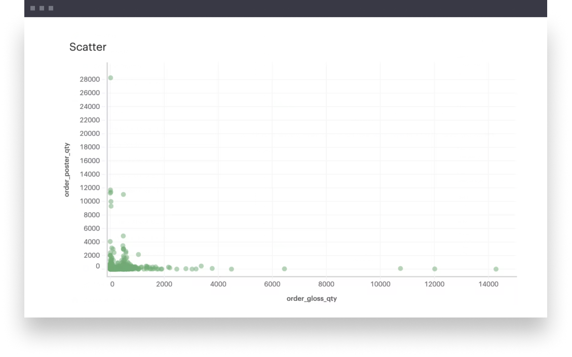
This example will walk you through how to create a simple scatterplot where you’re comparing (x,y) values of two continuous fields to identify patterns or correlations in your data.
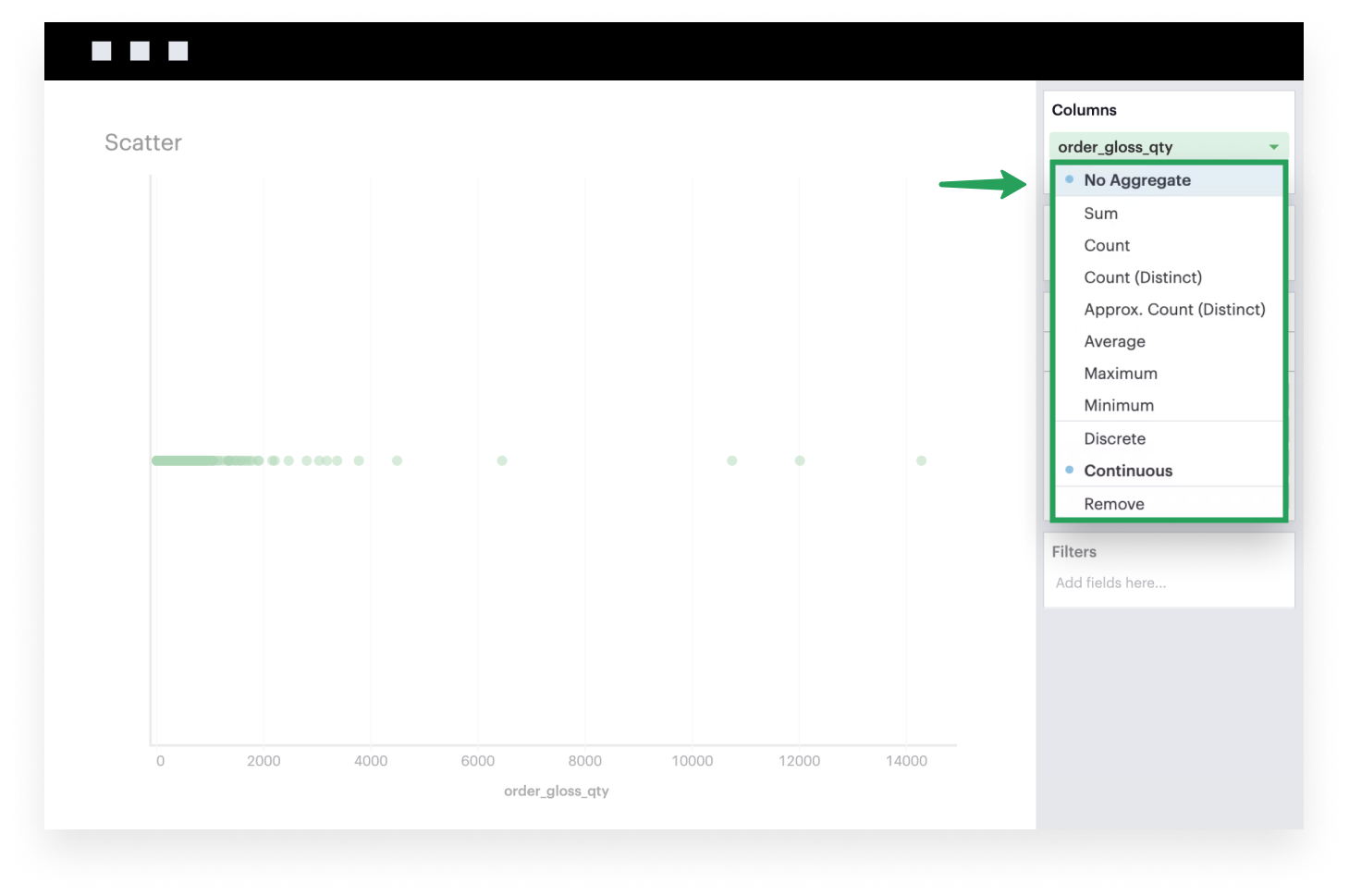
- Add a continuous, non-aggregated field to Columns. Because measures are aggregated by default, you’ll need to click the caret of that field to open its settings. In the context menu, you’ll see the option to select
No Aggregate.
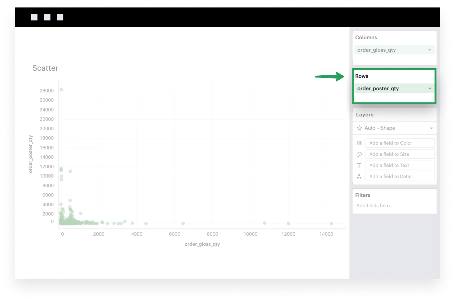
- Similarly, add another continuous, non-aggregated field to Rows.
-
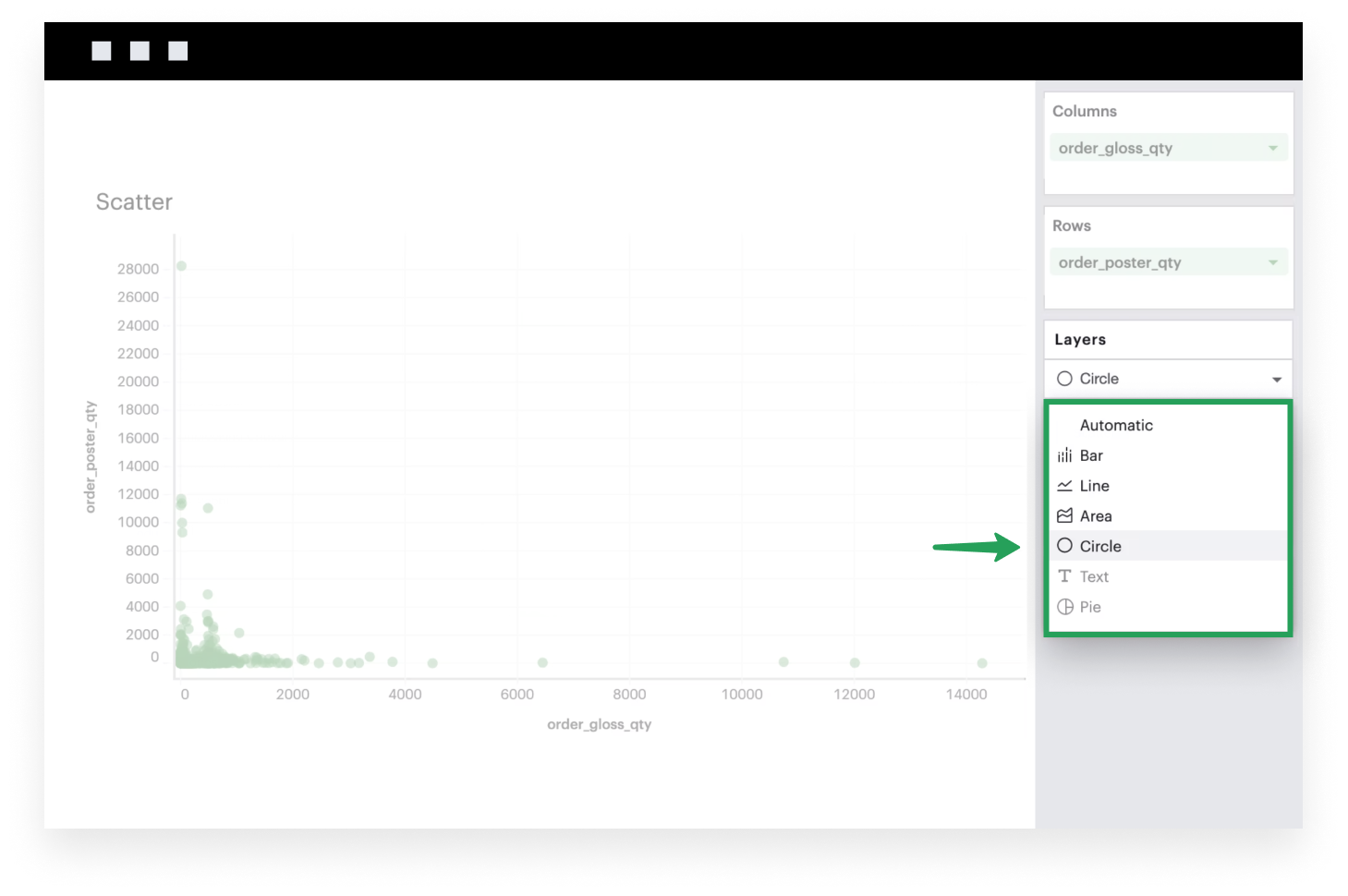
- If it isn’t already, make sure to set your Mark Type to
Circle
- If it isn’t already, make sure to set your Mark Type to