Visual Explorer Guides
Pie Chart
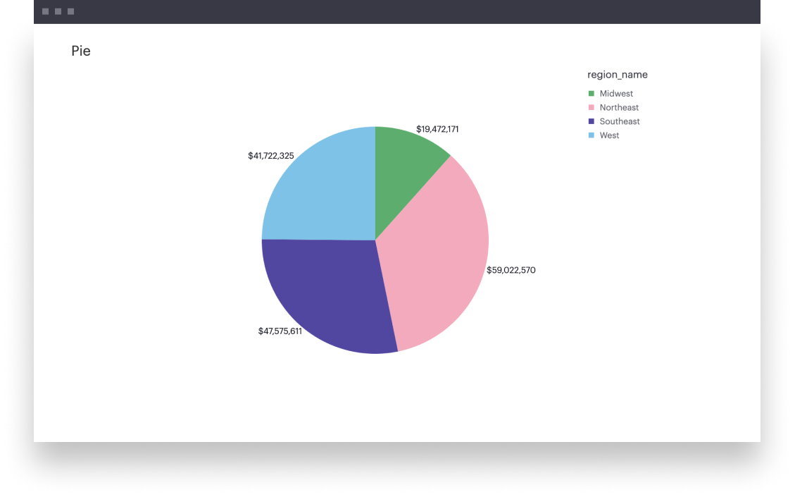
This example will walk you through how to create a simple pie chart where you’re breaking down some population across groups within a dimension.
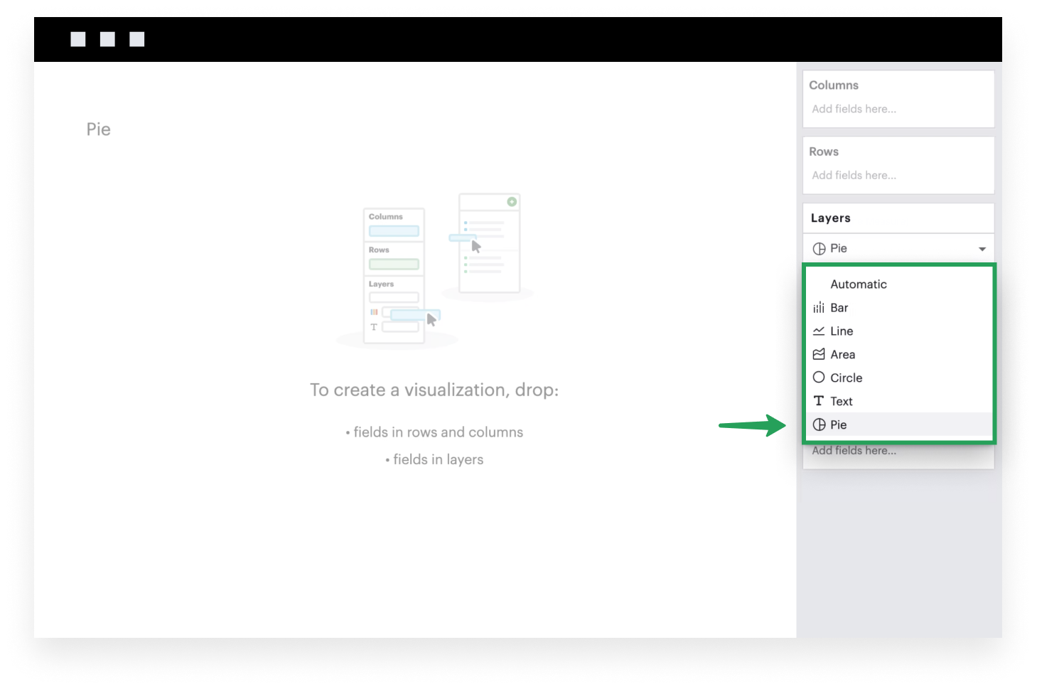
- First, set your Mark Type to Pie. This will ensure that you have all the relevant Layer channels to create your pie chart.
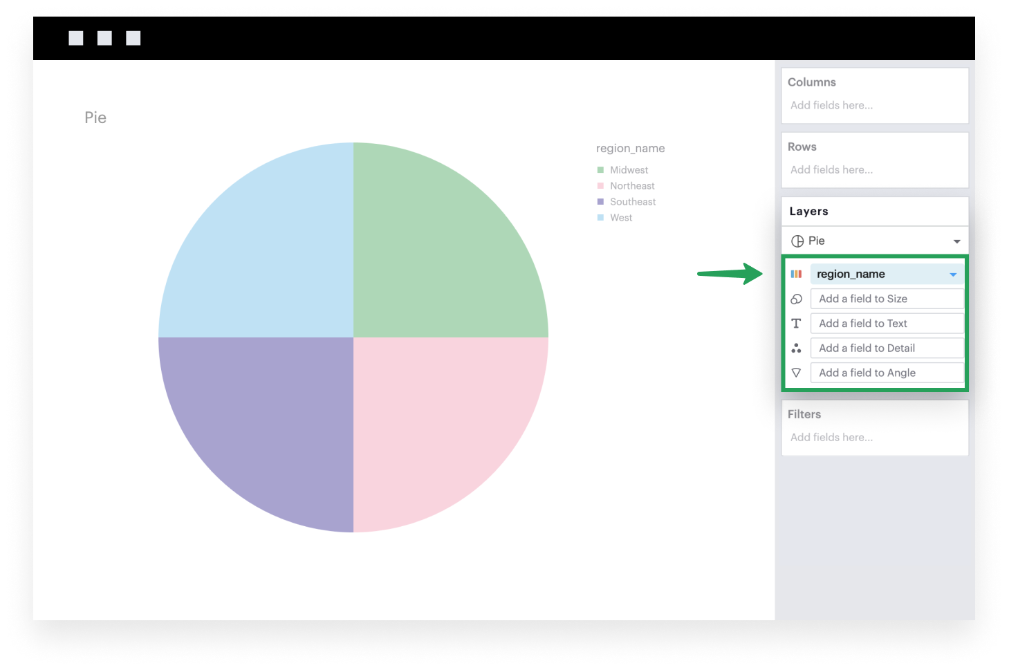
- Add a discrete field to the Color channel. Each group is assigned equal weight until otherwise specified.
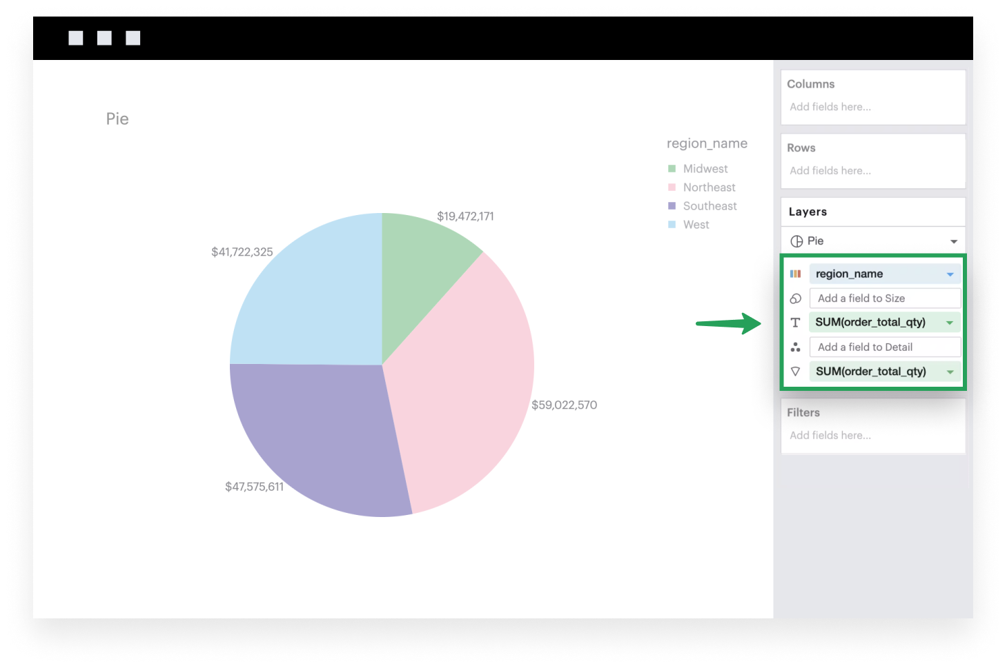
- Add a continuous, aggregated field to the Angle channel. This will now divide down your Pie graph into slices, where the size of each slice represents the value of that group relative to the total.
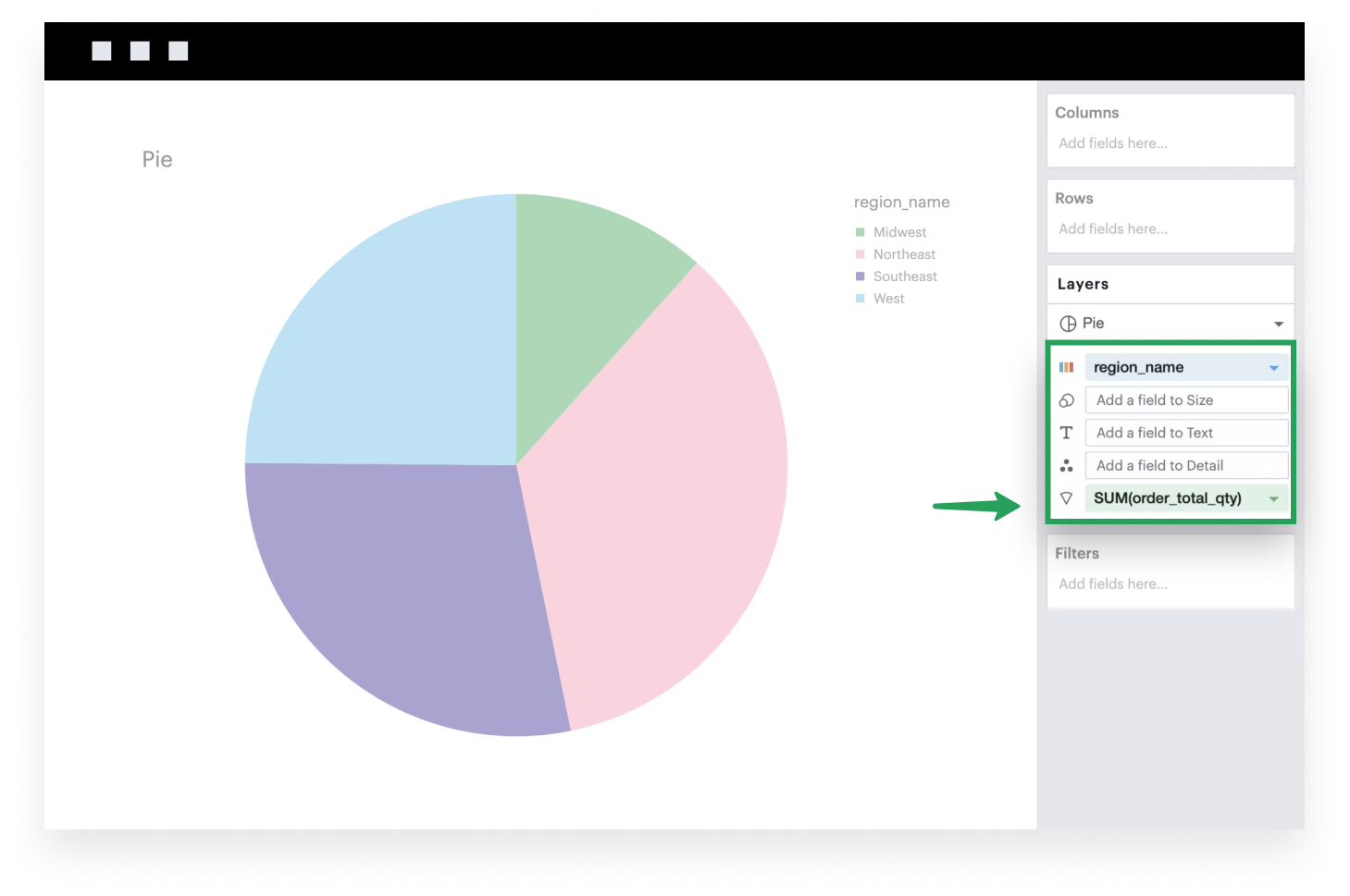
- Optionally, you can add labels to your Pie graph by adding a field to the Text channel.