Visual Explorer Guides
100% Stacked Bars
This example will walk you through how to create a simple 100% stacked bar chart when you have one continuous field that’s broken down by some dimension.
One Measure
-
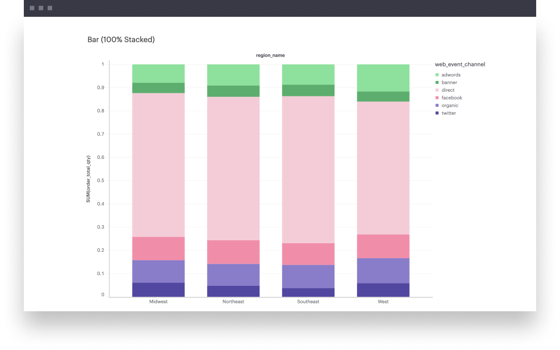
First, you’ll want to create a normal stacked bar chart. You can follow along step-by-step here.
-
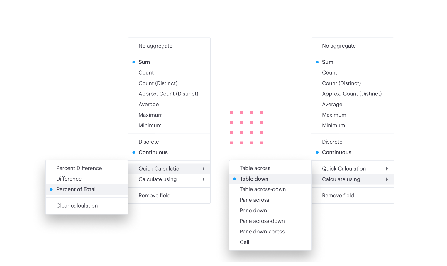
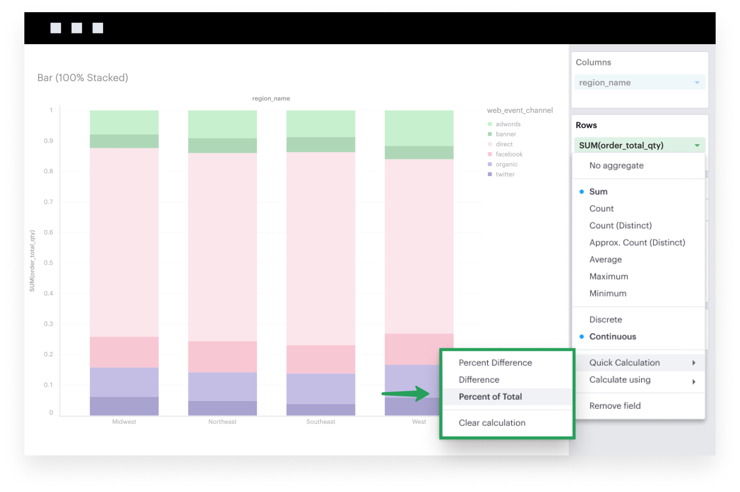
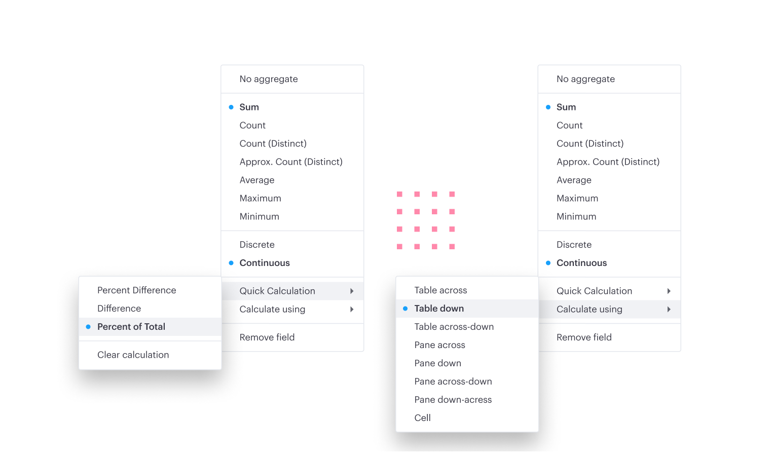
Now that you have a stacked bar chart, the last step is to normalize each stack in the bar based on the total value of that bar. You can do so by leveraging our Quick Calculations feature. Click on the caret of the continuous field in Rows to expand its field settings. One of the options you’ll see in the context menu that then opens is Quick Calculations. From there, you’ll want select the Percent of Total calculation type with the Table Down level and direction.
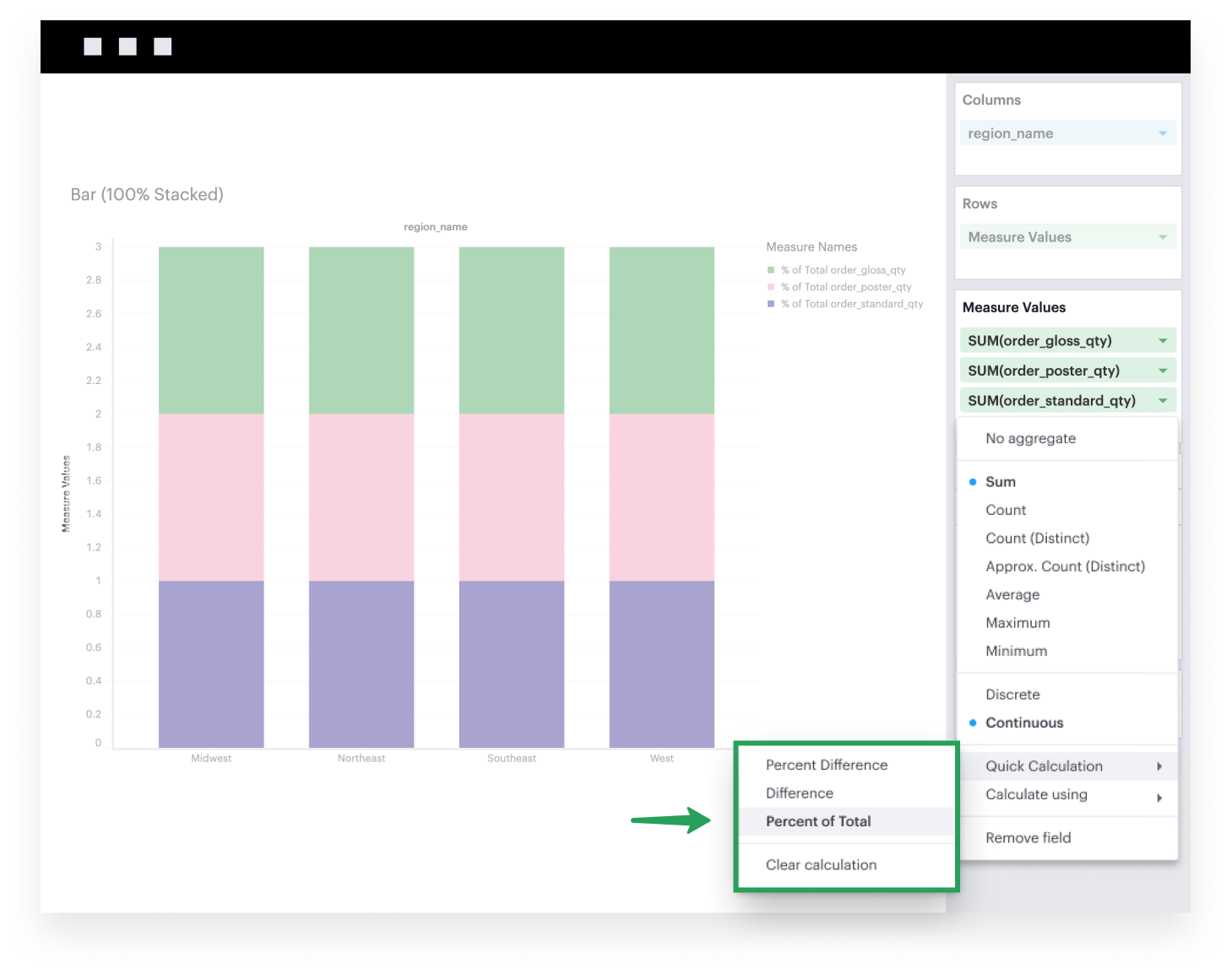
Multiple Measures
-
First, you’ll want to create a normal stacked bar chart. You can follow along step-by-step here.
-
Now that you have a stacked bar chart, the last step is to normalize each stack in the bar based on the total value of that bar. You can do so by leveraging our Quick Calculations feature. Click on the caret of the continuous fields in Measure Values to expand the field settings. One of the options you’ll see in the context menu that then opens is Quick Calculations. From there, you’ll want select the Percent of Total calculation type with the Table Down level and direction.