3 Things Your User Retention Rate is Hiding

Benn Stancil, Co-founder & Chief Analytics Officer
March 17, 2016
NaN minute read

Retention. It's the quiet force behind your product's growth. With bad retention, acquisition efforts fill a leaky bucket. Great retention, on the other hand, can bolster a wide variety of important metrics like virality, monetization, and lifetime value.
Improving retention is a complex challenge. But before you can improve retention, you have to understand it. And the way we've all grown accustomed to looking at retention hides as much as it reveals.
Download

Get the full Guide to improving retention
In this guide, we’ll show you how to uncover insights about your users that drive better engagement and growth.
The user retention chart we all know
If you ask someone for a user retention chart, you'll almost certainly get something like this:
The chart shows the percentage of users who returned to a hypothetical product X days after signing up. It appears to tell a clear story: about 80% of users drift away over the course of their first 30 days. The remaining users—based on the leveling curve at the end of the period—appear likely to stick around for a while longer.
Given the shape of the curve and the high churn rate, you might draw some reasonable conclusions:
Folks who use the product on day 30 are fine. Because the rate steadies out between 26 and 30 days, you shouldn't worry about longer-term retention. Users who find value in the first 30 days stick around and use the product regularly.
People aren't bailing immediately. The dropoff isn't very steep in the first few days, so people aren't bailing immediately. For the majority of users, something about the product resonates, but it doesn't work well enough to be useful long-term.
Invest in the customer in the first few weeks. The first several weeks are very important for keeping users around. You should focus on helping users find the value in your product during that period.
None of these conclusions are necessarily wrong. The problem is, the chart—which is often where measuring retention begins and ends—is only showing you a small piece of the puzzle.
What your user retention rate could be hiding
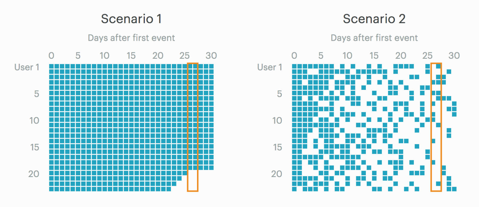
The graphic below shows the usage patterns for 100 users in two hypothetical scenarios. Each square represents a day that a user was active. User 1 in Scenario 1, for example, was active every day for 30 days after signing up. User 50 was active in the first seven days, but none of the following days.
The graphic below shows the usage patterns for 100 users in two hypothetical scenarios. Each square represents a day that a user was active. User 1 in Scenario 1, for example, was active every day for 30 days after signing up. User 50 was active in the first seven days, but none of the following days.
These two scenarios represent very different user behavior patterns. In Scenario 1, people use the product all the time, but when they leave, they don't come back. Users of daily, habit-forming products like Fitbit might behave like this.
In Scenario 2, people use the product more sporadically, and it's harder to detect when someone might be gone for good. Products that people use irregularly, like Amazon, might follow this pattern.
If you were thinking about how to improve retention, your approaches would probably be very different for each scenario. In other words, Fitbit and Amazon clearly need to think about retention differently.
But here's the problem. The overall retention rates for each scenario are identical—they're both represented by the “Overall Retention Rate” chart above. If that graph is all you consider, you'll think about retention in both scenarios in exactly the same way.
The curves are identical because retention is typically calculated by dividing the number of people who were active on a given day by the number of people who signed up. In both scenarios, of the 100 people who signed up, 20 were active on days 26 and 27. However, the 20 users who were active on day 27 could be the same 20 users who were active on day 26 (Scenario 1) or a very different set of 20 users (Scenario 2).
A more complete retention dashboard can highlight these differences. Three additional metrics, outlined below, will help you figure out what's really going on.
Note: We've open-sourced the interactive charts in this post (and the queries behind them), so you can tailor them to your product's data. Try it out.
Request a demo

Request a demo
Learn how Mode can get your company up-and-running with data.
Deconstructing user retention rate
1. Retention including previous period
In Scenario 1, every person who used the product on any given day also used it the previous day. In Scenario 2, retained users tended to cycle in and out, returning on some days but not others.
To detect these differences, you need to calculate how many people move in and out of being active period to period. This new result shows the same overall retention rate as the very first chart above, but splits it into two components: users who were included in the previous day's rate and users who weren't. The larger the yellow section, the more users move in and out of being active.
In Scenario 1, 100% of every day's retained users were also retained yesterday. In Scenario 2, about half the users on day 10 were also active on day 9. By day 30, however, only 5-10% of users were also active on day 29.
2. Average time since last activity
One of the most obvious differences between Scenario 1 and Scenario 2 is the gaps between active days. In Scenario 1, there are no gaps. In Scenario 2, the gaps vary from a day to longer than a week.
While the “Retention including previous period” charts identify the existence of these gaps, the “Average time since last activity” charts quantify how big they are and how they change. For users active on a given day, how many days, on average, has it been since they were last seen?
Consider the users active on day 20. In Scenario 1, it's been an average of one day since those users were last active. In Scenario 2, it's been an average of three and a half days.
You can interpret these charts in a couple ways. A lower average means that people use the product more frequently, but it also means that users who have been inactive for a long time aren't returning to the product.
Fitbit likely follows this pattern. People use it often, but once they take it off for a couple days, they're probably unlikely to pick up the habit again. In other words, if you see someone wearing a Fitbit, there's a pretty good chance they used it yesterday.
A higher average indicates people use the product more sporadically, but it also suggests the product is able to bring inactive users back. Someone who orders something from Amazon today is probably just as likely to have made her last purchase six months ago as she is a day ago. Though Amazon would surely prefer everyone to shop every day, their ability to bring back long-dormant customers is probably one of their greatest strengths.
3. Percent of users who return after an absence
When measuring retention, it's important to know when someone has likely churned. Under Scenario 1, it appears fairly obvious: once a user misses a day, she's probably never coming back.
But in Scenario 2, figuring out the length of time it takes a user to churn is a much tougher problem to solve. For instance, given that some Amazon shoppers might go months between purchases, how long should Amazon wait before they consider these customers churned? You can't really answer that off the top of your head.
This chart shows the likelihood of a user returning after she's been gone for a given number of days. The example below shows the percent of users who return the next day after an absence of that length.
If you're looking at retention rates over a longer time period than 30 days, you can adjust the length of time you give someone to come back. Rather than showing the percent of users who return the next day, you might show the percent of users who return in the next week or month. (For example, if someone hasn't worn their Fitbit in 30 days, how likely are they to put it back on in the next week?)
Scenario 1 shows what you already know—a one-day absence is all it takes for a user to disappear.
Scenario 2 tells a very different story. The amount of time a user's been gone has very little effect on the likelihood that they come back the next day. That implies that recent activity isn't a good predictor of whether or not someone might use the product soon. In this scenario, early in a user's life, long absences are unlikely to indicate that a person has truly churned.
This metric not only helps describe how long it takes for users to drift away, but also provides crucial insight into when to re-engage users who are slipping away.
What these new metrics show
The “Overall Retention Rate” chart appeared to tell us three things:
The first 30 days are very important for keeping users around.
People like the product initially, but it's not useful long-term.
Users who find value in the first 30 days stick around and use the product regularly.
Under Scenario 1, all three are mostly true. The first 30 days appear to be an important period for building a habit around the product. While people like the product initially, even frequent early usage isn't a sign they'll use it for a long time—some people churned after a few weeks of high usage. People who buy a product like Fitbit often do it to make a big change in their lives. Once that initial commitment wears off—much like going to a gym—they stop tracking their activity and it's very difficult to start up again.
That's why it's critical to get users to come back on a daily basis. If someone is showing any signs of disappearing, Fitbit should do everything they can to re-engage them and keep from breaking their still-forming habit.
Under Scenario 2, none of the three conclusions are right. People aren't really leaving the product. They're just using it on an occasional basis. People only place Amazon orders when they need or want something—that could be as often as once or twice a week or as little as every few months.
Instead of trying to instill a daily buying habit, Amazon would be better served nudging people into buying more often. If a customer makes a purchase every two weeks, can Amazon encourage her buy once a week instead? Ultimately, the goal isn't to incentivize daily usage, it's to get Amazon at top of people's minds when they want to buy something. A few emails or push notifications might be enough to create occasional—but very sticky—users.
Investigate your user retention rate
Don't base your business decisions on a small piece of the retention puzzle. We've open-sourced these charts (and the underlying SQL queries), so you can drill down into retention using your own data.
Simply click “Results à la Mode” at the bottom of the report to open it in Mode, and then click “Clone” in the upper right-hand corner. For more on cloning Mode reports, read this documentation.
Though the methods are exactly the same, this dashboard differs a bit from the charts shown above. It uses a larger, noisier, and more realistic dataset that mixes the two scenarios together.
Customization tips
These reports were built using Postgres. Save a few minor syntatical differences, they should work with most major databases except MySQL (MySQL doesn't support window functions, which are extremely useful in a number of these calculations). For workarounds, consult the documentation for the type of SQL you're using.
Changing the time period
This report looks at retention by day. You can adjust the time period in any of the charts by making a quick change to their SQL queries:
	event_age AS (
	SELECT DISTINCT user_id,
       	   FLOOR((EXTRACT('EPOCH' FROM occurred_at) - EXTRACT('EPOCH' FROM first_event))/(60*60*24)) AS periods_out,
           FLOOR((EXTRACT('EPOCH' FROM NOW()) - EXTRACT('EPOCH' FROM first_event))/(60*60*24)) AS user_age
	  FROM events
	)
These two long `FLOOR` statements find how old a user is at a current time. The first part of the statement finds the difference between a user's signup date and their next event in seconds; it's then divided by some period of time to find the age in the desired interval. The example above shows it by day—60 * 60 * 24 seconds equals one day. To make the time period a week or 28 days, multiply that calculation by 7 or 28. To make it hourly, remove the 24.
Changing how many previous periods are included
The “Retention including previous period” chart shows how many users in the current period were also present in the previous period. The current chart shows users who were also active yesterday, but it could include users who were active in the last 7 or 28 periods. Find the section of the query shown below and replace the 1 here `<= 1` with the number of periods you want to include.
last_event AS (
	SELECT *,
           CASE WHEN periods_out - LAG(periods_out,1) OVER
              (PARTITION BY user_id ORDER BY periods_out) <= 1
            THEN TRUE ELSE FALSE END AS retained_last_period
	  FROM event_age
	)
Changing the window for time to return
The “Percent of users who return after absence” chart shows how many users are active in the next period after being inactive for the given number of periods. To increase the size of the window you give a user to return, replace the 1 here `<= 1` with the number of periods you want to include.
COUNT(CASE WHEN e.next_event IS NOT NULL AND e.periods_until_next - c.counter <= 1 THEN e.user_id ELSE NULL END) AS returning_month,
Download

Data Teams Guide for Marketing Metrics
Use this guide to help set up your marketing team in Mode. Better understand the metrics they’re looking for and get inspired with sample charts they can use to accelerate their goals.
Get our weekly data newsletter
Work-related distractions for data enthusiasts.
