


According to data visualization expert Andy Kirk, there are two types of data visualizations: exploratory and explanatory. The aim of explanatory visualizations is to tell stories—they're carefully constructed to surface key findings.
Exploratory visualizations, on the other hand, “create an interface into a dataset or subject matter... they facilitate the user exploring the data, letting them unearth their own insights: findings they consider relevant or interesting.”
More often than not, exploratory visualizations are interactive. While there are many Python plotting libraries, only a handful can create interactive charts that you can embed online and distribute. Today we're sharing five of our favorites.
Let us know which libraries you enjoy using in the comments. We use customer requests to prioritize libraries to support in Mode Python Notebooks.
Python libraries to create interactive plots:
mpld3

Custom plugin example (Jake Vanderplas)
mpld3 brings together Python's core plotting library matplotlib and the popular JavaScript charting library D3 to create browser-friendly visualizations. You can make a plot in matplotlib, add interactive functionality with plugins that utilize both Python and JavaScript, and then render it with D3.
mpld3 includes built-in plugins for zooming, panning, and adding tooltips (information that appears when you hover over a data point). mpld3's real power, however, lies in its well-documented API, which allows you to create custom plugins. If you're familiar with D3 and JavaScript, there's no end to the kind of plots you can create.
When your plot is ready for publication, add an extra line of code at the end to convert your plot into a string of HTML and JavaScript, which can be embedded into any web page.
mpld3 works best with small- to medium-sized data sets; plots with thousands of data points will become sluggish in the browser.
Created by: Jake Vanderplas
Where to learn more: http://mpld3.github.io/
pygal
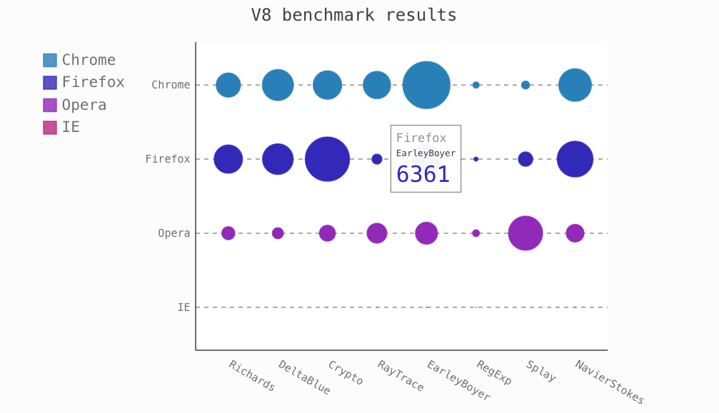
Basic dot plot (Florian Mounier)
pygal is a great choice for producing beautiful out-of-the-box charts with very few lines of code. Each chart type is packaged into a method (e.g. pygal.Histogram() makes a histogram, pygal.Box() makes a box plot), and there's a variety of colorful default styles. If you want more control, you can configure almost every element of a plot—including sizing, titles, labels, and rendering.
Charts display tooltips by default, but there's currently no way to zoom in and out or pan across plots.
You can output charts as SVGs and add them to a web page with an embed tag or by inserting the code directly into the HTML. Like mpld3, pygal is suited for smaller datasets.
Created by: Florian Mounier
Where to learn more: http://www.pygal.org/en/latest/index.html
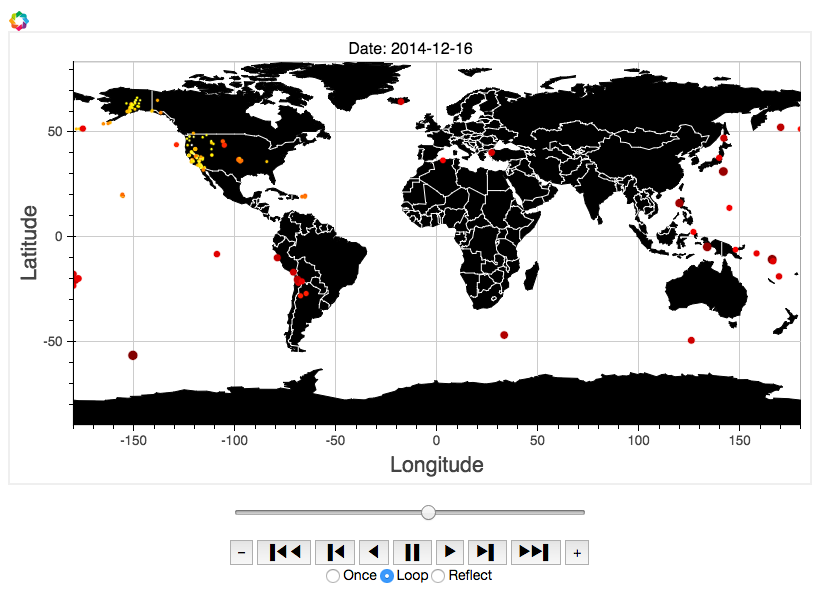
Bokeh
Cross filters example (Bokeh)
Bokeh is inspired by the concepts outlined in The Grammar of Graphics. You can layer components on top of one another to create a finished plot—for example, you can start with the axes and then add points, lines, labels, etc.
Plots can be output as JSON objects, HTML documents, or interactive web applications. Bokeh does a good job of allowing users to manipulate data in the browser, with sliders and dropdown menus for filtering. Like in mpld3, you can zoom and pan to navigate plots, but you can also focus in on a set of data points with a box or lasso select.
Created by: Anaconda
Where to learn more: https://docs.bokeh.org/en/latest/
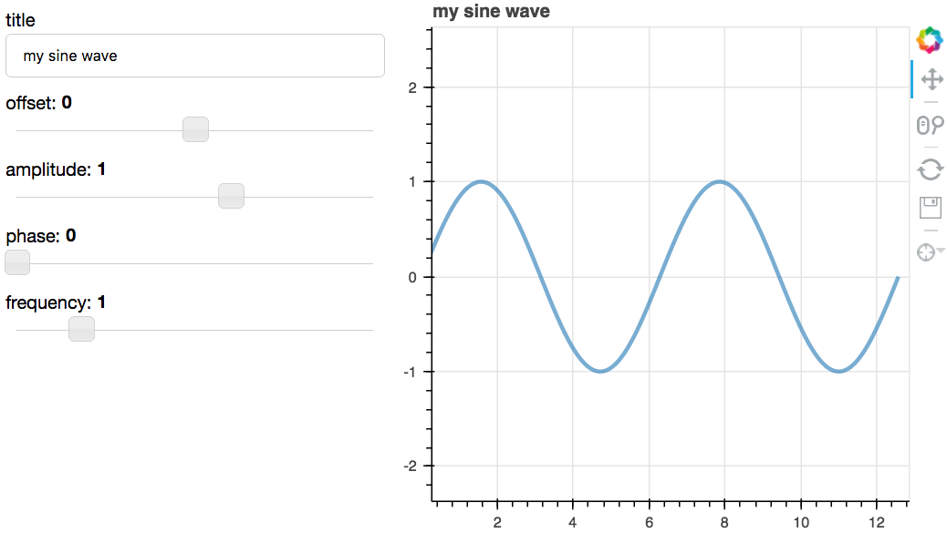
HoloViews
Map using Bokeh backend (IOAM)
HoloViews isn't actually a plotting library. Instead, it lets you build data structures that are conducive to visualization. Once you move your data into a HoloView Container object, such as a GridMatrix for multi-variate analysis or a Layout for displaying components next to each other, you can explore the data visually. Plotting happens separately on the matplotlib or Bokeh backends, so you can focus on the data, not writing plotting code.
The main interactive function HoloViews offers are sliders so folks can play with a variable to see its effect. When using the Bokeh backend, you can combine the slider component with Bokeh's tools for exploring plots, like zooming and panning.
HoloViews integrates with Seaborn and pandas, opening up the power of pandas DataFrames and Seaborn's statistical charts.
Created by: Jean-Luc Stevens, Philipp Rudiger, and James A. Bednar
Where to learn more: http://holoviews.org/
Plotly
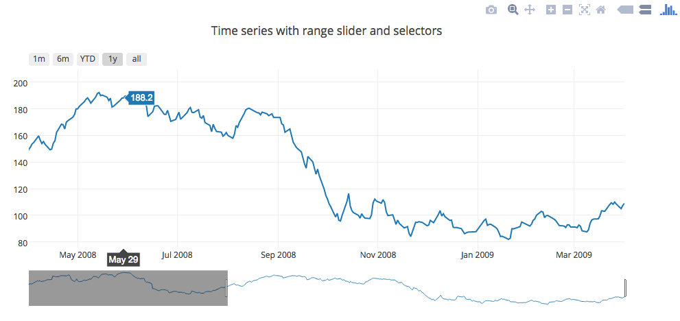
Range slider example (Plotly)
From the humble bar chart to intricate 3D network graphs, Plotly has an extensive range of publication-quality chart types.
Plotly is a web-based service by default, but you can use the library offline in Python and upload plots to Plotly's free, public server or paid, private server. From there, you can embed your plots in a web page.
All Plotly graphs include tooltips, and you can build custom controls (like sliders and filters) on top of a chart once it's embedded using Plotly's JavaScript API.
Another way to work in Plotly and share plots is in Mode. You can pull data with SQL, use the Plotly offline library in the Python Notebook to plot the results of your query, and then add the interactive chart to a report. The report lives online at a shareable URL and can be embedded into other pages, like this chart showing how the size of Lego sets have changed since 1950:
Created by: Plotly, available in Mode
Where to learn more: https://plotly.com/python/
Interactive plots can help you uncover new insights in your data. Try out the ones listed here to tell better stories about the insights you’re finding in Mode.

