


Presenting new data always raises more questions than it answers. Your coworkers want to better understand results to inform decision-making. Business teams have insatiable appetites for slices of data—a sales team wants the numbers segmented by account age, while a product manager wants them grouped by product type.
As an analyst, I've realized that refining data presentations takes both creativity and finesse. It's all about finding the sweet spot between clarity and conciseness.
I wanted to see how others achieve this balance. I've been intrigued by political data journalism since my days as a Poli Sci student and Capitol Hill intern. Data journalists excel at communicating complex concepts simply and quickly, and in few places is this more apparent (and important) than in sharing election results.
Just like a business's most popular analyses, U.S. presidential election maps have evolved over time, with each iteration striving to communicate the data more clearly than the last. This map has been scrutinized and built upon for over a century by some of the best journalists out there. What can we learn from the milestones in its hundred-plus-year history?
1896: Delivering quickly
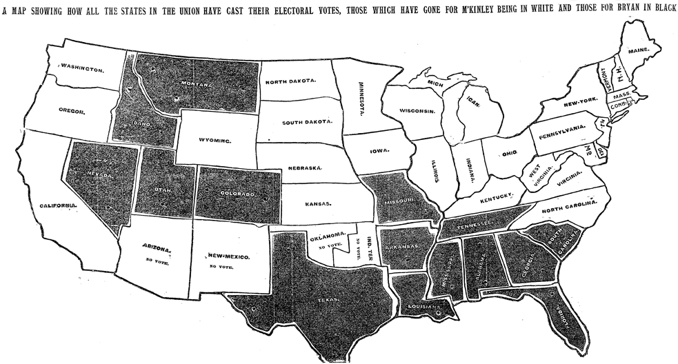
According to New York Times Deputy Graphics Director Matthew Ericson, November 4, 1896 marked the first New York Times presidential election map printed the day after an election. This turnaround time was unprecedented for its day, and despite some flaws, there are more similarities than differences between this 19th century bicolor state map and those of today.
 Source: Matthew Ericson
Similar maps existed before November 1896, and some were far more sophisticated. However, previous maps took much longer (sometimes years) to produce. For The New York Times, speed in sharing results was a competitive advantage that drew in readers from other papers.
Speed matters! As an analyst, I'm competing against compelling external forces, such as intuition and the status quo. If I can't share results and data-supported insights fast enough, it may be too late to influence the decision-making process.
Media outlets continue to compete for engagement today, and the most successful are often the speediest. The New York Times 2016 primary live model offers realtime results, putting to shame competitors who are still complacent with daily updates. Likewise, FiveThirtyEight's 2016 March Madness in-game win probabilities were updated live, providing college basketball fans an obvious destination to monitor their bracket performance.
1904: Facilitating fast takeaways
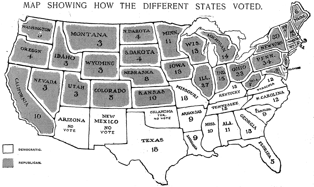
By 1904, The New York Times had implemented several important updates to their election map, including Electoral College votes and a map key. They added both context and clarity, enhancing the reader's ability to quickly process the information.
 Source: Matthew Ericson
What motivated the changes to the map format in 1904? The updates could be in response to publishing innovations or to reader questions and confusion. In creating data presentations for work, I've seen a lot more of the latter.
Once you share a new data presentation, it's not long before your audience comes back to you with a barrage of questions and requests to examine the data from different angles. These moments are opportunities to refine the presentation for clarity.
Build on something familiar. Placing new information in the context of something familiar helps your readers quickly understand results.
The 1904 map layered new information (electoral votes and a key) over the 1896 map, which itself was built on top of the well-known U.S. state map. The state map's familiar structure provided an intuitive base for readers, enabling them to rapidly determine how a party performed in a particular state.
Tie it back to a big goal. By including each state's Electoral College vote share, the 1904 map better frames results in the context of an overall national outcome. People are interested in the big picture (in this case, who won the presidency), and providing perspective on how each component impacts an overall goal keeps your audience focused on the important stuff.
Deciding what to emphasize and how is one way an analyst provides value. For example, bubble charts can be more effective than scatter plots when the relative weight of observations in your dataset is relevant and to the point. 0therwise, they can be distracting.
It's also important not to get so carried away emphasizing your point that you sacrifice the grounding that helps your audience get there. A New York Times graphics editor I spoke with cautioned that cartograms often confuse readers, as they tend to distort an image beyond recognition (remember: build on something familiar).
Don't count on people reading your title. Analysts know that a chart isn't complete until it has a descriptive title. However, I've seen many readers' eyes dart to the graph itself before the title. The 1904 map uses a key to communicate formatting rather than burying this information in the title like the 1896 map, where it's at risk of being overlooked.
Keys can be very helpful (like the Democrat/Republican key in the map above), but you can also take advantage of natural color associations—most readers will infer that red means bad and green means good. Similarly, when charting your company's performance against competitors, using the color palette associated with each brand enhances the clarity of your data presentation.
1916: Acknowledging uncertainties
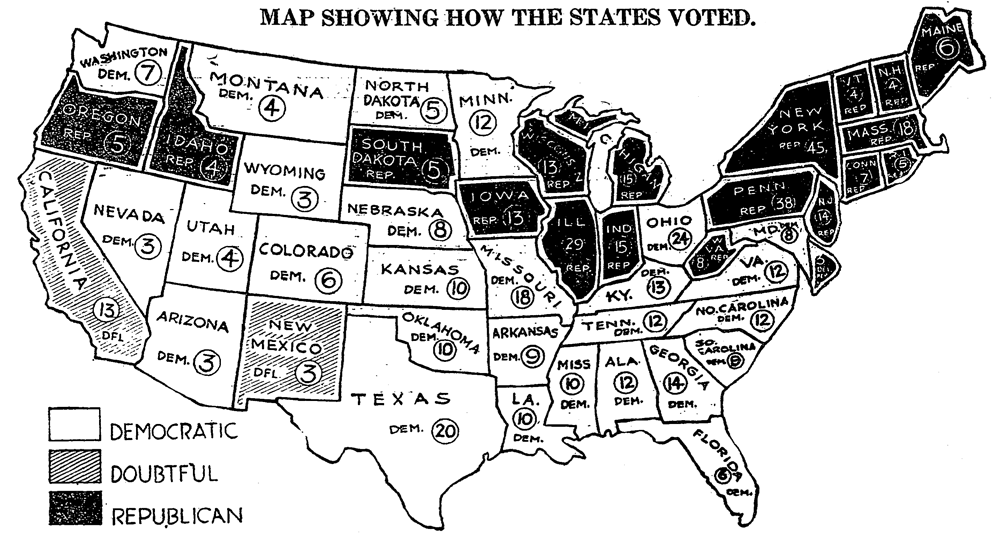
In 1916, 20 years after the inaugural New York Times election map, a further refined version was unveiled. What sets this one apart is its inclusion of a third category for “Doubtful” states (those that were undecided at the time of print).
 Source: Matthew Ericson
While refining a data presentation, I often encounter ambiguity—whether it's missing data or an edge case I previously overlooked. Perhaps I wrote something off as noise (a dangerous habit) and then realize things aren't summing to 100% or my groupings aren't mutually exclusive and collectively exhaustive. This is a good opportunity to address the known-unknowns and decide how to handle exceptions.
Come clean about limitations. Teams are counting on me to provide them with data they can rely on, so I need to be very clear about any potential gaps. Even if these grey-area scenarios are unlikely or seemingly obvious, communicating limitations and assumptions up front can help establish trust with your audience. By disclosing uncertainty in the form of “Doubtful” states, the 1916 map avoids creating confusion (and possibly losing trust) amongst readers.
If your reported measurement is subject to error or doubt, adding error bars can be a good way to indicate a degree of certainty. Important caveats buried deep in an appendix or footnote may be overlooked, so finding ways of integrating reliability estimates into your chart directly can keep your insights from being misinterpreted.
1968: Ensuring results get seen
Adaptability to new mediums fueled the U.S. presidential election map's longevity, allowing it to be widely disseminated. In turn, this ubiquity resulted in the map's iconic status. It became more than just a nifty graphic, but a framework for how we think about the entire concept of elections.
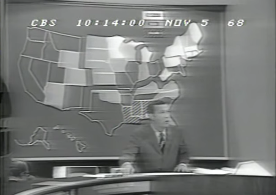
In November 1968, the U.S. presidential election map made the jump from print to television news when it was featured on CBS News' Election Night coverage.
 Source: YouTube
CBS put the 1968 map where people would pay attention to it—on TV. To ensure my work is seen, I've also had to modify how I distribute data presentations.
For over a year I distributed a weekly report via an emailed link. Initially it was celebrated for illuminating answers to pressing business questions. However, the effectiveness diminished over time due to the latency of results (speed matters!) and friction imposed by requiring a click.
It became clear that both the report and I would need to adapt to better serve my coworkers. I accomplished this by embedding the report content within the email body and developing automated dashboards to cover key metrics.
Make it easy for people to access your data presentations. A great data presentation means nothing if it doesn't get used. Successful analysts don't finish their data presentations and sit back in hopes of it one day being discovered, but instead find creative ways of attracting eyeballs.
Understanding how and where your readers spend their time is essential to delivering analysis that will actually get used. Embedding data presentations directly into tools like Salesforce, Confluence, and Slack is a great way of ensuring they'll be seen and enveloped into existing workflows.
2016: Encouraging exploration
The New York Times continues to add chapters to the living history of the U.S. presidential election map. For the primaries season, the Times online election portal featured the familiar map with a few notable enhancements including a Margin of Victory scale and interactive display.
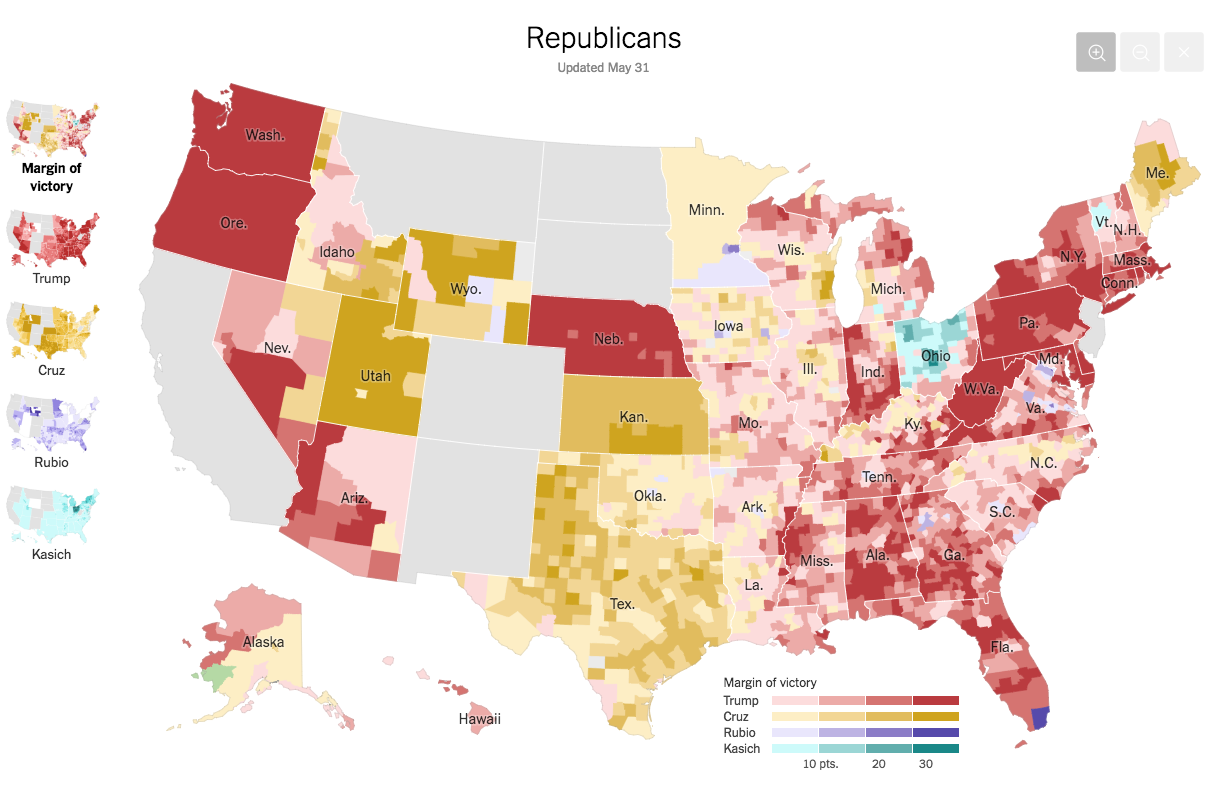 Source: The New York Times
The New York Times has started to look critically at how people interact with their charts. According to one graphics editor, the Times is now looking beyond web stats and paying attention to Twitter and other commentary to see if their charts are shifting the national conversation.
Make it interactive. Great analysts help their entire organization be more analytical by anticipating the next questions and providing a framework for further exploration. Building dynamic filters into your data presentation is one way of making it interactive, which not only satisfies many requests for additional data slices instantly (again, speed matters) but also helps engage people.
Monitor the conversation and harvest feedback. It's important to understand what's working and what isn't. Tracking view and usage stats is certainly valuable, but it's only half the story. Learn from how people are responding to your data presentations in conversations and on channels like Slack and email. What conclusions are they drawing? What's confusing to them? These insights should inspire you to continuously improve your presentations so others can gain a deeper understanding of the data.
Key takeaways
- Speed matters! Deliver analysis quickly to avoid decisions based solely on intuition.
- Build on something familiar to help readers rapidly understand results and process new information.
- Tie it back to a big goal to keep your audience focused on the important stuff.
- Don't count on people reading your title. Use elements like keys and color palettes to communicate crucial information.
- Come clean about limitations to establish trust with your audience.
- Ensure results get seen by embedding them in the tools where your audience spends most of their time.
- Make it interactive to facilitate further exploration.
- Monitor the conversation and harvest feedback to give people a deeper understanding of the data.

