Pareto Chart 101: Visualizing the 80-20 Rule

Joel Carron, Data Scientist at Mode
August 30, 2016
NaN minute read

You've probably heard of the Pareto principle, even if you didn't realize it at the time. Here are a few examples:
80% of web traffic comes from 20% of your site's pages.
80% of customer complaints are caused by 20% of product defects.
80% of revenue comes from 20% of your customers.
Starting to sound familiar? The Pareto principle (also known as the 80-20 rule) applies to a wide range of fields from natural science to sports, but it's particularly suited to solving business problems, like those above. Conducting Pareto analysis allows you to discern the vital few from the trivial many and prioritize actions.
The history of the Pareto principle
In the 19th century, Vilfredo Pareto observed that 20% of the pea pods in his garden contained 80% of the peas. Pareto also happened to be an economist, and the pea pod discovery got him thinking. In 1896, he published a paper demonstrating that around 80% of the land in Italy was owned by 20% of the population.
Later, Joseph M. Juran came across Pareto's work and realized how relevant this idea was to quality management issues. As an engineer, he had noticed that a small number of defects caused the bulk of issues. He christened the pattern the Pareto principle. Since then the term has been used to describe any phenomenon where a small percentage of factors is responsible for a large percentage of the effect.
The Pareto chart
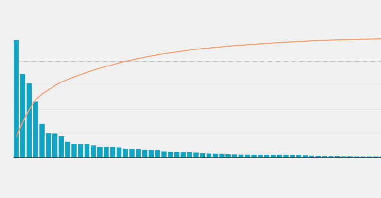
The Pareto chart is a visual representation of the 80-20 rule, featuring a bar + line chart. The bars represent the value of each item on your list (arranged in descending order), and the line indicates the cumulative percentage of those values.
Visualizing a Pareto analysis of your data allows you to quickly pick out where you should focus your time and resources. Take, for example, this dataset of consumer complaints submitted to the Consumer Financial Protection Bureau (a government agency working to protect consumers in the financial sector). Each complaint is bucketed into one of 94 distinct issue types, which might be too many for the CFPB to focus their policy efforts on all at once. Looking at a Pareto chart of consumer complaints will help them figure out where to start.
Click on the image above to see the full-size chart. To see the complete Python notebook generating this Pareto Chart, click here.
The CFPB's consumer complaint distribution follows the Pareto principle to a T. The top 20% of issues generate just over 80% of all complaints. This means that the CFPB can effectively work to address 80% of concerns by focusing on only the top 19 issues (compared to the total 94).
Not every distribution you come across will follow the 80-20 rule as closely as the CFPB's issue types. The Pareto principle assumes a long tail distribution, and not every dataset will follow that exact pattern. That said, a Pareto chart is an effective way of evaluating potential impact when selecting a subset of focus areas from a long list, regardless of the distribution.
Make your own Pareto chart
You can make your own Pareto chart for any list of things that have values associated with them (e.g. a list of blog post URLs and the number of web sessions for each, a list of accounts and the revenue they bring in). Check out the code in Mode and follow these steps:
Step 1: Pull data with SQL
Use a query like this one that pulls values for the items on your list. Note that a COUNT works here because you're counting complaints submitted. For numerical or financial data, you'll likely want to use a SUM instead.
SELECT issue,
      COUNT(DISTINCT complaint_id) as total
      FROM modeanalytics.consumer_complaints
GROUP BY 1
ORDER BY 2 DESC
Step 2: Plot in Python with Plotly
Next, copy this code into your Python notebook.
Before you create the plot, you need to make a new column for the cumulative percentage, which is what you'll use for the line in your chart.
df['cumulative_sum'] = df.total.cumsum()
df['cumulative_perc'] = 100*df.cumulative_sum/df.total.sum()
In this example, the DataFrame columns are named issue and total. If your columns are called something else, you'll need to update the Python code where applicable.
Optional Step 3: Customize HTML
The report page of this example also uses some custom HTML. The first code block sets the background color of the report page to match the background color used for the plot.
<style>

body {
  background: rgb(240, 240, 240) !important;
}

.chart {
  background-color: rgb(240, 240, 240);
  border: none;
}

.mode-embed.mode-object {
  border: none;
  background: rgb(240, 240, 240);
}

.js-table-container {
  background-color: rgb(240, 240, 240);
}

</style>
The second code block increases the height of the chart area on the report page.
<script>

  $("#python_52c4404842c0 .chart-content").css("height",700)
  $("#python_52c4404842c0 .mode-python").css("height",700)
  $("#python_52c4404842c0 .mode-python").css("max-height",700)
  $("#python_52c4404842c0 img").css("max-height",700)

</script>
Simply update the #python_ tags to match the chart id, which you'll find in a line that looks like this:
<mode-python id="python_52c4404842c0"options="python_options"></mode-python>
For more information on customizing the HTML of Mode reports, click here. And for more custom examples and inspiration, be sure to check out the Mode Gallery.
Additionally, here are some other tools and tutorials for making your own Pareto chart:
Recommended articles
Get our weekly data newsletter
Work-related distractions for data enthusiasts.


