There are many of us—errr, people—who build stuff with Legos at all ages. Having grown up with loads of hand-me-down Legos (and having a Lego Wall-E sitting on my desk right now), I started to wonder how Legos evolved from the sets I remember from my childhood to what they are today.
As an analyst, I turned to data for answers. I found a dataset on Rebrickable (a site that shows you which Lego sets you can build from the sets and pieces you already own), which contained information on the color, number, and type of pieces in each Lego set for the past 67 years. I used Plotly and Mode Python Notebooks to explore the data.
Building blocks
Like a baseplate, scatterplots make a good foundation for building analysis. I took a look at Lego sets through the years broken down by the most basic of Lego metrics—how many pieces are in the set.
Mouse over a data point for information about a particular set. Highlight an area to zoom in.
To see the complete Python notebook generating this plot, click here.
Lego set size
Is it fair to say sets are bigger now than they used to be? Well, sort of...
To see the complete Python notebook generating this plot, click here.
While the number of sets released each year have generally increased, there's a conspicuous dip from 2004-2009. Those years represent a difficult period for The Lego Group, when the company teetered on the brink of bankruptcy before picking up the pieces.
There's an interesting disparity between the annual mean and median pieces per set. While the mean pieces per set continues to grow, the median pieces per set remains fairly consistent over time (around 50-100 pieces). This indicates that while there are roughly an equal ratio of sets above and below 75 (plus or minus 25) pieces each year, something is happening with the volume of pieces to drive up the mean.
To see the complete Python notebook generating this plot, click here.
The box plot shows that the number of pieces per set has become more widely distributed over time. The first quartile (25th percentile) doesn't change much decade to decade, but the third quartile (75th percentile) has grown steadily. This signals that the increasing mean is driven by sets that were already above the median—or put simply, big sets have gotten bigger while small sets have stayed about the same size.
To see the complete Python notebook generating this plot, click here.
The 95th percentile of sets more than doubled in pieces from the 1970s to today. This outpaces the 90th percentile, which grew 80%, as well as the 75th percentile, which grew 37% over the same period.
This trend is particularly evident at the top. Until 1985, Lego's biggest set was still under 1000 pieces (the 973-piece U.S.S. Constellation). Today's biggest set (the 5922-piece Taj Majal) is six times bigger.
Lego colors
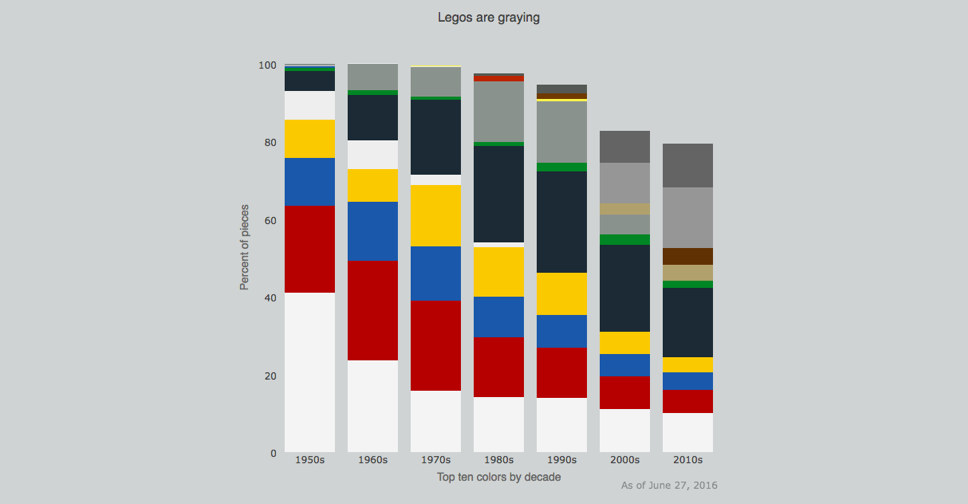
To see the complete Python notebook generating this plot, click here.
Legos have gotten darker, with white giving way to black and gray. The transition from the old grays to the current bluish grays (or “bley”) is a hot-button topic for many Lego fans.
Perhaps not surprisingly, Lego's color palette has expanded over the decades. Until the 1990s, almost every piece was one of the top ten colors; now only about 80% are.
To see the complete Python notebook generating this plot, click here.
The remainder of pieces outside the top ten consists of a growing long tail of many minor colors.
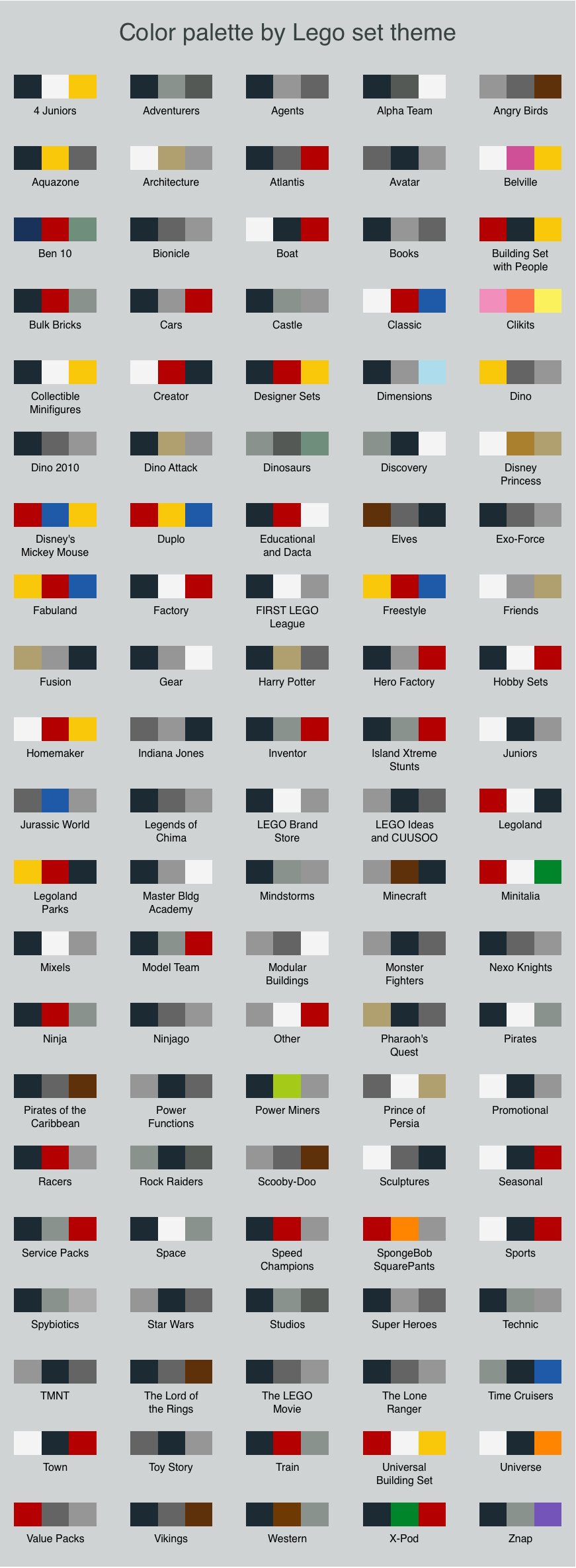 I decided to switch up the visualization tool for this chart—it was made with Apple Numbers.
Color palettes help define set themes. Some colors really pop out, like the orange of SpongeBob's pineapple house, tan of desert-based Pharaoh's Quest and Prince of Persia sets, and lime from the Power Miners series.
SpongeBob SquarePants
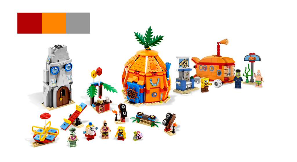
Source: Bikini Bottom Undersea Party via Lego and Good Neighbours at Bikini Bottom via Brickset
Pharaoh's Quest and Prince of Persia
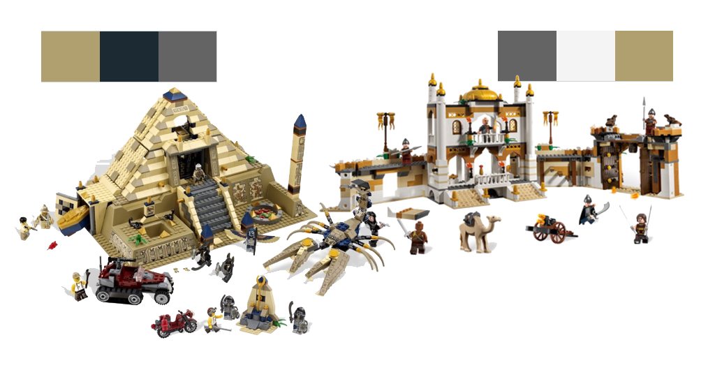 Source: Scorpion Pyramid and Battle of Alamut via Brickset
Power Miners
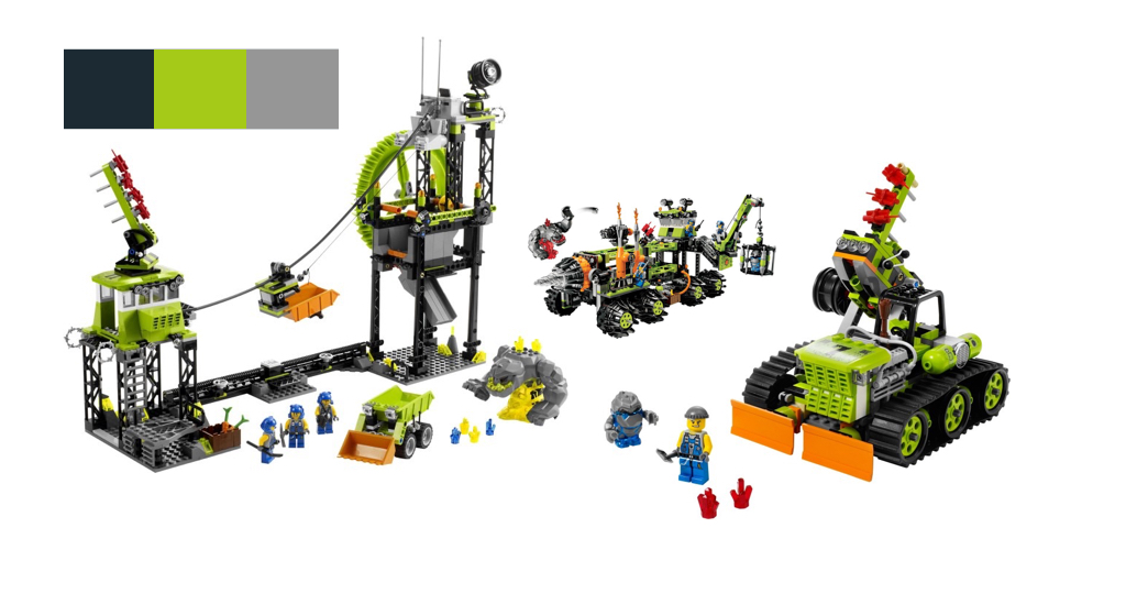 Source: Underground Mining Station, Titanium Command Rig, and Boulder Blaster via Brickset
The Lego network
The Lego universe can be thought of as a network in which sets that share many of the same pieces have strong connections, whereas sets that only share a few pieces have weak connections.
I defined the connection score for two sets as the number of shared pieces over the total number of pieces between the two sets. In (Lego) set theory, that formula would look something like this:
#(x ∩ y) / #(x ∪ y)
Each circle (or node in network-diagram-speak) in the visualization below represents a Lego set theme. The size of the circle represents the total number of pieces in a theme's sets; the color shown is the color that makes up the most pieces in that theme. By clicking and dragging the circles, you can explore how closely one theme is connected to others.
Mode Analytics To see the HTML powering this network diagram, click here. It was built in Mode using this D3.js library.
A few smaller themes—including Hobby Sets, Dinosaurs, and Fusion—share a high percentage of their pieces (and therefore have strong connections) with many other themes. Bionicle and Technic (two mechanical themes) don't share a strong connection directly, but end up close together by virtue of each of them sharing strong connections with Spybotics and Znap.
Summary of each year's Lego sets
Finally, I wanted a way to represent each year's Lego sets. I thought about the summary for each year as a combination of color and set size (median pieces). To determine the essential color for each year, I chose the most dominant color (by number of pieces) in the most sets.
To see the complete Python notebook generating this plot, click here.
All this Lego analysis had me eager to build something, so I recreated the above chart with Legos.
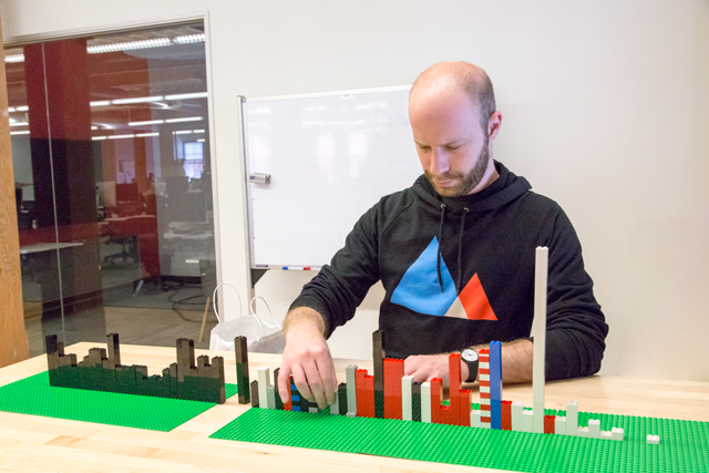
Legos are serious business.
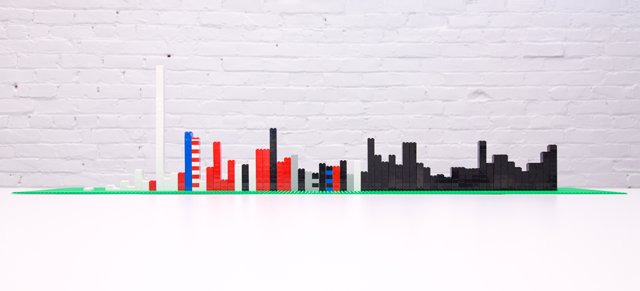
Want to join in on the fun? Explore Rebrickable's data for yourself in Mode's public warehouse.


