


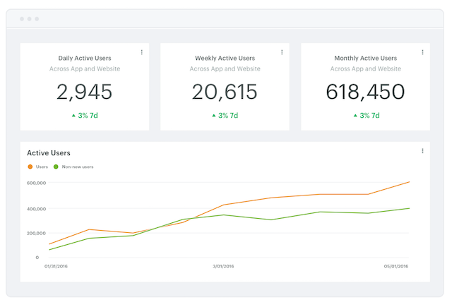
At the end of the day, a key job of any analytics team is to effectively communicate data and insights, with the goal of driving informed decisions throughout a business. Often this includes reporting on a core set of company or team metrics.
Key Performance Indicators (KPIs) don't always need the fanciest data visuals—in fact, keeping it simple can often better communicate a trend.
We just added a few new reporting features to make it easier to build KPI reports for teams throughout your company. The new Big Number chart type allows you to display... well...a big number. Combined with a new option to re-size the height of a report's elements, you can now create more information-rich reports.
Turning queries into Big Numbers
You can display a query result as a Big Number in just a few clicks.
After running your SQL query, click Add Chart and select Big Number from the Chart Type dropdown menu. Choose the column you want to display as your metric, and pick how you want it to be aggregated: high or low, an average, or the last value. To determine what the last value is, you can sort your results right in the charting tool panel using a dropdown without needing to tweak your query.
However, to use the Big Number chart type, you'll need to select a column with numerical results. If your data set only includes non-numerical results, such as text or date fields, you may need to tweak your query by using an aggregate function to get your data into a numerical format (check out our SQL tutorial if you need a refresher on aggregate functions).
Once you've chosen the data you want to display, click over to Format in the charting tools panel and choose how you want your Big Numbers chart to look. Format your metric as an absolute number or a percentage, show a rate of change, or add a color scale to make it immediately obvious to a viewer whether or not performance is going well.
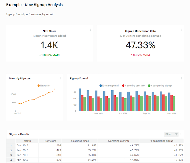
Here's a simple example. To explore it, click the image below and clone the report, then check out query results and chart builder to see how we built this metric. Start-to-finish it took about 60 seconds.
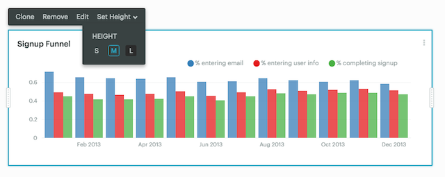
Re-Sizing Report Elements
We also recently added the ability to change the height of report element for better control over your report's layout.
To re-size any report element, just click on the chart or table in the Report Builder and choose Set Height. Pick from small, medium (the default size), or large for charts, or an additional “full” option for tables. Once you've re-sized an element within a report, adjacent elements will automatically snap in to place to match the new height.
With your reports looking snazzier than ever, don't forget to set up some recurring email sends to drop fresh KPI reports into your teammates' inboxes each morning.
Jump into Mode to experiment with these new reporting features. If you have any questions, reach out to us at hi@modeanalytics.com —we love hearing from you!

