


The applications of color theory in business are vast. One of the most useful applications of color theory is the visualization and presentation of data.
Companies typically encounter a challenge when trying to map their brand palettes to data visualizations: analysts and data scientists need to present information using brand colors, while also making the presentation engaging and easily consumable. Unfortunately, when most companies choose their brand colors, they aren't thinking about data presentation. But they still want branded presentations. People grow accustomed to seeing brand colors, so data visualizations in off-brand colors can stick out like a sore thumb. We wanted to share some tips for generating effective and comprehensive palettes within your brand guidelines.
Define Thoughtful, Useful Palettes
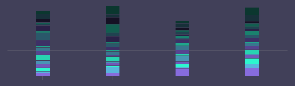
Let’s imagine that you’re working on a dashboard that will be shown on monitors all around the sales department. You really only have two or three memorable brand colors to work with, but your chart needs to showcase individual performance for each of the 18 people on your team. Recycling a three-shade palette won't be effective. One color cannot represent four different Account Executives when that information needs to be legible from fifteen feet away. Every time a team member walks by the dashboard, they'll be forced to pause and examine tiny legends or labels to get any kind of insight. That dashboard needs to be useful even for those taking a quick glance while walking past.
So what are your options? A common method to turn few brand colors into many is to progressively decrease saturation and darken the hues.
This quickly results in a muddy, unappealing chart. Another method is to simply generate a large array of random, non-deliberate colors. Maybe you have some tertiary brand colors that don't get used very often, or swatches that you can pull from your product’s interface.
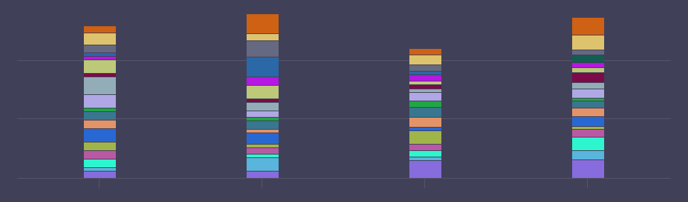
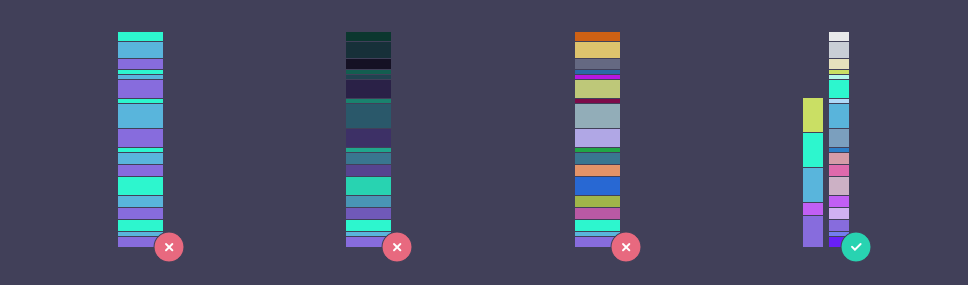
Even if you manage to find enough distinct shades, there may not be enough contrast between them, and it's unlikely to appear cohesive. None of these options lead to high-impact data visualizations.
To deliver on-brand visualizations with lots of categories, take the time to define a 20-color brand palette. You can keep the simple, pared-down palette for more straightforward visualizations; there’s no need for a single, perfect palette that works on both a chart with two series and one with twenty.
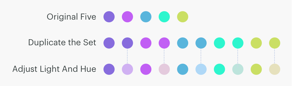
A great way to generate this larger palette is to use lighter shades of your original colors in between each, to stretch the palette out. Let’s use these five swatches as an example of a primary brand palette. To grow that palette from five shades to ten, we started by duplicating the original five shades. From there, we increased the lightness and adjusted the hue to create enough contrast.
These next sections will give you additional tips on how to expand and order your palettes.
Borrow from Nature
Replicate nature's color patterns when adding and ordering shades into gradients to give them a familiar appearance. For example, look at the two gradients below. A gradient that maps from light yellow to dark purple mimics the pattern of a summer sunset. A color progression that maps the opposite way, from light purple to dark yellow, should feel similar. But it doesn't; this gradient isn't commonly found in nature. When comparing the two side by side, the natural one clearly feels better.

This is a result of our subconscious conditioning to gradients that repeatedly appear in nature. A bright yellow or orange transitioning to a cool purple or blue appears in the most stunning of summer evenings. There isn’t a natural example of the reverse.

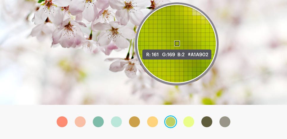
In addition to ordering your palettes to follow a more natural pattern, you can also use nature to inspire more harmonious and analogous palettes. Consider creating mood boards to collect images or photographs that reference colors similar to those in your brand, and look for complimentary shades you can pull from.
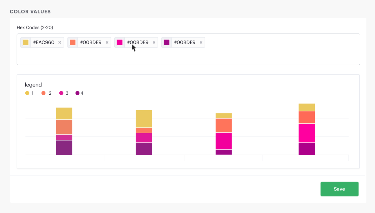
After you have a general sense of what your palette should look like and what colors you want to use, arrange them in a chart preview tool to quickly iterate and reorder your swatches to find the most natural look that works well in your visualizations.
Consider Color Symbolism

Humans can experience color in vastly different ways. Every person's unique mix of emotion, mood, cultural, and societal context influences their associations with different colors. But some color combinations have almost universal connotations. Take, for example, red and green. These colors are typically understood to have opposite meanings. One of the most obvious examples worldwide is the standard traffic light, with red and green universally indicating “stop” and “go”. Red is often used to represent caution, danger, or negative or troublesome financial information. However, in branding it can be used to communicate power or confidence. It evokes a passionate and vivid response.
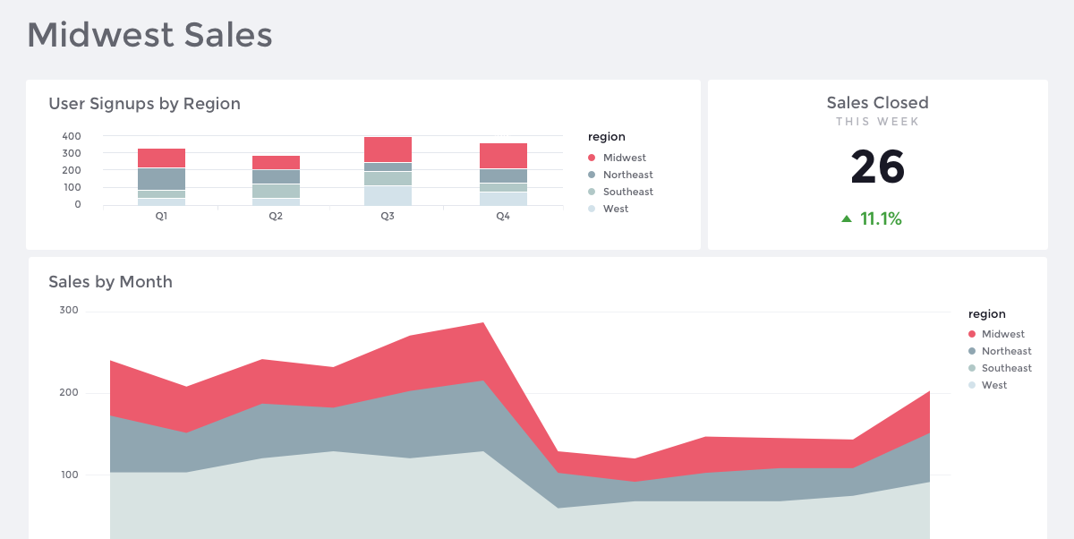
If your primary brand color is red, consider using it for emphasis in visualizations to highlight outliers or features, or as an accent in fonts and details elsewhere in your report theme. For example, If you’re building a dashboard on sales metrics throughout the United States and want the emphasis to be on the Midwest region specifically, try creating a palette using your brand color to represent the Midwest, and shades of gray to represent the remaining regions. Not only does this create brand recognition, it allows you to utilize the benefits of red’s ability to create a focal point to the outlier in the analysis.
Avoid using red to convey positive trends or gains, as this is antithetical to most people's perception of the color. If your company logo is green, a color commonly associated with growth and wealth, you'll want to find a different color for charts that portray the opposite, like customer churn or financial losses.
Make Visualizations More Accessible
Companies with limited brand colors struggle to visualize a wide variety of categories while keeping those categories distinguishable and easily scannable. There are some common pitfalls you can avoid.
A palette with few colors may provide adequate distinction between adjacent blocks of color in an area chart, but it's unlikely to work for comparisons between thin overlapping lines in a line chart. If you want your palette to be accessible regardless of the shape or proximity of colors, make sure that you’re comparing the values in a variety of sizes and proximities, and that the values can overlap with one another while maintaining contrast. You can determine whether individual shades have enough contrast by testing them in places where visual differentiation is most difficult, such as chart legends and in line charts where multiple series are overlapping.
Palettes are typically created for display on light backgrounds. This poses a problem when a company wants to present data on a dark background, like for a large monitor display. You can easily make a palette more suitable for dark backgrounds by increasing both lightness and saturation.
Another challenging factor when visualizing data is making that visualization accessible to the visually impaired. A great way to test palettes for these problems is Toptal's Color Blind Filter web tools, which can test color schemes or reports for compatibility with various forms of colorblindness.
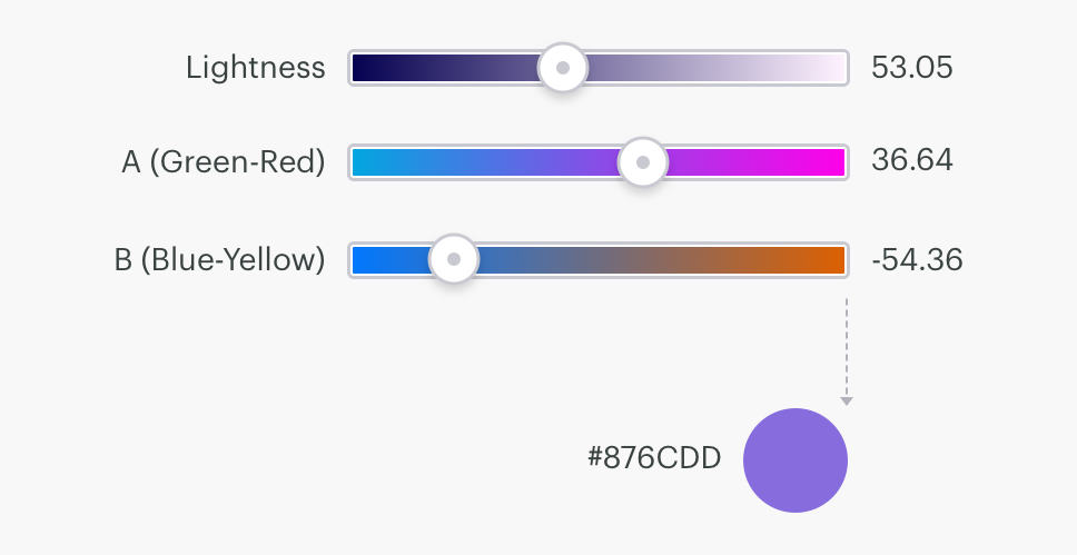
A great tool for navigating all of these challenges is CIE Lab.
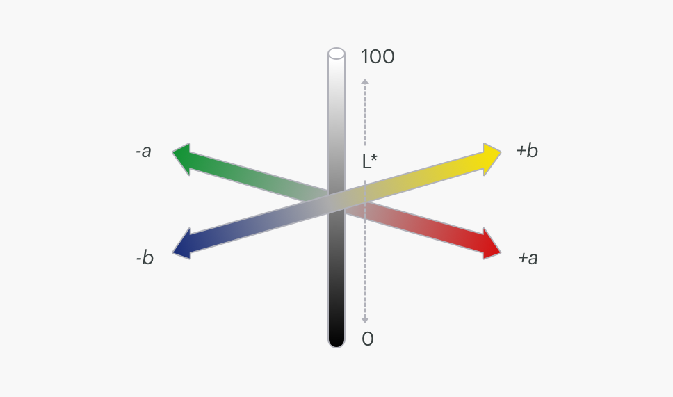
CIE Lab is a three-dimensional color space that helps account for perceptual distances between colors. Take a look at the swatches below. Mathematically, these five shades are interpolated equally. But while looking at them, the first two shades appear to be much closer together. After updating the shades according to CIE Lab, it’s much easier to notice the five distinct swatches.

To use CIE Lab to improve your brand palettes, use its three scales to generate your shades:
L - plot the lightness or luminance from white to black
A - plot the values between red and green
B - plot the values between yellow and blue
Try adjusting your brand shades using these three scales in a color generator that works in CIE Lab. Whether updating the lightness or hue of an existing color or creating new compliments, you can easily tweak the values and save your new corresponding hex value.
Articles, Tools, and Resources
If you're as excited by the idea of color theory as we are, or if you have the freedom to create palettes that go beyond limited brand colors for your visualizations, there are plenty of amazing articles and resources online that go in-depth into the science behind color. Here are some of our favorites:
- Articles:
- Color Theory - Tips and Insights: Janie Kliever, Design Artistree Creative Studio
- Introduction to CIE Lab & LCH: Phil Cruse, Colourphil Colour Management Consultancy
- Make Grey Your Best Friend: Andy Kirk, Visualising Data
- Resources:
- Colorbrewer2: Sequential and divergent data visualization palettes
- Color Hunt: Palettes with four colors or less
- Coolors: Lock in your brand essentials and swap out the others
- Adobe Color CC: Create new palettes or browse thousands of pre-made selections from the community
- Color Picker for Data: Great tool for data that allows you to keep the chroma consistent while building your palette

