
In October, we launched our new product, RJMetrics Pipeline. Pipeline integrates data from all the systems you use to run your business into Amazon Redshift so that you can analyze it with any analytics tool. As with any new product launch, excitement around the office ran high. We celebrated every free trial signup, and about a week post-launch, we were eagerly awaiting our first batch of real clients.
Unfortunately, far fewer of our first cohort of users converted than we had anticipated. The user acquisition flow for Pipeline is similar to a lot of SaaS products: sign-up form, onboarding steps, free trial, and finally, become a customer. There’s inevitable drop-off that happens during this process, and enormous value to be gained from spotting any bottlenecks as soon as possible.
We had two advantages on this front. We had our data ready prior to launch: our event stream was implemented, our web usage and app usage flowed together, and our marketing automation, CRM, and billing platforms were integrated into the same warehouse (all using Pipeline, of course!). And we were using Mode Analytics on top of that data to analyze and distribute insights throughout our company.
The result? A single funnel analysis chart—built using one SQL query—showing each stage of the funnel, from visit to signup to implementation to payment. It shows us where prospects get stuck in the funnel, so we can focus resources on figuring out what the problem is and how to solve it.
This chart ended up being a core part of our launch strategy. Here’s how we got our data in order and built the funnel.
Establishing the funnel
The first step of our funnel analysis was to identify an event flow, with all of the steps in the funnel deemed significant conversion points. These conversion points represent milestones the prospect reaches when moving through the funnel. For Pipeline prospects, we identified these milestones as:
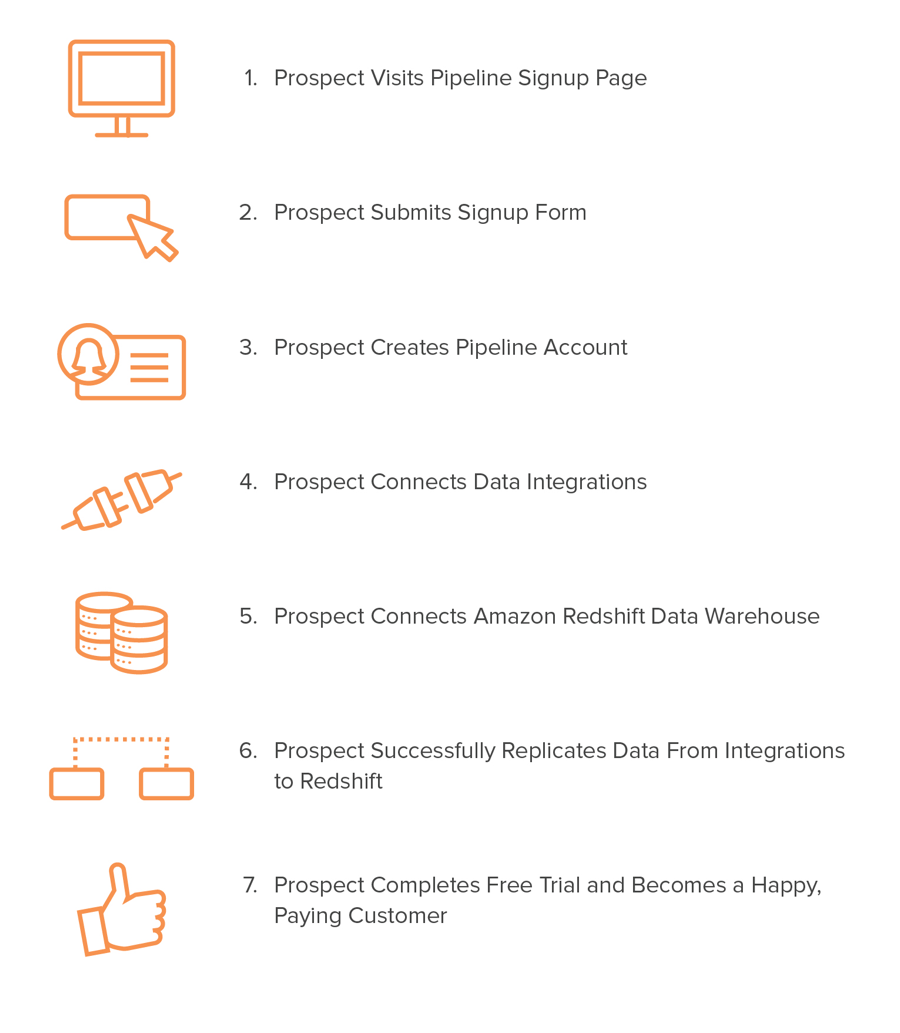
After we identified the milestones for acquisition and onboarding, we had to:
- Collect the relevant data
- Load the data into a warehouse so that we could query it
Integrating the data together
As it turns out, the data being collected to analyze these milestones lives in a variety of different places. Below I’ve mapped the milestone to its respective data source:
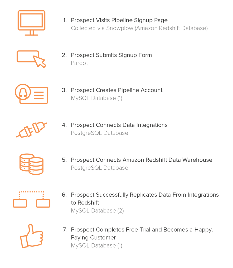
Fortunately, we already were collecting the data we needed for most of these events. The only missing piece was the events that take place directly within the product itself. During the development of Pipeline we had an engineer build an event bus on top of Amazon SQS that any Pipeline service could publish or subscribe to. He then instrumented the product with dozens of events, including the ones listed above. Finally, we built a queue consumer that replicated all events to a PostgreSQL database where we could get at this event data.
Once we were collecting all the necessary data, we needed to load it into a single warehouse for analysis. Plenty of companies have solved problems like this by building a custom data pipeline internally. However, the amount of effort and resources involved are often underestimated. RJMetrics Pipeline aims to solve this problem by offering a cloud-based, fully-managed solution that enables you to consolidate all of your disparate data sources into a single Amazon Redshift data warehouse.
Pipeline allowed us to quickly and easily consolidate all of the relevant data necessary to construct our acquisition & onboarding funnel into a single Redshift instance. Now that the data was living in this centralized location, we were able to move on to analyzing the data.
Analyzing the data
Connecting the data sources with user identifiers
After we had all of our relevant data sources consolidated into our data warehouse, we were ready to start constructing our report.
We needed the ability to track a single prospect all the way through the funnel. Since the data was already centralized, all that was left was to ensure a way to connect all the data sources together.
We use Snowplow to pass a custom user identifier to a website visitor. This custom user identifier can be anything that your business uses to identify a user internally (e.g. a User ID determined when a client creates an account).
This feature makes it possible to join Snowplow behavioral data with other customer data sets. In our case, we pass the corresponding prospect ID from Pardot to a Snowplow user. This enables us to connect a Snowplow user directly to Pardot. Once a user is identified in Pardot, we are then able to identify the client that Pardot user belongs to and connect it to our production MySQL client database. At that point, we can use our internal client identifier to follow a person throughout the rest of the funnel.
Conducting funnel analysis
We decided to construct the funnel analysis report using Mode, due to it’s ability to quickly and efficiently turn SQL queries into visualizations, which can then be shared internally.
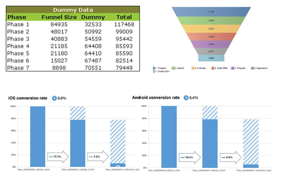
With this data in hand, we wrote a query that gives us insight into the total number of users that made it to each milestone, and the conversion rates between milestones. When thinking about how we wanted to visualize this data, we knew we didn’t want to follow the conventional path of funnel visualization, which is more often than not, presented in a way that isn’t immediately insightful. Here are some particularly scary examples:
Instead, we wanted to visualize the data in a way that would enable any viewer to immediately recognize where the weak points were. Eventually we landed on the following design (easily customizable thanks to Mode’s HTML editor):
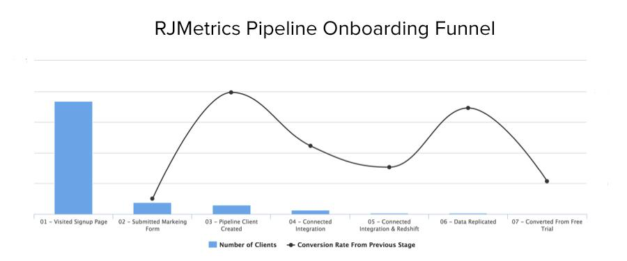
This chart shows the funnel analysis for Pipeline after it was in the world for about two weeks. Let me explain two glaringly obvious things about this chart:
- That drop at the beginning looks particularly scary, but the conversion rate from page visit to signup is 10%+, in line with our expectations.
- We offer a two-week free trial for Pipeline so, at this point in the story, we still didn’t have any converted customers.
The area of concern was the fourth step, where users are connecting to data integrations and their Redshift data warehouse. Data integration is typically in the realm of an engineer or data scientists. Our hypothesis was that this user would be the buyer for Pipeline and therefore, comfortable spinning up a Redshift instance. Thanks to this chart, we knew almost as soon as users hit this stage of the funnel that we had a problem.
After personally following up with users who fell off at this step, we found that many of them simply could not figure out how to spin up a Redshift instance and connect it to Pipeline. Even though we have documentation on how to do this, we were depending on the user to engage with the documentation.
Armed with this knowledge, we decided that a much more proactive approach was needed. Since then, we have implemented a solution via Intercom, where we proactively reach out to a prospect with assistance in the form of a video tutorial showing the user how to connect Redshift. Two weeks into its implementation, we’re seeing some initial signs of improvement.
The takeaway
Having this insight visualized in an easily-digestible way allowed us to quickly take action on a problem we otherwise would have been oblivious to. This was essential for us when we launched Pipeline, and it’ll be valuable as the product grows, too. We continue to use this one funnel analysis chart to guide our entire onboarding experience.
Of course, this is only of one the many examples of how analysis of consolidated data improves decisions. If you would like to consolidate your data and come up with your own uses, you can sign up for Pipeline here. Integrate your data, spin up Redshift, connect your database to Mode, and start analyzing.
A big thanks to David Wallace from RJMetrics for this story! Want to see more ideas for how to bring together data from across your business and make it actionable? David and Benn (Mode's Chief Analyst) are joining forces next week for a webinar. RSVP to snag a spot!