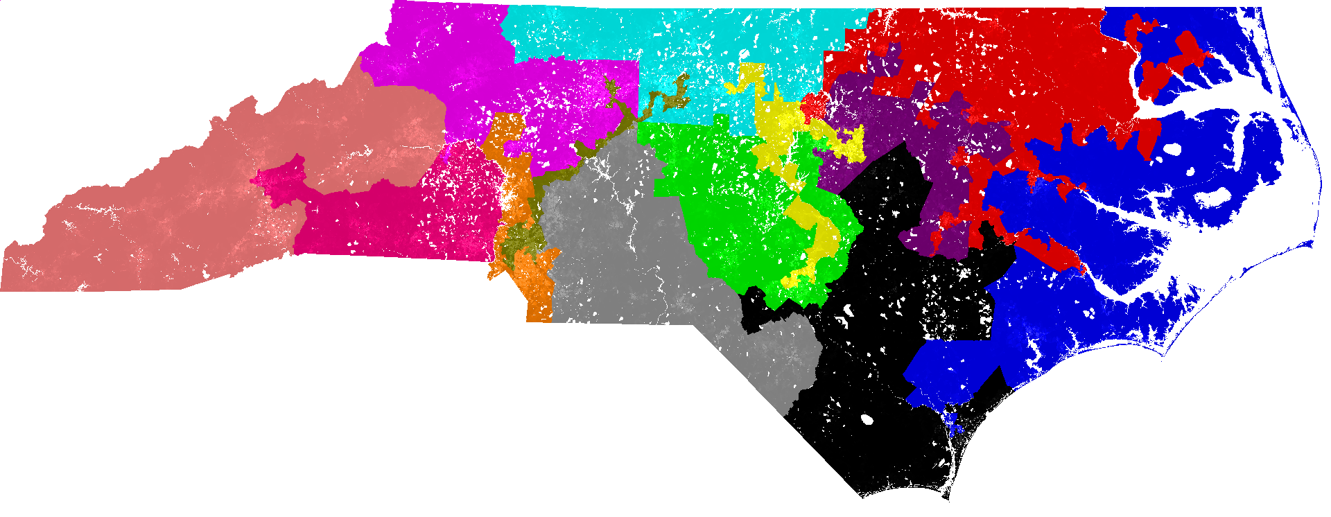
Yesterday, I came across an interesting Vox.com article discussing Congressional district gerrymandering. In the article, author Andrew Prokop highlighted several of the country’s most gerrymandered districts. Having recently crunched some numbers on geographic data, why not try to quantitatively define the most gerrymandered districts and states?
Defining Gerrymandering
As Prokop noted, there’s not a great way to determine if a district is gerrymandered. Nevertheless, researchers have proposed a few ideas to approximate it. The proposals largely measure gerrymandering in one of two ways: By calculating how far various points on the district’s boundary are from the district’s geographic center, and by comparing the perimeter of the district to that of a similar-sized district with a regular shape (in this case, a circle). Both calculations are far from perfect—the first calculation doesn’t work for noncontinuous districts, while the second is affected by any irregular boundaries, including coastlines and state borders—but they give decent estimates.
Because the effect created by irregular borders is both smaller and a bit easier to adjust for, I chose to rank districts by the ratio of the perimeter of the district to the circumference of a circle of equal area. The larger that ratio, the more gerrymandered it is.
Importantly, this ignores any political definitions for gerrymandering and assumes the best drawn districts are all circles. This assumption clearly doesn't work geometrically or politically. A more true measure of gerrymandering would compare actual lines to those that make sense given the area’s geography and population distribution, but that adds significantly more complexity to the problem.
Ranking the Districts
After calculating the area and perimeter of each district as well as the circumference of a circle with the same area (discussed in more detail below), districts can be ranked by how severely they’re gerrymandered. The list below shows the top 10 most gerrymandered districts in the United States.
The winner, North Carolina’s 12th District, is hardly a surprise. (According to Wikipedia, “It is an example of gerrymandering.”) Maryland’s 3rd and Florida’s 5th are also examples of some “creative” geographic interpretations. One unexpected addition to the list is Hawaii’s 2nd. In this case, Hawaii’s geography appears to be confusing the ranking, which misinterprets the district’s several islands as severely gerrymandered boundaries. It’s worth noting, however, that this method still ranks three other contiguous districts as having been gerrymandered worse than a district broken into several pieces.
For those interested in the full ranking of all 435 districts, it is available here.
Ranking the States
Four of the top ten most gerrymandered districts are in North Carolina. This certainly makes North Carolina the frontrunner for the most gerrymandered state, but is it actually the worst?
It turns out that’s not a straightforward question to answer. You can’t simply sum each district’s gerrymandering scores because states with more districts tend to have much higher scores. Furthermore, taking the average of all the districts in each state doesn’t work either, because states with irregular borders or coastlines (like Alaska, Hawaii, Louisiana, and North Carolina) will appear more gerrymandered than they actually are.
To attempt to correct for these issues, I adjusted each state’s average score by how gerrymandered the state would appear if it were a single district. The more irregular the state border, the less penalized that state is for having irregular districts.
As the chart below shows, North Carolina is still, in fact, the worst offender. In addition to ranking states, the chart also colors each state according to who controls the process of drawing district lines. States with split executive and legislative branches or with split legislative houses are categorized as having split control. States that only have one Congressional district are grouped in with those that employ independent commissions to draw district lines.
While the graph above implicates both parties, it does suggest that independent commissions, unsurprisingly, help reduce gerrymandering. Half of the ten least gerrymandered states (excluding those with one district) employ independent commissions, while only two of the ten most gerrymandered districts do so. (Additionally, many of the least gerrymandered states have fewer districts. This makes sense because fewer districts provide fewer opportunities for gerrymandering.)
Importantly, this isn’t the only way to rank states—there are other (likely better) ways to measure district gerrymandering, other ways to aggregate it, and additional political and population data that might be useful. If anyone would like to try a different method of analysis or add additional data, I’ll be happy to provide full access to my data and work in Mode.
Data
To rank Congressional districts, I needed to figure out two things: The area and perimeter of each district. Fortunately, D3, the JavaScript visualization library, can do this pretty easily. Using several of D3’s geographic functions and GeoJSON data on Congressional districts, I was able to calculate each district’s (as well each state’s) area and perimeter. That raw data is available here, as is the script that generated it (it’s in an .html file). I. Note that the area data and perimeter data are in different units. Ratios between the two can be compared, but you can’t convert one to the other. Data on who controls the redistricting process was provided by Justin Levitt.


