If you're an analyst, you probably already know and love the tools made by Plotly. Plotly lets analysts and developers create powerful interactive visualizations, whether offline or right in your browser.
Today we're excited to announce that Plotly.R is now available in Mode's new R Notebooks. (Psst: you can also use Plotly with our Python Notebooks, if that's your jam.) This means that it's easier than ever to build all kinds of custom, interactive R-powered visualizations right into your Mode reports and dashboards.
What can you do with Plotly + Mode?
Does your data call for a choropleth map that lets you zoom in or see details when you mouse-over? Plotly in Mode can help with that. In the map below, the color of a country tells you in a glance what the range is for that nation's total sales figures. Zoom in or out, or hover over any country for more precise 2-year sales figures.
Isolate specific data series
Or maybe you've got a chart you created with some other native R package— say, ggplot or ggdendro—that would be more useful if you could click into it and isolate one or more series. Plotly in Mode has got you covered there, too. Using just one line of code, we made this ggplot2 chart interactive.
Double-click on any day of the week in the legend to isolate that day's data. Single click on a day label in the legend to add individual days back into your view.
Add interactive sliders
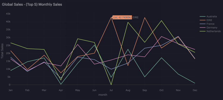
Plotly plays nicely with tons of other packages and libraries, multiplying the power of native R and Python visualizations by adding all kinds of interactivity. For example, we added sliders (under the x-axis) to this line chart showing sales over time.
The sliders make it easy to limit or change the time scale, so viewers can focus on just the data they need for any given question.
Take Plotly for a spin
For more inspiration and to find templates for re-creating the visualizations above, check out this sample report we built to showcase Plotly in Mode. You'll find lots of interactive R visualizations (sortable bar charts, anyone?) that you can use as starting points for your own visual analyses.
To take Plotly for R for a spin in Mode, just clone our sample report (from the Report menu, select Clone) and adapt away.
Don't have a Mode account yet? You can start creating your own Plotly-powered reports in minutes by signing up for Mode Studio—it's a complete analytical toolkit, free forever.
If you have other questions or requests, drop us a line at hi@modeanalytics.com, or tweet at us @ModeAnalytics. We love hearing from you!
