Analyzing Customer Success Performance With 3D Visualization

Joel Carron, Data Scientist at Mode
December 14, 2017
NaN minute read

Customer success teams are a central pillar of recurring-revenue businesses. Great customer success teams help users get the highest possible value out of a product or service, leading to more valuable accounts and happy, long-term customers. Tracking a customer success team's ability to deliver on these goals can help identify opportunities for improvement.
Understanding the relationships between retention, revenue expansion and customer happiness can be difficult when charting these metrics with traditional visualization methods. So we built a framework for tracking all three metrics in a single visual, by charting them in a 3D cube. To explain how this works, let's start by defining the metrics in this framework:
Retention Rate
Typically, retention rate is the primary measurement of a customer success team. There are two main ways to calculate retention: customer retention and revenue retention.
Customer Retention
Customer Retention measures the total number of accounts retained. It's a good first metric to show what's going on at the highest level. We'll be measuring customer retention on a monthly interval using the the following formula:

Revenue Retention
Revenue retention is a measurement of the total amount of revenue retained. This is a common metric to track alongside Customer Retention in businesses where the revenue generated from each customer is highly variable, and the sheer number of accounts doesn't paint a complete picture of the state of the business. For these companies, there's a necessary priority placed on retaining the customers with the highest-revenue contracts. Both customer churn and downselling can affect revenue retention, whereas only customer churn can affect customer retention.
Since we're measuring performance monthly, we'll use monthly recurring revenue (MRR) in our formula to define Revenue Retention:

Expansion Revenue
In addition to retention, customer success teams play a key role in expanding the revenue generated from accounts, through upselling and cross-selling. This makes Expansion Revenue one of the most important measurements of a customer success team's performance. Let's define Expansion Revenue as the percentage of upsell revenue a team has at the end of the month, compared to the total amount that they had at the start of the month:

Net Promoter Score
Net Promoter Score is a measurement of how likely a customer is to recommend a product or service to other potential customers. This information is typically collected via survey, asking each customer to rate their own recommendation likelihood on a scale of 0-10. Answers of 9 and 10 are considered promoters, answers of 0-6 are considered detractors, and answers of 7 and 8 are considered neutral. The Net Promoter score is the percentage of promoters, less the percentage of detractors:

The Traditional View(s)
These metrics are typically viewed as separate figures, which is great for a targeted look at how your team is performing. We generated example data for four imaginary Customer Success Managers: Elaine, George, Jerry and Kramer. We then charted the gang's performance below in some examples of conventional visualizations: bar charts, boxplots, and time series graphs: Mode Embed
This bar chart shows the three categories of performance mentioned above, ranking each CSM side-by-side. This is effective for understanding which CSM is leading in each category, and whose performance is lacking. Here it looks like Jerry's NPS score is lagging behind Elaine's.
These boxplots are useful for illustrating distribution. It can show that Kramer's NPS ratings are quite volatile, whereas George's NPS ratings are consistent... just consistently bad.
Time series showing how metrics are changing with time. Changing business dynamics can have an impact on customer success performance, and this time series chart shows exactly how that impact is affecting performance trends, while showing how the CSMs stack up against each other.
Now in 3D!
The challenge with looking at each metric separately is that it's often difficult to understand the relationships between metrics, see how reps compare to each other across all metrics, or prioritize which metrics to focus on improving. You'll need to understand the interplay between metrics to do that.
Luckily, there exists... a third dimension.
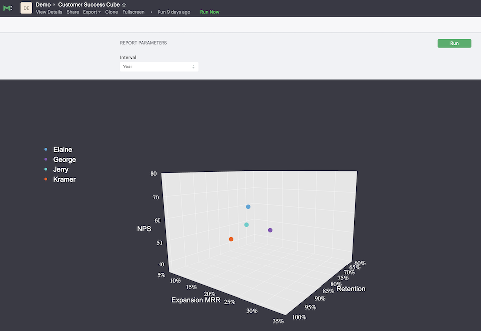
A 3D visualization can illustrate how metrics relate to one another, and provide a holistic understanding of performance. We charted Retention Rate, Expansion MRR, and NPS Score in this 3D cube. Click the cube below and it will open in a new tab:

Exploring this cube shows how all four CSMs are performing across all three performance metrics at once. Try clicking and dragging the cube to see how the reps stack up in each category. Change the interval from year to month in the parameter menu and see datapoints for each month for each CSM. This can be a lot to consume at once, so try clicking on each CSM's name to toggle them off. This will let you examine an individual's performance over time across multiple metrics, or compare specific CSMs rather than look at the whole team.
At first glance, this may seem more flash than fodder for actual business improvement. But this type of visualization has a lot to offer in practical application. 3D visualization enables the rapid classification of CSM performance across three goals in one view. Unlike conventional 2D visuals which require bouncing between different reports to get a complete understanding of how a customer success team is doing, this 3D framework offers a holistic, single view of what's going on. It can help identify consistency and volatility across multiple metrics at once, and it can quickly identify CSMs with complementary skills to arrange knowledge-sharing.
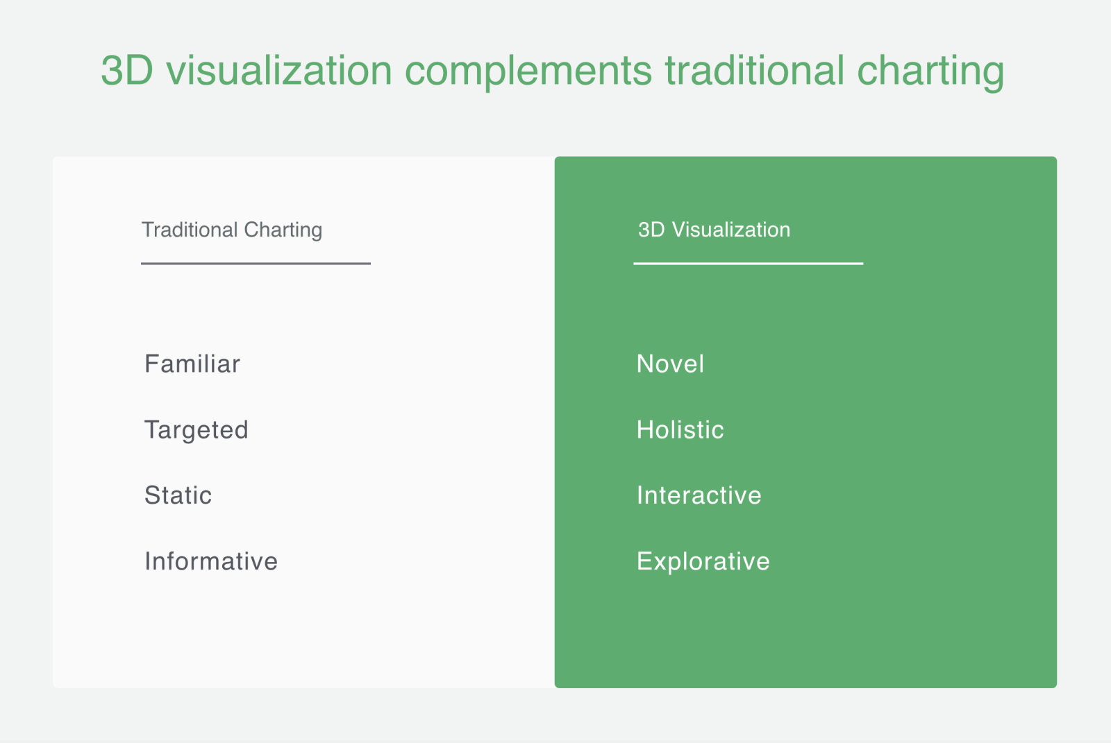
There's obviously no need to throw out 2D visuals entirely. Traditional charting is very useful for specific comparison, and shouldn't be replaced by 3D charting. But whereas traditional charting is familiar, targeted, and informative, 3D charting is holistic, interactive and explorative. The methods are complementary, and customer success teams should use both to get the best analysis possible on their work.

Do It Yourself
Interested in analyzing your own teams data in 3D? Good news, you can!
This cube was built in Mode's Python notebook, with a library called Plotly. The report is built on an open-source environment here. To use it for your own data, click "Clone" in the menu at the top of the window. The parameters can be changed to fit your needs. For instance, see how reps are performing over time by changing the interval from year to month in the parameter menu. This will show datapoints for each month for each CSM. This can be a lot to consume at once, so try clicking on each CSM's name to toggle them off. This will let you examine an individual's performance over time across multiple metrics, or compare specific CSMs rather than look at the whole team. Try it yourself, and let us know how it works out!
Interested in using this type of analysis, but for customer support? We built a framework for that too! The customer support cube examines Quality, Efficiency and Efficacy. Check it out in this blog.
Get our weekly data newsletter
Work-related distractions for data enthusiasts.


