


When we launched Mode's public beta in June 2014, we knew we were putting an MVP (minimum viable product) editor into the wild. As soon as we released it, we started thinking about how we could make it even easier for analysts to create and share work. But, the beta gave us something we couldn't get otherwise: usage data. By analyzing the way analysts have been using Mode, we've been able to validate some of our early feature ideas, throw out others, and uncover completely new ones.
This process isn't unique—software companies are constantly digging through their data looking for product guidance (in fact, we built Mode to help companies do exactly that). In the spirit of open-sourcing some of our analysis code, we're happy to share some of the analysis that went into yesterday's product updates.
An Editor You Can Change As Your Query Changes
In addition to the schema browser and report builder features, we changed the editor's layout. One of the toughest decisions we had to make—and one where our own opinions were strongest—was how the editor should be oriented. Some people wanted the query stacked on top of the data, some wanted a side-by-side view, and others (like me) waffled back and forth. So we decided to see if our data held the answer. What kind of editor would most users want?
After looking, we discovered the answer: it depends. But surprisingly, not only does it depend on the person, it depends on how far along an analyst is in their work.
When analysts are first writing a query, the queries tend to be short and the results usually include a lot of columns. Short queries and wide tables are better suited for a horizontal editor.
But as analysts edit their reports and get closer to the final version, queries get longer and datasets get narrower. Both of these attributes are better suited for a vertical editor.
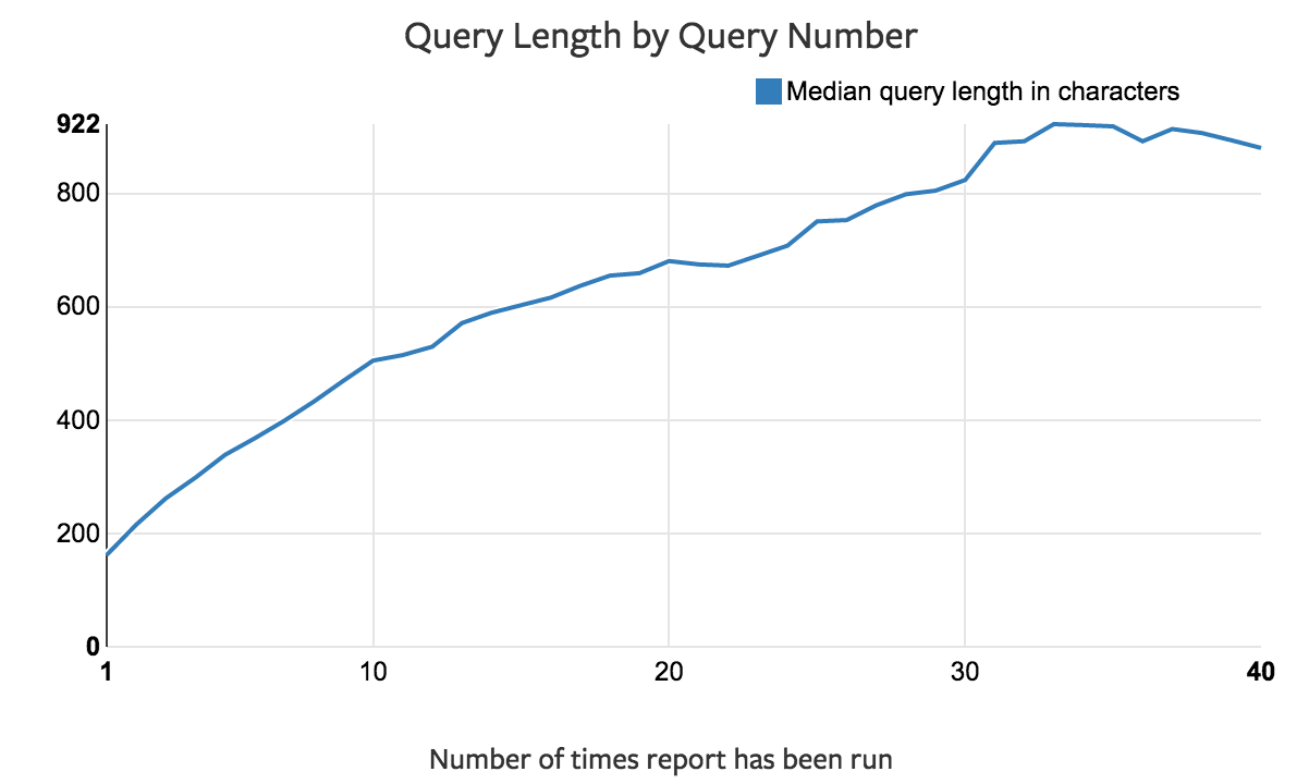
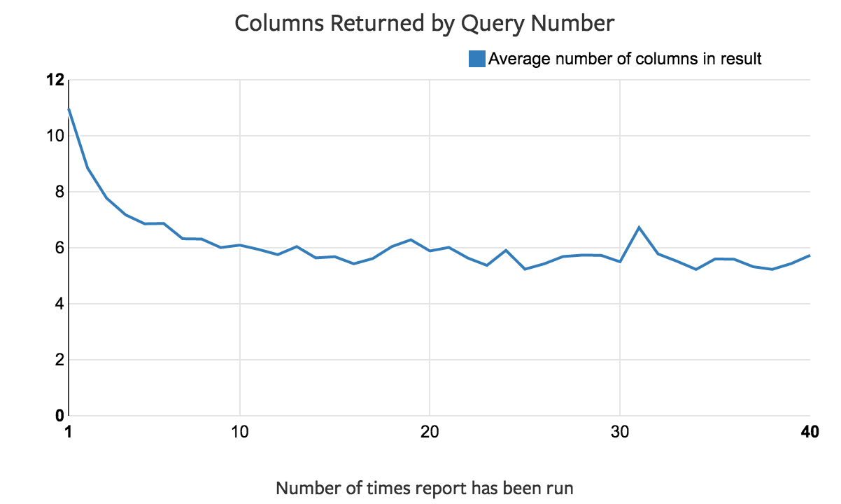
This data guided the design of a flexible editor. It also inspired us to incorporate a horizontal/vertical orientation option into the UI rather than putting it in a settings menu off the editor.
Sharing Options That Make Sense
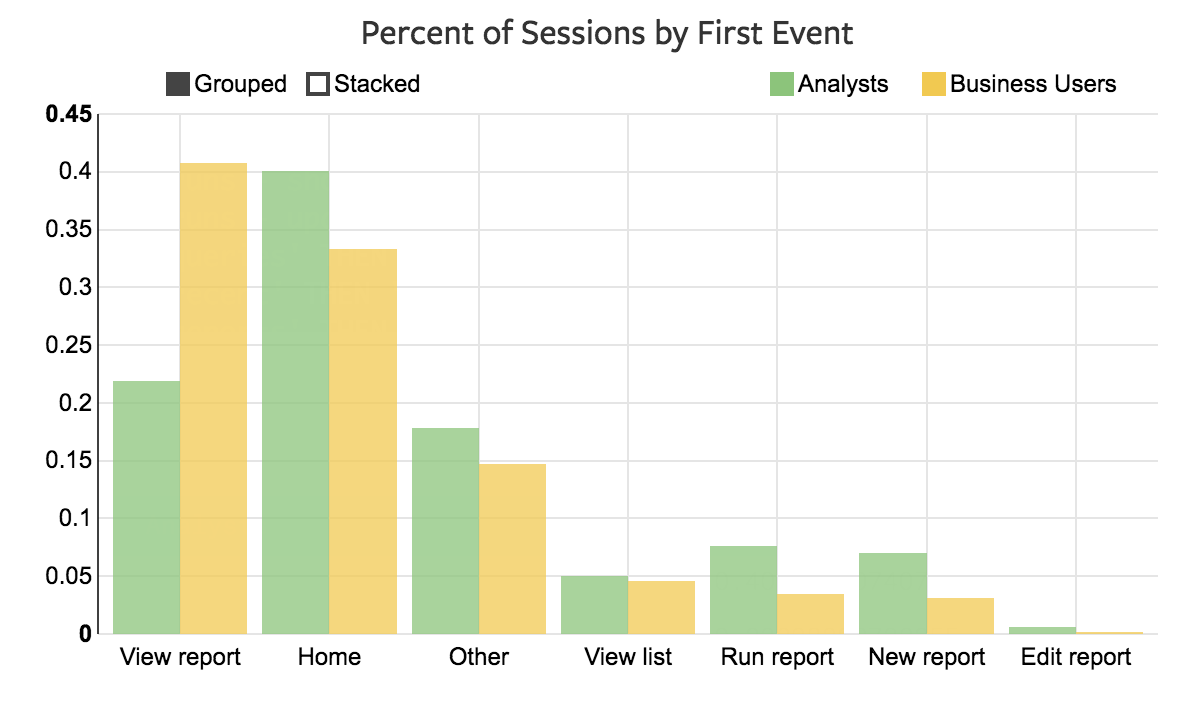
One of the first things we learned when we started looking at user behavior was that analysts (people who write queries) and business users (those who primarily view results) interact with Mode in different ways. Analysts start sessions on Mode's home page more often than business users, while business users tend to enter the product via links to specific reports.
While we expected this behavior, we were still surprised by exactly how many business users come via report links. It's the most common entry point—and about twice as common for business users as for analysts.
Knowing this, we looked into how we could change the product to be most useful to both sets of users, and how we could make the interactions between these two groups better.
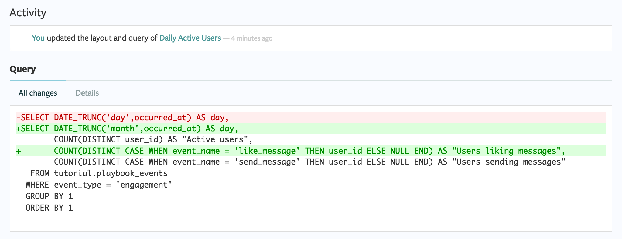
Because analysts tend to come to the homepage, this area is the best place to help analytics teams stay on the same page with current projects. We added an activity feed that shows when someone shares a report, updates a report, or creates a list. Clicking on timestamps in the activity feed shows the diffs for each edit.
Given that distributing reports is a critical task for analysts, we wanted to make this process better as well. To provide analysts more control over what they share—and to ensure business users are only seeing work that's ready to be consumed—we now let analysts save work without publishing it to the rest of their organization. Analysts can now work through draft reports and share them with collaborators in private. Once they're ready for all of their colleagues to see their work, they can share it with their entire organization.
Gimme The Candy
Small improvements can matter as much as big feature additions. Extra clicks and small annoyances hurt a user's experience—and we sought to rid Mode of as many of these as possible with this launch.
After creating hundreds of charts for our own internal reporting, I became acutely aware of exactly how many clicks it took to make the charts I wanted. While much larger charting changes are on the way, we worked to smooth over small annoyances in the meantime.
Of all the reports in Mode that have charts, the “Candy” color scheme is the most popular (we limited the analysis to charts with titles to weed out scratch-work charts that the analyst had no intention of saving). Given that a user has to click two buttons to change chart colors, that's a remarkable rejection of our default colors—and a huge vote for the “Candy” scheme. Based on this data, we changed the default chart color to “Candy.”
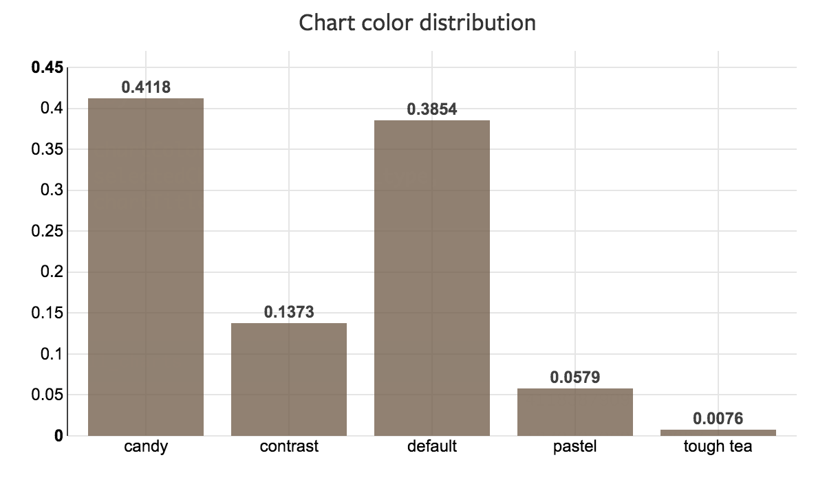
This chart is presented using the much-maligned “Tough Tea” color scheme.
Rethinking Pins
More features often mean more complexity. While we added features, we were careful to keep Mode from becoming overwhelmed with buttons and windows and menus. This meant making some tough decisions to cut features.
Though it's popular among folks at Mode, we haven't heard much from our customers about the report pinning feature. When we looked into it, we realized why: people use pins almost exclusively for pinning tables. More than 90% of manually created pins are tables.
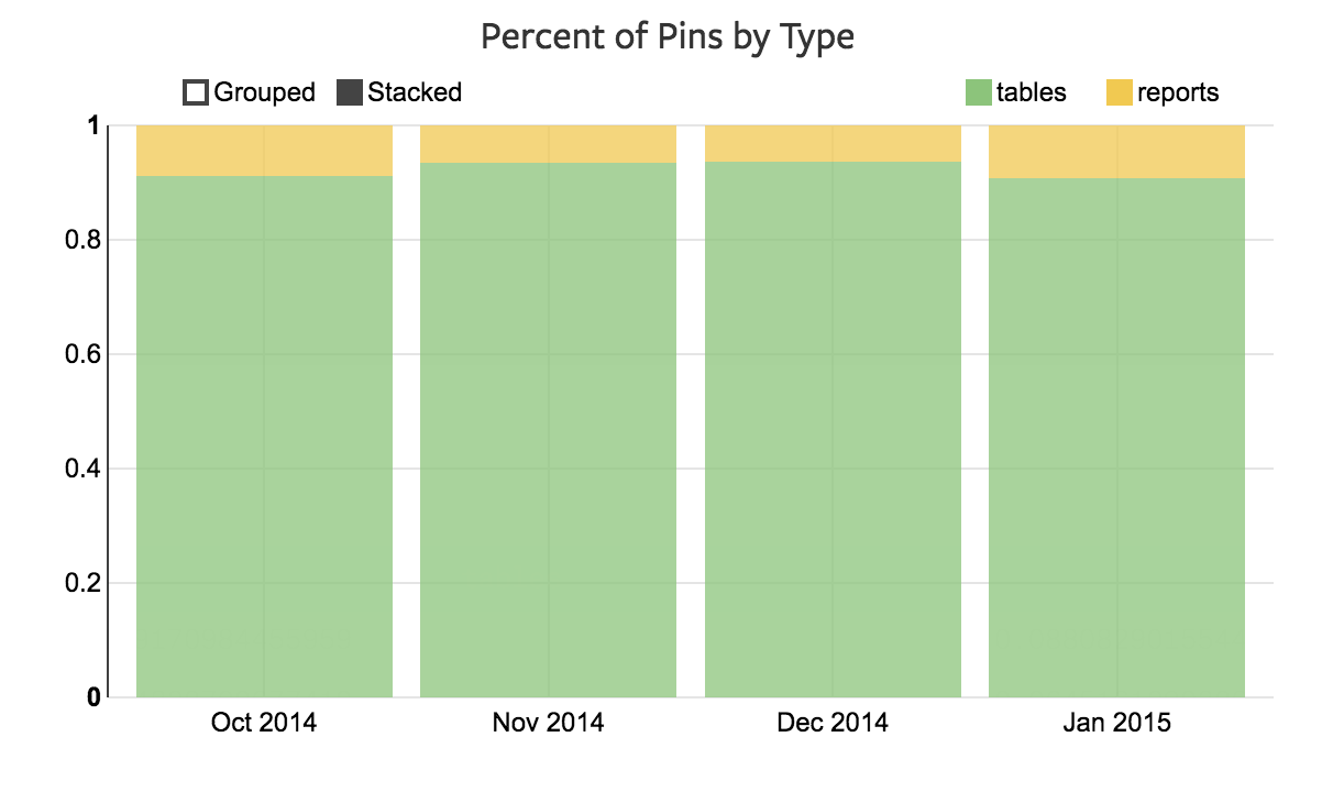
When we looked into ways to design the editor without report pins, we found a seamless way to incorporate table pins into the new schema browser. By building pinning into an otherwise standard schema browser, the editor automatically surfaces information about the tables you're querying. It's a powerful tool—but adding it came at the cost of pinning reports. Looking at our data helped reassure us that we're making the right tradeoff.
What Data Doesn't Tell Us
We used data to help guide as many decisions as we could when developing Mode's new workflow. But in some cases, data doesn't reveal the full picture. New or novel features may be outside of the scope of the data produced by our current product. Different data points could tell conflicting stories. And data only reveals what our users do, not what they want. Designer Blake Reary filled in these gaps with qualitative data and user interviews. Next time, on the Mode blog.

