
Charts
Links in Big Number charts
Bullet chart
Sparklines in Big Number charts
Chart heights
Chart annotations
Choropleth map
Force-directed graph
Funnel chart
Geographic heat map
Google Maps with markers
Heat map
Hive plot
Horizontal bar chart
Network matrix
Creating Chart Annotations using Matplotlib
Creating Histograms using Pandas
Creating Horizontal Bar Charts using Pandas
How to Create R Histograms & Stylize Data
Creating Horizontal Bar Charts using R
Sunburst chart
State choropleth map
Word cloud
World choropleth map
Zipcode choropleth map
How to implement gallery examples using the HTML editor
Creating Chart Annotations using Matplotlib
When creating data visualizations, it's often useful to provide supplementary context to the data being shown. For example, maybe there was a significant dip in traffic to your website on a certain day. In situations like this, it's common practice to enrich a data visualization with annotations in order to answer the inevitable “What happened here?” question.
In this recipe, you'll learn how to apply supplementary text and annotations to a python matplotlib visualization. In this example, you're going to be applying annotations to a visualization of daily orders for a fictitious e-commerce store to provide context to a dip in daily order volume. The steps in this recipe are divided into the following sections:
You can find implementations of all of the steps outlined below in this example Mode report. Let’s get started.
Data Wrangling
You’ll use SQL to wrangle the data you’ll need for our analysis. For this example, you’ll be using the daily_orders dataset available in Mode's Public Data Warehouse. Using the schema browser within the editor, make sure your data source is set to the Mode Public Warehouse data source and run the following query to wrangle your data:
select *
from modeanalytics.daily_orders
order by date
Once the SQL query has completed running, rename your SQL query to Orders so that you can easily identify it within the Python notebook.
Data Preparation
Now that you have your data wrangled, you’re ready to move over to the Python notebook to prepare your data for visualization. Inside of the Python notebook, let’s start by importing the Python modules that you'll be using throughout the remainder of this recipe:
import numpy as np
import pandas as pd
import matplotlib.pyplot as plt
from matplotlib.ticker import StrMethodFormatter
import datetime as dt
Mode automatically pipes the results of your SQL queries into a pandas dataframe assigned to the variable datasets. You can use the following line of Python to access the results of your SQL query as a dataframe and assign them to a new variable:
df = datasets['Orders']
Before visualizing the data, set the index of the dataframe to be the date column:
df = df.set_index('date')
Now that we have our dataset prepared, we are ready to visualize the data.
Data Visualization
To create a line chart of daily orders, you will use pandas plot() method:
ax = df['value'].plot(color='#334f8d', figsize=(11,8), fontsize=11, zorder=2)
You can then apply assorted matplotlib styling to the visualization:
# Despine
ax.spines['right'].set_visible(False)
ax.spines['top'].set_visible(False)
ax.spines['left'].set_visible(False)
ax.spines['bottom'].set_visible(False)

# Remove x-axis label
ax.set_xlabel('')

# Switch off ticks
ax.tick_params(axis="both", which="both", bottom="off", top="off", labelbottom="on", left="off", right="off", labelleft="on")

# Get y-axis tick values
vals = ax.get_yticks()

# Draw horizontal axis lines
for val in vals:
    ax.axhline(y=val, linestyle='dashed', alpha=0.3, color='#eeeeee', zorder=1)

# Format y-axis label
ax.yaxis.set_major_formatter(StrMethodFormatter('{x:,g}'))

# Set y-axis label
ax.set_ylabel("Orders", labelpad=20, weight='bold')

# Set y-axis limit
ylim = ax.set_ylim(bottom=0)
At this point, you will be returned the following visualization:
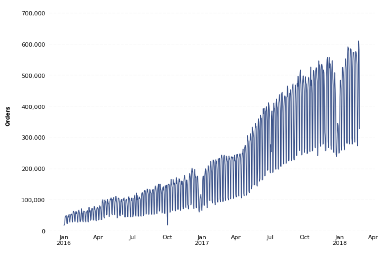
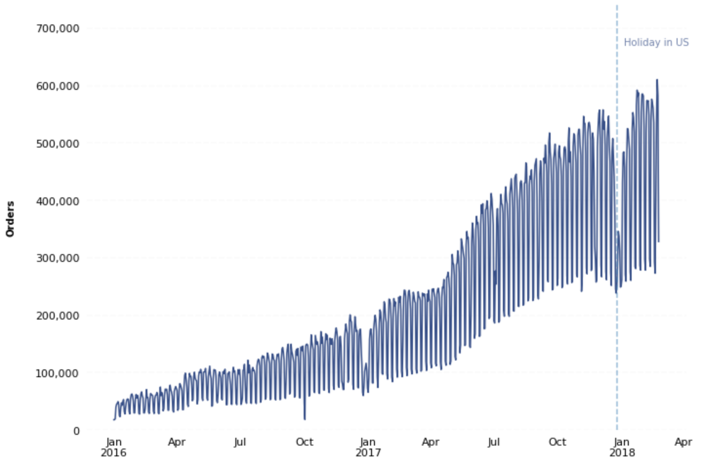
You can see that there are noticeable dips in order volume around the holiday season. To give your data consumers the proper context when they view this visualization, add annotations to the data.
One way of doing this is by adding vertical and/or horizontal lines and supplementary text to your visualization. For example, you could add a vertical line around the most recent holiday with text exclaiming that this is the holiday season. You can add these components using the Axes object .axvline() and .text() methods, respectively:
# Annotate
x_line_annotation = dt.datetime(2017, 12, 25)
x_text_annotation = dt.datetime(2018, 1, 4)
ax.axvline(x=x_line_annotation, linestyle='dashed', alpha=0.5)
ax.text(x=x_text_annotation, y=670000, s='Holiday in US', alpha=0.7, color='#334f8d')
You can also use an Axes object's native .annotate() method for even further annotation customization:
# Annotate
x_line_annotation = dt.datetime(2017, 12, 25)

ax.annotate('Holiday in US',
            xy=(x_line_annotation, 230000),
            xycoords='data',
            xytext=(-50,-100),
            textcoords='offset points',
            arrowprops=dict(headwidth=10, width=4, color='#363d46', connectionstyle="angle3,angleA=0,angleB=-90"),
            fontsize=12)

This is only a small portion of what's possible using matplotlib's annotation functionality. You can discover more annotation possibilities by reading the matplotlib annotation documentation here.